Best Selling Products

ChatGPT Plus Account (GPT-4)
16 USD

Windows 10 & 11 Pro Key
36 USD

Upgrade genuine Capture One account
120 USD

Genuine Adobe Illustrator account
99 USD

Genuine Cheap Canva Pro
39 USD

Freepik Premium Account
59 USD

Plugin Retouch4me
69 USD

Adobe Photoshop Copyright - Full App
120 USD

Adobe Premiere Pro Account
99 USD

Copyright Adobe Lightroom Account
59 USD

Upgrade Duolingo Super
29 USD

Autodesk All App Account Copyright
120 USD

Capcut Pro 1 Year
39 USD

Upgrade Genuine Office 365
49 USD

MidJourney Account
29 USD
Discover the 10 most prominent graphic design trends on Pinterest.
Nội dung
- 1. FunHaus : When Showmanship Becomes Refined
- 2. Khaki Coded : The Khaki Color Palette and Practical Language
- 3. Cool Blue : Purification in Every Shade
- 4. Art Deco in a New Version: Classical Geometry, Contemporary Spirit
- 5. Extra Celestial : When Design Goes Beyond Earth
- 6. Deliberate Errors : Imperfect Beauty in the Digital Age
- 7. Poetcore : When Literature Becomes Visual Language
- 8. Glamoratti : The Return of the Glorious 80s
- 9. Romantic Gothic: Dark and Emotional Beauty
- 10. Gimme Gummy : Designed for the Sense of Touch
- 11. How to Apply These Trends to Your Work
- 12. Conclusion
In its Pinterest Predicts 2026 report, the platform compiled 21 prominent visual trends based on billions of searches, spanning fashion, beauty, travel, interior design, food, and personal preferences. While not all were born specifically for graphic design, many have quickly been adapted by designers into visual languages for branding, packaging, media publications, and other creative projects. Below are ten of the most noteworthy Pinterest trends for the graphic design industry this year.
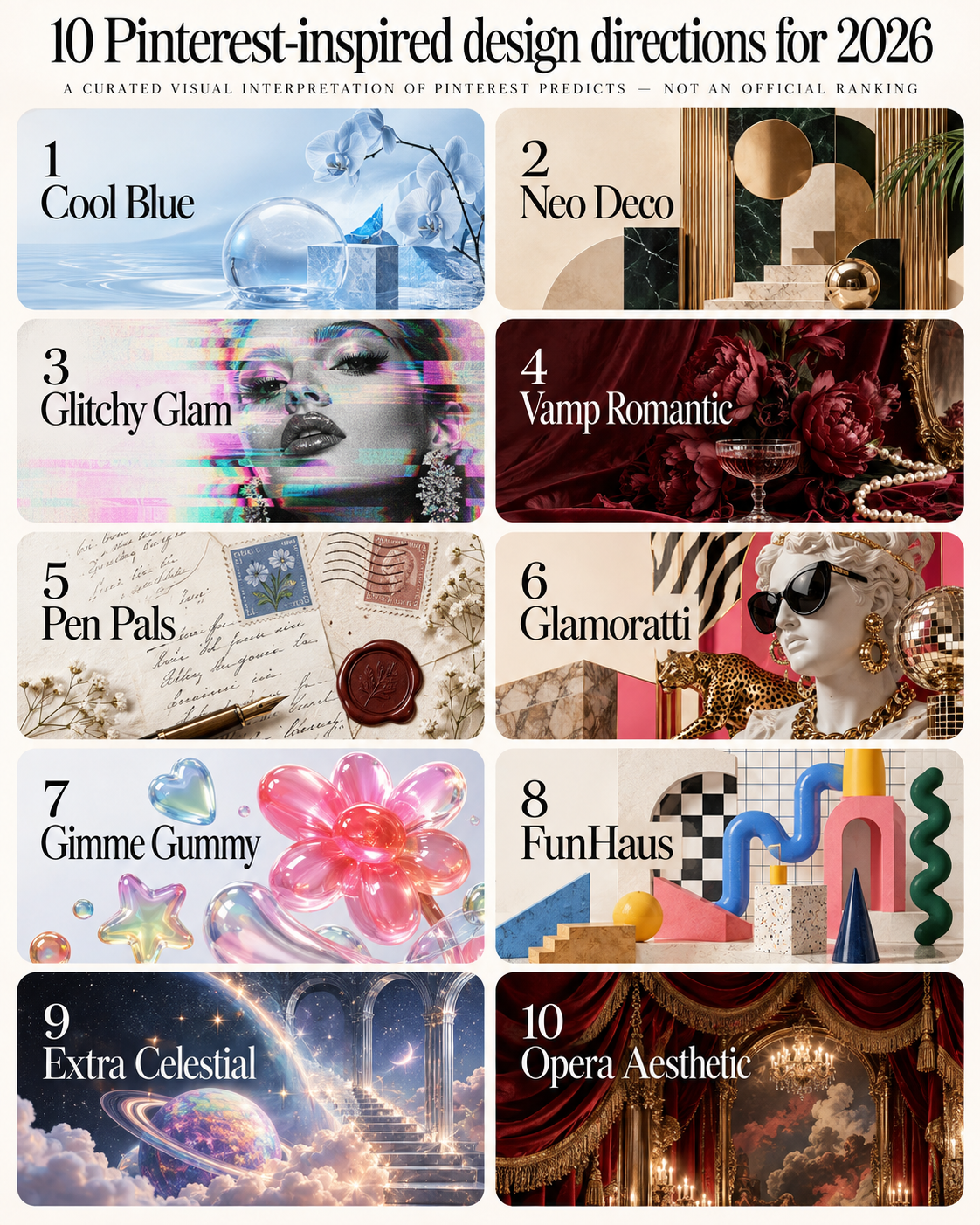
1. FunHaus : When Showmanship Becomes Refined
The first trend draws inspiration from the atmosphere of classic circuses, where bold stripes, sculptural shapes, and playful details blend with a touch of clownish mischief. The key is that the most successful designs in this direction often avoid excessive detail, instead balancing the ostentation with a more restrained color palette.
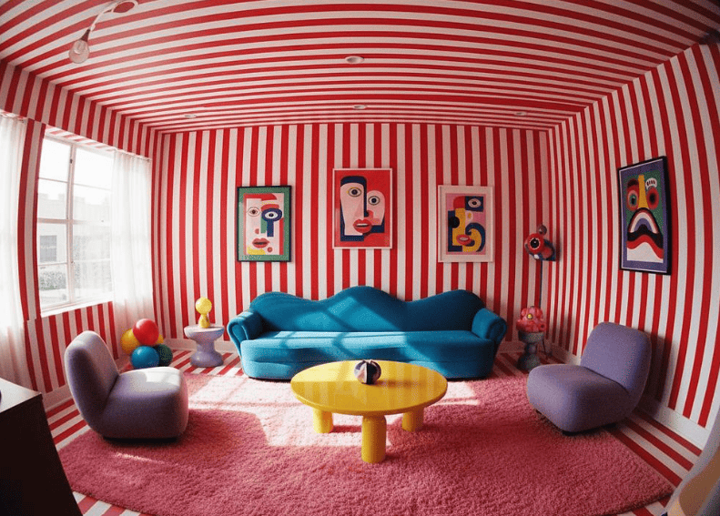
For graphic design, this is an opportunity to experiment with oversized typography, curved layouts, theatrical presentations, large stripes, oversized shapes, and unusual proportions. A poster inspired by this trend might use a giant font that wraps around a central object. A brand identity might combine circus-style stripes with a modern sans serif font. A newspaper or internal publication could use unexpected arches, stars, borders, and large numbers for emphasis.
The most important thing isn't to literally turn every design into a circus poster, but to select one or two visual features and combine them with contemporary design principles. For example, a completely minimalist brand could use a pale cream background, accented with a large red and white stripe and expressive typography to create a playful feel while maintaining professionalism and avoiding a childish appearance.
2. Khaki Coded : The Khaki Color Palette and Practical Language
This trend draws inspiration from the spirit of exploration, practical clothing, and the style of those who love to travel. Khaki shorts, combat jackets, practical multi-compartment bags, and the image of a true traveler are the roots of this color palette and design philosophy.
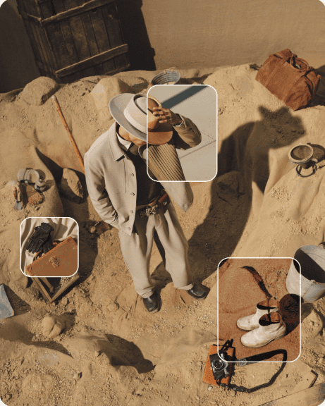
For designers, this is a suitable direction for outdoor brands, travel companies, fashion labels, journalistic projects, and lifestyle campaigns. The color palette is the most adaptable element, including khaki, olive green, sand, beige, brown, faded green, and ivory, all creating a foundation that feels close to nature.
Beyond color, designers can also borrow ideas from military graphics and field manuals without copying them verbatim, such as grids, coordinates, labels, stamps, arrows, maps, technical diagrams, tool symbols, and concise typography. Photography also contributes to this spirit, with landscapes, equipment, maps, field notes, or close-ups of raw materials. This trend is particularly useful for those who want to break away from the polished look often seen in digital branding design, moving towards a more practical and authentic approach.
3. Cool Blue : Purification in Every Shade
Cool blue is one of the dominant trends appearing across various fields, from food and fashion to beauty and events. This color palette evokes feelings of icy coolness and purity, with clear, almost transparent shades of blue.
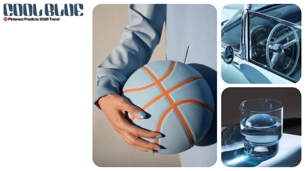
In graphic design, this trend can be expressed through icy blue hues, transparent surfaces, cool gradients, chrome metallic details, soft shadows, and clean, minimalist layouts. Since blue is already a familiar color in brand identity, the challenge is to find a fresh version, rather than sticking to the familiar office navy blue. Designers can experiment with pale icy blue, electric blue, gray-blue, icy cyan, or a nearly white background.
This trend is suitable for technology, skincare, health and wellness, fashion, digital products, packaging, and media publications. When combined with silver or chrome accents, this color palette evokes a futuristic feel; while when paired with warm beige, it becomes softer and more relatable to everyday life.
4. Art Deco in a New Version: Classical Geometry, Contemporary Spirit
This is a modernized version of the Art Deco style, characterized by sharp geometry, fan-shaped arches, chevron patterns, and metallic materials such as chrome and brass. Because Art Deco was already closely associated with typography, geometry, and architecture, this trend is particularly well-suited for those working in brand identity.
Instead of simply reproducing the traditional Art Deco layout, designers should simplify this visual language. A geometric outline, a modern font, a tightly symmetrical layout, or a metallic accent would suffice, rather than covering the entire design with ornate patterns.
This trend has proven particularly effective in the hospitality, restaurant, event, fashion, beauty, packaging, poster, and luxury brands industries. A layout following this approach might combine a clean sans serif font with a geometric display background, or use a large arch or fan shape as a backdrop for a simple text logo. It also serves as a reminder that historical styles can be reinterpreted, simplified, and reinterpreted for contemporary audiences, rather than being copied verbatim.
5. Extra Celestial : When Design Goes Beyond Earth
This trend draws inspiration from outer space, fantasy worlds, futuristic settings, and surreal, mystical imagery. It appears in many different fields, from beauty, interior design, and fashion to the automotive industry.
For graphic designers, the application possibilities are virtually limitless. Starfields, glowing gradients, planets, metallic objects, metallic surfaces, iridescent pearlescent colors, futuristic typography, and surreal layouts can all contribute to this feel. The trend fits naturally into posters, album covers, game graphics, tech campaigns, digital products, event branding, and typography experiments.
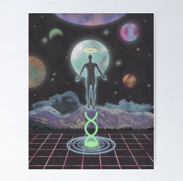
However, designers shouldn't rely solely on generic, indiscriminate imagery of space. A more effective approach is to combine cosmic elements with a clear concept, such as using a single large planet as the background for the typography, rather than filling the entire layout with stars and planets. Colors can range from deep navy and black to vibrant purple, silver, cyan, and pink, with gradient and glowing effects to create depth without overly complex layouts.
6. Deliberate Errors : Imperfect Beauty in the Digital Age
This trend combines polished aesthetics with intentionally created digital flaws, embodying a calculated deviant spirit. It suggests experimentation with distortion and deliberately imperfect digital effects.
This could include distorted typography, duplicated objects, digital noise, misaligned layers, broken gradients, pixelated details, unexpected cropping, and slightly off-axis layouts. The most important keyword here is intent. Adding random glitch effects doesn't automatically make the design more contemporary; the distortion needs to serve the overall idea and still be controlled enough so that the main message remains clear and readable.
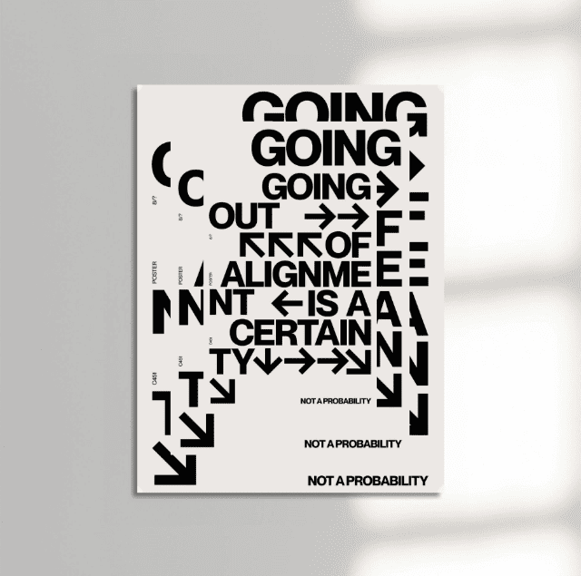
This trend is particularly well-suited to music publications, fashion campaigns, digital posters, social media graphics, tech brands, entertainment projects, and creative journalistic experiments. A simple example is a cleanly rendered fashion portrait, but with a distorted section, a duplicated title, or a subtle RGB color channel splitting effect. It is this contrast between the perfect and the intentionally flawed parts that creates visual appeal for the entire work.
7. Poetcore : When Literature Becomes Visual Language
This trend brings literature, calligraphy, classic fashion, and the image of a modern poet into visual life. It is associated with searches related to the style of those pursuing the art of writing, scholarly robes, bags, and literary accessories.
This aesthetic translates incredibly naturally into journalistic and publishing design. Think classic serif fonts, literary references, paper textures, handwritten notes, fountain pen details, vintage book covers, muted color palettes, and layouts inspired by print publications. Designers can combine traditional typography with modern typesetting, avoiding the work from looking like a mere historical copy.
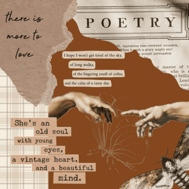
This trend is particularly suitable for book covers, magazines, personal branding, cultural organizations, cafes, stationery, fashion campaigns, and creative portfolios. Typography should play a central role, with high-contrast serif fonts, italics, small uppercase letters, justified alignment, large quotes, and carefully placed notes, all creating the feel of a truly printed literary publication. Small imperfections, rough paper textures, scan marks, or handwritten elements can also make the design more intimate and personal.
8. Glamoratti : The Return of the Glorious 80s
This trend evokes the maximalist luxury spirit of the eighties, with sculptural forms, bold jewelry, powerful tailoring, oversized accessories, gold accents, and an overall sense of fullness and extravagance.
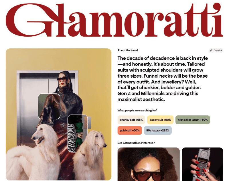
In terms of graphic design, this spirit can be translated through rich typography, metallic effects, dramatic photography, dark backgrounds, large-scale layouts, and luxurious color schemes. Black and gold are familiar starting points, but designers can certainly expand to deep burgundy, emerald green, navy, cream, copper, and other warm metallic shades to create a more sophisticated color palette.
This trend is highly useful for high-end brands, fashion campaigns, event graphics, restaurant branding, cosmetic packaging, album covers, and luxury product advertising. Typography can become the dominant design element, with large serif headlines, dense display fonts, gold leaf effects, high contrast, and tightly controlled letter spacing. Most importantly, restraint is key; luxury doesn't necessarily mean covering everything in gold. Sometimes, a single metallic detail, an impressive typography, and a powerful image are enough to convey more than a page full of ornate details.
9. Romantic Gothic: Dark and Emotional Beauty
This trend offers a darker, more romantic version, contrasting with the more subdued romantic aesthetics often seen. Although originating in the beauty industry, the visual language of this trend can be fully translated into graphic design through dark tones, dramatic imagery, gothic references, romantic typography, and theatrical layouts.
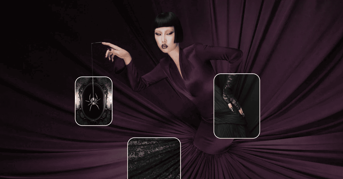
For designers, this can be expressed through deep burgundy, black, plum purple, crimson, classic gold, photography rich in shadows, elegant serif typography, and vintage-inspired details. This trend is suitable for album covers, fashion publications, perfume brands, book covers, posters, wedding invitations, and beauty campaigns.
The most successful designs often avoid overly literal interpretations. It doesn't necessarily require bats, roses, or Gothic castles to convey this atmosphere; sometimes, a dark background, elegant typography, dramatic lighting, and a sufficiently powerful image are enough to create the desired effect. This trend also works well when combined with contrast, for example, pairing delicate typography with dark imagery, or combining soft photography with heavy typography, thereby creating captivating visual tension.
10. Gimme Gummy : Designed for the Sense of Touch
This is perhaps the most visually recognizable trend on this list. It draws inspiration from gummy candy textures, jelly-like surfaces, pliable objects, and ASMR visual experiences, linked to searches for gummy bear aesthetics, jelly blush, and jelly candy in general.
The biggest opportunity this trend offers is texture. Designers can move beyond conventional flat graphics to create images that look soft, transparent, puffy, glossy, or slightly elastic. Rounded 3D typography, transparent bubble-like blocks, gel-like buttons, glossy icons, and colorful transparent shapes can all convey the characteristic feel of this trend.
It's particularly well-suited for product packaging, cosmetic branding, food graphics, social media campaigns, posters, and digital products aimed at young people. Designers can easily create a simple text logo and then surround it with raised letters or jelly-like objects without complicating the entire layout. Color also plays a key role; vibrant pinks, candy reds, oranges, purples, blues, and translucent pastel tones create a playful effect, while a neutral background can prevent the design from becoming overwhelming.
11. How to Apply These Trends to Your Work
Following Pinterest trends doesn't mean copying every popular image exactly. In fact, adhering too rigidly to a trend can quickly make your design outdated. A more effective approach is to identify the core visual elements that make up the trend, then select the elements that best suit your project.
A helpful process is to break down each trend into five basic elements: color, typography, layout, texture, and overall spirit. For color, ask yourself which shades define that aesthetic. For typography, determine whether the font is elegant, playful, concise, classic, or experimental. For layout, consider whether the arrangement is symmetrical, chaotic, minimalist, layered, or oversized. For texture, identify the materials used—paper, metal, glass, grain, or digital effects. Finally, for overall spirit, determine the emotion the trend evokes—whether it's playful, luxurious, nostalgic, mysterious, futuristic, or utilitarian.
Once these elements are separated, the designer can borrow individual ideas instead of copying an entire aesthetic, thereby creating a product with a more distinct personal touch.
12. Conclusion
The most useful Pinterest trends aren't necessarily what looks most impressive on a mood board, but rather what can be transformed into a clear, consistent visual system.
The key lies in viewing these trends as inspiration, not as a mandatory formula to follow. Take the color palette from one trend, the typography from another, and then combine it with your own design system. This approach will help the final product have a contemporary feel without losing its unique identity or being perceived as simply following a trend.
Pinterest can tell designers what people are embracing today, but the real skill lies in the ability to transform those signals into original visual ideas that are enduring even after the trend has died down.





















VIP Products








Best Selling Products
ChatGPT Plus Account (GPT-4)
16 USD
Windows 10 & 11 Pro Key
36 USD
Upgrade genuine Capture One account
120 USD
Genuine Adobe Illustrator account
99 USD
Genuine Cheap Canva Pro
39 USD
Freepik Premium Account
59 USD
Plugin Retouch4me
69 USD
Adobe Photoshop Copyright - Full App
120 USD
Adobe Premiere Pro Account
99 USD
Copyright Adobe Lightroom Account
59 USD
Upgrade Duolingo Super
29 USD
Autodesk All App Account Copyright
120 USD
Capcut Pro 1 Year
39 USD
Upgrade Genuine Office 365
49 USD
MidJourney Account
29 USD