Best Selling Products

Upgrade Genuine Office 365
49 USD

Autodesk All App Account Copyright
120 USD

Capcut Pro 1 Year
39 USD

Freepik Premium Account
59 USD

Upgrade genuine Capture One account
120 USD

ChatGPT Plus Account (GPT-4)
16 USD

Adobe Photoshop Copyright - Full App
120 USD

Genuine Cheap Canva Pro
39 USD

Genuine Adobe Illustrator account
99 USD

Copyright Adobe Lightroom Account
59 USD

Windows 10 & 11 Pro Key
36 USD

Upgrade Duolingo Super
29 USD

Adobe Premiere Pro Account
99 USD

MidJourney Account
29 USD

Plugin Retouch4me
69 USD
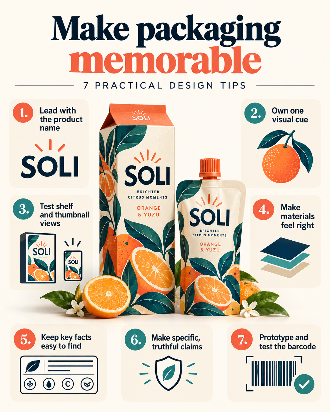
How to make product packaging memorable? 7 helpful design tips.
Nội dung
- 1. How to Make Product Packaging More Memorable
- 1.1. Start with the Brand Story, Not the Colors
- 1.2. Using Color as a Tool to Create an Impression
- 1.3. Incorporating Typography into Brand Identity
- 1.4. Create a Visual Element That People Can Remember
- 1.5. Utilize a Simple Design with a Clear Hierarchical Structure
- 1.6. Packaging Design Works as a Unified System
- 1.7. Don't Forget the Hands-on Experience
- 2. Thoroughly review packaging designs before mass production.
- 3. Avoid Chasing Fleeting Trends When Designing Packaging
- 4. Conclusion
On crowded shelves, a product only has a few seconds to capture a customer''s attention before they move on to another option. Packaging is not simply about protecting the product inside; it''s the face of the brand, the first thing that helps consumers recognize and remember the brand even before they read the product name. For designers, packaging is a combination of many elements: brand positioning, typography, color, layout, illustrations, materials, and product information. All these elements need to work together seamlessly. A package can look very appealing but still fail if the product name is difficult to read, the information is presented in a confusing way, or the design is too similar to a competitor''s.
1. How to Make Product Packaging More Memorable
To create packaging that leaves a lasting impression on consumers, designers need to approach the problem systematically, rather than focusing solely on superficial aesthetics. Below are seven of the most important principles.
1.1. Start with the Brand Story, Not the Colors
Before choosing a color palette or sketching images, designers need to clearly understand what the product and brand want to convey. An organic skincare product certainly shouldn't have a design language similar to an energy drink can. Target customers, product segment, price point, brand personality, and market position all influence the design direction.
Before you begin sketching, ask yourself these fundamental questions: Who will buy this product? What problem does it solve for them? What makes it different from the competition? What should customers feel when they see the packaging? Where will the packaging appear—on supermarket shelves, in high-end stores, or on e-commerce platforms? Who are the direct competitors? And finally, what is the lasting impression the brand wants customers to have?
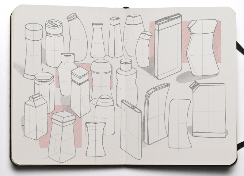
These answers will form the foundation upon which the designer will build a specific direction. Memorable packaging often stems from a clear idea, whether it's simplicity, elegance, youthful energy, pristine nature, or traditional values, as long as that idea aligns with the product's essence.
Furthermore, packaging design needs to be closely linked to the overall brand identity system. The logo, colors, typography, imagery, and other graphic elements should feel like they belong to the same ecosystem, so that every time customers encounter any brand touchpoint, they can recognize it immediately.
1.2. Using Color as a Tool to Create an Impression
Color is the first and quickest element that consumers notice when looking at packaging. A strong color choice can help a product stand out among dozens of similar products on the shelf; however, using color simply to create visual appeal is not enough. Each color chosen needs a clear reason, linked to the brand's personality and values.
For example, a natural food brand might use earthy green tones and warm neutral colors to evoke a sense of closeness to nature. A product for children often prioritizes bright, vibrant colors, while a high-end cosmetic product might opt for a more restrained color palette with black, white, metallic, or soft neutral tones to convey elegance.
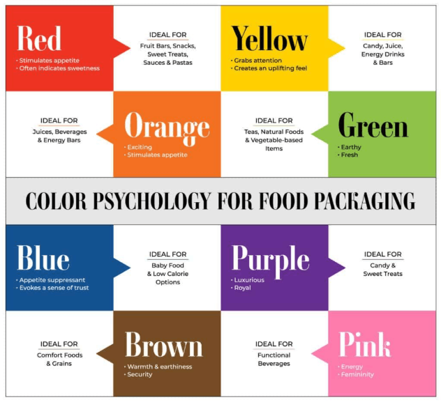
The most important thing is to build a consistent color scheme, rather than randomly choosing colors for each individual product line. A product line can use a main color representing the brand, combined with different secondary colors for each product variant. This approach helps customers both recognize the overall brand and easily distinguish each specific product.
In addition, designers also need to check the colors under actual printing conditions. A color that looks perfect on a computer screen can change significantly when printed on cardboard, plastic, glass, or matte surface materials.
Another important point is to avoid using too many colors at once. Adding too many colors doesn't automatically make the packaging more impressive; on the contrary, it can make the design cluttered and difficult to understand. The safe rule is to start with a main color, combine it with one or two auxiliary colors, and a neutral color when necessary. A restrained color palette usually gives designers better control over visual priority and recognizability.
1.3. Incorporating Typography into Brand Identity
Typography has the power to make packaging easily recognizable even when the design lacks other graphic elements. The product name is often the most important detail on the front of the packaging, so the font, size, boldness, spacing, and placement of the letters all need careful consideration.
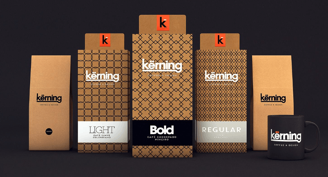
A uniquely designed and innovative brand signature can become a defining characteristic of a product. A sophisticated serif typeface can lend a distinctly luxurious feel to high-end products, while a clean, sans-serif typeface is often more suited to tech or modern lifestyle brands.
Font selection shouldn't be based solely on visual appeal on font websites. Designers need to experiment with the font in the actual product name, considering factors such as letter spacing, boldness, word length, readability, capitalization, contrast, display effectiveness at reduced size, and potential limitations in printing.
Furthermore, the typography needs to work effectively across the entire product line, not just on a single product. Thorough testing in various sizes and formats will help ensure consistency and recognition. In many cases, a carefully chosen typography alone is enough to create memorable packaging without the need for any additional decorative details.
1.4. Create a Visual Element That People Can Remember
Packaging doesn't need dozens of complex graphic details. Sometimes, a single visual element is enough to make an impression. That element could be a distinctive illustration, a unique pattern, an unusual symbol, a unique product shape, a highly graphic typography, an easily recognizable character, a characteristic border style, or a graphic detail that is repeated throughout.
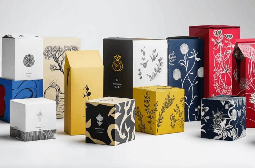
The key is that this visual element needs to truly belong to the brand, not be a detail easily confused with another brand. For example, a small illustrative character appearing throughout an entire product line can become an image closely associated with the brand in the customer's mind. An exclusive design can also serve a similar purpose.
This visual element needs to work well at various sizes, as it can appear not only on the main packaging but also on the website, social media images, advertisements, and other media materials. This consistent presence creates a strong link between the product packaging and the entire brand system, making it easy for customers to recognize the product wherever they encounter it.
1.5. Utilize a Simple Design with a Clear Hierarchical Structure
A product packaging typically needs to contain a wealth of information, including the logo, product name, description, ingredients, usage instructions, dimensions, certification marks, barcode, manufacturer information, and many other mandatory details. The biggest challenge is how to organize all this information without making the packaging look cluttered or overwhelming.
This is where visual hierarchy plays a crucial role. Designers need to clearly decide what viewers should see first, what comes second, and what comes third in order of priority. A typical hierarchy usually starts with the brand name, followed by the product name, then the main benefit or description, then important supporting information, and finally legal or technical information.
Not all information needs to be presented with the same size or level of prominence. A common mistake is trying to make every element stand out, bold, and vibrant at the same time, resulting in no element truly gaining priority in the viewer's eyes.
A simple design is often easier to remember because it reduces the amount of information the viewer has to process at once. This approach also makes the product more easily recognizable when customers only have a few seconds to glance at it on a shelf or scroll through a product list online.
1.6. Packaging Design Works as a Unified System
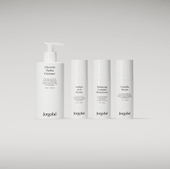
If a business sells only a single product, the packaging still needs to fully represent the brand. But when a business owns multiple products, the design challenge becomes much more complex. A set of packaging needs to look closely related to each other, but at the same time shouldn't be so identical that it's difficult to distinguish them.
For example, a skincare brand might use a consistent logo placement, typography, layout, and graphic style across all its products, while varying the accent colors for each different product line. This creates a unified visual family, allowing customers to recognize the brand from a distance and then identify the exact product they need based on color or product name.
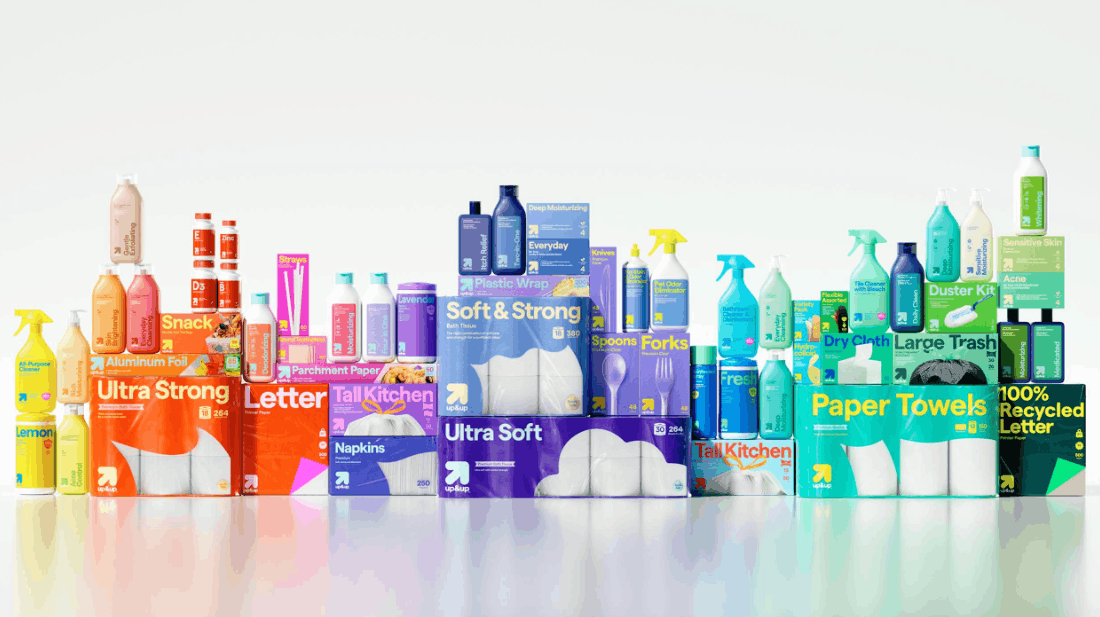
A complete packaging system typically clearly defines elements such as logo placement, product name placement, typography, color scheme, photography style, illustration style, symbol style, use of motifs, information hierarchy, and packaging materials. Establishing a clear system from the outset also offers significant benefits when a business launches a new product in the future, as designers don't need to start from scratch but can build upon the existing foundation.
1.7. Don't Forget the Hands-on Experience
Packaging design is not just a flat image on a computer screen. Consumers touch it, open it, hold it, carry it, and store it; sometimes they even keep the packaging after the product inside has been used. This opens up many opportunities for designers to create a truly memorable experience.
Factors that need careful consideration include the overall shape of the packaging, the type of paper or material used, the matte or glossy finish, embossing techniques, foil stamping details, decorative cutouts, labels, the opening mechanism, the interior printing, any included items, and the reusability of the packaging after its purpose is fulfilled.
All these details need to serve the purpose of reinforcing the brand image, rather than existing merely as decorative elements. A high-end product might use materials that create a special tactile feel or sophisticated embossing techniques, while a youthful, playful brand might cleverly incorporate a surprising message hidden inside the product box.
Even simple packaging can become memorable when the tactile experience aligns with and is consistent with the brand's visual identity. This is especially important for online brands, as customers often only experience the packaging after placing an order. At that point, the packaging becomes an integral part of the unboxing experience, contributing to the customer's initial feelings and impressions of the brand.
2. Thoroughly review packaging designs before mass production.
A design that looks great on a computer screen may not necessarily be ready for actual production. Before approving the final design, businesses should create realistic packaging mockups and, if conditions permit, produce additional physical prototypes for a comprehensive evaluation.
The inspection should be conducted from various viewing distances. At a normal viewing distance, can customers easily recognize the brand? Can they clearly read the product name? Does the packaging stand out significantly from competing products? Do the colors retain their intended effect when printed? Does the design appear balanced and harmonious from all angles?
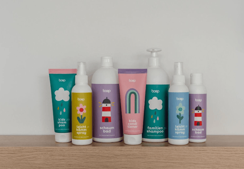
In addition to inspecting each product individually, businesses also need to consider how the packaging presents itself when placed side-by-side as a complete product line. There are cases where a packaging design looks impressive on its own, but loses its effectiveness when placed alongside five other products from the same brand. Thorough pre-production testing is a valuable opportunity to identify and address these potential problems, avoiding costly mistakes once mass production begins.
3. Avoid Chasing Fleeting Trends When Designing Packaging
Design trends are always a useful source of inspiration; however, blindly following every trending packaging trend can quickly make a product look outdated and lacking in depth. A currently popular font, a favored color scheme, or a striking visual effect can become boring and outdated after only a short time.
This doesn't mean product packaging should be monotonous or uncreative. A more sensible approach is to understand the nature of the trend, then carefully consider whether it truly aligns with the brand's personality and core values, rather than applying it mechanically simply because it's popular in the market.
Truly memorable packaging needs to possess something unique to the product and brand, a hallmark that is not easily copied or blended into the crowd of general trends. Simplicity, consistency, and long-term recognition are far more solid foundations than relying solely on short-lived visual trends.
4. Conclusion
Memorable packaging design isn't about adding as many graphic details as possible, but about making the right decisions and giving customers something they can easily recognize and remember. That journey should begin with a clear brand idea, followed by purposeful color choices, integrating typography into the brand identity, creating a memorable visual element, keeping the information structure simple and clear, and ensuring the entire product line feels cohesive and unified.
After perfecting the visuals on the screen, designers need to think beyond the confines of a flat design. Materials, shapes, finishes, unboxing experience, and small physical details can all significantly contribute to how customers remember the product in their minds.
The most successful packaging designs often possess a simple idea that is consistently expressed across all touchpoints. When the logo, colors, typography, graphics, and tactile experience work together harmoniously, the packaging is no longer merely an outer shell for the product, but becomes a true part of the brand—something customers can recognize and remember every time they encounter it.





















VIP Products








Best Selling Products
Upgrade Genuine Office 365
49 USD
Autodesk All App Account Copyright
120 USD
Capcut Pro 1 Year
39 USD
Freepik Premium Account
59 USD
Upgrade genuine Capture One account
120 USD
ChatGPT Plus Account (GPT-4)
16 USD
Adobe Photoshop Copyright - Full App
120 USD
Genuine Cheap Canva Pro
39 USD
Genuine Adobe Illustrator account
99 USD
Copyright Adobe Lightroom Account
59 USD
Windows 10 & 11 Pro Key
36 USD
Upgrade Duolingo Super
29 USD
Adobe Premiere Pro Account
99 USD
MidJourney Account
29 USD
Plugin Retouch4me
69 USD