Best Selling Products

Upgrade genuine Capture One account
120 USD

Upgrade Duolingo Super
29 USD

Adobe Photoshop Copyright - Full App
120 USD

Capcut Pro 1 Year
39 USD

Adobe Premiere Pro Account
99 USD

Copyright Adobe Lightroom Account
59 USD

Genuine Cheap Canva Pro
39 USD

ChatGPT Plus Account (GPT-4)
16 USD

Upgrade Genuine Office 365
49 USD

Plugin Retouch4me
69 USD

Genuine Adobe Illustrator account
99 USD

Autodesk All App Account Copyright
120 USD

Freepik Premium Account
59 USD

MidJourney Account
29 USD

Windows 10 & 11 Pro Key
36 USD
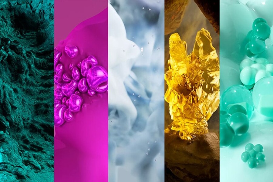
Color Trends 2026: The Colors Predicted to Be in Style
Nội dung
A compilation of colors predicted to be strongly present in various creative fields.
Looking back at recent years, we can easily see a clear shift in how people approach color. While the earlier period prioritized vibrant colors that strongly asserted individuality, after the pandemic and global upheavals, the trending color palette has gradually shifted towards shades that are more comforting, stable, and closer to nature.
2026 is predicted to be a year where color plays a more prominent role as an "emotional language" than ever before. Color palettes will no longer serve merely visual purposes, but will also aim to create feelings of safety, mental balance, and connection between people and their surrounding environment. This is evident in the rise of warm neutral tones, soothing blues, pure whites, and colors inspired by pristine nature. For designers, marketers, or anyone working in creative fields, grasping the 2026 color trends early will not only help you create trendy products but also build a strong and meaningful brand image.
1. Top trending colors predicted to be popular in 2026.
1.1 Variable Green Teal (WGSN)
Transforming Teal is one of the colors that WGSN highly recommends for the period 2026–2027. This is not the familiar teal often seen in technology design or modern spaces, but a refined version that is more “moved,” flexible, and full of depth.
This shade of blue lies between blue and green, but its saturation is reduced to create a sense of calm, maturity, and stability. The "transformative" element in its name clearly reflects the spirit of this color: its ability to adapt to many different contexts, from digital environments to physical spaces, from high-tech brands to products with a human element.
In color psychology, teal is often associated with intelligence, emotional balance, and confidence. The teal version of 2026 doesn't feel cold or distant; on the contrary, it creates a pleasant state, helping viewers feel "held back" and not swept away by the fast pace of life.
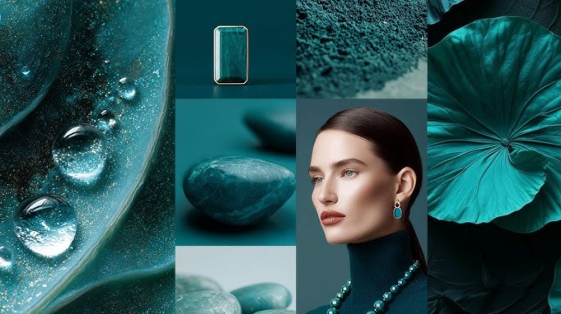
In branding design, the versatile teal color is well-suited for technology companies, fintech firms, educational institutions, digital healthcare, and forward-looking products. It's modern enough to convey a spirit of innovation, yet soft enough to avoid feeling oppressive or rigid. It's a color that can be used long-term, is less likely to become outdated, and can easily be expanded into an entire brand color scheme.
1.2 Pure White Cloud Dancer (Pantone)
Cloud Dancer is a shade of white that Pantone predicts will play a pivotal role in design in 2026. For many years, white was often considered "safe," "neutral," and sometimes boring. However, Cloud Dancer has completely changed how we perceive the color white.
This is a pure white, yet not cold; it has a subtle warmth, evoking a soft, ethereal feeling like floating clouds. Cloud Dancer is not industrial or cold like traditional pure white, but possesses greater depth and clearer emotion.
The rise of Cloud Dancer reflects a trend toward seeking space, tranquility, and minimalism in both living and digital spaces. In a context where people are increasingly bombarded with information, images, and content, a "breathable" white color scheme becomes crucial for visual balance.
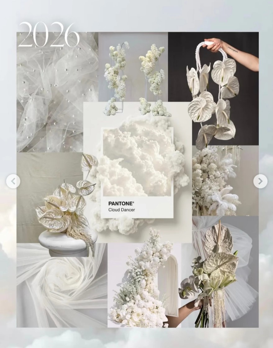
In interior design, Cloud Dancer makes spaces feel spacious and bright without being cold. In graphic design and UI/UX, this white color improves readability, reduces eye strain, and creates a friendly user experience. Cloud Dancer is not just a color; it represents a philosophy of minimalist design with depth, where every empty space has value.
1.3 Gentle green
Soft green is a color that represents rebirth, healing, and connection with nature. Unlike the powerful, dark shades of green or the energetic neon green, soft green evokes feelings of peace and closeness.
The strong appearance of this color in the 2026 forecast is linked to the trend of slower living, green living, and a greater focus on mental health. People are becoming increasingly aware of the importance of nature, not only as an environmental factor but also as a source of healing energy.
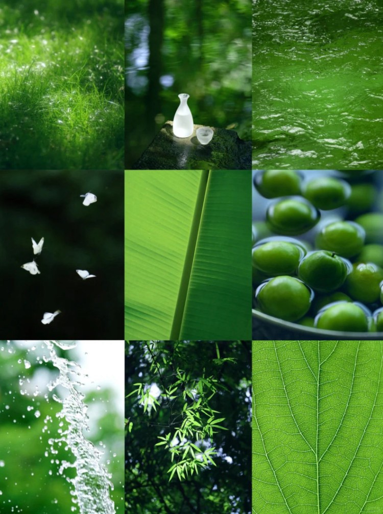
In design, soft green is often used to create a feeling of friendliness, approachability, and trustworthiness. It is particularly suitable for brands related to wellness, clean food, natural cosmetics, education, and community-oriented products.
Visually, this color is easy to combine with neutral colors like Cloud Dancer, beige, or light gray. When used correctly, the soft green helps the overall design become gentle, balanced, and emotionally profound, rather than focusing solely on surface prominence.
1.4 Cool Blue Glacier Lake
Glacier Lake is a shade of blue inspired by pristine glacial lakes, where nature remains largely untouched by human activity. It's a "purifying" color, evoking feelings of tranquility, clarity, and trustworthiness.
Unlike the powerful navy blue or the strong cobalt blue, Glacier Lake is gentler and more approachable. It doesn't overwhelm the eye but creates a cool, refreshing feeling, helping viewers feel relaxed and comfortable.
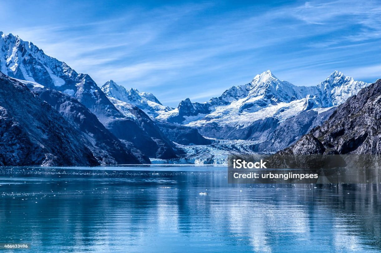
In the context of 2026, when humanity faces the pressures of technology, artificial intelligence, and a rapidly digitizing lifestyle, Glacier Lake becomes a symbol of transparency and stability. This color scheme is often applied in interface design, technology products, online education, and platforms that need to build trust with users.
In living and working spaces, cool blue helps to expand the visual field, create a sense of spaciousness, and reduce stress. It's one of the colors that has the potential to remain timeless, never go out of style, and suit many different design styles.
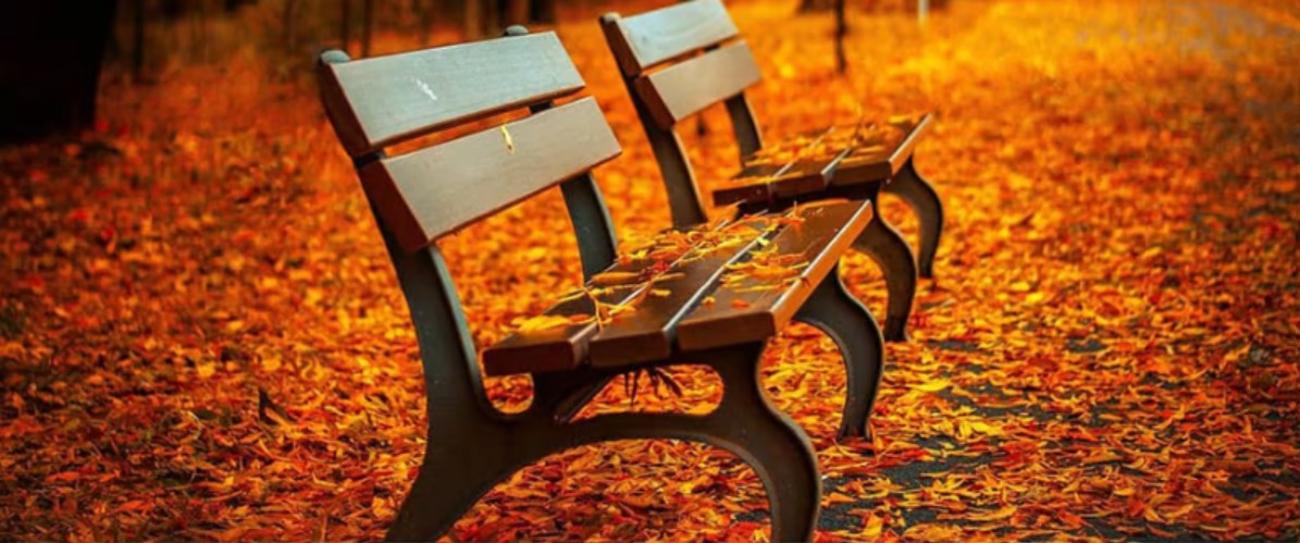
1.5 Warm earthy orange
Warm, earthy orange is a highly emotional color in the 2026 color palette. It's a blend of orange, brown, and red, creating a deep, warm, and rich tone. Not bright or flashy, earthy orange evokes a friendly, approachable feeling and a distinctly handcrafted quality.
The return of earthy orange reflects a trend towards returning to original, handcrafted, and personalized values in design. In an increasingly digitized world, "tactile" colors like earthy orange become especially important.
In interior design, earthy orange creates a warm, comfortable, and human atmosphere. In fashion and product packaging, this color evokes a sense of luxury, durability, and reliability. When used in graphic design, earthy orange often acts as an accent color, adding an emotional touch to the overall design without being overdone.
1.6 Beige
Beige is a warm, neutral color that is fundamental and highly versatile. It's not flashy or visually jarring, yet it possesses enduring appeal that transcends many trend cycles.
In 2026, beige is predicted to continue playing a significant role in interior design, fashion, and branding. This color offers a natural, gentle feel and is very easy to combine with other colors in the trending color palette.
Beige yellow helps create a sophisticated, mature, and trustworthy design. It suits brands that pursue a sustainable, minimalist, and profound image. When combined with cool teal, green, or blue, beige yellow acts as a balance, preventing the overall look from being cold or overly serious.
2. Hot trend color combinations for 2026 that are beautiful and timeless.
Understanding and choosing the right trending colors is only the first step. More importantly, it's about how to combine colors in a way that is both fashionable and long-lasting. In 2026, the use of too many bright or strongly contrasting colors is discouraged; instead, harmony, restraint, and purpose are prioritized.
A key principle in color schemes for 2026 is to use neutral tones like Cloud Dancer or beige as a base, thereby creating space for dominant colors such as teal, soft green, or Glacier Lake to take center stage. This approach gives designs depth, makes them easy on the eyes, and prevents visual fatigue.
Warm, earthy orange tones should be used as an emotional accent, rather than as the dominant color. Just a small detail, a subtle splash of color, and earthy orange can bring warmth and personality to the entire design.
To avoid becoming outdated, designers should avoid blindly following trends. Instead, they should understand the essence of each color palette and apply them in specific contexts. A well-structured color palette is not only aesthetically pleasing in the present moment but also adaptable and evolving over time.
For designers, understanding color trends isn't just about "following the trend," but about gaining a deeper understanding of the people and era they're designing for. When used correctly, color not only enhances the product's aesthetics but also creates a deep and lasting emotional connection with the user.


VIP Products


Best Selling Products
Upgrade genuine Capture One account
120 USD
Upgrade Duolingo Super
29 USD
Adobe Photoshop Copyright - Full App
120 USD
Capcut Pro 1 Year
39 USD
Adobe Premiere Pro Account
99 USD
Copyright Adobe Lightroom Account
59 USD
Genuine Cheap Canva Pro
39 USD
ChatGPT Plus Account (GPT-4)
16 USD
Upgrade Genuine Office 365
49 USD
Plugin Retouch4me
69 USD
Genuine Adobe Illustrator account
99 USD
Autodesk All App Account Copyright
120 USD
Freepik Premium Account
59 USD
MidJourney Account
29 USD
Windows 10 & 11 Pro Key
36 USD