Best Selling Products

Autodesk All App Account Copyright
120 USD

Windows 10 & 11 Pro Key
36 USD

Genuine Adobe Illustrator account
99 USD

Freepik Premium Account
59 USD

MidJourney Account
29 USD

Upgrade Duolingo Super
29 USD

Upgrade Genuine Office 365
49 USD

ChatGPT Plus Account (GPT-4)
16 USD

Upgrade genuine Capture One account
120 USD

Capcut Pro 1 Year
39 USD

Adobe Photoshop Copyright - Full App
120 USD

Adobe Premiere Pro Account
99 USD

Copyright Adobe Lightroom Account
59 USD

Genuine Cheap Canva Pro
39 USD

Plugin Retouch4me
69 USD
Common Mistakes When Designing Mooncake Boxes and How to Fix Them
Nội dung
- 1. Mistakes regarding color
- 1.1. Color System Differences Between RGB and CMYK
- 1.2. Overuse of overly bright colors
- 1.3. Distortions of the Mid-Autumn Festival Identity
- 2. Mistakes in layout
- 2.1. Overcrowding with details
- 2.2. Ignore spaces
- 2.3. Lack of visual focal points
- 2.4. Imbalances and Proportions
- 3. Font mistakes
- 3.1. Using too many fonts
- 3.2. Using overly stylized fonts
- 3.3. Poor contrast between text and background.
- 4. How to check your design before printing
Discover how to design professional mooncake boxes by minimizing mistakes in color, layout, and typography.
1. Mistakes regarding color
Color is one of the first elements that influences customer perception. For mooncake packaging, color not only serves to make the product stand out on the shelves but also evokes feelings of warmth, togetherness, and aligns with the brand's positioning.
1.1. Color System Differences Between RGB and CMYK
One of the most common technical mistakes is designing packaging using the RGB color system but failing to convert and check for compatibility before printing.
RGB is primarily used for digital displays, while printed products such as cake boxes, paper bags, catalogs, or labels typically use the CMYK color system. These two color systems have different color creation methods, so some colors displayed on a screen may not be reproduced exactly when printed.
For example, a red or yellow color designed on a screen might look very vibrant, but after printing it may appear dark, dull, or faded. This is especially noticeable in designs using highly saturated colors.
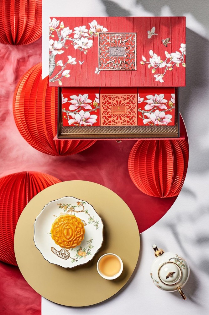
To minimize errors, it's crucial to clearly define the print design from the outset. Design files should be created according to the printer's requirements, and color checks should be performed before final outputting the file.
The basic process can be carried out as follows:
Step 1: Determine the printing method and technical requirements from the printing company.
Step 2: Set up the document using a color system suitable for the printed product.
Step 3: Review all images, background colors, text colors, and graphic elements.
Step 4: Export the file according to the printer's specifications.
Step 5: If the product has high requirements for brand color accuracy, a test print or proof check should be performed before mass production.
In particular, you shouldn't rely solely on the colors displayed on the screen to judge the finished product's color. Different screens, brightness levels, and display settings can cause the perceived color to differ from the actual product.
1.2. Overuse of overly bright colors
Another mistake is using too many bright colors in the hope of making the cake box stand out.
Mid-Autumn Festival is a festive season, so using red, yellow, orange, or other vibrant colors isn't the issue. The problem lies in how they're combined. When too many highly saturated colors appear at the same time, the design can easily become overwhelming and lack visual focus.
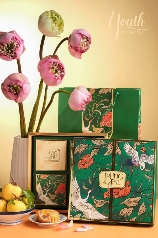
In particular, strong contrasting color combinations, if not carefully controlled, can make content difficult to read. A bright red background paired with bright yellow text, or a patterned background with text of a similar color, can cause information to be lost in the background.
A high-end design typically doesn't need too many colors. You can choose a main color, a secondary color, and an accent color. This approach makes the overall design easier to manage and creates a more unified feel.
1.3. Distortions of the Mid-Autumn Festival Identity
Not every beautiful color is suitable for mooncakes. Packaging needs to convey the spirit of the festival season and align with customers' perceptions of the product.
Colors that are too cool or too modern, such as neon or highly vibrant colors, can make a product lose its traditional and cozy feel if not used correctly.
Red, yellow, brown, orange, or muted colors often evoke feelings of warmth, togetherness, and festive atmosphere. However, this is not a mandatory rule. Brands can absolutely use dark blue, purple, turquoise, or pastel colors if they balance them with the brand's imagery, typography, and story.
2. Mistakes in layout
While color evokes emotion, layout determines how customers perceive and receive information. A mooncake box might have beautiful imagery but still lack professionalism if the components are placed too close together or lack a clear visual order.
2.1. Overcrowding with details
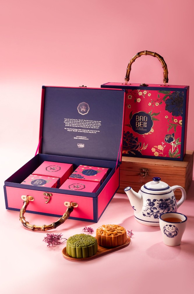
Mid-Autumn Festival features many iconic images such as lotus flowers, the moon, lanterns, clouds, waves, the legendary Cuoi character, the jade rabbit, and traditional motifs. This provides a rich source of inspiration for designers but can also easily lead to packaging overload.
A common mistake is trying to fit all these images onto the same side of the box. This causes the pattern, logo, cake name, product information, and illustration to compete for attention.
The solution is to identify the main theme before designing. If the moon image is the focal point, the remaining elements should play a supporting role. Not all beautiful elements need to appear in the same area.
2.2. Ignore spaces
Whitespace , or empty space, is intentionally left blank in a design. It's not wasted space, but rather a tool that helps create a more open layout and highlights important elements.
A box of cookies with too much ornamentation will make it difficult for viewers to find the brand name or product name. Conversely, with enough empty space, the viewer's eye can easily identify the area that needs attention.
White space is also particularly useful for high-end cake designs. A restrained layout with minimal but precisely arranged details often creates a more luxurious feel than a design with too many decorative elements.
2.3. Lack of visual focal points
An effective design needs to answer the question: What should the customer see first?
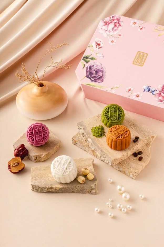
It could be the brand logo, the collection name, the product name, or an image of the cake. However, all elements shouldn't be the same size and level of prominence.
If the logo, cake name, illustration, and supplementary information are all large, viewers won't know what the main content is.
Designers should establish a visual hierarchy. The most important content is prioritized in terms of size, position, or contrast. Secondary information is downplayed in prominence to support the main content.
2.4. Imbalances and Proportions
Inconsistent alignment, uneven spacing between elements, or placing the logo too close to the edge can all detract from design quality.
For mooncake boxes, this issue is also directly related to the manufacturing process. When designing the print file, it is necessary to consider the die-cutting lines, folding lines, safety zones, and bleed areas. If the logo or important information is too close to the edge, it risks being affected during die-cutting, cutting, or folding the box.
Therefore, before finalizing the design, it is necessary to check carefully:
Step 1: Accurately determine the dimensions of the finished product.
Step 2: Place the die-cut and fold lines according to the box mold.
Step 3: Establish a safe zone for the logo, product name, and important information.
Step 4: Ensure that the background image and graphic elements have sufficient bleed space for printing.
Step 5: Inspect the entire surface of the box after mold assembly to visualize the finished product.
Step 6: Export the file according to the specifications of the printing and finishing unit.
This step should not be skipped, because a design that looks good on a flat surface may not necessarily look good when folded into a box.
3. Font mistakes
Typography determines readability and contributes to the personality of the packaging. For mooncakes, the font must also match the traditional, modern, or premium style that the brand aims for.
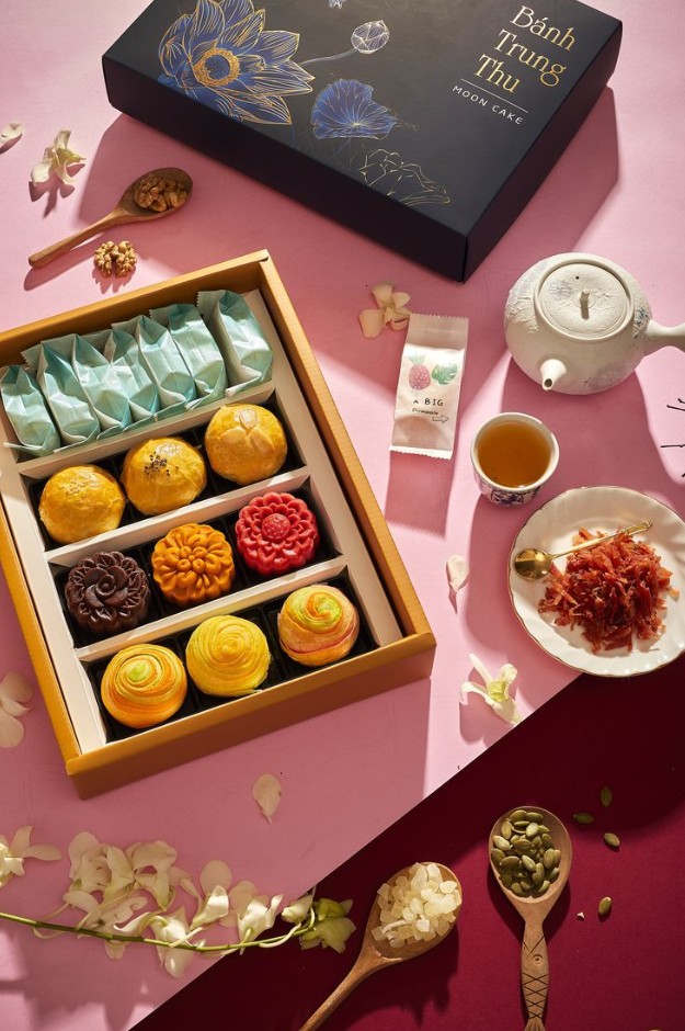
3.1. Using too many fonts
Using 3 to 5 different fonts on the same box easily creates font chaos . Each font has its own style, so when too many fonts appear at the same time, the design easily loses its consistency.
Instead of using multiple fonts, you can choose a primary font for the brand name and title, combined with a secondary font for the descriptive content. The difference can be made through size, boldness, spacing, or arrangement.
A simple typography system often makes packaging look more professional and easily recognizable.
3.2. Using overly stylized fonts
Calligraphy fonts, fonts that mimic handwriting, or decorative typefaces can be very suitable for the Mid-Autumn Festival theme. However, using too many of them for content will reduce readability.
Product names can use a stylized font to add personality, but ingredient information, weight, storage instructions, or contact information should prioritize a clear font.
The important principle is that decorative fonts should be used to create emphasis, and readability should not be sacrificed for artistic value .
3.3. Poor contrast between text and background.
A common typography mistake is placing text on an overly complex background. For example, thin yellow text on a brightly patterned background, or white text on an overly bright image.
In that case, customers would have to make an effort to read the information.
The solution could involve increasing the contrast between the text and the background, adjusting the font size, or creating a simple background area behind the content. For important information such as product names and prices, readability should always be a priority.
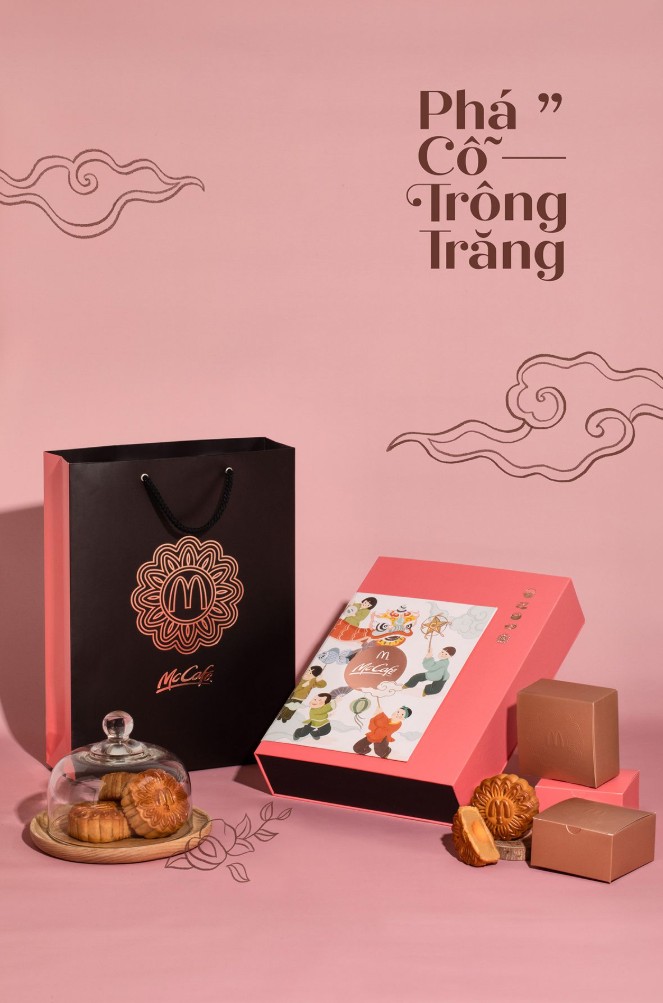
4. How to check your design before printing
After finalizing the colors, layout, and fonts, don't send the file to print immediately. A final check will help minimize many costly errors.
First, check the colors and ensure the document is using a color system compatible with the printing method. Next, check the spelling, product name, brand information, weight, ingredients, and price.
Next, check the layout across the entire box mold. Pay particular attention to areas near the die-cutting lines, folds, and box edges.
Finally, enlarge the small text areas to check readability and review the entire design at its actual size. If possible, create a mockup or proof print for a more accurate assessment before mass production.
An effective mooncake packaging design doesn't necessarily need a lot of colors or patterns. The key is to eliminate unnecessary elements, retain the right focal points, and create a balance between aesthetics, branding, and informational impact . When color, layout, and typography are handled harmoniously, the box will look more professional and make a stronger impression during the Mid-Autumn Festival.





















VIP Products








Best Selling Products
Autodesk All App Account Copyright
120 USD
Windows 10 & 11 Pro Key
36 USD
Genuine Adobe Illustrator account
99 USD
Freepik Premium Account
59 USD
MidJourney Account
29 USD
Upgrade Duolingo Super
29 USD
Upgrade Genuine Office 365
49 USD
ChatGPT Plus Account (GPT-4)
16 USD
Upgrade genuine Capture One account
120 USD
Capcut Pro 1 Year
39 USD
Adobe Photoshop Copyright - Full App
120 USD
Adobe Premiere Pro Account
99 USD
Copyright Adobe Lightroom Account
59 USD
Genuine Cheap Canva Pro
39 USD
Plugin Retouch4me
69 USD