Best Selling Products

Plugin Retouch4me
69 USD

Freepik Premium Account
59 USD

MidJourney Account
29 USD

Adobe Premiere Pro Account
99 USD

Copyright Adobe Lightroom Account
59 USD

Upgrade Duolingo Super
29 USD

Windows 10 & 11 Pro Key
36 USD

Upgrade genuine Capture One account
120 USD

Autodesk All App Account Copyright
120 USD

Genuine Adobe Illustrator account
99 USD

ChatGPT Plus Account (GPT-4)
16 USD

Genuine Cheap Canva Pro
39 USD

Upgrade Genuine Office 365
49 USD

Adobe Photoshop Copyright - Full App
120 USD

Capcut Pro 1 Year
39 USD
Creative Design with Popular Color Pairings and Unique Effects
Nội dung
- 1. Learn about contrasting colors.
- 1.1. Definition of contrasting colors
- 1.2. The role of contrasting colors
- 2. Common contrasting color combinations help attract the eye.
- 2.1. Operating principle
- 2.2. Common compatible color pairs
- 3. Rules for choosing contrasting colors
- 3.1. Select color based on the color wheel
- 3.2. Balancing color ratios
- 3.3. Creating contrast through hue and saturation
- 4. The application of contrasting colors reflects the results in graphic design.
- 4.1. Website and app design
- 4.2. Poster and banner design
- 4.3. Logo and Identity Design
- 4.4. Social Media Design
Learn how to combine traditional colors with modern effects to create striking looks.
A beautifully designed product relies not only on a logical layout or high-quality images, but largely on the way colors are combined. In particular, color contrast is a key technique that helps direct attention, emphasize messages, and create powerful visual effects. By understanding the principles of contrast and mastering common color pairings, you can elevate your design and tell your story more effectively. This article provides a comprehensive overview of color contrast, common color pairings, and how to apply them in practice, from website and app design to posters, banners, logos, and social media content.
1. Learn about contrasting colors.
1.1. Definition of contrasting colors
Contrasting colors are a combination of two or more colors that have distinctly different characteristics in terms of hue, tone, or position on the color wheel. When two opposing colors are placed next to each other, they create a visual "reverberation," causing the eye to immediately recognize and distinguish them. This is an important element in design because it not only makes images easier to see but also creates a clear and striking effect.
Color contrast can come in many forms, such as light-dark contrast, saturation contrast, warm-cool contrast, or complementary contrast. Each type of contrast has its own characteristics and can be applied to specific purposes. The important thing is to understand the nature of this opposition and use it purposefully, rather than mixing colors based on intuition.

1.2. The role of contrasting colors
Color contrast plays a crucial role in guiding the viewer's gaze. When the human eye encounters a design, the first thing they notice is not the content or symbol, but the overall color and contrast. The clearer the contrast, the higher the level of recognition, and the better it helps the viewer identify the most important elements.
In terms of attracting attention, details using strong contrasting colors are always the first to catch the eye. A banner with a dark blue background combined with bright white text, or a prominent orange action button against a blue background, will immediately draw the viewer's attention. This is why many advertising campaigns, movie posters, or digital application interfaces utilize contrast as a means of directional focus.
Contrast also helps create emphasis in situations requiring focus. On an event poster, you can use yellow contrasting with a purple background to highlight the time or important information. On an app interface, an orange registration button placed on a blue background not only attracts attention but also encourages action due to its striking visual impact.
Furthermore, contrasting colors play a crucial role in visual balance. When the overall design uses a single color or an overly uniform color palette, it can easily become bland and lack depth. However, with the addition of well-placed contrasts, the overall design becomes more harmonious, providing both visual emphasis and rhythm. This balance is especially important in UI/UX, where user experience largely depends on clarity and ease of information reception.
2. Common contrasting color combinations help attract the eye.
2.1. Operating principle
Contrasting colors work based on opposing positions on the color wheel, differences in hue, and contrasting emotions and color temperatures. The following three main principles explain how contrasting colors create a powerful effect.
The first principle is warm-cold contrast. This involves combining warm colors like red, orange, and yellow with cool colors like blue, green, or purple. These two color groups differ significantly not only in feeling but also in visual energy. Warm colors tend to be more prominent and approachable to the viewer, while cool colors create a sense of distance. When combined, you can create an effect that is both striking and balanced. A poster with a cool blue background and yellow details is a prime example, immediately drawing the viewer's attention to the key areas.
The second principle is direct contrast, also known as opposite contrast on the color wheel. This is the strongest form of contrast, because two colors located opposite each other always complement and enhance each other's vibrancy. Classic color pairs like red-green, blue-orange, or purple-yellow are always present in marketing campaigns, graphic design, or brand color palettes to create a strong yet harmonious visual effect.
The third principle is light-dark contrast. It's not just color that creates contrast; the brightness and darkness of colors are also crucial. When you place a light tone like white or pale yellow next to a dark color like black or deep blue, the human eye will immediately distinguish and be drawn to it. This technique is widely used in minimalist designs, minimalist logos, or communication interfaces where absolute clarity is required.
2.2. Common compatible color pairs
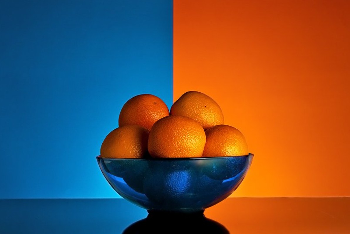
Blue and orange are one of the most modern color combinations, used by many brands and designers. The contrast between cool blue and warm orange creates a youthful, dynamic feel, particularly suitable for technology, startups, or online education. Blue conveys a sense of reliability and stability, while orange brings energy and creativity. When combined, they create a balanced yet fresh color palette.
Red and green are a pair of colors with strong contrast, conveying a vibrant and powerful feeling. Due to their striking contrast, they often appear in sports posters, energetic brands, or festive occasions that need to convey liveliness. However, since this color combination symbolizes Christmas in Western culture, you need to consider the context when using them.
Gold and purple evoke a sense of luxury, uniqueness, and artistry. Gold represents nobility and brightness, while purple brings depth, mystery, and elegance. When combined, they create a distinctive beauty often used in fashion, beauty, or art events.

Black and white are the most classic contrasting color combination. They never go out of style, are not dependent on trends, and can be applied to any type of design. Black and white represent minimalism, modernity, and clarity. They are particularly useful in logos, brand identity, or minimalist interfaces.
Green and pink create a fresh, sweet, and youthful feeling. This color combination is suitable for fashion, cosmetics, or products aimed at young people. Green has a natural, cool feel, while pink brings gentleness and modernity. When combined, the two colors create a harmonious and pleasant sensation.
3. Rules for choosing contrasting colors
3.1. Select color based on the color wheel
The color wheel is a basic but extremely useful tool for choosing contrasting colors. When you find two colors that are opposite each other, you'll have a pair of strongly contrasting colors. For professional designers, the color wheel not only helps in choosing suitable color pairs but also helps in better understanding the relationship between them. Besides directly opposite pairs, you can also use split complementary contrast, where you choose two opposite colors that are slightly offset to create a softer effect while still maintaining the necessary contrast.
3.2. Balancing color ratios
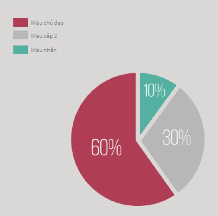
No matter how beautiful contrasting colors may be, if used in the wrong proportions, they can make a design look cluttered or overly flashy. The 60-30-10 rule is a common method in interior design, but it's also extremely effective in graphic design. One main color occupies the majority of the area, with supporting secondary colors and accent colors in smaller proportions to create visual interest. This distribution helps create a more balanced design and avoids the situation where contrasting colors compete with each other.
3.3. Creating contrast through hue and saturation
Contrast doesn't always require bright or highly saturated colors. Contrast can also be achieved through the difference between bold and light colors, or between saturated and pastel colors. A soft yet striking design can be achieved by choosing a highly saturated accent color against a pastel or neutral gray background. It is this subtle difference that makes the design more versatile in practice.
4. The application of contrasting colors reflects the results in graphic design.
4.1. Website and app design
In UI/UX, contrast determines readability, visibility, and the overall user experience. An orange CTA button on a blue background is a classic example of creating a strong impact and prompting action. Headings need to contrast with the background to ensure readability. Additionally, important content areas such as notifications and alerts also use strong contrasting colors to ensure users don't miss them.
4.2. Poster and banner design
Posters are a space to express powerful ideas, and color contrast is the most effective tool. A concert poster might use a deep purple background and gold lettering to convey a sense of luxury. A sports advertising campaign could utilize red and green to convey energy. The key is to define the message and choose the right contrasting color combination.
4.3. Logo and Identity Design
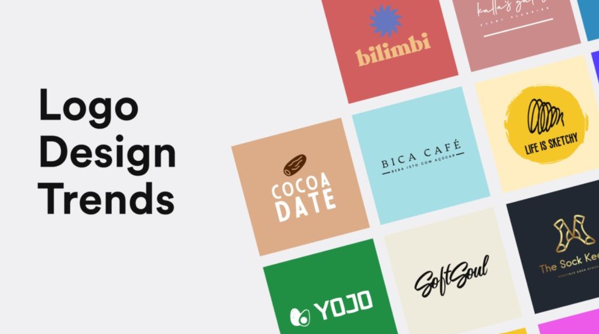
A logo needs to be highly memorable and recognizable, so color contrast plays a crucial role. A black and white logo makes a strong impression due to its minimalist design, while a blue and orange logo conveys a modern and youthful feel. Considering contrast during the logo design phase will help the brand stand out across various platforms such as websites, packaging, and printed materials.
4.4. Social Media Design
Social media content has an extremely short display time, so posts need to grab attention in the first second. Color contrast is key to making a post stand out among hundreds of other pieces of content. Fashion brands often use green and pink to create a youthful feel, while tech brands prefer blue and orange to convey energy.
Contrasting colors are not simply a combination of two opposing shades, but rather a blend of visual science and emotional artistry. Understanding their nature and applying them effectively allows you to create designs that are not only beautiful but also profound, conveying messages more persuasively. Mastering fundamental principles such as using the color wheel, balancing proportions, and adjusting hues will give you more confidence in color selection. When applied correctly to websites, apps, posters, logos, or social media, contrasting colors can elevate the entire work.


VIP Products


Best Selling Products
Plugin Retouch4me
69 USD
Freepik Premium Account
59 USD
MidJourney Account
29 USD
Adobe Premiere Pro Account
99 USD
Copyright Adobe Lightroom Account
59 USD
Upgrade Duolingo Super
29 USD
Windows 10 & 11 Pro Key
36 USD
Upgrade genuine Capture One account
120 USD
Autodesk All App Account Copyright
120 USD
Genuine Adobe Illustrator account
99 USD
ChatGPT Plus Account (GPT-4)
16 USD
Genuine Cheap Canva Pro
39 USD
Upgrade Genuine Office 365
49 USD
Adobe Photoshop Copyright - Full App
120 USD
Capcut Pro 1 Year
39 USD