Best Selling Products

Autodesk All App Account Copyright
120 USD

Genuine Cheap Canva Pro
39 USD

Plugin Retouch4me
69 USD

Upgrade genuine Capture One account
120 USD

Freepik Premium Account
59 USD

Genuine Adobe Illustrator account
99 USD

Adobe Photoshop Copyright - Full App
120 USD

ChatGPT Plus Account (GPT-4)
16 USD

Windows 10 & 11 Pro Key
36 USD

MidJourney Account
29 USD

Upgrade Genuine Office 365
49 USD

Upgrade Duolingo Super
29 USD

Capcut Pro 1 Year
39 USD

Copyright Adobe Lightroom Account
59 USD

Adobe Premiere Pro Account
99 USD
Decoding Design Language from A–Z Terms for Designers
Nội dung
- 1. The Importance of Understanding Terminology in Design
- 2. Basic Terms Every Designer Needs to Know
- 2.1. Typography
- 2.2. Layout
- 2.3. Color Theory
- 2.4. Image & Resolution
- 3. Advanced and Common Terms in User Interface (UI/UX)
- 3.1. UI and UX
- 3.2. Wireframe and Prototype
- 3.3. Responsive Design và Interaction Design
- 4. Terms Related to Printing and Multimedia
- 4.1. CMYK vs RGB
- 4.2. Bleed & Margin
- 5. Commonly Used Tools During the Design Process
- 5.1. Adobe Creative Suite
- 5.2. Other Support Tools
Have you ever heard of "mockup", "grid", or "kerning" but are not sure what they are? Join SaDesign to discover a complete design terminology dictionary from A to Z - easy to understand, easy to remember and immediately applicable to real work.
In the world of creative design , where everything is built with images, colors and ideas, language is not only a communication tool but also a foundation to help you understand the job requirements correctly, communicate effectively with customers or colleagues as well as save time when implementing projects. However, in reality, there are many terms used daily in brainstorming sessions, brief files, or when working on design software that many people still do not really understand or use in the right context.
So, if you want to become a professional designer or simply understand better when working with a design team, supplementing your knowledge of these terms is an extremely necessary step. In this article, SaDesign will explore with you the most popular and important terms in the design field. Let's find out!
1. The Importance of Understanding Terminology in Design
Every profession has its own set of technical vocabulary, and the design industry is no exception. When working with colleagues, clients, or developers, mastering design terminology will help you communicate more effectively and professionally. This will help you:
Create consistency in communication: When everyone understands and uses the same technical language, information exchange becomes coherent and misunderstandings are minimized.
.png)
Save time and effort: Instead of having to explain basic concepts again, you can go straight to the point, thereby speeding up the project progress.
Demonstrate professionalism: A designer with a deep understanding of terminology not only helps assert his position but also builds trust with customers.
Furthermore, constantly updating and enriching the design vocabulary also helps professionals stay abreast of new trends in the industry. Design technologies and approaches are constantly changing, so understanding new terminology is key to staying relevant in an increasingly competitive world.
2. Basic Terms Every Designer Needs to Know
Before diving into advanced concepts, we need to have a firm grasp of the basic terminology. This knowledge is a solid foundation for developing design skills.
2.1. Typography
Typography is not just about choosing typefaces, but also the art of arranging typefaces so that they are both aesthetically pleasing and easy to read. This is one of the core elements of a design product.
.png)
Font / Typeface: This is a set of characters designed in a certain style. For example, Arial, Helvetica, Times New Roman, each font has its own emotion and meaning. Choosing the right font can create a strong connection between the brand and the user.
Kerning: This is the space between two characters. Kerning adjustment helps to balance the space between letters, avoiding crowding or being too sparse.
Leading: The spacing between lines of text is also important to ensure readability. Proper spacing helps the reader's eyes not to strain, especially in long articles.
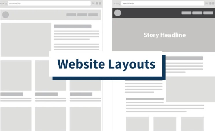
2.2. Layout
Layout in design is how you arrange elements on a page to convey a message visually and effectively. A balanced layout will help viewers easily receive and understand the content you want to convey.
Grid System: Grid systems are a powerful tool for creating a consistent layout. Designers use grids to divide a page into sections, making it easier to position elements such as text, images, or buttons.
.png)
Hierarchy: The arrangement of elements in order of importance helps viewers identify key information. From large headlines to small details, priority determines the focus of the design.
Alignment: Proper alignment not only creates harmony but also gives a clean, clear feel to the design. Properly aligning content sections also helps highlight the key points you want to convey.
When these elements are skillfully combined, your design will become intuitive, accessible and create a strong impression on users. This plays a decisive role in attracting and retaining customers.
2.3. Color Theory
Color theory is one of the vital elements in any design project. Color not only creates aesthetic beauty but also conveys emotions and brand messages.
Hue: Hue is simply the shade or base color. Each color has its own meaning; for example, blue often evokes feelings of trust, while red represents enthusiasm and energy.
.png)
Saturation: The saturation of a color reflects how strong or weak a color is. A highly saturated color is often very vibrant and eye-catching, while a low saturation color is soft and subtle.
Contrast: The contrast between colors is key to making content stand out. A design with high contrast will easily attract attention, helping users quickly identify information.
2.4. Image & Resolution
There is no denying that images are an essential part of modern design. However, beautiful images are not enough, they also need to meet resolution and quality standards to ensure good display on all devices.
Pixels: Pixels are the basic building blocks of every digital image. A high-resolution image means a larger number of pixels, resulting in clearer, more detailed images.
Vector: Unlike raster images (which are pixel-based), vector images are created using mathematical formulas. This allows for scaling without loss of quality, making them ideal for printing or use at a variety of sizes.
.png)
DPI/PPI: The “Dots per inch” (DPI) or “Pixels per inch” (PPI) index is a measure of the display quality of an image. An image with a high DPI/PPI index usually produces good print quality, while digital displays rely heavily on PPI index.
Image and resolution factors are fundamental to ensuring your design deliverables are consistently high quality, from print to digital experiences. This is especially important for today’s multimedia projects, where every detail contributes to the overall look.
3. Advanced and Common Terms in User Interface (UI/UX)
Once we have grasped the basic terminology, we will move on to advanced concepts, especially in the field of UI/UX – a very important area in modern design.
3.1. UI and UX
The two terms “UI” and “UX” are inseparable concepts when talking about user interface design.
UI Design: This is the process of creating visual elements such as buttons, icons, menus, and other visual elements. A well-designed interface should not only be attractive but also easy for users to interact with.
.png)
UX Design (User Experience Design): Unlike UI, UX emphasizes the user's feelings and journey when interacting with the product. An excellent UX design must ensure that every step of the user from starting to completing the task is optimized.
When these two elements are integrated harmoniously, the product not only has an eye-catching interface but also provides a smooth, user-friendly experience. This is the key to building a sustainable relationship between the brand and the customer.
3.2. Wireframe and Prototype
To turn ideas into reality, designers often go through sketching and testing phases. Two important terms in this phase are:
Wireframe: A rough sketch of a website or application, focusing on defining the structure and placement of components without going into too much visual detail. Wireframes help you visualize the overall structure and facilitate discussion and input from stakeholders.
.png)
Prototype: After the wireframe is approved, the next step is to prototype the fully interactive interface with the purpose of testing the user experience before the final product. Prototypes provide a realistic view of how the product will actually work, thereby helping to detect and fix errors during testing.
Using wireframes and prototypes not only brings clarity to the design process but also reduces risk when implementing the final product. This is a powerful support tool, helping teams coordinate effectively, saving costs as well as editing time later.
3.3. Responsive Design và Interaction Design
In today’s digital age, users access the internet through many different devices. Therefore, responsive design and interaction design have become indispensable requirements.
Responsive Design: This is an approach to designing interfaces so that products can automatically adjust to fit any screen size – from phones, tablets to desktops. Elements like breakpoints and fluid grids are used to create a consistent experience for users regardless of the device they use.
.png)
Interaction Design: More than just the interface, interaction design focuses on the effects and responses when users interact with the product. Elements such as microinteractions and animations help create a lively and pleasant feeling, while guiding users intuitively.
These two elements, when combined, will result in a product that is not only aesthetically pleasing but also meets actual usage needs, creating a comprehensive and effective user experience.
4. Terms Related to Printing and Multimedia
Despite living in the digital age, print and multimedia production still hold an important place in the communication strategy of businesses. Understanding the terminology related to printing helps ensure the final product is of the highest quality.
4.1. CMYK vs RGB
These two color systems serve different purposes and it is important to distinguish between them:
RGB: This color model is commonly used for digital designs, from websites to mobile apps. RGB (Red, Green, Blue) allows millions of colors to be created by combining its basic components.
.png)
CMYK: In contrast, the CMYK (Cyan, Magenta, Yellow, Key/Black) color system is used in the printing industry. Since the printing process requires different color gamut accuracy than digital displays, the conversion between RGB and CMYK must be done carefully to ensure that the print quality is not distorted by color.
Understanding the difference between CMYK and RGB is essential when designing multimedia products, from print to digital advertising, to create the final product that you expect.
4.2. Bleed & Margin
These two terms are closely related to the printing process and the processing of the finished printed product:
Bleed: This term refers to the area of the design that extends beyond the cutting boundaries of the printed material. The purpose of bleed is to ensure that when the printed product is cut, there are no unwanted white borders or cutting errors.
Margin: The opposite of bleed, margin refers to the space between the main content and the edge of the paper. A properly defined margin not only makes the product look neat and professional, but also ensures that the content is not cut off or distorted during printing.
.png)
Technical factors such as bleed and margin require precision in every stage of production, from design to printing. Only when they are carefully calculated can the printed product truly meet the standards and represent the brand's value.
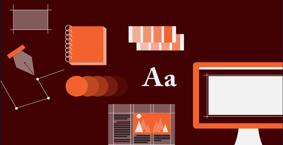
5. Commonly Used Tools During the Design Process
In a professional design environment, it is impossible not to mention the support tools that designers often use to create impressive and quality products.
5.1. Adobe Creative Suite
Adobe Creative Suite is considered the industry standard toolkit in design. Key software includes:
Photoshop: The ultimate photo editing tool, allowing you to handle everything from basic tasks like color correction to creating advanced effects and combining images.
Illustrator: Vector graphics software, helps create images with infinite resolution, ideal for designing logos, icons and branding elements.
InDesign: Primarily used for layout design of publications, printed materials and ebooks. InDesign helps integrate text and images in a professional way, creating a finished product that is easy to edit and update.
.png)
5.2. Other Support Tools
In addition to Adobe Creative Suite, there are many other tools that are widely used in the industry today:
Sketch: A user interface design software exclusively for Mac computers. Sketch is known for its simple, easy-to-use interface and many supporting plugins, making the design process fast and intuitive.
Figma: Highly regarded for its online collaboration capabilities. Figma allows designers to edit and discuss the same project simultaneously, creating a synchronized and flexible workflow.
Adobe XD: A powerful tool for UI/UX design with the ability to create interactive prototypes, help test and collect feedback from users quickly.
The above tools not only help optimize the workflow but also open up many creative possibilities, allowing designers to freely develop ideas and turn them into the most perfect products.
Through this article, SaDesign hopes that you will not only master the basic terminology but also feel the connection between theory and practice. The synchronization between language and design tools will help you be more confident in communicating with colleagues, customers, and partners, while affirming your own value in the eyes of the design community.


VIP Products


Best Selling Products
Autodesk All App Account Copyright
120 USD
Genuine Cheap Canva Pro
39 USD
Plugin Retouch4me
69 USD
Upgrade genuine Capture One account
120 USD
Freepik Premium Account
59 USD
Genuine Adobe Illustrator account
99 USD
Adobe Photoshop Copyright - Full App
120 USD
ChatGPT Plus Account (GPT-4)
16 USD
Windows 10 & 11 Pro Key
36 USD
MidJourney Account
29 USD
Upgrade Genuine Office 365
49 USD
Upgrade Duolingo Super
29 USD
Capcut Pro 1 Year
39 USD
Copyright Adobe Lightroom Account
59 USD
Adobe Premiere Pro Account
99 USD