Best Selling Products

Copyright Adobe Lightroom Account
59 USD

Freepik Premium Account
59 USD

Upgrade genuine Capture One account
120 USD

Upgrade Duolingo Super
29 USD

MidJourney Account
29 USD

Windows 10 & 11 Pro Key
36 USD

Adobe Premiere Pro Account
99 USD

Genuine Cheap Canva Pro
39 USD

ChatGPT Plus Account (GPT-4)
16 USD

Autodesk All App Account Copyright
120 USD

Adobe Photoshop Copyright - Full App
120 USD

Upgrade Genuine Office 365
49 USD

Capcut Pro 1 Year
39 USD

Plugin Retouch4me
69 USD

Genuine Adobe Illustrator account
99 USD
Design Color Schemes: Choosing the Optimal Color Palette for Your Brand
Nội dung
- I. The importance of color in graphic design
- 1. Make a first visual impression
- 2. Convey emotions and brand messages
- 3. Strengthen brand recognition
- 1. Color Wheel
- 2. Basic color schemes
- III. Color Psychology: Universal Meanings and Practical Applications
- 1. Red
- 2. Orange
- 3. Yellow
- 4. Green
- 5. Blue
- 6. Purple
- 7. Black and white
- IV. How to choose a color palette for each type of brand
- 1. Young and dynamic brand
- 2. High-end, luxury brand
- 3. Technology and financial brands
- 4. Food and health industry brands
- IX. Conclusion
Learn how to use color effectively in graphic design to help your brand stand out and communicate your message clearly. Learn how to build the optimal color palette for every creative project.
Color always plays an essential role in the field of graphic design. Not only a visual element, color also contributes to shaping brand identity, directing viewers' emotions and creating a harmonious visual experience. Proper color coordination not only makes the work more professional but also conveys a strong, consistent message. In this article, sadesign.vn will provide comprehensive knowledge about the principles of color coordination, suggest popular color palettes and how to apply appropriate color palettes in each practical design context.
I. The importance of color in graphic design
Color is more than just a decorative element in graphic design; it is a powerful tool that can trigger strong emotions, influence perception and determine the visual behavior of users. Each color has a distinct meaning, closely related to psychology, culture and visual taste, thereby directly influencing the way a design is received and remembered.
.jpg)
1. Make a first visual impression
In a world of information and visual overload, the ability to grab attention immediately is key. Research shows that in less than 3 seconds, viewers are affected by color before they even realize the specific content or message. This means that color plays a decisive role in creating a first impression – whether a design is attractive enough to make viewers stop and explore. Choosing the right, harmonious and prominent colors will make the design more memorable, create a sense of professionalism and attract attention at first sight.
2. Convey emotions and brand messages
Each color represents a specific set of emotions and meanings, creating a powerful visual language without words:
Red: Often symbolizes strength, urgency, passion, danger, or energy. For example, in advertising, red can stimulate buying action or signal a big sale.
Blue: Evokes feelings of security, stability, trust, professionalism, and peace. This is why many banks, large technology companies, and healthcare organizations often use blue in their logos and identities.
Yellow: Represents creativity, joy, optimism, energy and attention. Yellow is often used to create a happy, friendly feeling or to highlight an important detail.
Green: Associated with freshness, nature, growth, health and harmony. Popular in organic products, environmental or medical fields.
Purple: Represents luxury, nobility, mystery and creativity. Often used in high-end cosmetics and fashion brands.
Using a suitable color system not only creates a certain feeling but also strongly reinforces the communication message that the brand wants to convey, helping the audience feel the "personality" of that brand.
3. Strengthen brand recognition
Consistency is key to building a strong brand. When a color palette is used consistently across all of your communications – from your logo, website, product packaging, to advertising campaigns – people will easily associate the color with your brand, even subconsciously.
A typical example is the signature purple of a luxury cosmetics brand, or the familiar blue of a major bank – these colors have become powerful symbols and are almost synonymous with the brand itself. Audiences only need to see the color to immediately recognize which brand’s product or service it is, thereby creating trust, familiarity and loyalty. Color is an inseparable part of the brand’s DNA.
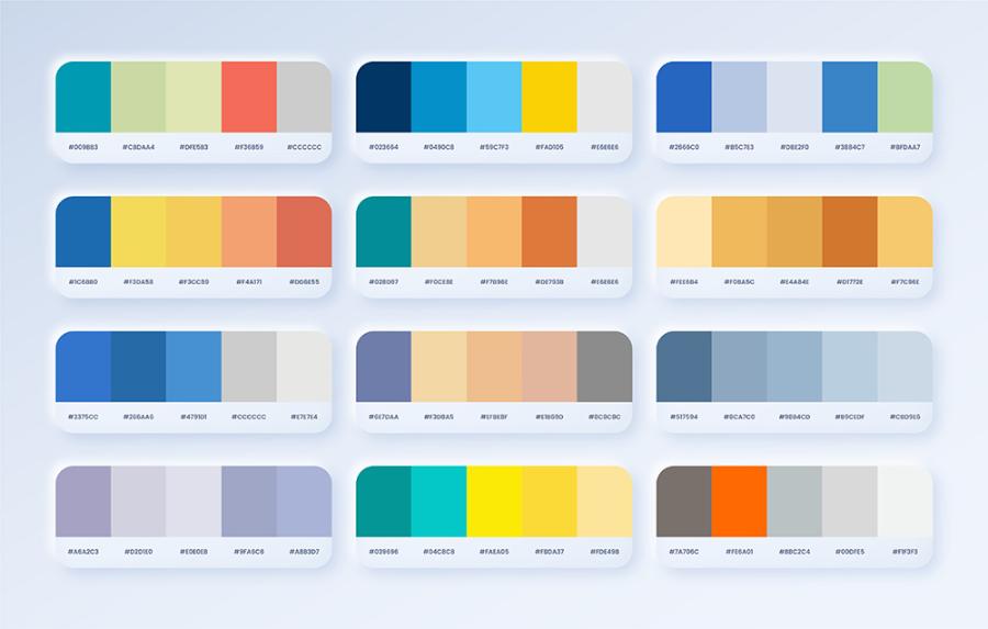
II. Basic knowledge: Color wheel and color theory
To master color in graphic design, it is extremely important to have a solid understanding of the color wheel and basic color schemes. This is the "guiding principle" that helps you create harmonious, attractive color palettes that convey the right message.
.jpg)
1. Color Wheel
The color wheel is the most basic and intuitive tool in color theory. It arranges colors in a circle, showing their logical and scientific relationships. The basic color wheel usually consists of 12 colors divided into three main groups:
Primary Colors: Red, Blue, Yellow. These are the three colors that cannot be created by mixing other colors. They are the foundation for creating all other colors.
Secondary Colors: Orange, Green, Violet. These colors are created by mixing two primary colors together in equal proportions:
Red + Yellow = Orange
Yellow + Blue = Green
Blue + Red = Purple
Tertiary Colors: Created by mixing a primary color with a secondary color adjacent on the color wheel. Examples: Red-Orange, Yellow-Orange, Yellow-Green, Blue-Green, Blue-Violet, Red-Violet.
The color wheel is an indispensable tool for you to visualize, select and build harmonious and systematic color palettes.
2. Basic color schemes
Understanding color schemes will help you create purposeful color palettes that convey emotions and messages most effectively.
a. Monochromatic color scheme
This color scheme uses the same hue but varies the saturation and brightness of that color.
Advantages: Easily creates a sense of harmony, sophistication, luxury and professionalism. It brings a high level of unity to the design.
Disadvantages: Can become monotonous if not skillful in using different shades or adding elements of patterns and textures to create highlights.
Application: Often used in minimalist designs, logos, brand identities or user interfaces that require elegance and softness.
b. Analogous color scheme
This color scheme combines colors that are next to each other on the color wheel (usually 3-5 adjacent colors). These colors share a common base shade, creating a smooth transition.
Advantages: Suitable for designs that give a light, natural, relaxing or nature-inspired feel (e.g. greens, blues, turquoises). Creates a pleasant and visually harmonious feeling.
Cons: Lacks strong contrast, can be difficult to create emphasis without a prominent primary color.
Applications: Interior design, landscape, environmental websites, or artistic, light-hearted publications.
c. Complementary color scheme
This is a combination of two colors that are directly opposite each other on the color wheel (for example, red and green, yellow and purple, blue and orange).
Pros: Creates a strong and striking contrast that instantly draws the eye. Extremely effective when you need a strong focal point or want to create energy in your design.
Disadvantages: If used carelessly, too much contrast can cause glare, discomfort, and a sense of conflict. One color should be dominant and the other an accent color.
Applications: Billboards, sports logos, designs that require dynamism, warnings or to create impressive highlights.
d. Split Complementary color scheme
A “safer” variation of the complementary color scheme. You use a primary color, then combine it with two secondary colors that are directly opposite the color on the color wheel. For example, if the primary color is Red, instead of using Green (the opposite), you would use Blue-Green and Yellow-Green.
Advantages: Still ensures contrast and prominence like complementary color schemes but brings a more balanced and harmonious feeling. Less glaring and more comfortable for the viewer.
Applications: Very versatile, suitable for many types of designs that need to be dynamic but still retain sophistication, such as posters, infographics, or marketing publications.
e. Triadic color scheme
This color scheme uses three colors that are evenly spaced on the color wheel, forming an equilateral triangle (for example, red, blue, yellow; or orange, green, purple).
Advantages: Helps create vibrant, dynamic and harmonious color compositions. Provides color diversity while maintaining visual balance.
Disadvantages: Because there are three high contrasting colors, it requires reasonable adjustment of saturation and brightness to avoid color conflicts. Usually choose one color as the main color and the other two colors as accents.
Application: Logo design, branding for technology companies, children, or events that need to be fresh, dynamic and fun.
Mastering the principles of the color wheel and these color schemes will be a solid foundation for you to create graphic designs that are not only beautiful but also effective in conveying messages.
III. Color Psychology: Universal Meanings and Practical Applications
Colors are more than just the spectrum that our eyes see; each color carries its own symbolism, which can profoundly influence human emotions and visual behavior. Understanding color psychology helps you choose colors not only for decoration but also to convey messages in a purposeful and effective way.
.jpg)
1. Red
Meaning: Symbolizes energy, passion, strong action, love, urgency and danger. It is the color of attention, of intense vitality.
Practical application:
Marketing & Advertising: Used to attract immediate attention (e.g. "Sale", "Promotion" signs, "Buy Now" buttons).
Brand: Suitable for brands that want to express dynamism, strength, and determination (eg Coca-Cola, Ferrari, CNN).
Warning: Used in hazard signs, emergency stop buttons.
Note: Overuse may cause feelings of aggression, overwhelm or overload.
2. Orange
Meaning: Combining the warmth of red and the cheerfulness of yellow, orange represents friendliness, creativity, joy, enthusiasm, excitement and positive energy.
Practical application:
Education & Children: Often seen in products, services for children or creative, educational fields because of its playful, curiosity-stimulating nature.
Startup Technology: Many startups use orange to represent innovation, difference, and open-mindedness.
Call to Action Buttons: Some “Sign Up,” “Learn More” buttons use orange to create an inviting, approachable feel.
Note: Be careful not to come across as cheap or childish.
3. Yellow
Meaning: The color of sunshine, it symbolizes optimism, happiness, joy, hope, and energy. It can also carry the meaning of warning or attention.
Practical application:
Brand: Suitable for brands that want to convey friendliness, youthfulness, and dynamism (eg McDonald's, National Geographic).
Packaging design: Used for products that need to make a fun, fresh impression.
Warning: Traffic signs and construction signs are often yellow to attract attention.
Note: Use in moderation and combine appropriately, because yellow that is too bright or used too much can cause eye strain, discomfort or anxiety.
4. Green
Meaning: Associated with nature, growth, development, health, freshness, harmony and safety. It brings a sense of peace and balance.
Practical application:
Environment & Ecology: Widely used by environmental protection organizations, organic products, clean food.
Health & Medical: Hospitals, clinics, and healthcare products often use green to convey cleanliness, safety, and healing.
Finance: Some banks or financial institutions use green to represent growth and prosperity.
Note: Different shades have different meanings (dark green is luxurious, light green is fresh).
5. Blue
Meaning: Symbolizes trust, peace, professionalism, stability, logic and intelligence. It often evokes feelings of the sky and ocean.
Practical application:
Finance, technology, healthcare: Favored in these sectors for their ability to build trust, stability, and reliability (e.g. Facebook, IBM, major banks).
Website Design & UI/UX: Comfortable, Clear and Efficient.
Security: Represents safety and security.
Note: Blue that is too dark can cause a feeling of sadness and coldness.
6. Purple
Meaning: Mysterious, creative, luxurious, noble, unique and inspiring. It is a blend of the energy of red and the calmness of blue.
Practical application:
High-end fashion and cosmetic brands: Suitable for products that aim for exclusivity, sophistication and luxury.
Creativity & Art: Fields related to art, spirituality or groundbreaking ideas often use purple.
7. Black and white
These two colors are often referred to as "neutral colors" but have very powerful meanings and applications:
White:
Meaning: Represents purity, cleanliness, minimalism, innocence, openness and new beginnings.
Practical application: Very popular in minimalist design, medical, wedding fashion, or as a background to highlight other colors.
Black:
Meaning: Represents luxury, power, mystery, sophistication, modernity and strength. It can also carry the meaning of opposition, ending.
Practical applications: Often used in luxury brands, high-end technology, or as a background to highlight other vibrant colors.
Typography Design: Black text on white background is the easiest reading combination!
Understanding the psychology of color will not only help you create beautiful designs, but also effectively communicate and influence the emotions and behaviors of your viewers. Consider the meaning of each color to choose the most appropriate color palette for your goals.
IV. How to choose a color palette for each type of brand
Choosing a color palette for each type of brand plays an important role in building brand image and recognition. Each color has its own meaning and emotion, so it needs to be carefully considered based on the business sector, target customers and core values of the brand.
.jpg)
1. Young and dynamic brand
Use highly saturated colors like orange, yellow, and bright green. Analogous or Triadic color schemes help create a cheerful and friendly feeling.
2. High-end, luxury brand
Prioritize dark colors combined with metallic colors such as black - metallic gold, charcoal - silver gray. Should be combined in a monochrome style or complementary alternating with low contrast.
3. Technology and financial brands
Choose blue, gray, white, combined with green to evoke a sense of trust and innovation. The color scheme should be minimalist and consistent for easy cross-platform application.
4. Food and health industry brands
Green, pale yellow, earthy orange or light beige add a sense of intimacy and cleanliness. Analogous and Split Complementary color schemes are suitable for industry characteristics.
IX. Conclusion
The ability to mix and match colors effectively is a key factor in helping designers create visually appealing products and subtly communicate brand messages. With a deep understanding of color psychology, color theory, application context, and knowing how to use the right tools at the right time, designers can transform any design from "pretty" to "impressive and memorable".


VIP Products


Best Selling Products
Copyright Adobe Lightroom Account
59 USD
Freepik Premium Account
59 USD
Upgrade genuine Capture One account
120 USD
Upgrade Duolingo Super
29 USD
MidJourney Account
29 USD
Windows 10 & 11 Pro Key
36 USD
Adobe Premiere Pro Account
99 USD
Genuine Cheap Canva Pro
39 USD
ChatGPT Plus Account (GPT-4)
16 USD
Autodesk All App Account Copyright
120 USD
Adobe Photoshop Copyright - Full App
120 USD
Upgrade Genuine Office 365
49 USD
Capcut Pro 1 Year
39 USD
Plugin Retouch4me
69 USD
Genuine Adobe Illustrator account
99 USD