Best Selling Products

Windows 10 & 11 Pro Key
36 USD

Freepik Premium Account
59 USD

Adobe Photoshop Copyright - Full App
120 USD

Upgrade Genuine Office 365
49 USD

Copyright Adobe Lightroom Account
59 USD

Adobe Premiere Pro Account
99 USD

Upgrade Duolingo Super
29 USD

Upgrade genuine Capture One account
120 USD

Genuine Adobe Illustrator account
99 USD

Autodesk All App Account Copyright
120 USD

Capcut Pro 1 Year
39 USD

MidJourney Account
29 USD

Genuine Cheap Canva Pro
39 USD

Plugin Retouch4me
69 USD

ChatGPT Plus Account (GPT-4)
16 USD
Distinguishing Between Fonts and Typefaces: Essential Typography Knowledge Every Designer Needs
Nội dung
- 1. Typography and the Role of Fonts in Design
- 2. What is a Font?
- 3. What is a Typeface?
- 4. The Difference Between Fonts and Typefaces
- 5. Why do many people often confuse fonts and typefaces?
- 6. The Role of Typefaces in Brand Design
- 7. The Role of Fonts in the Design Process
- 8. How to Choose the Right Typeface for Your Website
- 9. Common Mistakes When Using Fonts
- 10. Trends in Typefaces and Fonts in Modern Design
- 11. Conclusion
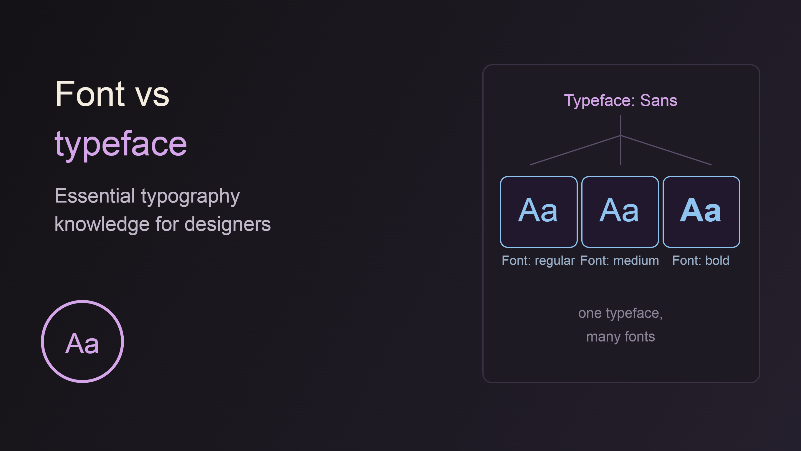
When you start learning about graphic design or website development, you''ll certainly encounter two familiar terms: Font and Typeface. Although often used interchangeably, these are two completely different concepts in typography.
1. Typography and the Role of Fonts in Design
Before delving into the distinction between fonts and typefaces, we need to understand what typography is.
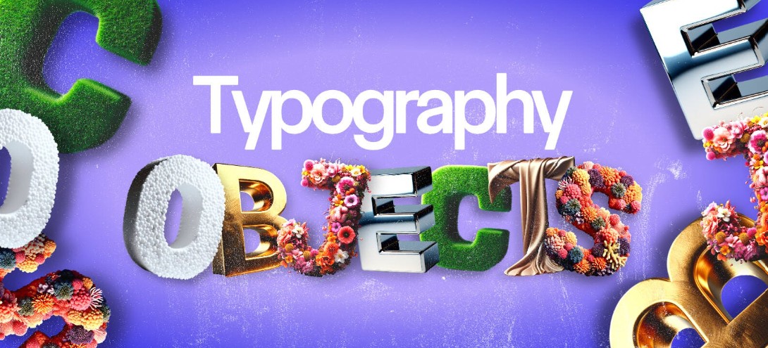
Typography is the art of arranging and presenting text to create readability, clarity, and aesthetic value for content. Typography is present almost everywhere in modern life, from websites and mobile applications to books, newspapers, advertising posters, and brand identity systems.
A beautiful design relies not only on images but also heavily on the use of typography. The same content can be conveyed much more professionally, modernly, or elegantly if the right font is chosen.
That's why designers always spend a lot of time researching fonts before starting a project. However, to make the right choice, we first need to understand what fonts and typefaces actually are.
2. What is a Font?
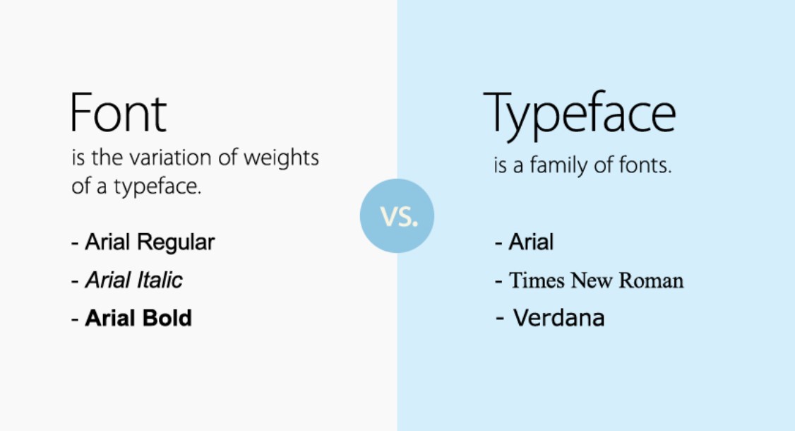
A font is a collection of characters defined by a specific style, weight, and size.
Simply put, a font is a specific version of a typeface. When you use a particular font in design or word processing software, you are selecting a specific variation in the thickness, slant, or size of the letters.
For example, when opening Microsoft Word or Adobe Photoshop, you might encounter options such as: Arial Regular, Arial Bold, Arial Italic, Arial Bold Italic, Roboto Light, Roboto Regular, Roboto Medium, Roboto Bold
Each of the above options is considered a separate font. Although they share basic identifying characteristics, each font carries a different weight or style.
Historically, the concept of fonts emerged during the lead type printing era. Each physical typeface, with its own size and style, was considered a font. For example, the 12pt Times New Roman typeface was one font, while the 14pt Times New Roman typeface was considered a different font.
Today, although digital technology has changed the way we use text, the concept of a font remains to refer to specific text files or variations that we install on our computers.
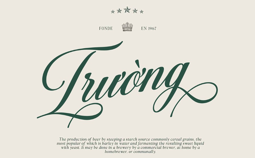
When you download a font set from the internet, you are actually downloading multiple different font files. For example, a complete Roboto set might include Roboto Thin, Roboto Light, Roboto Regular, Roboto Medium, Roboto Bold, and Roboto Black.
Each of those files contains a separate font.
3. What is a Typeface?
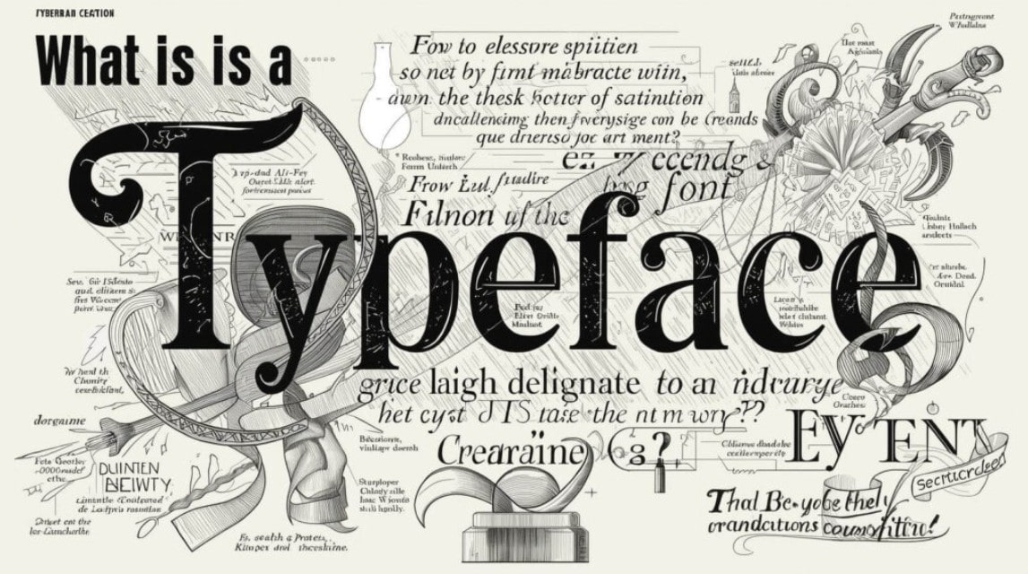
A typeface is understood as a family of fonts that includes many different fonts but shares a common design style. In other words, a typeface is a collection of fonts that have the same identifying characteristics.
For example, Arial is a typeface. Within the Arial typeface, you would find: Arial Regular, Arial Bold, Arial Italic, Arial Black, Arial Narrow, Arial Rounded.
Although each font has a different thickness or style, they all belong to the same Arial family because they retain the core design characteristics.
Similarly, Roboto is also a typeface. Within the Roboto typeface, there are many fonts such as: Roboto Thin, Roboto Light, Roboto Regular, Roboto Medium, Roboto Bold, Roboto Black, Roboto Condensed, and Roboto Slab.
All of these fonts were developed using the same design language and are grouped together into one typeface.
To put it simply, if a typeface is a family, then the font is each member of that family.
4. The Difference Between Fonts and Typefaces
Typeface is a general concept used to describe the style of typography design. Font, on the other hand, is a specific variation within the typeface.
If you say "I like Helvetica," you're referring to the Helvetica typeface. But if you say "I use Helvetica Bold 16pt," you're referring to a specific font. Another easy-to-understand example is the fashion industry. Imagine the typeface as a clothing brand, while the font is the specific product of that brand.
For example, Nike is a brand. A white Nike shirt in size M is a specific product.
Similarly: Roboto is a typeface, Roboto Bold is a font, and Roboto Bold 18pt is a specific way of using the font.
This distinction is especially important in a professional work environment, where designers, developers, and marketers frequently exchange ideas about typography.
5. Why do many people often confuse fonts and typefaces?
Despite their clear conceptual differences, these two terms are often used interchangeably in practice.
The first reason stems from the development of digital technology.
Modern software like Word, Photoshop, Figma, and Canva often use the word "Font" in their user interfaces. This has led most users to become accustomed to calling all types of text "font."
The second reason is that in everyday communication, distinguishing between font and typeface isn't always necessary.
When someone says, "Choose a nice font for the website," the listener can still understand the meaning without any difficulty.
However, in the professional design field, using the right terminology will help to communicate more accurately and demonstrate better expertise.
6. The Role of Typefaces in Brand Design
Typefaces play a crucial role in building brand identity.
Each typeface has its own unique personality. Some typefaces feel modern, minimalist, and technological. Others have a classic, elegant, or creative feel.
When choosing a typeface for their brand, businesses are indirectly conveying their image and values to customers.
For example, technology companies often prefer modern sans-serif typefaces to create a professional and approachable feel.
Meanwhile, high-end fashion brands often use serif typefaces to create a sense of class and luxury.
A suitable typeface can contribute to increased brand recognition and create consistency across all media platforms.
7. The Role of Fonts in the Design Process
While the typeface determines the overall style, the font allows designers to control how content is presented in each specific case.
For example, on a business website, a designer might use the same typeface but apply different fonts for different purposes.
The main title can use a bold font to make it stand out. Subheadings can use a medium font to create a hierarchical flow of information. The main body of the content can use a regular font to improve readability.
As a result, the entire interface maintains consistency while still creating a clear hierarchy for the user.
This is why modern typefaces are often developed with a wide variety of fonts.
8. How to Choose the Right Typeface for Your Website
When designing a website, the typeface selection should be done before choosing a specific font.
First, define the goals of the website.
If the website is in the technology, startup, or software sector, modern typefaces like Roboto, Inter, or Open Sans are often suitable choices.
If the website targets the financial or educational sectors, traditional typefaces can help increase credibility.
For fashion, art, or creative websites, designers may consider more personalized typefaces to create a distinctive brand identity.
After selecting a suitable typeface, the next step is to determine the specific fonts for the header, body, and other interface elements.
9. Common Mistakes When Using Fonts
One of the most common mistakes is using too many typefaces in the same design.
Combining too many different fonts can make the layout look cluttered and detract from its professionalism.
The next mistake is choosing a font that is not suitable for the intended purpose.
For example, using overly ornate fonts for lengthy content can reduce readability and be irritating to users.
Many people also often overlook the importance of consistency between fonts within a design. Even when using different fonts, they still need to have a stylistic connection to ensure overall aesthetic appeal.
Additionally, failing to optimize fonts for a website can increase page load times and negatively impact user experience.
10. Trends in Typefaces and Fonts in Modern Design
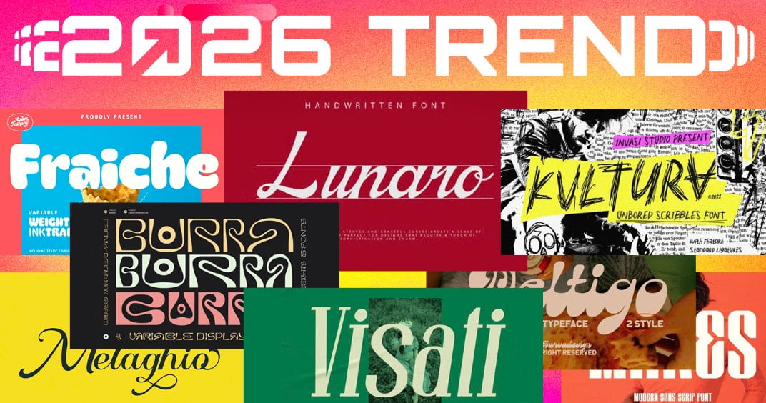
In recent years, minimalist typefaces have become a popular trend on both websites and mobile applications.
Fonts like Inter, Roboto, SF Pro, and Helvetica continue to be popular due to their ability to display well on a variety of screen sizes.
In addition, variable fonts are also developing rapidly. This technology allows multiple font variations to be integrated into the same file, reducing download size and improving website performance.
Modern trends no longer focus on elaborate designs but rather on clarity, readability, and optimizing the user experience across all devices.
11. Conclusion
Understanding the difference between fonts and typefaces not only helps you use the correct terminology in a professional design environment but also supports a more effective text selection process for websites, brands, and other media products. This is a crucial foundation that any designer, marketer, or web developer should master before delving into the world of typography.





















VIP Products








Best Selling Products
Windows 10 & 11 Pro Key
36 USD
Freepik Premium Account
59 USD
Adobe Photoshop Copyright - Full App
120 USD
Upgrade Genuine Office 365
49 USD
Copyright Adobe Lightroom Account
59 USD
Adobe Premiere Pro Account
99 USD
Upgrade Duolingo Super
29 USD
Upgrade genuine Capture One account
120 USD
Genuine Adobe Illustrator account
99 USD
Autodesk All App Account Copyright
120 USD
Capcut Pro 1 Year
39 USD
MidJourney Account
29 USD
Genuine Cheap Canva Pro
39 USD
Plugin Retouch4me
69 USD
ChatGPT Plus Account (GPT-4)
16 USD