Best Selling Products

Copyright Adobe Lightroom Account
59 USD

Windows 10 & 11 Pro Key
36 USD

Freepik Premium Account
59 USD

ChatGPT Plus Account (GPT-4)
16 USD

Autodesk All App Account Copyright
120 USD

Upgrade genuine Capture One account
120 USD

Capcut Pro 1 Year
39 USD

Adobe Photoshop Copyright - Full App
120 USD

Upgrade Genuine Office 365
49 USD

Genuine Adobe Illustrator account
99 USD

Adobe Premiere Pro Account
99 USD

Plugin Retouch4me
69 USD

Upgrade Duolingo Super
29 USD

MidJourney Account
29 USD

Genuine Cheap Canva Pro
39 USD
The Most Popular Font Groups in Modern Web Design
Nội dung
In website design and UX, fonts play a role just as important as color or layout. Each font group brings a different emotion, style, and ability to convey a message.
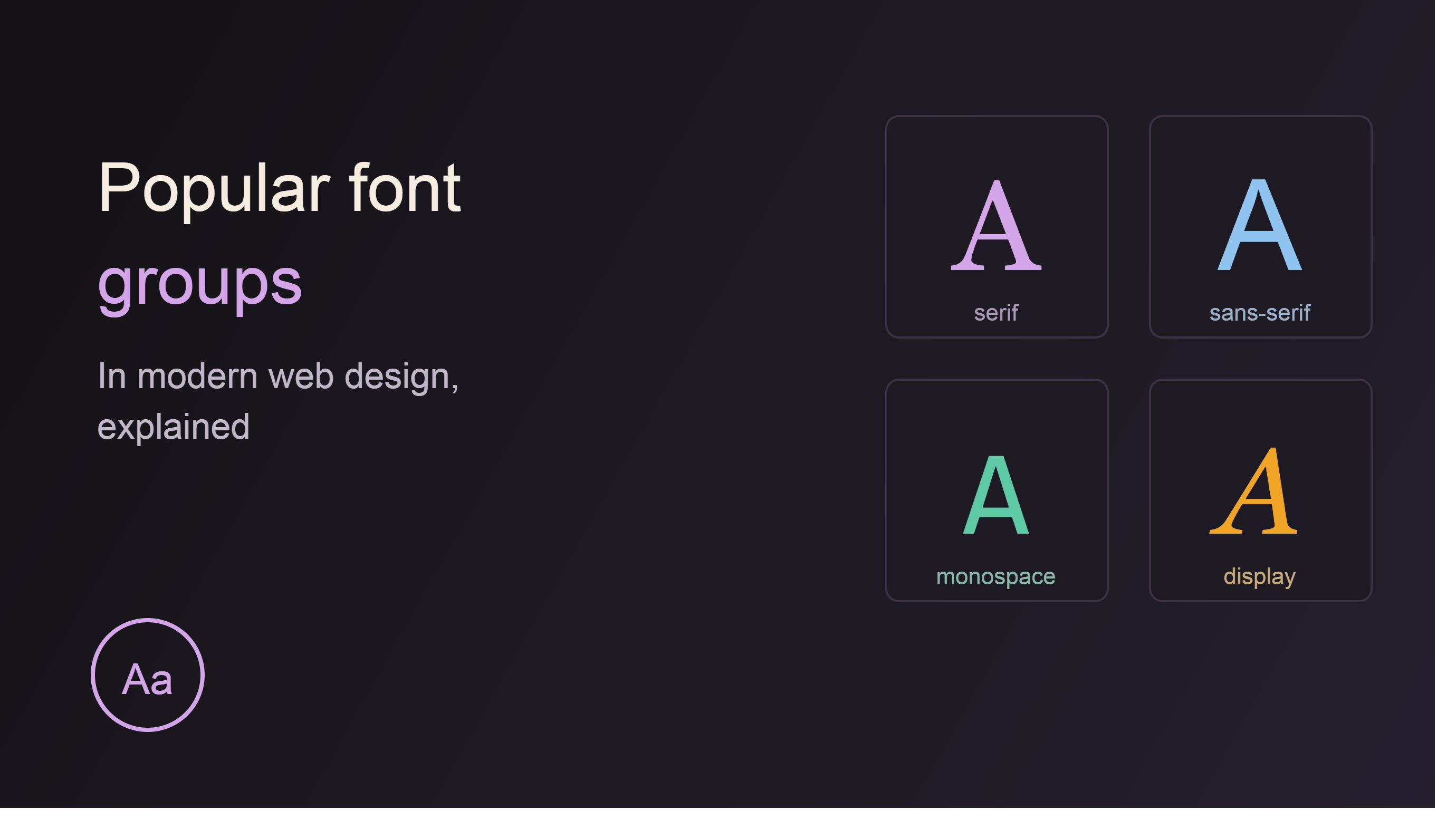
1. Serif Font – Fonts with Feet
Serif fonts are one of the oldest font groups in the history of typography. They are typefaces with small strokes or decorative details at the end of each character. These details are called "serifs," or more commonly known as footprints. The origins of serif fonts can be traced back to ancient Roman stone carvings. When engravers carved letters onto stone, the ending strokes were often extended, creating small lines at the beginning or end of characters. Over time, this feature became an integral part of typeface design and gave rise to the serif font group we know today.
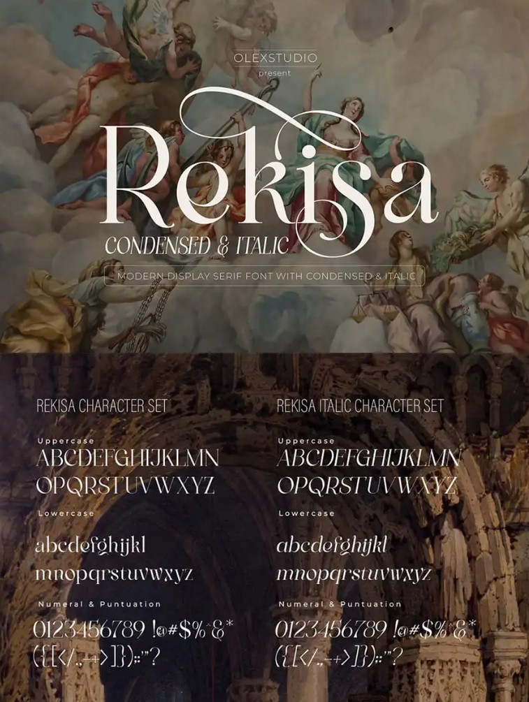
Serif fonts are distinguished by their ability to convey a sense of tradition, academic quality, and trustworthiness. Therefore, they frequently appear in books, magazines, research papers, and established brands. In website design, serif fonts create a professional and sophisticated feel. Users often associate websites using serif fonts with credibility, quality, and a high level of academic rigor. Studies in visual psychology show that serif fonts convey stability and trustworthiness much better than many other font groups. This is why many financial institutions, universities, and law firms choose serif as their primary identifying font.
Popular serif fonts today include Times New Roman, Georgia, Merriweather, and Playfair Display.
Times New Roman is considered one of the most popular fonts in the world. Despite having been around for decades, this typeface is still widely used in academic documents and professional writing.
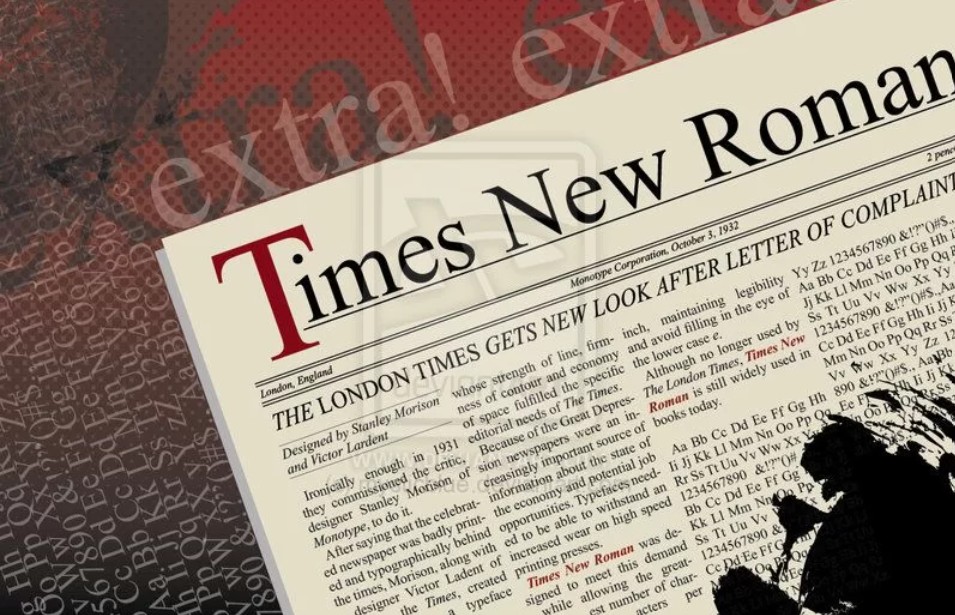
Georgia is a Serif version optimized for digital screens. With its clear design and excellent web display capabilities, Georgia was once the top choice for many online newspapers.
Playfair Display, on the other hand, has a more elegant and artistic style. This font is often used in high-end fashion brands, magazines, or websites with a high aesthetic appeal.
Merriweather is considered one of the most reader-friendly serif fonts on the modern web.
In UX, serif fonts are often suitable for websites with long amounts of content, such as in-depth blogs, online newspapers, or educational websites. Long paragraphs of text presented using serif fonts can create a more natural and comfortable reading experience in many cases.
However, it's important to note that not every interface is suitable for Serif. For technology websites or modern applications, Serif can sometimes feel too traditional and less flexible.
2. Sans-serif Font – Fonts without Sans-serifs
The name Sans-serif comes from French, where "Sans" means "without". As the name suggests, this font group completely eliminates serifs, creating a minimalist, clean, and more accessible appearance.
Today, sans-serif fonts are the most commonly used font group in website and UX design.
The main reason lies in its excellent display capabilities on digital screens. As electronic devices began to flourish, designers realized that the simple characters of sans-serif fonts made text clearer on screens of varying resolutions.
Unlike Serif fonts with their many small decorative details, Sans-serif fonts focus on clean, modern lines. This makes it easier for users to read content on phones, tablets, and desktop computers.
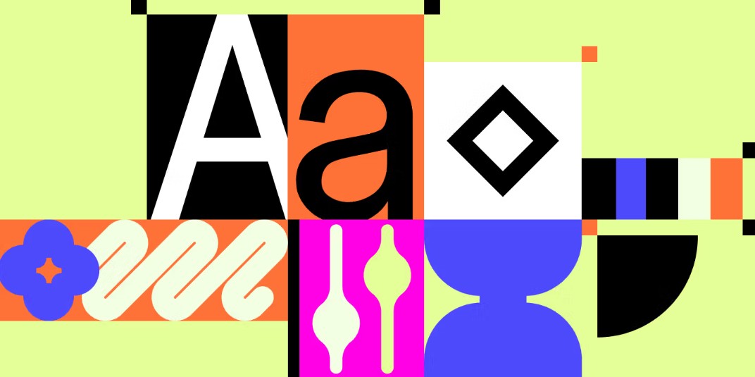
Emotionally, Sans-serif fonts convey a sense of youthfulness, efficiency, friendliness, and modernity.
Therefore, most major technology companies around the world choose Sans-serif fonts for their brand identity systems.
Google is famous for its Roboto font set.
Apple uses SF Pro.
Microsoft chose Segoe UI.
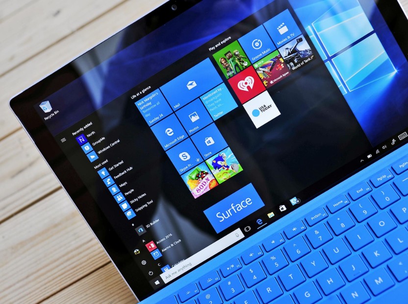
Many other global tech brands also favor Sans-serif fonts to create a modern and accessible image.
Popular sans-serif fonts today include Roboto, Open Sans, Montserrat, Lato, Helvetica, and Arial.
Roboto was designed specifically for the Android operating system and is currently one of the most popular fonts in the world.
OpenSans stands out for its ability to display well across a wide range of screen sizes.
Montserrat has a more modern and distinctive style, often used for headlines and creative projects.
Helvetica has long been an icon of minimalism in graphic design.
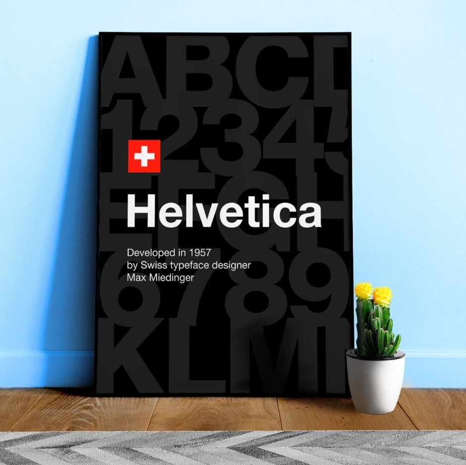
In the UX field, Sans-serif is almost the default choice for most user interfaces. Mobile applications, e-commerce websites, SaaS platforms, and admin dashboards all prioritize the use of Sans-serif to ensure optimal readability.
Another important advantage is its ability to flexibly combine with many different design styles. Whether it's a business interface, startup website, portfolio website, or e-commerce website, Sans-serif can handle it well.
It's no exaggeration to say that Sans-serif is the "default language" of modern web design.
3. Font Display – Unconventional Font Style
Unlike Serif and Sans-serif, which focus on readability, Display is designed primarily to attract attention.
This font group possesses a high degree of creativity and is often designed to create a strong visual impact.
Display isn't a single style, but rather a collection of many different typefaces. They can be modern, classic, artistic, playful, or even extremely unique.
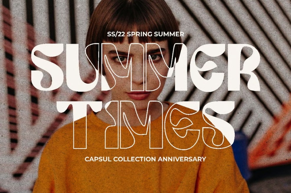
A common characteristic of display fonts is their ability to make an impression at first glance.
When users visit a website, the header is usually the first area that catches their attention. This is where display fonts truly shine.
Thanks to its bold and distinctive design, Display helps messages stand out and increases brand memorability.
Popular fonts in this group include Bebas Neue, Oswald, and several variations of Lobster.
Bebas Neue is a popular choice for advertising banners and website headers due to its strong, clear design.
Oswald features a modern design with a high font ratio, optimizing display space.
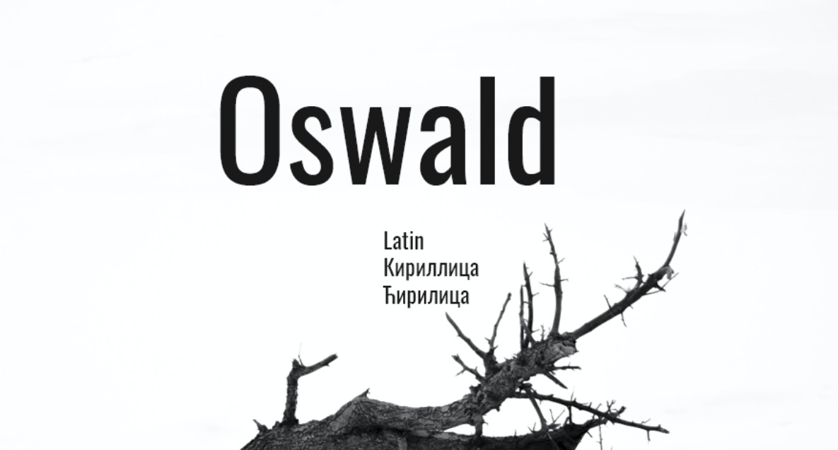
Many young brands today use Display technology to create their own unique identity in an increasingly competitive environment.
However, Display should not be used for long paragraphs.
The reason is that these fonts often prioritize aesthetics over readability. When applied to large amounts of content, users quickly become fatigued and find it difficult to concentrate.
In UX, display is seen as a tool for creating emphasis. It should appear in the main headline, advertising banners, or areas that need to attract special attention.
Using Display correctly can help your website stand out and make a strong impression on customers.
4. Script Font – Handwriting Font
Script fonts are inspired by human handwriting. They can mimic traditional ink strokes, personal signatures, or the soft curves of modern calligraphy. This is a highly artistic group of fonts.
Unlike typical digital fonts, Script fonts often evoke a more intimate and natural feel. When users see a beautiful Script font, they often associate it with creativity, craftsmanship, and individuality. This is why Script fonts are widely used in fashion, beauty, photography, and craft industries.
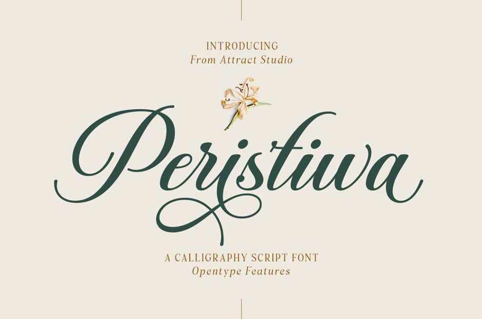
Popular script fonts today include Pacifico, Dancing Script, and Lobster.
Pacifico has a youthful and cheerful style.
Dancing Script creates a soft, elegant feel.
Lobster is one of the most popular script fonts on websites thanks to its ability to strike a balance between aesthetics and readability.
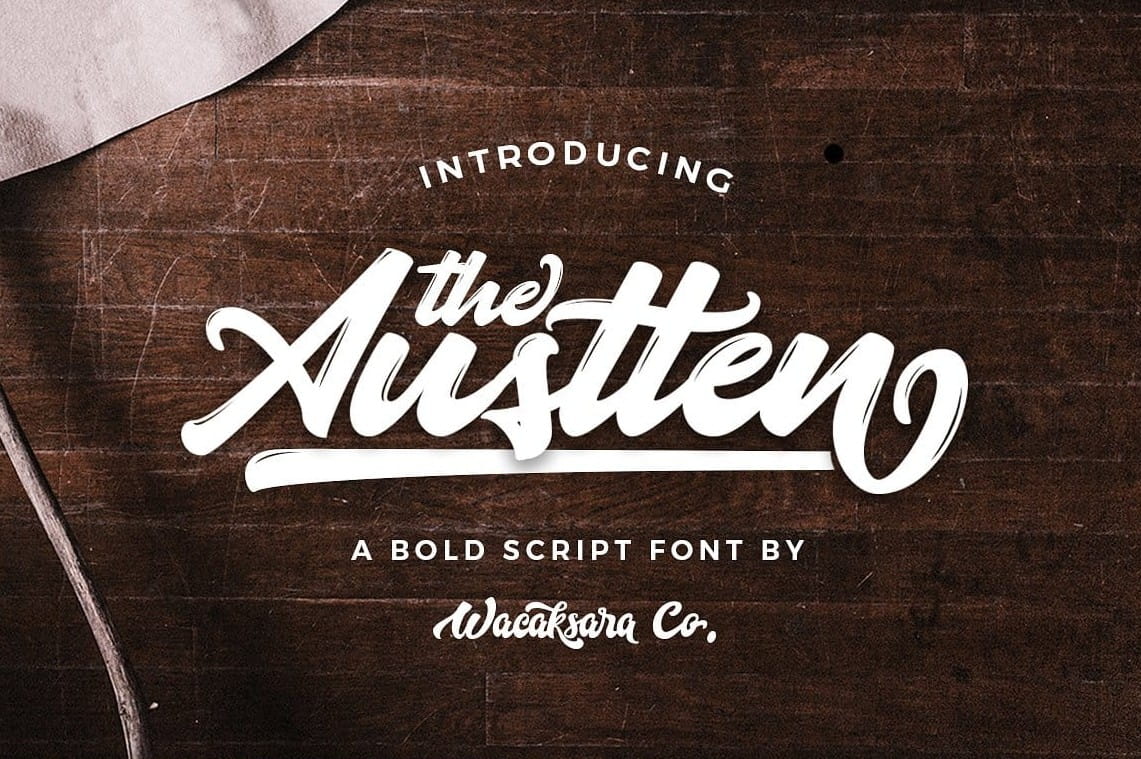
In UX design, scripts should be used sparingly.
Due to their complex character structure, scripts are often much more difficult to read than serif or sans-serif fonts.
If applied to all website content, the user experience would be significantly affected.
Instead, the script should be used as a visual highlight.
Logos, short titles, brand signatures, or catchy quotes are the most suitable placements.
When combined correctly with sans-serif or serif fonts, script fonts can create the perfect balance between artistry and practicality.
5. Slab Serif Font – Block Letters with Feet
Slab Serif is a distinct variation of the traditional Serif font. The biggest difference lies in the serif strokes. Instead of the slender strokes of classic Serif, Slab Serif uses thicker, more square and sturdy serifs. This design creates a feeling of strength, confidence, and reliability. Many typography experts consider Slab Serif to be the perfect combination of the classic look of Serif and the clarity of Sans-serif.

Popular slab serif fonts today include Roboto Slab, Rockwell, Arvo, and Courier New.
Roboto Slab is widely used in modern web design thanks to its excellent display capabilities on screens.
Rockwell stands out with its sturdy and robust appearance.
Arvo embodies a modern style while retaining the distinctive traditional characteristics of Serif.
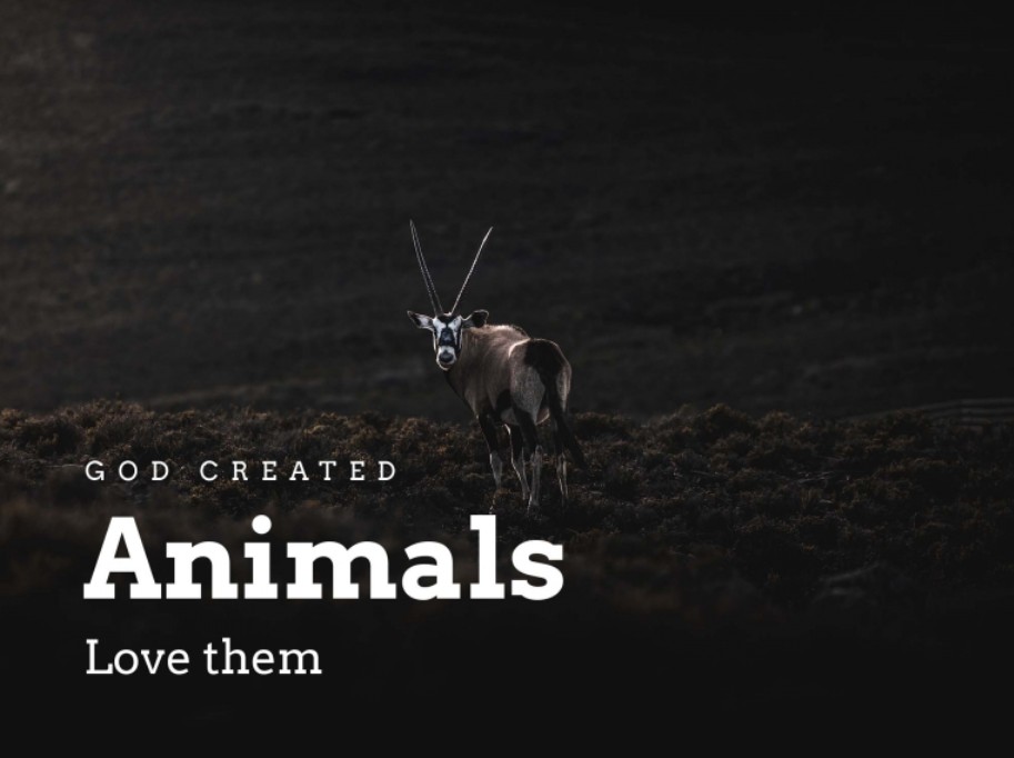
In UX design, Slab Serif often appears in headings or areas where a sense of trust needs to be conveyed.
Businesses operating in the engineering, industrial, construction, or B2B technology sectors often prioritize using Slab Serif to build their brand image.
Additionally, the strong resurgence of retro style in recent years has also contributed to the increased popularity of Slab Serif.
Thanks to its blend of classic and modern aesthetics, Slab Serif can create unique designs without sacrificing professionalism.
6. How to Choose the Right Font for Your Website and UX
Font selection shouldn't be based solely on personal preference. First, you need to clearly define your target audience and the goals of your website.
If the website is aimed at a technology company or startup, sans-serif is usually the optimal choice.
If you want to build a reputable and academic image, Serif graphics would be a better fit.
If the goal is to create visual impact, Display can be highly effective.
This script is suitable for brands with a personal or artistic focus.
Meanwhile, Slab Serif is an ideal choice for brands that want to project strength and reliability.
A key principle in UX is to always prioritize readability over aesthetics. A beautiful but difficult-to-read font will detract from the user experience and negatively impact the effectiveness of information delivery.





















VIP Products








Best Selling Products
Copyright Adobe Lightroom Account
59 USD
Windows 10 & 11 Pro Key
36 USD
Freepik Premium Account
59 USD
ChatGPT Plus Account (GPT-4)
16 USD
Autodesk All App Account Copyright
120 USD
Upgrade genuine Capture One account
120 USD
Capcut Pro 1 Year
39 USD
Adobe Photoshop Copyright - Full App
120 USD
Upgrade Genuine Office 365
49 USD
Genuine Adobe Illustrator account
99 USD
Adobe Premiere Pro Account
99 USD
Plugin Retouch4me
69 USD
Upgrade Duolingo Super
29 USD
MidJourney Account
29 USD
Genuine Cheap Canva Pro
39 USD