Best Selling Products

Upgrade Genuine Office 365
49 USD

Windows 10 & 11 Pro Key
36 USD

Upgrade Duolingo Super
29 USD

Freepik Premium Account
59 USD

Autodesk All App Account Copyright
120 USD

ChatGPT Plus Account (GPT-4)
16 USD

Copyright Adobe Lightroom Account
59 USD

Plugin Retouch4me
69 USD

Genuine Adobe Illustrator account
99 USD

Genuine Cheap Canva Pro
39 USD

Adobe Photoshop Copyright - Full App
120 USD

MidJourney Account
29 USD

Upgrade genuine Capture One account
120 USD

Capcut Pro 1 Year
39 USD

Adobe Premiere Pro Account
99 USD
Explore basic colors and their applications in design
Nội dung
- 1. Color Theory: The Foundation of Understanding
- 1.1. Color Wheel: The Most Intuitive Tool
- 1.2. Color Models: How Colors Are Created
- 2. Characteristics of Color
- 2.1. Hue
- 2.2. Saturation
- 2.3. Value / Lightness / Brightness
- 3. The Emotional and Psychological Meaning of Color in Design
- 3.1. Warm Colors
- 3.2. Cool Colors
- 3.3. Neutral Colors
- 4. Basic Color Combinations in Design
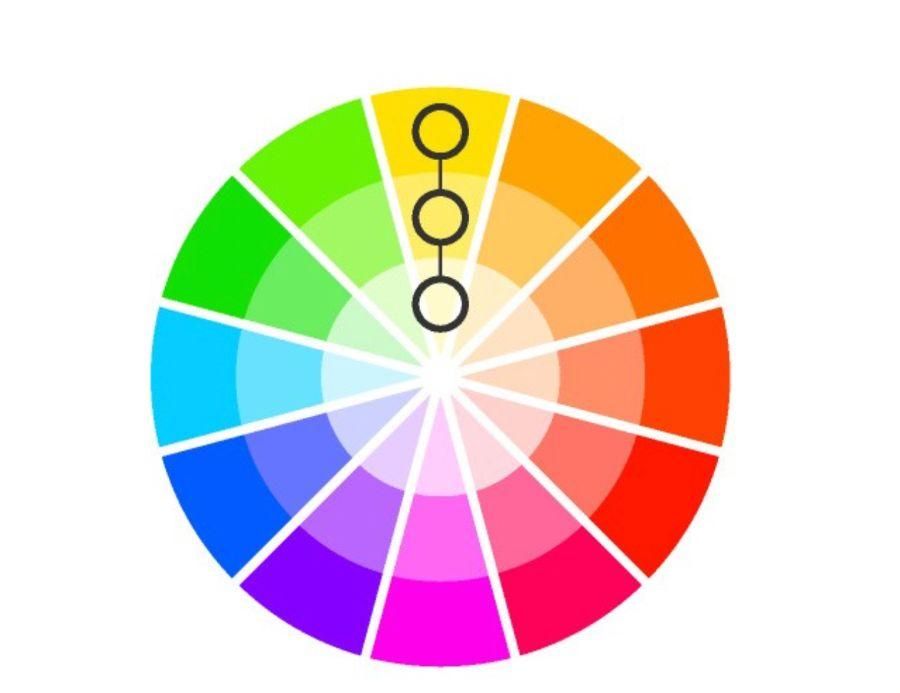
- 4.1. Monochromatic Color Scheme
- 4.2. Analogous Color Scheme
- 4.3. Complementary Color Scheme
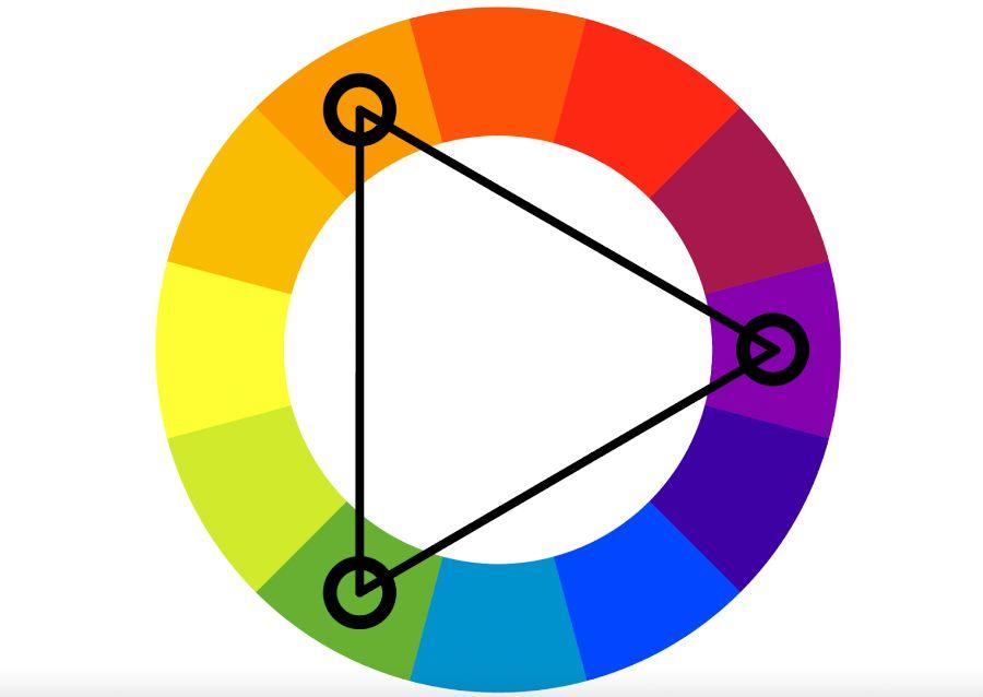
- 4.4. Triadic Color Scheme
- 4.5. Split-Complementary Color Scheme
- 4.6. Tetradic/Rectangular Color Scheme
- 5. Color Applications in Specific Design Areas
- 5.1. Graphic Design and Branding
- 5.2. Web Design and User Interface (UI/UX Design)
- 5.3. Interior Design
- 5.4. Fashion Design
- 6. Color Trends In Modern Design
- 7. Conclusion
Discover basic colors and their applications in design to help you better understand color theory, how to combine colors effectively, and create impressive, professional design products.
Color is one of the most powerful elements in design. Not only do they make things look beautiful, they also have the ability to evoke emotions, convey messages, and even shape our perception of the world around us. From a brand logo, a website to a piece of art or an interior space, color always plays a central role, a wordless visual language that connects viewers with the work. This article sadesign will take you on a journey to explore the world of color, from core theories to how to apply them skillfully in diverse design fields.
1. Color Theory: The Foundation of Understanding
To truly master color, we need to start with the basics of color theory. This is a set of guidelines and rules about how colors are created, mixed, and interact with each other.
1.1. Color Wheel: The Most Intuitive Tool
A color wheel is a circular diagram that shows the relationships between colors. It is the most basic but extremely important tool for understanding colors and how they combine. Traditional color wheels are based on the RYB (Red, Yellow, Blue) color model.
-
Primary Colors: These are the three most basic colors that cannot be created by mixing other colors. In the RYB model, they are Red, Yellow, and Blue . These are the base colors that create all other colors.
-
Secondary Colors: Created by mixing two primary colors in equal proportions.
-
Red + Yellow = Orange
-
Yellow + Blue = Green
-
Blue + Red = Purple
-
-
Tertiary Colors: Created by mixing a primary color with a secondary color adjacent on the color wheel. Examples: Red-Orange, Yellow-Orange, Yellow-Green, Blue-Green, Blue-Violet, Red-Violet.
1.2. Color Models: How Colors Are Created
The way we see colors depends on how they are created. There are two main color models:
-
Additive Colors Model - RGB:
-
Origin: Based on light. When light colors are added together, they create other colors.
-
Primary colors: Red, Green, Blue .
-
Result: When these three colors are mixed at maximum intensity, they produce white .
-
Application: Often used in light-emitting devices such as computer screens, TVs, phones, LED lights. All designs displayed on the screen use the RGB color system.
-
-
Subtractive Colors - CMYK:
-
Origin: Based on printing ink. When ink colors are mixed, they absorb light and reflect the rest.
-
Primary Colors: Cyan, Magenta, Yellow . K (Key/Black) is added to create pure black and depth, as mixing C, M, Y does not produce perfect black.
-
Result: When C, M, Y are mixed in maximum proportions, they produce black (or near black) .
-
Application: For printing. Any design that will be printed onto paper, fabric, etc., must use the CMYK color system to ensure accurate color.
-
2. Characteristics of Color
To understand colors more deeply, we need to grasp their three basic properties:
2.1. Hue
-
The pure name of a color, for example: red, blue, yellow. Hue is the position of that color on the color wheel.
-
When you say "change color", you are talking about changing the Hue.
2.2. Saturation
The intensity or purity of a color. Highly saturated colors are very vivid and vibrant.
-
A color with low saturation will appear lighter, grayer, or almost colorless. Dragging the Saturation to 0 will turn the color gray.
-
Saturation helps convey emotion: highly saturated colors are often strong, energetic; low saturation colors are often soft, sad, or delicate.
2.3. Value / Lightness / Brightness
-
Is the lightness or darkness of a color.
-
Tint: A color to which white has been added to make it brighter (e.g. pink is a tint of red).
-
Shade: A color to which black has been added to make it darker (e.g. dark brown is a shade of orange).
-
Tone: The color is to which gray is added to soften it.
-
Value/brightness affects the contrast and readability of text, as well as giving depth to a design.
3. The Emotional and Psychological Meaning of Color in Design
Each color has its own unique meaning and psychological impact, deeply influencing how viewers perceive a design, a brand or a message. Understanding this meaning is the key to choosing the right color to convey the right emotion.
3.1. Warm Colors
Includes Red, Orange, Yellow and their variations. These colors often evoke feelings of warmth, energy and excitement.
-
Red:
-
Meaning: Energy, passion, love, danger, strength, urgency, attention.
-
Applications: Call to Action, food related branding (increases appetite), sports, warnings, love. Often used to create strong emphasis.
-
-
Cam (Orange):
-
Meaning: Creative, enthusiastic, youthful, friendly, fun, adventurous, affordable.
-
Applications: Youth brands, active products, food industry, user-friendly websites.
-
-
Yellow:
-
Meaning: Happiness, optimism, energy, sunshine, attention, warning, cheap.
-
Applications: Fun symbols, children's toy labels, children's products, traffic warnings. Be careful when using large amounts as it may cause eye strain.
-
3.2. Cool Colors
Includes Green, Blue, Purple and their variations. These colors often evoke feelings of calm, professionalism and tranquility.
-
Green:
-
Meaning: Nature, freshness, growth, health, peace, money, environmentally friendly.
-
Applications: Environmental, healthcare, organic, financial, agricultural brands.
-
-
Blue:

Meaning: Reliable, stable, calm, professional, intelligent, secure, technological.
-
Applications: Banking, technology, healthcare, aviation, social media (Facebook, Twitter). The most popular color for brands looking to build trust.
-
Team (Purple/Violet):
-
Meaning: Luxurious, noble, mysterious, creative, spiritual, intellectual.
-
Applications: Luxury brands, creative products, cosmetics, meditation. Light purple tones can evoke romance and femininity.
-
3.3. Neutral Colors
Includes White, Black, Gray, Brown and Beige. These colors are often used as a background, creating balance and space for other colors to stand out.
-
White:
-
Meaning: Pure, clean, minimalist, bright, new beginning.
-
Applications: Minimalist design, medical products, high-tech, fashion, empty space.
-
-
Black:
-
Meaning: Luxurious, strong, sophisticated, mysterious, powerful, classic, modern.
-
Application: Luxury brands, fashion, photography, art, creating strong contrast.
-
-
Grey:
-
Meaning: Neutral, stable, professional, balanced, calm.
-
Application: Background, technology, corporate design, creating a luxurious, modern feel.
-
-
Brown:
-
Meaning: Earthy, natural, rustic, sustainable, warm, stable.
-
Applications: Natural products, coffee, food, interior decoration, crafts.
-
-
Be (Beige):
-
Meaning: Peaceful, gentle, neutral, warm, flexible.
-
Application: Background, fashion, interior, creating relaxing space.
-
4. Basic Color Combinations in Design
Once you understand what each color means, the next important thing is to know how to combine them harmoniously. Color harmonies are based on the position of colors on the color wheel.
4.1. Monochromatic Color Scheme
-
Features: Uses different shades, tones and brightnesses of a single color .
-
Advantages: Creates harmony, sophistication, gentleness and professionalism. Very pleasing to the eyes.
-
Disadvantages: Can become monotonous without enough contrast or tonal variety.
-
Application: Minimalist design, website, logo, interior space needs quiet, professional.
4.2. Analogous Color Scheme
-
Characteristics: Uses three colors adjacent to each other on the color wheel.
-
Advantages: Creates a more harmonious, pleasant, natural and rich look than monochrome. There is a main color, a supporting color and an accent color.
-
Disadvantages: Lacks strong contrast, may not stand out enough if attention is needed.
-
Applications: Illustrations, nature design, logos (create smooth color transitions), art.
4.3. Complementary Color Scheme
-
Characteristics: Uses two colors that are opposite each other on the color wheel (eg: Red - Green, Yellow - Purple, Blue - Orange).
-
Advantages: Creates strong, energetic contrast, attracts attention and sets each other apart.
-
Disadvantages: If used carelessly, it can cause glare, discomfort, or imbalance. Requires one dominant color and one accent color.
-
Application: Call to action buttons, dynamic logos, advertising posters, creating design highlights.
4.4. Triadic Color Scheme
-
Characteristics: Uses three colors that are evenly spaced on the color wheel, forming an equilateral triangle (eg: Red - Yellow - Blue, Orange - Purple - Green).
-
Advantages: Balanced, vibrant, rich in color while maintaining harmony.
-
Cons: Needs good control over saturation and brightness to avoid feeling too "noisy" or unbalanced.
-
Application: Design for children, posters, illustrations that need to be playful and dynamic.
4.5. Split-Complementary Color Scheme
-
Characteristics: Uses one primary color and two colors adjacent to its complementary color (e.g. Red and two colors Green-Yellow and Green-Blue).
-
Advantages: Provides the same strong contrast as complementary color schemes but is softer and more versatile, with less glare.
-
Disadvantages: Attention must be paid to the usage ratio to avoid clutter.
-
Applications: Infographics, web design, logos, where contrast is needed while still being harmonious.
4.6. Tetradic/Rectangular Color Scheme
-
Characteristics: Uses four colors that form a rectangle on the color wheel, including two pairs of complementary colors.
-
Advantages: Provides maximum variety and richness of colors.
-
Disadvantages: Difficult to balance, easy to get messy without a clear dominant color and reasonable usage ratio. Requires a deep understanding of color.
-
Application: Complex, artistic designs where multiple elements need to be highlighted.
5. Color Applications in Specific Design Areas
Color is not only a decorative element but also a strategic tool in every field of design.
5.1. Graphic Design and Branding
-
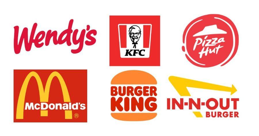
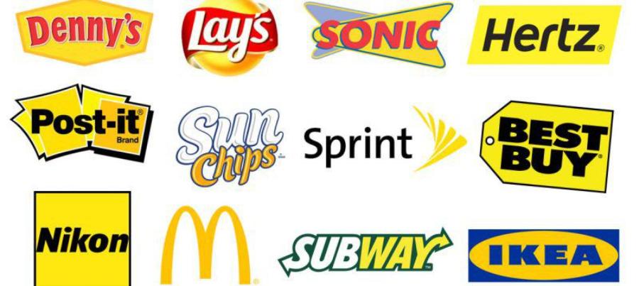
Logo and brand identity: Colors are the most important element in creating brand identity. They convey core values, personality and brand positioning in the minds of customers. For example: Facebook blue (trust), Coca-Cola red (energy, excitement).
-
Advertising Design: Color is used to attract attention, create emotion, and drive purchase behavior. Call-to-action buttons often use warm or complementary colors.
-
Infographics and illustrations: Use color to highlight data, create clarity, and help viewers easily absorb information.
-
60-30-10 Ratio: A common rule of thumb is to use 60% dominant color, 30% secondary color, and 10% accent color to create balance and harmony.
5.2. Web Design and User Interface (UI/UX Design)
-
Usability: Color affects the readability of text, information hierarchy, and navigation. Color contrast between text and background is extremely important.
-
User Experience (UX): Colors create feelings and moods for users. Consistent colors help users feel familiar and comfortable.
-
Buttons and interactive elements: Colors are used to indicate interaction status (e.g. green for "Done" button, red for "Cancel").
-
Responsive Design: Make sure your color scheme looks good and works well on all screen sizes and devices.
5.3. Interior Design
-
Space and feel: Wall, floor, and furniture colors can make a room appear more spacious (light, cool colors) or cozier (dark, warm colors).
-
Create a focal point: Use contrasting colors to highlight a piece of furniture or a specific area.
-
Mood: Color directly affects the mood of the person in the room. Bedrooms often use soft colors, living rooms can use more vibrant colors.
5.4. Fashion Design
-
Collections: Fashion designers often create seasonal or thematic color palettes to guide their collections.
-
Make an impression: The color of clothing affects how others perceive the wearer (e.g. black for power, pastel colors for softness).
-
Trends: Colors in fashion change with trends, reflecting culture and social psychology.
6. Color Trends In Modern Design
The world of color is constantly evolving with new trends emerging every year. Keeping up to date with these trends will keep your designs fresh and modern.
-
Pastel and Muted Colors: Evoke a soft, elegant feel, often used in minimalist, modern designs.
-
Gradient Color: Color transition effects are still very popular, creating softness, dynamism and depth.
-
Neon and Vibrant Colors: Used to create strong accents, attract attention, often combined with dark backgrounds to increase contrast.
-
Earthy Tones: Reflect concern for the environment, sustainability, creating a rustic, intimate feeling.
-
High Contrast Colors: A combination of high contrast colors to create drama and pop.
Following trends is good, but the most important thing is to understand the audience and goals of the project to choose the most suitable colors, instead of just following the trend.
7. Conclusion
Colors are more than just decorative elements; they are language, emotions, and the backbone of all visual design. From mastering the primary, secondary, and tertiary color types, understanding the RGB and CMYK color models, to perceiving the psychological meaning of each color and knowing how to blend them harmoniously – all are essential skills that any designer needs to hone.


VIP Products


Best Selling Products
Upgrade Genuine Office 365
49 USD
Windows 10 & 11 Pro Key
36 USD
Upgrade Duolingo Super
29 USD
Freepik Premium Account
59 USD
Autodesk All App Account Copyright
120 USD
ChatGPT Plus Account (GPT-4)
16 USD
Copyright Adobe Lightroom Account
59 USD
Plugin Retouch4me
69 USD
Genuine Adobe Illustrator account
99 USD
Genuine Cheap Canva Pro
39 USD
Adobe Photoshop Copyright - Full App
120 USD
MidJourney Account
29 USD
Upgrade genuine Capture One account
120 USD
Capcut Pro 1 Year
39 USD
Adobe Premiere Pro Account
99 USD