Best Selling Products

Adobe Premiere Pro Account
99 USD

Upgrade Genuine Office 365
49 USD

Upgrade genuine Capture One account
120 USD

Upgrade Duolingo Super
29 USD

ChatGPT Plus Account (GPT-4)
16 USD

Genuine Adobe Illustrator account
99 USD

Copyright Adobe Lightroom Account
59 USD

Freepik Premium Account
59 USD

Adobe Photoshop Copyright - Full App
120 USD

Genuine Cheap Canva Pro
39 USD

Capcut Pro 1 Year
39 USD

Plugin Retouch4me
69 USD

MidJourney Account
29 USD

Autodesk All App Account Copyright
120 USD

Windows 10 & 11 Pro Key
36 USD
Glossary of Graphic Design Terms
Nội dung
In the increasingly developing world of graphic design, clearly understanding specialized terms is extremely important. This glossary not only helps designers communicate more effectively but also enhances their creativity and professional knowledge. From basic concepts nto more complex terms, each term carries its own meaning, contributing to the success of a design project. In this article, Appvip will explore with you the glossary of specialized graphic design terms, helping you grasp the necessary knowledge to be more confident in this field.
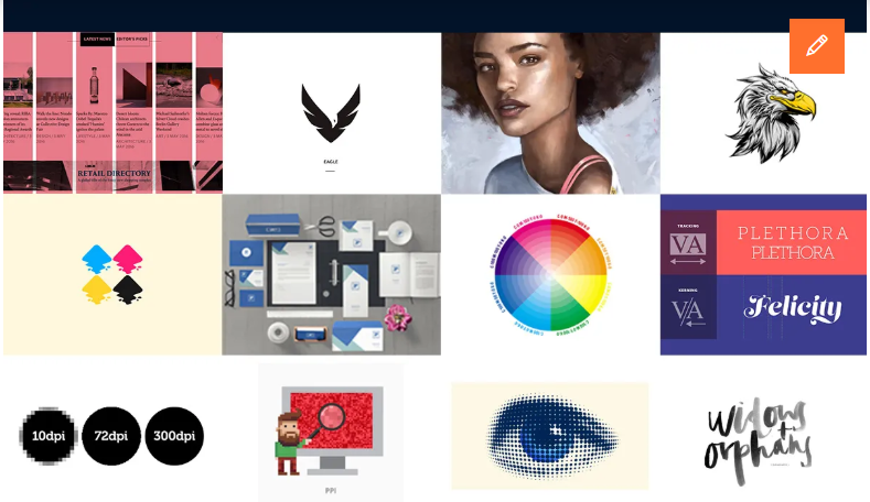
1. Basic specialized graphic design terms
In the field of graphic design, mastering basic terms is a prerequisite for designers to develop and communicate effectively. Below are some important terms that every learner should understand right from the first steps in their creative journey.
Graphic Design (Graphic design)
Graphic design is the process of creating images, graphics, and visual content to convey a specific message. This profession not only requires creativity but also requires understanding of design principles, colors, and layout. Graphic design appears in many fields, from advertising to communication, and plays an important role in attracting consumers’ attention.
Comp (Comprehensive layout)
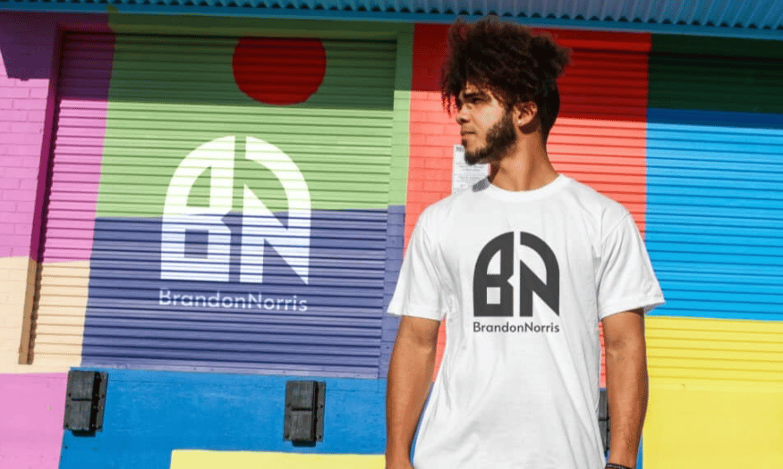
Comp, also known as comprehensive layout, is the sketch version of a design. This can be done by hand or using design software. Comp helps designers visualize the overall product before starting on more specific details. Creating a quality comp will help save time and effort in the design development process.
Mock-up (Sample model)
Mock-up is an important tool in design, allowing designers to present a model or full size of the design board. It helps customers or project teams have a visual view of the final product, thereby easily giving feedback and adjustments. Mock-ups can be created in many different forms, from hand drawings to 3D simulations.
Mood Board (Mood board)
Mood board is a board presenting ideas and reference images during the design process. It not only helps shape the mood and emotion that the designer wants to convey but is also a useful tool to communicate ideas to team members. Mood boards usually include images, colors, and other design elements to create an overview of the project direction.
Body Copy (Content section)
Body Copy is the main text section in a graphic design product. This is where important information that the designer wants to convey to viewers is contained. Choosing typeface, size, and line spacing in body copy is very important, because it directly affects readability and the viewer’s perception of the message.
Aspect Ratio (Aspect ratio)
Aspect ratio is the ratio between the width and height of an image or video. For designers, clearly understanding this concept helps them create products suitable for different formats, from websites to print advertising. The correct aspect ratio will ensure that the product is not distorted and still maintains its aesthetics.
.png)
Typography (Typeface, font style)
Typography is the art and technique of arranging written text so that it is both aesthetic and easy to read. It includes choosing typeface, size, color, and spacing between characters. A good design is not merely a combination of images and text, but also the way the text is presented to match the message and emotion that the designer wants to convey.
Display (Display screen)
Display screen is the device that users use to view design products. Understanding different types of screens and how they display colors, resolution, and contrast is very important in graphic design. This ensures that the designed product will look beautiful and professional on every device that viewers may use.
Mastering these terms not only helps you be more confident in the field of design but also opens up many opportunities for cooperation and development in the creative industry.
2. Specialized graphic design words: About images
In graphic design, images are the central element, and clearly understanding image-related terms is necessary to create quality products. Below are important terms that designers need to master to work effectively in this creative environment.
Vector Image (Vector image)
Vector image is a type of image created from vector graphic design software, such as Adobe Illustrator. The special thing about vector images is that they are built from lines and geometry, allowing designers to enlarge or reduce the image without losing quality. This is very useful in creating designs that need to be resized for many different purposes, such as logos or icons.
Raster Image (Raster image)
In contrast to vector images, raster images are created from pixels and have a fixed size. This type of image is often used for products such as photos or complex graphics, where details and colors are very important. However, raster images cannot be enlarged without reducing quality, so choosing the right size from the beginning is very important.
DPI (Dots per inch resolution)
DPI, short for Dots Per Inch, is a unit of measurement for image resolution. The DPI index indicates the number of ink dots that can be printed on one inch of surface. The higher the DPI index, the sharper and more detailed the image will be. This is especially important in printing, where image sharpness directly affects the quality of the final product.
EPS (Vector image format)
EPS, or Encapsulated PostScript, is a graphic file format commonly used for vector-based images. This format allows images to be stored together with related information, such as colors and layout, making it easy to share and edit between different design software. EPS is a popular choice in the professional printing and graphic design industry.
PSD (Raster image format)
PSD, short for Photoshop Document, is the original file format of Adobe Photoshop software. PSD files can contain many layers, allowing designers to easily edit each part of the image without affecting other parts. This is a very important tool in the design process, helping create refined and professional final products.
.png)
RAW (Raw image format)
RAW format is an unprocessed raw image, commonly used in digital cameras. Photos in this format contain all the image data captured by the camera sensor, giving photographers many options in editing and processing images later. RAW provides the highest image quality, ideal for projects requiring accurate detail and colors.
Texture (Surface part of a design)
Texture is a concept related to the surface characteristics of an object, including size, shape, density, and arrangement of object components. In graphic design, texture is often used to create a feeling and depth for products, helping increase aesthetics and attract viewers. Choosing a suitable texture can highlight design elements and convey the emotion that the designer wants to send.
TIFF (Tagged image file format)
TIFF, short for Tagged Image File Format, is an image format using lossless compression. This means the image is stored at the highest quality without being reduced when compressed. TIFF is often used in printing and image storage, although the file size is larger than other formats such as JPEG. This is an ideal choice for those who need to store images with the best quality.
3. Specialized graphic design words: About layout
Layout is an important part of graphic design, directly affecting how viewers receive information. Below are specialized terms related to layout that you need to master to create beautiful and effective designs.
Alignment (Alignment)
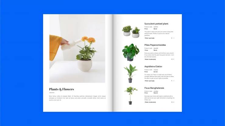
Alignment is a basic element in design that helps create harmony and attraction for the work. Aligning design elements in their correct positions not only helps create neatness but also supports viewers in easily following information. A well-aligned layout will guide the viewer’s eye naturally and coherently.
Balance (Balance)
Balance in design refers to the reasonable distribution of visual and text elements. A balanced design is usually more attractive and creates a comfortable feeling for viewers. Conversely, an unbalanced layout can highlight certain information, helping viewers focus on more important elements in the design.
Negative Space (Negative space)
Negative space is the area around design elements, including both text and images. Using negative space skillfully can create contrast and help highlight the main elements in the design. Some designers choose to take advantage of negative space as part of the creative idea, helping bring uniqueness to the product.
Radial (Radial direction)
Radial is a layout style in which design elements radiate from a central point and spread around. Radial design often creates a dynamic feeling and attracts attention to the main focal point. This type of layout is often used in posters or advertisements to create a strong impression.
Rule of Thirds (Rule of thirds)
The rule of thirds is a popular layout method, in which the image is divided into three equal parts both horizontally and vertically. Identifying the intersection points of these lines helps designers find the natural focal point for the image, thereby creating balance and harmony in the overall layout.
.png)
Scale (Scale)
Scale refers to the size of an object compared to other elements in the design. Using scale reasonably helps create emphasis for important objects and creates depth for the design. Scale can also affect the viewer’s perception of space and the size of elements in the product.
Skeuomorphism (Skeuomorphism)
Skeuomorphism is a design style that simulates physical objects in digital space. For example, a button in an application can be designed like a physical button on a computer. This style often creates a familiar and easy-to-use feeling for users, helping them feel more comfortable when interacting with the product.
White Space (White space)
White space is the area without images or text in a design. Although the name may make people think these are unimportant areas, in reality, white space plays an important role in creating balance and emphasis for other elements. It helps viewers not feel overloaded with information and creates conditions for other design elements to stand out more.
4. Specialized graphic design words: About colors
Color is an important element in graphic design, strongly affecting the perception and emotions of viewers. Below are some specialized terms about color that designers need to master.
Analogous Colors (Analogous colors)
Analogous colors are the combination of colors located close to each other on the color wheel. Using analogous colors helps create harmony and coherence for the design, often applied in advertising and art projects.
CMYK (Four-color process)
CMYK stands for Cyan, Magenta, Yellow, and Key (black). This is the main color model used in printing, helping create diverse colors by mixing four different types of ink.
Grayscale (Grayscale)
.png)
Grayscale only uses black, white, and gray shades between them. It is often used in simple designs, such as black-and-white films, to create a classic and elegant feeling.
Hex Code (Hex code)
Hex code is a six-digit code representing a specific color in digital design. This code is often used in design tools to ensure color consistency.
Hue (Hue)
Hue is the purest form of primary colors such as red, green, and blue. Hue is an important element in determining the identity of a design.
Monochrome (Monochrome)
A monochrome color palette is created from different shades of a single color. This style often creates a consistent and elegant feeling.
RGB (Additive color model)
RGB, short for Red, Green, and Blue, is the color model for all images displayed on electronic screens. Combining these colors helps create a wide range of colors.
Saturation (Saturation)
Saturation indicates the intensity of color in an image. Increasing saturation makes colors become more vivid, while decreasing saturation creates a softer appearance.
Shade (Shade)
Shade is the result of a pure color when black is added. This creates darker shades, helping create depth for the design.
Tint (Tint)
Tint is created by mixing a pure color with white, resulting in soft colors such as pastel pink or light blue.
Tone (Tone)
Tone is the darkness or lightness of a color, which can be adjusted by adding gray. This helps create diversity in design.
Triadic (Triadic color scheme)
Triadic is a color scheme consisting of three colors evenly distributed on the color wheel. This style often creates balance and prominence in design.
Pantone (Matching system)
Pantone is a standardized color system, helping designers easily refer to and use exact color shades in printing.
Pixel (Image unit)
Pixel is the smallest unit of a digital image, the image points that make up an image on the screen. Clearly understanding pixels is necessary to ensure image quality in design.
.png)
5. Conclusion
In summary, mastering the glossary of specialized graphic design terms is not only a basic requirement but also the key to opening new opportunities in a career. These terms not only support communication and teamwork but also help designers understand more deeply about the creative process and apply that knowledge in practice. Once you have mastered this glossary, you will not only become a good designer but also a person who inspires those around you in the field of creative art. Continue to explore and learn, because graphic design is a journey without an endpoint.





















VIP Products








Best Selling Products
Adobe Premiere Pro Account
99 USD
Upgrade Genuine Office 365
49 USD
Upgrade genuine Capture One account
120 USD
Upgrade Duolingo Super
29 USD
ChatGPT Plus Account (GPT-4)
16 USD
Genuine Adobe Illustrator account
99 USD
Copyright Adobe Lightroom Account
59 USD
Freepik Premium Account
59 USD
Adobe Photoshop Copyright - Full App
120 USD
Genuine Cheap Canva Pro
39 USD
Capcut Pro 1 Year
39 USD
Plugin Retouch4me
69 USD
MidJourney Account
29 USD
Autodesk All App Account Copyright
120 USD
Windows 10 & 11 Pro Key
36 USD