Best Selling Products

MidJourney Account
29 USD

Plugin Retouch4me
69 USD

Upgrade Duolingo Super
29 USD

Genuine Cheap Canva Pro
39 USD

Freepik Premium Account
59 USD

Autodesk All App Account Copyright
120 USD

Adobe Photoshop Copyright - Full App
120 USD

Upgrade Genuine Office 365
49 USD

Capcut Pro 1 Year
39 USD

ChatGPT Plus Account (GPT-4)
16 USD

Windows 10 & 11 Pro Key
36 USD

Copyright Adobe Lightroom Account
59 USD

Upgrade genuine Capture One account
120 USD

Genuine Adobe Illustrator account
99 USD

Adobe Premiere Pro Account
99 USD
Keeping Up with Logo Design Trends 2025
Nội dung
Logo design is not simply an image representing a brand but also a decisive factor in building the first impression with customers. A logo is an identification mark, reflecting the identity and core values of a business. However, for a logo to become outstanding and suitable for trends, designers need to continuously update and create. In this article, Appvip will go through the logo design trends that are causing a stir in 2025, from minimalist styles to creative animated images, helping you better understand how to create a logo that is both visually appealing and effective in attracting customers.
1. Gradient Logo
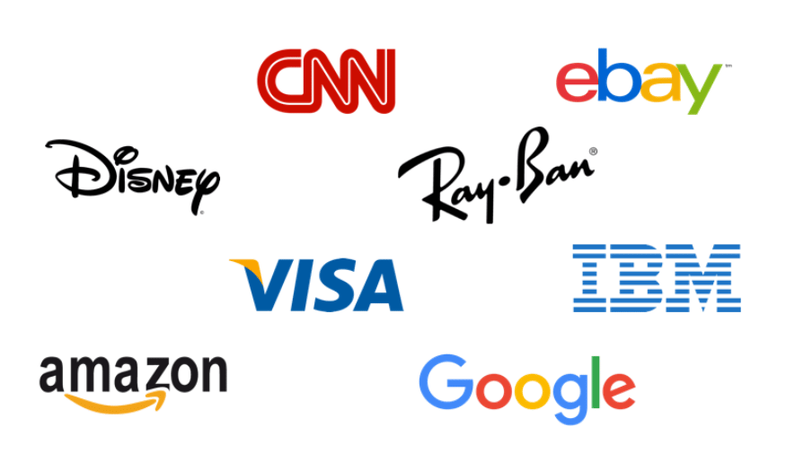
Gradient, or the color transition effect, has become one of the popular and sustainable design trends in recent years. In today’s digital era, where images and graphics dominate, gradient is not only applied in website background design but is also a perfect choice for logos. The combination of colors, from single-color to multi-color, brings depth and vividness to the design product. A logo with gradient not only attracts the eye but also creates a modern and creative feeling, helping the brand stand out from the crowd.
To create a successful gradient logo, ensuring coherence and smoothness between colors is very important. The soft transition between colors not only helps the logo become eye-catching but also conveys the message effectively. However, applying gradient may face some challenges, especially in maintaining aesthetics across many different sizes and formats. Therefore, designers need to consider carefully when deciding to use gradient, to ensure that it does not reduce the clarity and recognizability of the logo.
A useful tip when designing a gradient logo is to apply this effect only to a small part of the overall design. This helps create balance and does not confuse the viewer’s eyes. In addition, combining gradient with minimalist shapes can create a modern and memorable logo. Finding the perfect combination between gradient and other design elements is the key to creating an impressive and professional logo, helping the brand leave a mark in customers’ minds.
.png)
2. 3D Logo
In recent years, the nostalgic Y2K trend has opened the door for the return of 3D logos. 3D logos were once very popular in the early 2000s, but were replaced by flat design when this style took the spotlight. However, with the development of technology and changes in taste, 3D logos have returned with a fresh appearance. 3D design not only attracts attention but also brings a modern feeling and depth to the product.
The return of 3D logos not only brings aesthetics but also helps convey messages more clearly. Techniques such as blurring, reflection and color transition can create unique effects, making the logo more vivid and attractive. However, just like gradient, the use of 3D needs to be considered carefully. If overused, the logo may become confusing and difficult to recognize. Therefore, designers should consider using 3D as part of the overall design, combining it with minimalist elements to create harmony.
One thing to note when designing a 3D logo is its applicability across different platforms. If the brand mainly operates in an online environment, a 3D logo can help create a strong impression and express the characteristics of the brand effectively. On the contrary, for printed products, a 3D logo may cause distraction and not convey the message clearly. Therefore, understanding the goals and target customers is very important to apply 3D logos effectively.
3. Animation Logo
The animation logo design trend has become a phenomenon in the branding world, as businesses from large to small all seek ways to make their logos more lively. Animation is not only a tool that helps convey messages effectively but also an important part of building brand identity. With the development of technology, applying animation to logos has become easier, giving brands the opportunity to stand out and create a deep impression in consumers’ minds.
One of the reasons why animation has become popular is the storytelling ability it brings. An animated logo can convey a brand message in a more lively and attractive way than a static logo. Movement not only attracts attention but also creates an emotional connection with viewers. However, not all brands are suitable for this style. Applying animation needs to be consistent with the identity and field of operation of the business. An animation logo can be very effective in online advertising campaigns but may not be suitable in printed materials.
When designing an animation logo, it is important to ensure that it does not reduce brand recognition. Animation should be used as an addition to the logo, not as the main element. Designers need to carefully consider how the logo works in different situations, from online promotion to printing. A successful animated logo will help the brand create its own mark and difference in customers’ hearts, thereby strengthening its position in the market.
.png)
4. Nostalgic feeling
In the context of fashion and design being increasingly influenced by retro trends, it is not difficult to see that nostalgic feeling has become an indispensable part of logo design. The characteristic neon colors of the 80s or the artistic Grunge patterns of the 90s are being strongly revived. One of the interesting things that Generation Z brings is the ability to recreate elements that seemed outdated, but make them vivid and suitable for the present. When bringing nostalgia into logo design, it is important that it harmonizes with the message the brand wants to convey.
The combination of traditional and modern elements is a great way to create a unique and impressive logo. For example, using classic serif fonts combined with minimalist and trendy shapes can create an interesting contrast, helping the logo carry nostalgic beauty while still being modern. This not only highlights the brand personality but also creates a strong connection with consumers. In a world full of changes, seeking timeless values through design is a smart way to build a brand.
Moreover, applying nostalgic elements to a logo not only attracts attention but also evokes memories and emotions for viewers. This helps create a strong emotional connection, thereby increasing brand recognition. Designers can further explore classic styles and iconic images to create logo designs that are not only beautiful but also rich in meaning. The perfect combination between the past and the present will help your brand stand out and leave a mark in customers’ minds.
5. Monochrome color range
Monochrome has always been a popular choice in logo design, and this trend is expected to continue to dominate in the coming years. With the concept of “monochrome”, the design uses only one single color but still brings diversity and depth through adjusting light and dark tones. This not only helps create a simple logo but also makes it impressive and memorable. Color has great power in conveying brand messages, so choosing colors that suit the personality and identity of the brand is extremely important.
A monochrome logo can bring a strong and sophisticated feeling. The color trend for 2022 showed that bright, warm and friendly tones would become more popular. These colors are not only easy to combine with other elements in design but also create a friendly and close feeling with consumers. However, it should be noted that following trends is not always the best. A logo needs to correctly reflect the brand personality, and color selection must be carefully considered to ensure it is not only visually appealing but also suitable for the message the brand wants to convey.
Besides, a monochrome logo also has high adaptability across different platforms, from online advertising to printing. Its simplicity makes it easy to recognize and remember, thereby creating a lasting impression in customers’ hearts. To optimize the effectiveness of a monochrome logo, designers should pay attention to the coordination between visual elements and colors, creating a perfect product that is both attractive and easy to convey the message.
.png)
6. Hand-drawn details
Hand-drawn logos are becoming a prominent trend in design, bringing uniqueness and difference to the brand. Like a personal signature, a hand-drawn logo shows a unique mark and creates a close connection with viewers. Hand-drawn patterns not only bring a rustic and authentic feeling but also show the unlimited creativity of designers. In 2022, beauty from imperfection became a criterion, and this made hand-drawn logos even more popular.
A major advantage of hand-drawn logos is flexibility in expressing brand personality. Whether it is writing or images, these elements can all be freely transformed to suit the style of the brand. The sophistication in each stroke not only elevates the logo but also creates a deep impression of the brand’s character. Brands will have the opportunity to flourish in creativity when applying hand-drawn elements to design, thereby creating unique and different products.
What makes hand-drawn logos special is the ability to convey emotions and messages in an authentic way. Consumers often easily empathize with products that carry a personal mark, and this helps the brand build a deeper connection with customers.
7. Using many Layers
Layering is an important technique in graphic design that helps increase depth and thickness for a logo. When applying different layers, the main part of the logo will be highlighted, creating a clear contrast between elements. This combination not only brings aesthetic effectiveness but also creates a richer visual experience for viewers. However, in 2022, the use of layers needs to be done subtly and thoughtfully, avoiding clutter with too many unnecessary elements. This means each layer must have a clear purpose and contribute to the overall design of the logo.
To use layering effectively, designers need to consider how each element will work independently as well as in relation to other components. A logo can include many layers of shapes, lines and colors, but it is important to ensure that those layers do not confuse the viewer’s eyes. Instead, they should complement each other, creating a harmonious and easily recognizable whole. Applying layering intelligently will help the logo not only attract attention but also be easy to remember, thereby creating a lasting impression in customers’ hearts.
.png)
8. Typography as the main focus
Typography always holds an important position in logo design, and 2022 witnessed the explosion of many new font trends. From high-contrast serif typefaces to artistic script fonts, typography is not simply a design element but also an important part of telling the brand story. A logo designed entirely from type, also known as a Wordmark logo, can be a smart choice for any field. With the ability to convey messages powerfully, choosing the right font will contribute to shaping brand identity and helping it develop over time.
Consistency in Visual Brand Identity is necessary to convey a consistent message. Sometimes, a simple text-based logo can bring higher effectiveness than complex designs. Typography not only creates recognition but also contributes to the emotion that the brand wants to express. Therefore, designers need to carefully consider when choosing typefaces, ensuring that they are not only visually appealing but also suitable for the core values of the brand. A strong and readable font will help strengthen the connection with customers, thereby consolidating the brand’s position in the market.
9. Classic White – Black
Although minimalism is often considered monotonous, the power of black and white logos cannot be underestimated. “Classic” in logo design means these designs never go out of date. Black and white logos have the ability to create strong contrast, emphasizing visual elements without having to rely on color. Negative space technique is one of the important elements in black and white logo design, helping create unique visual effects and convey metaphorical messages in an easy-to-understand way.
To design an effective black and white logo, simplicity is the key. However, this does not mean the design will be easy; on the contrary, it requires absolute consideration and precision. Because no other colors are used, the logo needs to be highly memorable and easy to recognize. Elements such as spacing and typography will play an important role in conveying the message clearly and impressively. A well-designed black and white logo not only brings aesthetic beauty but also creates a strong impression in consumers’ hearts, helping the brand stand out and be easily remembered.
.png)
10. Conclusion
In summary, keeping up with logo design trends is not only a necessary requirement but also an opportunity for businesses to affirm their identity and create their own mark in customers’ hearts. A logo designed delicately and in line with trends not only attracts attention but also contributes to building trust and loyalty from consumers. Remember that the logo is the face of the brand; therefore, investing in logo design is never a waste. Do not hesitate to be creative and innovate to take your brand to a new height!





















VIP Products








Best Selling Products
MidJourney Account
29 USD
Plugin Retouch4me
69 USD
Upgrade Duolingo Super
29 USD
Genuine Cheap Canva Pro
39 USD
Freepik Premium Account
59 USD
Autodesk All App Account Copyright
120 USD
Adobe Photoshop Copyright - Full App
120 USD
Upgrade Genuine Office 365
49 USD
Capcut Pro 1 Year
39 USD
ChatGPT Plus Account (GPT-4)
16 USD
Windows 10 & 11 Pro Key
36 USD
Copyright Adobe Lightroom Account
59 USD
Upgrade genuine Capture One account
120 USD
Genuine Adobe Illustrator account
99 USD
Adobe Premiere Pro Account
99 USD