Best Selling Products

Upgrade genuine Capture One account
120 USD

Plugin Retouch4me
69 USD

Adobe Premiere Pro Account
99 USD

ChatGPT Plus Account (GPT-4)
16 USD

Upgrade Duolingo Super
29 USD

Windows 10 & 11 Pro Key
36 USD

MidJourney Account
29 USD

Upgrade Genuine Office 365
49 USD

Genuine Adobe Illustrator account
99 USD

Adobe Photoshop Copyright - Full App
120 USD

Freepik Premium Account
59 USD

Copyright Adobe Lightroom Account
59 USD

Autodesk All App Account Copyright
120 USD

Capcut Pro 1 Year
39 USD

Genuine Cheap Canva Pro
39 USD
Monogram - Interlocking Letter Logo That Helps Optimize the Message Being Conveyed
Nội dung
- 1. What is an interlocking letter logo – Monogram?
- 2. When should an interlocking letter logo – Monogram be used
- 2.1 When doing business in the high-end brand segment
- 2.2 When the brand name is too “bulky”
- 2.3 When wanting to enter the international market
- 2.4 When running a family company
- 2.5 When not wanting to be bound by limits
- 3. Tips when using an interlocking letter logo – Monogram
- 3.1 Research a variety of typefaces
- 3.2 Choose the representative color for the brand
- 3.3 Test many different layouts
- 3.4 Make use of empty spaces
- 3.5 Create hidden meanings
- 4. The perfect interlocking letter logo creation tool
- 5. Conclusion
Monogram, also known as an interlocking letter logo, is not merely a brand identity symbol but also an art in optimizing the message being conveyed. With the refined combination of letters, a monogram creates a unique, memorable image and has the ability to evoke positive emotions in customers. In the context of an increasingly competitive market, owning an impressive monogram will help a business not only affirm its own style but also convey the core values it wants to send to consumers.
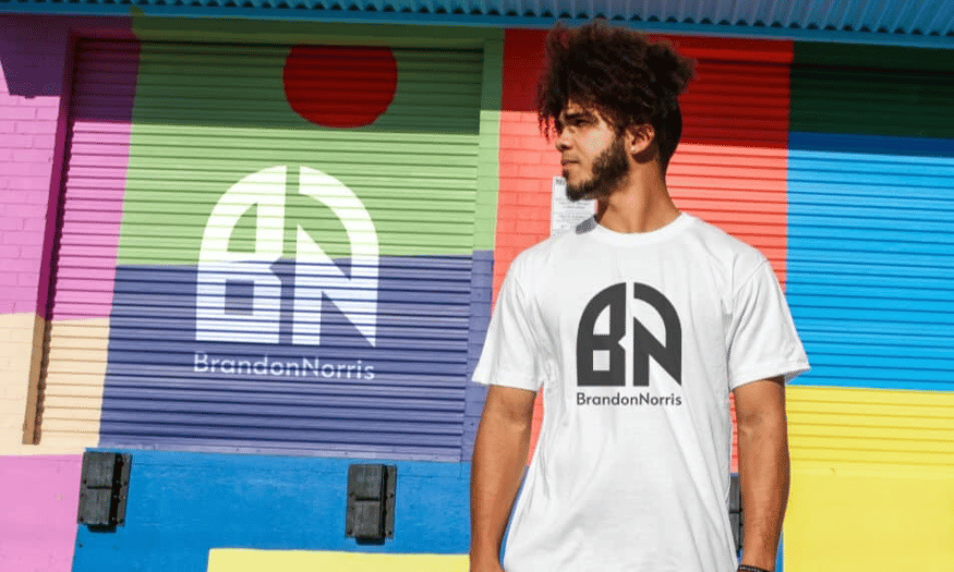
1. What is an interlocking letter logo – Monogram?
An interlocking letter logo, also known as a monogram, is a special type of symbol created from the combination of the first letters in the name of a brand. The term "lettermark" is often used to refer to typography-based designs, with the goal of simplifying and streamlining brand identity. Monograms usually include only 2 to 3 characters, but they have the power to convey a strong and memorable impression. With the development of graphic design, monogram has become an art in expressing the unique identity of a brand.
In the 19th century, interlocking letters became very popular and quickly won the favor of many businesses. From wedding cards to product labels, monograms were widely used to mark intellectual property ownership and affirm brand position. Not merely a symbol, an interlocking letter logo also carries the meaning of luxury, nobility, and class. Famous brands such as Louis Vuitton or Gucci have made use of monograms to express traditional values and personalized style, building a unique and unforgettable image in customers’ minds.
.png)
2. When should an interlocking letter logo – Monogram be used
Designing a logo for a brand is a process that requires careful attention to every detail, and one of the most important principles is always placing customers at the center. A logo not only needs to be aesthetically attractive but also must clearly convey the value of the business. An interlocking letter logo, or monogram, is an ideal choice when you want to create a memorable and appealing mark. The concise and vivid nature of monograms helps a brand stand out from the crowd, thereby attracting attention and creating a long-lasting impression.
2.1 When doing business in the high-end brand segment
When your brand operates in the luxury goods sector, using an interlocking letter logo becomes a smart strategy. A monogram logo not only shows class but also enhances the feeling of personalization for the product. Customers in this segment often look for unique items with their own distinctive mark, from towels to fountain pens. A sophisticatedly designed logo will create a strong connection, making customers feel that they own a special part of the brand.
A typical example is Louis Vuitton, the high-end fashion brand that has skillfully incorporated the monogram into its identity. The logo is not only a symbol but also a part of history, associated with the development of their family through many generations. From there, customers do not just buy a product but also become part of a long story about heritage and luxury.
2.2 When the brand name is too “bulky”
In the case where the brand name is long or difficult to read, an interlocking letter logo can be the perfect solution. With only 2 to 3 letters, a monogram helps simplify the brand name, thereby creating an image that is easier to remember and recognize. This is especially important in a world where people often have only a few seconds to remember a logo.
A clear demonstration of this is the Bang & Olufsen brand, with the logo "B&O". The use of interlocking letters not only makes the brand easy to recognize but also creates a familiar and approachable feeling. Customers can quickly recognize and remember the brand without having to think too much about the full name.
2.3 When wanting to enter the international market
In the context of globalization, creating a logo that is easily recognizable in the international market is a major challenge. Language and cultural barriers can make conveying messages difficult. However, an interlocking letter logo with the first letters in the brand name creates flexibility, helping customers from many cultures easily recognize and connect with the brand.
H&M is a typical example of using a monogram logo to create global recognition. The simple and concise logo of H&M allows this brand to have a strong presence around the world without encountering any language or cultural barriers. This helps the brand build a consistent and memorable image in customers’ minds.
.png)
2.4 When running a family company
Monograms are also very popular in family companies, where each first letter often carries deep meaning. An interlocking letter logo not only shows the presence of a name but also connects family members together. On special occasions such as weddings, using monograms on products such as teapots and cups or gifts has become a tradition, showing love and connection.
When family businesses want to preserve traditional values through many generations, an interlocking letter logo helps build a stable and friendly image. This not only adds value to the brand but also creates empathy with customers, those who seek a connection with the heritage and story behind the brand.
2.5 When not wanting to be bound by limits
Although an interlocking letter logo may seem simple, it allows a brand to grow without being limited by a specific image. When a business wants to expand into many different fields, a monogram will help them maintain consistency in identity without losing their essence. This is extremely important in a highly competitive market, where flexibility and adaptability are the keys to success.
For example, a business specializing in real estate consulting can use an interlocking letter logo to easily expand into other services such as interior design or real estate management. In this way, they not only create a memorable image but also keep the brand fresh and flexible in the face of market changes.
.png)
3. Tips when using an interlocking letter logo – Monogram
Now that you understand what an interlocking letter monogram logo is, here are a few tips to create your own logo! Logo design is not only an art but also a science, requiring refinement and strategy in every step. Below are useful tips to help you build an impressive interlocking letter logo that suits your brand.
3.1 Research a variety of typefaces
One of the factors that determines the success of an interlocking letter logo is the typeface you choose. First, identify the style your brand wants to convey. If you want to evoke a sense of tradition and durability, serif typefaces will be the ideal choice. They often bring a classic and trustworthy feeling, such as the example of the New York Yankees logo, where the two letters “N” and “Y” are stacked on top of each other, creating a strong and memorable image.
On the contrary, if your brand aims for modernity and creativity, consider using a sans serif typeface. These typefaces often bring a clean and dynamic feeling. In particular, you can refer to Michael Schumacher’s logo, where the monogram is designed close to his handwritten signature, creating personalization and uniqueness. The choice of typeface is not simply a matter of aesthetics but also reflects the core values of the brand.
3.2 Choose the representative color for the brand
Colors in a monogram logo are not simply decorative elements; they also carry deep meaning and greatly influence customers’ emotions. Each color has its own message. For example, red often symbolizes enthusiasm and dynamism, as in the CNN logo, where red and white combine to create a strong and trustworthy image. White not only softens the red tone but also expresses purity and integrity.
When choosing colors, consider three things you want the public to feel from your brand. Blue can evoke trustworthiness and sustainability, while green expresses health and freshness. Focusing on 1 to 3 main colors not only helps you create a unique mark but also makes the brand message clearer and easier to understand.
3.3 Test many different layouts
One aspect that is often overlooked when designing a monogram logo is the layout. The layout not only affects the image but also impacts how the public perceives the brand. While many traditional logos have a rectangular form, transforming the layout will help you stand out more. Try placing letters on top of each other or forming a unique shape, like the Yves Saint Laurent logo, with the letters stacked on top of each other, creating a feeling like a connected chain.
Similarly, the Grant Associates logo stacked the letters to create the image of two people shaking hands, symbolizing connection and cooperation. These variations not only make the logo more attractive but also create a strong message about the mission of the brand. Do not hesitate to experiment with different layouts to find the style that best suits the message you want to convey.
.png)
3.4 Make use of empty spaces
Once you have identified the main elements for the logo, consider making use of negative space to create power for your message. Empty space not only makes the logo more refined but also creates a strong impression in customers’ minds. A typical example is Roger Federer’s logo, where empty space is used to shape the first letter in his name, creating an easily recognizable and unique image.
Creativity in using empty space can help your logo become different and more memorable. The human brain has the ability to fill in empty spaces by itself, thereby creating a strong connection with the brand. Try experimenting with empty spaces in your logo design to create unexpected and unique impressions.
3.5 Create hidden meanings
An interlocking letter logo does not necessarily only contain 2-3 letters but can carry many layers of hidden meaning. This creativity not only makes the logo more interesting but also increases brand value in the eyes of the public. Research and consider how your logo can tell a story or convey a profound message.
For example, the LG logo is not merely an interlocking letter logo; when looking closely, people can see the image of a human face, creating friendliness and approachability. Similarly, the FedEx logo has a "hidden" arrow between the letters “e” and “x”, symbolizing speed and efficiency in delivery services. Consider all the elements such as typeface, color, and layout that you have chosen, and see whether they are telling a powerful story about your brand or not. If there are still shortcomings, continue experimenting until you find a perfect design.
.png)
4. The perfect interlocking letter logo creation tool
In the world of graphic design, Photoshop has become an indispensable tool for professional designers. With powerful image editing capabilities and diverse features, Photoshop allows users to create creative products, from simple to complex. Especially when designing an interlocking letter logo (monogram), Photoshop provides many useful tools that help you easily turn ideas into reality, from choosing typefaces to color coordination and layout.
However, to improve the design experience, you should choose Appvip to upgrade the improved version of Photoshop, bringing users more unique and convenient features. When upgrading at Appvip, you will find ready-made interlocking letter logo templates, allowing you to easily customize and personalize them according to your own style. In addition, Appvip also integrates tools that support creating unique type styles, helping you easily create impressive interwoven characters, creating a distinctive mark for the brand.
With Appvip, designing an interlocking letter logo is not merely a task but becomes an exciting creative process. The friendly software interface and smart features help users save time and effort, while also inspiring design creativity. If you are looking for a powerful Photoshop tool to bring your interlocking letter logo ideas to life, upgrading at Appvip is the perfect choice to turn creative ideas into practical and impressive products.
.png)
5. Conclusion
In short, monogram is a powerful tool in building and optimizing the message conveyed by a brand. The combination of art and message in each interlocking letter logo not only helps strengthen recognition but also creates a deep connection with customers. When designed intelligently and creatively, a monogram is not merely a symbol but also an indispensable part of an overall marketing strategy. Therefore, businesses should invest time and resources to develop a suitable monogram, contributing to enhancing brand value and creating a distinctive mark in the market.





















VIP Products








Best Selling Products
Upgrade genuine Capture One account
120 USD
Plugin Retouch4me
69 USD
Adobe Premiere Pro Account
99 USD
ChatGPT Plus Account (GPT-4)
16 USD
Upgrade Duolingo Super
29 USD
Windows 10 & 11 Pro Key
36 USD
MidJourney Account
29 USD
Upgrade Genuine Office 365
49 USD
Genuine Adobe Illustrator account
99 USD
Adobe Photoshop Copyright - Full App
120 USD
Freepik Premium Account
59 USD
Copyright Adobe Lightroom Account
59 USD
Autodesk All App Account Copyright
120 USD
Capcut Pro 1 Year
39 USD
Genuine Cheap Canva Pro
39 USD