Best Selling Products
Genuine Cheap Canva Pro
39 USD

Capcut Pro 1 Year
39 USD
Upgrade genuine Capture One account
120 USD
Plugin Retouch4me
69 USD

Freepik Premium Account
59 USD

Copyright Adobe Lightroom Account
59 USD

MidJourney Account
29 USD
Upgrade Genuine Office 365
49 USD
Autodesk All App Account Copyright
120 USD
Adobe Premiere Pro Account
99 USD

ChatGPT Plus Account (GPT-4)
16 USD
Windows 10 & 11 Pro Key
36 USD
Adobe Photoshop Copyright - Full App
120 USD

Upgrade Duolingo Super
29 USD
Genuine Adobe Illustrator account
99 USD
How to apply the principles of Balance and Visual Hierarchy in design.
Nội dung
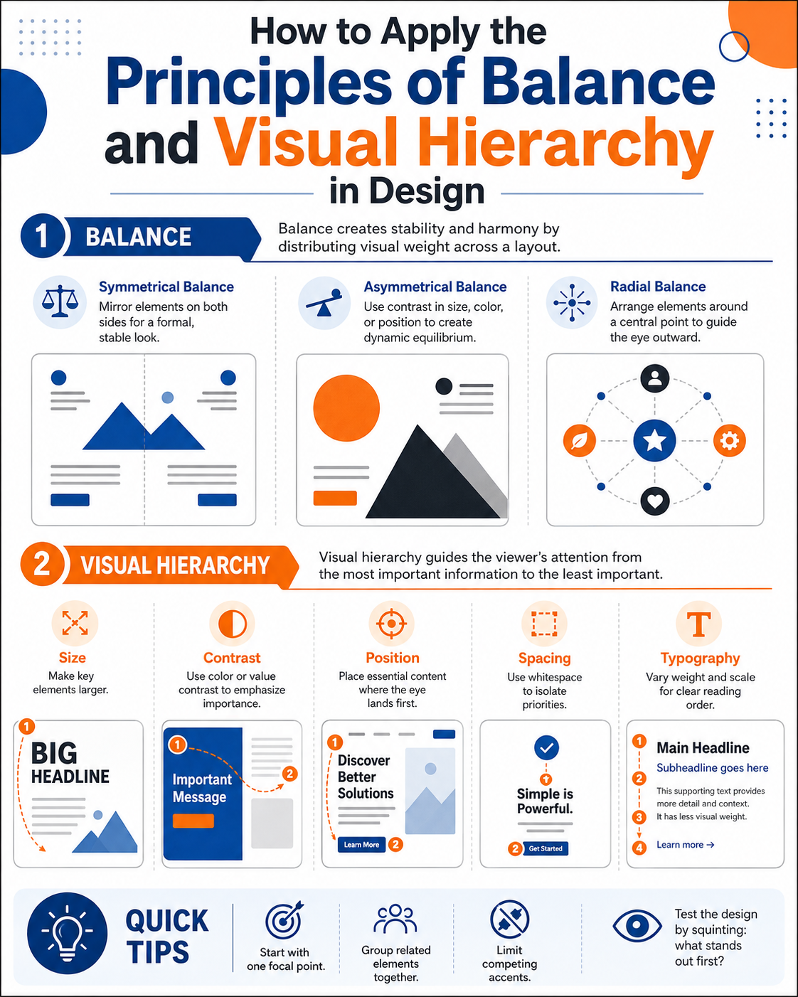
- 1. The principle of balance
- 1.1. Symmetrical Balance
- 1.2. Asymmetrical Balance
- 1.3. Radial Balance
- 1.4. Practical tips for checking balance
- 2. Visual Hierarchy
- 2.1. T1 – Main Title (Heading)
- 2.2. T2 – Subheading
- 2.3. T3 – Body Text
- 2.4. Don't just use size to create hierarchy.
- 3. Incorporate visual balance and hierarchy in design.
- 4. Conclusion
Layout and visual hierarchy are two core principles that help any design become balanced, intuitive, and effectively convey its message.
1. The principle of balance
Have you ever looked at a design and felt like everything was tilted to one side or that something felt too heavy in one corner? While we can't pinpoint the exact problem, our eyes easily perceive the imbalance. This is why the principle of balance is considered one of the most important foundations of graphic design.
You can imagine the layout as a seesaw. Each element, such as images, headlines, paragraphs, icons, colors, or white space, carries a certain "visual weight." When these elements are distributed appropriately, the overall effect is stable and pleasing. Conversely, if one area contains too much detail or striking color while the rest is too empty, the design will become unbalanced and unprofessional.
It's important to note that visual weight isn't solely dependent on size. A small object with vibrant colors or high contrast can sometimes attract more attention than a large image with muted tones. Therefore, designers need to evaluate the overall picture rather than just the size of individual components.
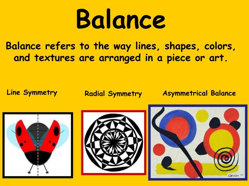
1.1. Symmetrical Balance
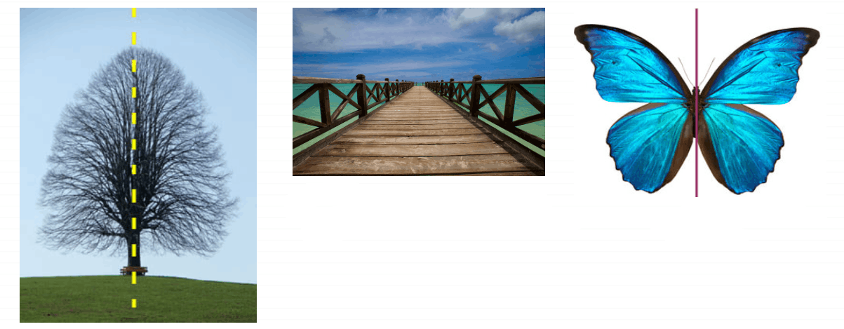
This is the most familiar and easiest type of balance to apply. The components are arranged identically or nearly identically on either side of a central axis.
This type of layout creates a sense of stability, formality, and reliability. Therefore, symmetrical balance often appears in traditional designs such as wedding invitations, certificates, logos, corporate documents, or high-end brands.
The biggest advantage of symmetrical layouts is that they easily convey a sense of order and professionalism to the viewer. However, if overused, the design can become rigid and lack creativity.
1.2. Asymmetrical Balance
Unlike symmetrical composition, asymmetrical balance does not require the two sides to be identical. Instead, elements of varying size, shape, or color are arranged so that the overall visual weight on both sides is equal.
For example, a large image with a muted color palette can be balanced by a small block of text using bold colors and high contrast. This contrast creates a modern, dynamic, and engaging feel.
Today, most advertising banners, websites, landing pages, and social media posts prioritize asymmetrical layouts. This arrangement allows for greater design flexibility, creates strong visual impact, and maintains overall balance.

1.3. Radial Balance
In this type of layout, all elements are oriented towards or radiate from a central point.
Radial balance is commonly found in logo designs, circular infographics, clocks, icons, or layouts that aim to emphasize a central object.
This type of balance creates a very strong visual effect because the viewer's gaze naturally focuses on the center before moving to the surrounding areas.

1.4. Practical tips for checking balance
One very simple method, but one that many designers use, is to squint when observing the design.
When you squint, small details become blurred, leaving only the main areas of light and shadow. If any area is too prominent or too heavy, causing your eye to constantly be drawn to it, the composition is likely unbalanced.
At this point, you can adjust the size, change the color, move the position, or add whitespace to redistribute the visual weight. Just a few small changes can make the overall effect much more harmonious.
2. Visual Hierarchy
If layout is the framework of design, then visual hierarchy is the system of instructions that helps the viewer know where to look first, which section to read next, and where to end.
In reality, users only spend the first few seconds deciding whether to continue viewing a design. If all the information is the same size, color, and level of prominence, the brain won't know which content is most important. As a result, viewers quickly leave because they feel overwhelmed.
Visual Hierarchy helps solve this problem by creating a clear order of priority between components.
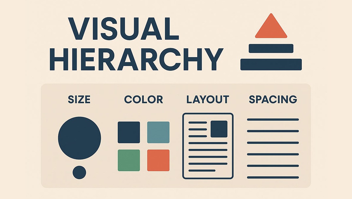
A good hierarchy will guide the viewer's eye in the order the designer intends, from the main title, to supplementary content, and finally to the detailed information or call to action.
2.1. T1 – Main Title (Heading)
This is the most important level in the entire layout.
The headline needs to be the largest, boldest, and usually use the most striking color. T1's goal is to grab attention within the first few seconds.
An effective headline should be concise, easy to read, and convey the main message of the design. If viewers can understand the overall content by reading only the headline, then you have successfully built a hierarchy.
2.2. T2 – Subheading
Once the title grabs attention, the subtitles help to expand on and further explain the information.
The T2 tag is smaller than the title but still prominent enough to create a smooth transition to the content.
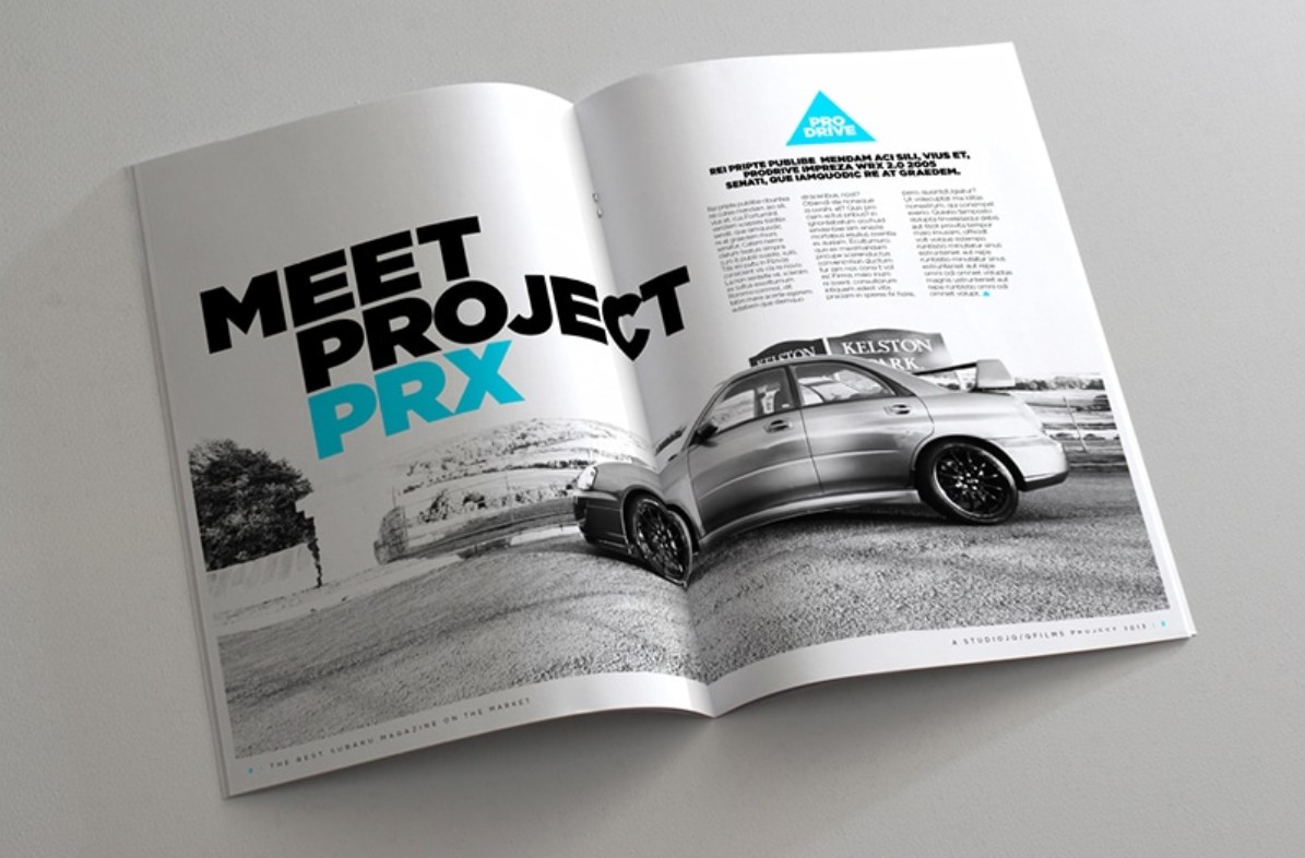
For longer articles, brochures, or landing pages, subtitles also serve to break down the content into smaller sections, making it easier for viewers to scan the information instead of having to read a large block of text.
A clear subtitle system also enhances professionalism and makes the layout more organized.
2.3. T3 – Body Text
This section contains the most information, so the top priority is readability.
You should use simple fonts, moderate sizes, and reasonable line spacing so that readers' eyes don't get tired when following long passages of text.
Adjusting the line height appropriately will make the content look more spacious, while maintaining reasonable character spacing prevents the text from appearing too cramped or too disjointed.
Additionally, avoid using too many fonts or effects such as shadows, borders, and gradients in the body text, as this can reduce readability.
2.4. Don't just use size to create hierarchy.
Many people think that visual hierarchies are created simply by changing the font size. In reality, this is just one of many supporting tools.
Color is a very important factor. Warm colors like red, orange, or yellow tend to attract attention first, while cool colors like blue or gray create a sense of being in the background.
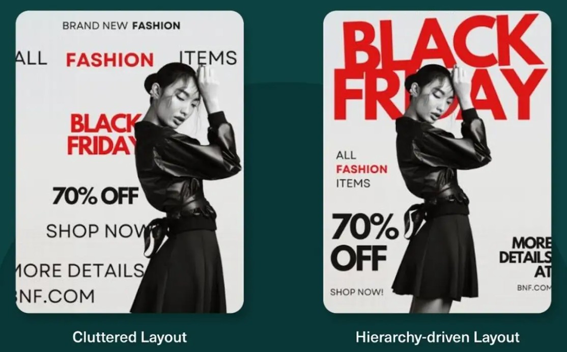
Contrast also directly affects the order of observation. A white headline on a black background will stand out much more than a gray paragraph on a white background.
Position also determines priority. Users tend to scan content in an F-shaped pattern when reading articles or websites with a lot of text. With banners or posters, the gaze usually moves in a Z-shaped pattern, starting from the top left corner, to the right corner, down to the bottom left corner, and ending in the bottom right corner.
Understanding these observational patterns will help you place headlines, images, call-to-action buttons, and key information in the right places to maximize communication effectiveness.
3. Incorporate visual balance and hierarchy in design.
These two principles do not operate independently but always support each other.
A balanced layout without hierarchy will result in all elements having equal prominence. Viewers won't know where to start reading and may easily miss important information.
Conversely, a design with a clear hierarchy but lacking balance will create a feeling of discomfort, instability, and reduced aesthetic appeal.
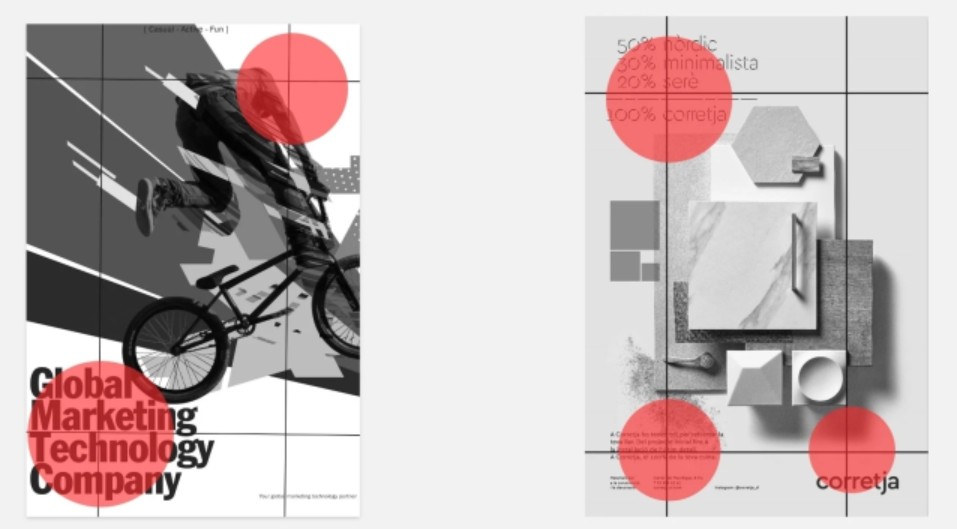
Therefore, in the design process, you should start by building a balanced layout to determine the placement of the main elements. Then, use size, color, whitespace, contrast, and positioning to create a clear visual hierarchy.
When these two principles are combined effectively, viewers will receive information in the desired order without having to search for it. This is what makes a design more intuitive, professional, and capable of conveying its message more effectively.
4. Conclusion
Always remember that a beautiful design isn't about having the most effects, but about naturally guiding the viewer's gaze. By knowing how to distribute visual weight, choose appropriate layouts, and build a logical information hierarchy, you'll create products that are not only attractive but also effectively convey the message, enhance the user experience, and contribute to building a professional brand image.
















VIP Products



Best Selling Products
Genuine Cheap Canva Pro
39 USD
Capcut Pro 1 Year
39 USD
Upgrade genuine Capture One account
120 USD
Plugin Retouch4me
69 USD
Freepik Premium Account
59 USD
Copyright Adobe Lightroom Account
59 USD
MidJourney Account
29 USD
Upgrade Genuine Office 365
49 USD
Autodesk All App Account Copyright
120 USD
Adobe Premiere Pro Account
99 USD
ChatGPT Plus Account (GPT-4)
16 USD
Windows 10 & 11 Pro Key
36 USD
Adobe Photoshop Copyright - Full App
120 USD
Upgrade Duolingo Super
29 USD
Genuine Adobe Illustrator account
99 USD