Best Selling Products

Freepik Premium Account
59 USD

Autodesk All App Account Copyright
120 USD

MidJourney Account
29 USD

Capcut Pro 1 Year
39 USD

Genuine Adobe Illustrator account
99 USD

Adobe Photoshop Copyright - Full App
120 USD

Upgrade genuine Capture One account
120 USD

Plugin Retouch4me
69 USD

Adobe Premiere Pro Account
99 USD

Upgrade Genuine Office 365
49 USD

Windows 10 & 11 Pro Key
36 USD

Upgrade Duolingo Super
29 USD

Genuine Cheap Canva Pro
39 USD

ChatGPT Plus Account (GPT-4)
16 USD

Copyright Adobe Lightroom Account
59 USD
What are Serif and Sans Serif fonts? How to choose the right font for any design.
Nội dung
- 1. Learn about Serif and Sans Serif
- 2. Serif Fonts: Symbols of tradition and professionalism
- 3. Sans Serif Fonts: Modern, minimalist, and versatile.
- 4. When should you choose Serif fonts and when should you choose Sans Serif fonts?
- 5. Should Serif and Sans Serif fonts be combined in the same design?
- 6. SaDesign's perspective on font selection
- 7. Conclusion
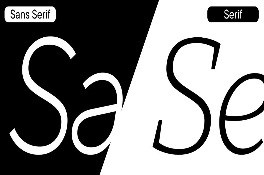
Serif and Sans Serif fonts are two popular font groups that play a crucial role in shaping style and enhancing the effectiveness of conveying the message in each design.
1. Learn about Serif and Sans Serif
Before choosing a font, the most important thing is to understand the characteristics of each group.
Serif fonts are a group of fonts that have small strokes appearing at the beginning or end of each letter. These details are often referred to as "letter feet." According to many studies on the history of typography, serif strokes may have originated from the process of writing with a brush or carving letters on stone, and then gradually became a familiar part of type design.
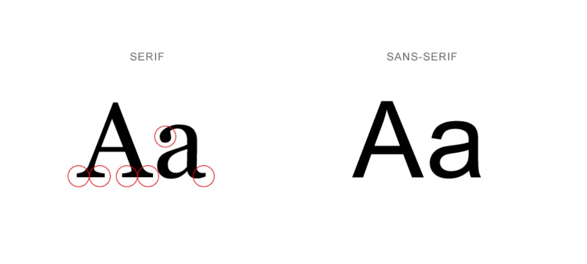
Familiar fonts belonging to the Serif group include Times New Roman, Garamond, Georgia, and Baskerville. These are all typefaces that appear frequently in books, newspapers, academic documents, and long-established brands.
Conversely, Sans Serif, as its name suggests, is a group of fonts without serifs. The characters are designed more simply with clean, decisive, and modern lines. Helvetica, Arial, Futura, Inter, and Montserrat are all prominent representatives of the Sans Serif group.
Although they differ only in very minor details, these two font groups evoke completely different emotions when they appear in a design.
2. Serif Fonts: Symbols of tradition and professionalism
One of the reasons Serif has endured for centuries is its ability to convey a sense of prestige and trustworthiness.
When people see a serif font, they often associate it with history, experience, and professionalism. This is also why many well-known newspapers, long-established publishers, and educational institutions still prefer to use this font group in their branding systems.
Serif fonts not only offer aesthetic value but also improve readability in printed documents. The small strokes make it easy for readers to distinguish the shape of each character, while also creating a seamless feel as the eye moves across lines of text. Therefore, books, magazines, and documents with a lot of content often use serif fonts for the main text.
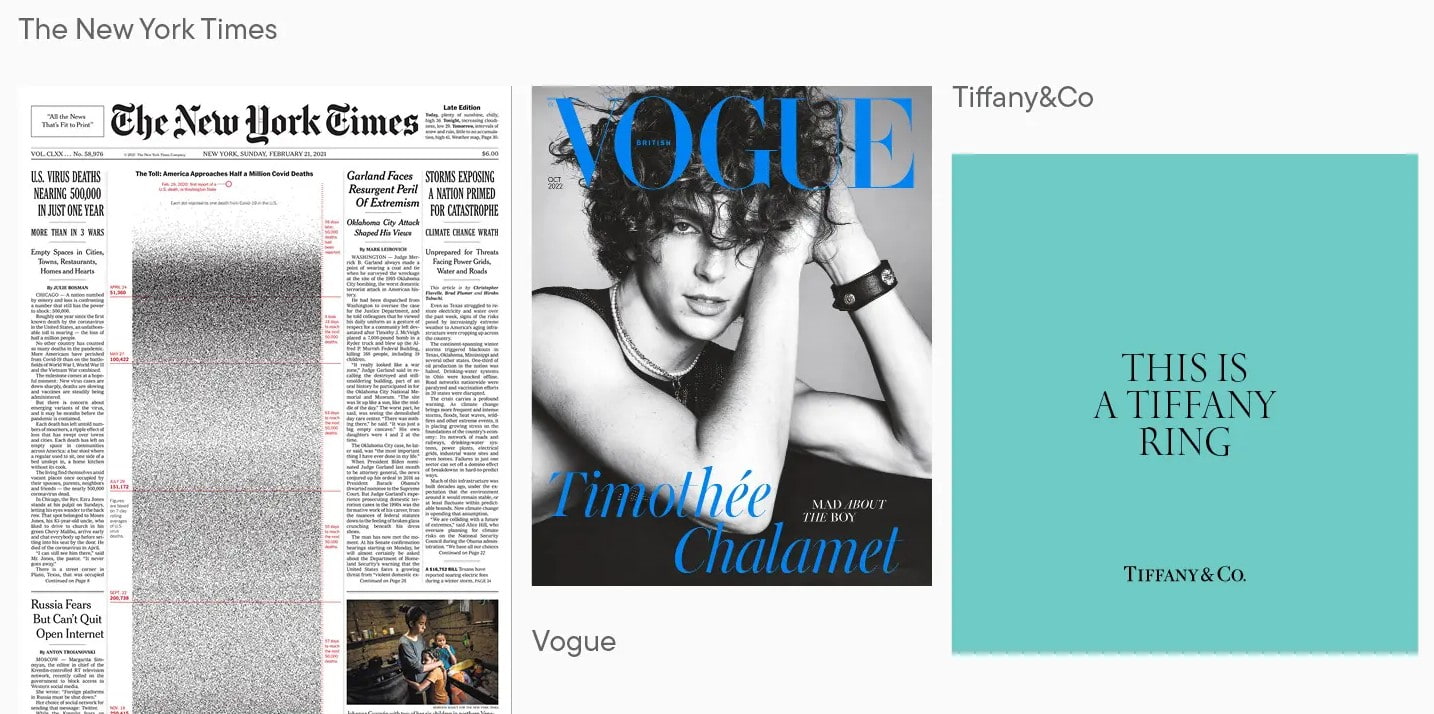
In design, Serif is particularly well-suited to fields such as finance, law, education, high-end real estate, luxury fashion, or brands that want to convey traditional values and prestige.
However, serif fonts aren't always the best option. If used at a size that's too small on some low-resolution screens or in interfaces that need to display a lot of concise information, the serifs can make the text less clear.
3. Sans Serif Fonts: Modern, minimalist, and versatile.
If Serif represents tradition, then Sans Serif is the epitome of modern design.
Sans Serif fonts gained significant popularity in the 20th century and quickly became a favorite choice for minimalist designers. Their clean lines give them a youthful, dynamic, and approachable feel.
Today, the majority of websites, mobile applications, and software interfaces use Sans Serif fonts. This is because this font group displays very well on screens, especially at small sizes or in digital environments.
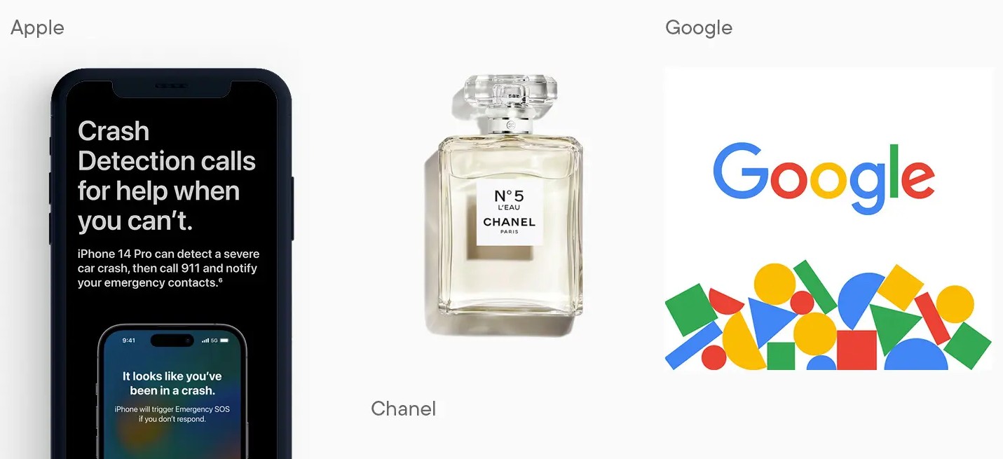
Adobe also argues that Sans Serif is particularly well-suited for website design, applications, signage systems, maps, and other spaces where users need to read quickly in a short amount of time. Fonts like Helvetica or Clearview are designed to ensure readability from a distance or across various screen sizes.
In addition to its advantages in display capabilities, Sans Serif is also very versatile in many different design styles, from technology, startups, e-commerce to social media or online advertising.
4. When should you choose Serif fonts and when should you choose Sans Serif fonts?
No font group is inherently better than another. The important thing is to choose one that suits your communication goals.
If you're designing a book, magazine, research paper, or a brand that wants to convey elegance and longevity, serif fonts are a sensible choice. The clean lines enhance the sense of formality and inspire confidence at first glance.
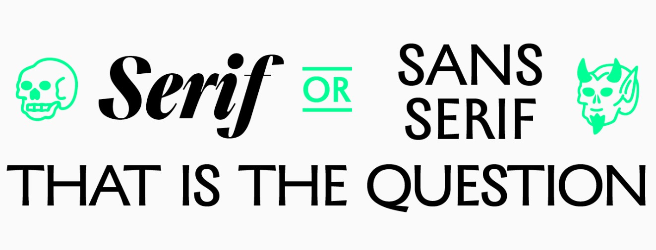
Meanwhile, if the project focuses on digital experiences such as websites, apps, landing pages, or advertising banners, Sans Serif fonts often deliver better results. This font style is clear, easy to read, and suits the modern style that most brands pursue today.
Besides the display environment, you also need to consider your target audience. A high-end fashion brand might choose Serif to create a sophisticated look, while a tech startup often prefers Sans Serif to convey innovation and dynamism.
5. Should Serif and Sans Serif fonts be combined in the same design?
The answer is absolutely yes, if you know how to combine them.
One of the typography principles widely applied by designers is the use of Serif and Sans Serif fonts to create visual contrast. For example, you can use Serif fonts for the headline to create emphasis, while using Sans Serif fonts for the body text ensures readability.
Conversely, many brands also use Sans Serif for headlines to create a modern look, while using Serif in quotes or emotionally charged content to add depth to the design.
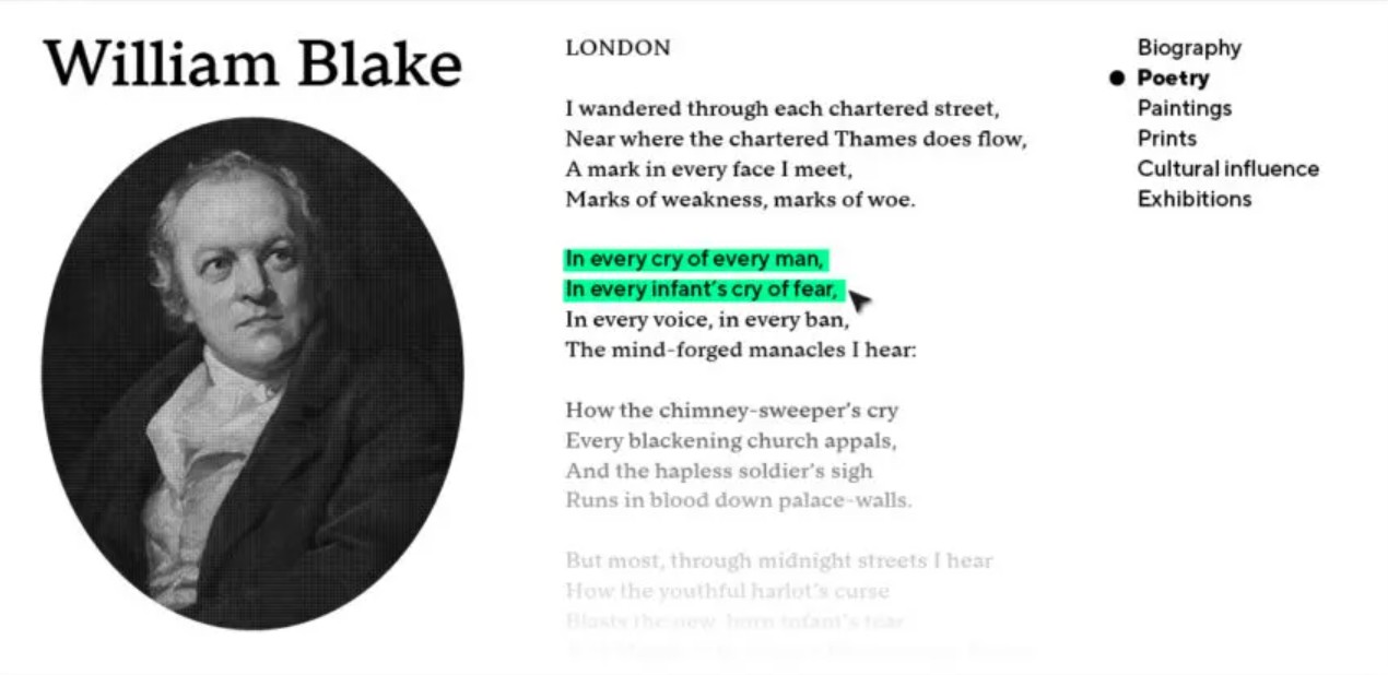
It's important to note that you shouldn't combine too many fonts in the same layout. Two fonts that are too strong or too similar can detract from the visual impact. Prioritize font pairs that are sufficiently different but still maintain overall harmony.
6. SaDesign's perspective on font selection
At SaDesign, we believe that font selection shouldn't begin with the question "which font is prettier?" but rather with the question "which font is more suitable?".
Each project has different communication goals, target customers, and usage contexts. A technology website will have completely different requirements compared to a brand identity for a luxury hotel or a book publisher.
Instead of blindly following trends, designers should consider multiple factors simultaneously, such as brand personality, display environment, readability, user experience, and consistency across the entire brand identity system. Only when these elements are harmoniously combined can typography truly fulfill its role in conveying the message and enhancing the design value.
7. Conclusion
Serif and Sans Serif fonts are not competing font groups, but rather tools serving different purposes. Serif fonts convey a sense of tradition, professionalism, and reliability, while Sans Serif fonts represent modernity, minimalism, and versatility across digital platforms. The choice between the two font groups depends more on brand messaging, target audience, and usage environment than on design trends.
For designers, understanding the characteristics of each font group will help them make more accurate decisions in each project. Instead of choosing fonts based on intuition, build a typography system that suits the brand and user experience. This is also the approach SaDesign always applies in the process of consulting and building professional design solutions, helping clients create products with high aesthetic value and effectively convey their message.





















VIP Products








Best Selling Products
Freepik Premium Account
59 USD
Autodesk All App Account Copyright
120 USD
MidJourney Account
29 USD
Capcut Pro 1 Year
39 USD
Genuine Adobe Illustrator account
99 USD
Adobe Photoshop Copyright - Full App
120 USD
Upgrade genuine Capture One account
120 USD
Plugin Retouch4me
69 USD
Adobe Premiere Pro Account
99 USD
Upgrade Genuine Office 365
49 USD
Windows 10 & 11 Pro Key
36 USD
Upgrade Duolingo Super
29 USD
Genuine Cheap Canva Pro
39 USD
ChatGPT Plus Account (GPT-4)
16 USD
Copyright Adobe Lightroom Account
59 USD