Best Selling Products

Autodesk All App Account Copyright
120 USD

Upgrade Duolingo Super
29 USD

Upgrade genuine Capture One account
120 USD

Plugin Retouch4me
69 USD

Copyright Adobe Lightroom Account
59 USD

Genuine Cheap Canva Pro
39 USD

Adobe Photoshop Copyright - Full App
120 USD

MidJourney Account
29 USD

Windows 10 & 11 Pro Key
36 USD

Upgrade Genuine Office 365
49 USD

ChatGPT Plus Account (GPT-4)
16 USD

Freepik Premium Account
59 USD

Capcut Pro 1 Year
39 USD

Genuine Adobe Illustrator account
99 USD

Adobe Premiere Pro Account
99 USD
What is kerning in typography? When should you adjust the spacing between characters?
Nội dung
Kerning is one of the important techniques in typography, helping to adjust the spacing between pairs of characters to make the text more balanced and easier to read.
1. What is Kerning?
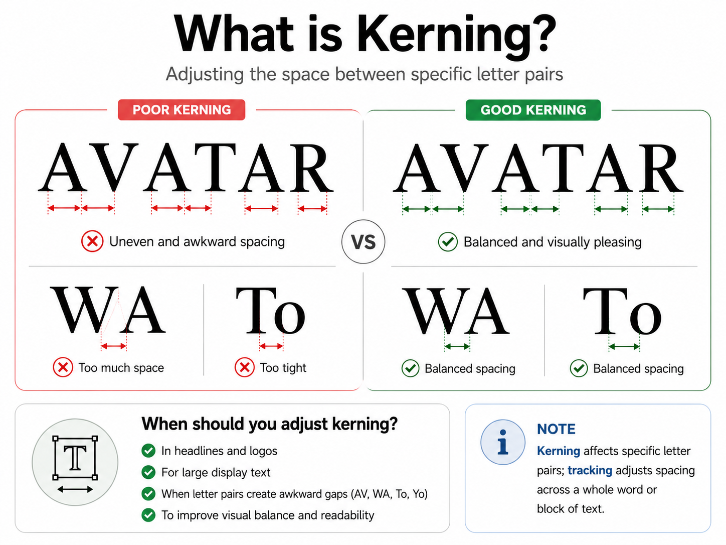
Kerning is the process of adjusting the spacing between individual pairs of characters to create visual balance and improve readability. Unlike Tracking, which adjusts the spacing uniformly across an entire word or paragraph, Kerning focuses on specific pairs of characters to address gaps that aren't harmonious.
Each font comes with built-in kerning parameters (Metrics Kerning) for common character pairs. When working in software like Adobe Illustrator, Photoshop, or InDesign, the system automatically applies these parameters to create the default spacing between letters. However, these settings are not always suitable for every size, layout, or purpose.
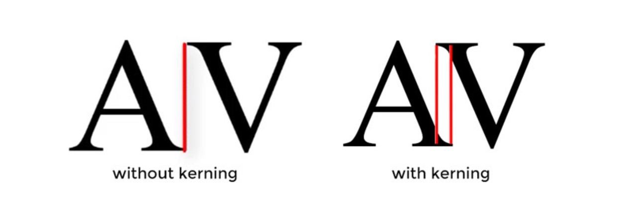
In practice, when designing logos, large headlines, posters, or using free fonts that aren't well-optimized, you often need to manually adjust kerning to create better balance. The important thing is that kerning isn't based on measured distances but on visual perception. Two distances with the same numerical value can still feel different due to the different shapes of individual characters.
Simply put, kerning is the process of balancing the whitespace between characters so that the entire word or sentence looks more coherent and harmonious. This is a small operation, but it can make a significant difference between a polished design and one that lacks sophistication.
2. How is Kerning different from Tracking?
Kerning and tracking are both tools that help adjust the spacing between characters, but they serve two completely different purposes.
Tracking is the process of increasing or decreasing the spacing evenly between all the characters in a word, sentence, or paragraph. This tool is often used to make text more spacious and easier to read, or to narrow the spacing to fit a layout while maintaining consistency.
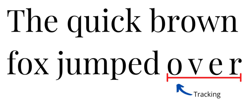
Meanwhile, Kerning only affects pairs of adjacent characters. For example, the letters "AV" often have a larger gap than usual because the two diagonal strokes don't fill the space between them. If you only adjust Tracking, the spacing of the entire word will change, potentially affecting pairs of characters that are already well-proportioned. Kerning allows you to adjust only the "AV" pair or pairs like "WA", "To", "Yo" to achieve harmony without affecting the remaining characters.
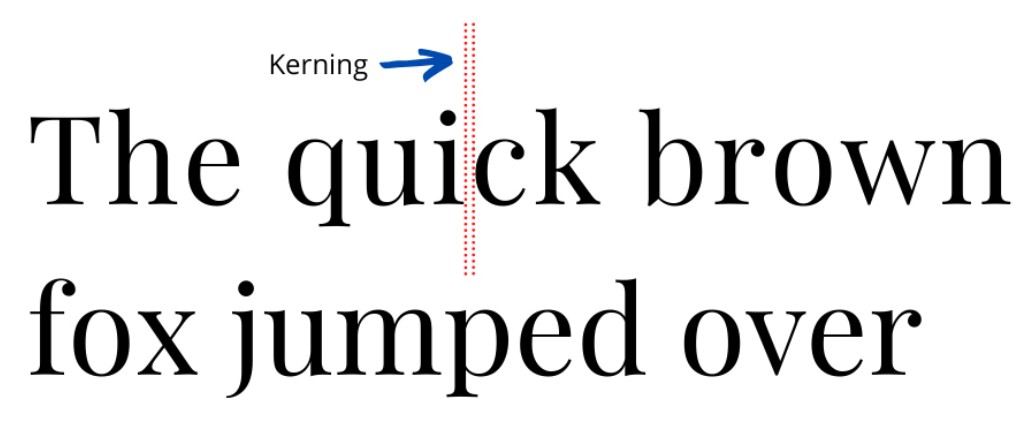
In their workflow, many designers will first adjust the tracking to create the appropriate text density for the layout, and then fine-tune the kerning where necessary. Combining these two tools will help create a more balanced and professional typography.
3. Why is Kerning important?
Kerning plays a crucial role in creating visual rhythm and improving text readability. When the spacing between characters is too close, the letters can blend together, making it difficult for the reader to identify each character. Conversely, if the spacing is too wide, the characters will be separated, reducing the coherence of the word and making reading feel unnatural.
For large headlines, logos, slogans, banners, or posters, kerning becomes even more important because small white spaces become more apparent when the font size is enlarged. Simply adjusting the spacing between a few characters can make the overall design much more balanced and professional.
Kerning not only improves readability but also contributes to building brand image. Most famous logos have carefully adjusted spacing between characters to create a harmonious feel, increase memorability, and demonstrate attention to detail. This is also one of the factors that distinguishes a professional design from one created too quickly or not thoroughly refined.
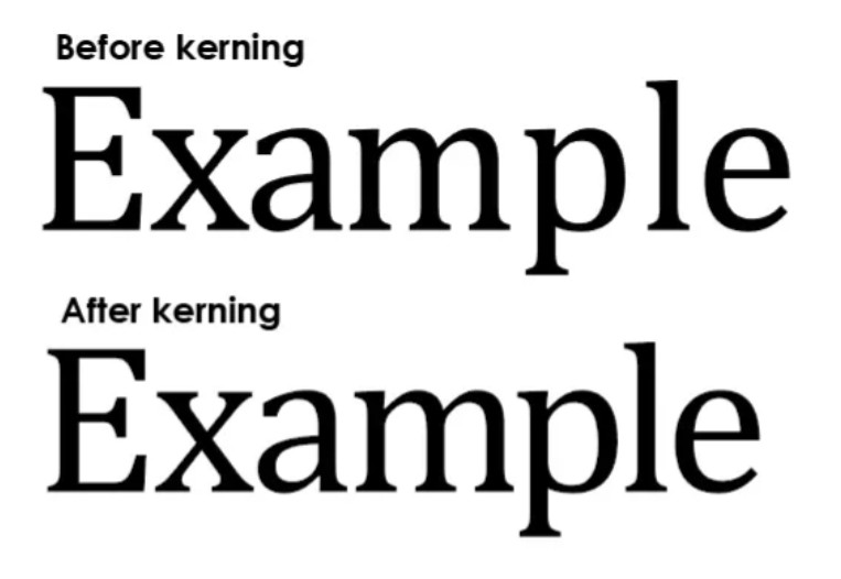
4. When should you adjust Kerning?
You don't always need to adjust the kerning manually. For typical text using high-quality fonts, the default kerning settings usually meet display needs and provide stable readability.
However, you should check and adjust kerning when designing logos, large headlines, posters, banners, product packaging, or publications where typography plays a key role. When font sizes are enlarged, inappropriate spacing between characters will easily become apparent and needs to be adjusted to ensure balance.
Furthermore, if using free fonts or fonts that haven't been well optimized, checking the kerning becomes even more necessary because the spacing between characters may not be perfectly uniform. During the design process, you should also zoom in and out of the content at different sizes to observe the overall effect. This is a simple way to detect unusual whitespace before exporting the file or delivering the product.
Taking a few extra minutes to check the kerning can help refine the typography, enhancing the overall aesthetics and professionalism of the design.
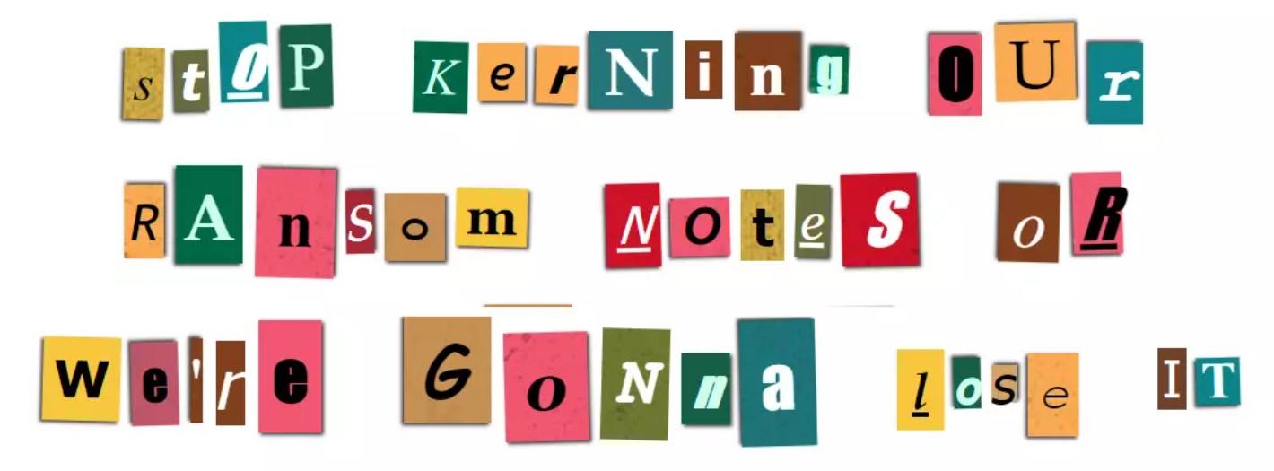
5. Character pairs that often require Kerning adjustments
Not all pairs of characters have spacing issues. However, some letters with unusual shapes often create unusually large or small spaces, causing the overall word or sentence to lose its visual balance.
Characters with diagonal strokes like A, V, W, Y , or T are the most common ones that need to be checked. When placed next to each other or combined with other letters, they often create larger gaps than regular character pairs. For example, pairs like AV , VA , WA , To , Yo , or Ta are prone to uneven spacing if only using the font's default settings.
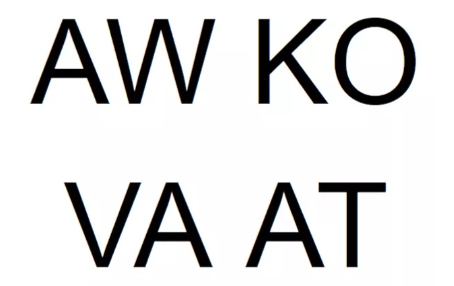
Additionally, words that combine uppercase and lowercase letters should be carefully considered, especially with serif fonts. In many cases, the spacing after the first capital letter or between characters of different heights needs to be adjusted to create a more balanced feel.
When performing kerning, instead of focusing on each individual character, observe the spacing between them. The goal isn't to make every space have the same numerical value, but rather to create a visually uniform feel. This holistic approach will help the typography appear more natural, harmonious, and professional.
6. Tips for effective kerning exercises
Kerning is a skill that relies heavily on the designer's observational skills and intuition. There is no single formula that can be applied to every font or every project, as each typeface has different characteristics and proportions.
A simple but effective method is to focus on only two characters at a time. When observing each pair of letters separately, you'll find it easier to spot unusual spaces than when looking at an entire word or paragraph. After adjusting each pair, step back to check the overall structure to ensure the entire line of text remains balanced.
Additionally, don't hesitate to zoom in and out of the design at various sizes. A line of text might look great on a screen but have awkward spacing when printed in large format or displayed at small sizes. Testing at multiple scales will help you more accurately assess the quality of the kerning.
Another tip is to ask a colleague or someone else to review the design. After working on the same product for too long, our eyes become accustomed to the current layout and find it difficult to spot small errors. A fresh perspective will help identify inconsistencies that you may have overlooked.
7. Conclusion
Kerning is a small technique but has a huge impact on the effectiveness of typography. Adjusting the spacing between pairs of characters not only makes the text easier to read but also creates balance, sophistication, and professionalism for the entire design. In many cases, this is the factor that differentiates an ordinary product from a highly aesthetic design.
For designers, investing time in honing observation skills and practicing kerning will yield long-term benefits in any creative project. Consider kerning an indispensable step in the typography refinement process. When each character is positioned correctly, the brand message will be conveyed more clearly, and the viewer's visual experience will be more complete.





















VIP Products








Best Selling Products
Autodesk All App Account Copyright
120 USD
Upgrade Duolingo Super
29 USD
Upgrade genuine Capture One account
120 USD
Plugin Retouch4me
69 USD
Copyright Adobe Lightroom Account
59 USD
Genuine Cheap Canva Pro
39 USD
Adobe Photoshop Copyright - Full App
120 USD
MidJourney Account
29 USD
Windows 10 & 11 Pro Key
36 USD
Upgrade Genuine Office 365
49 USD
ChatGPT Plus Account (GPT-4)
16 USD
Freepik Premium Account
59 USD
Capcut Pro 1 Year
39 USD
Genuine Adobe Illustrator account
99 USD
Adobe Premiere Pro Account
99 USD