Best Selling Products
How to create a Trainspotting movie poster in your own style
Nội dung
- 1. Unique symbolism of the Trainspotting movie poster
- 2. Setting up a Trainspotting movie poster in Indesign
- 3. Add Text to the Trainspotting Movie Poster
- 4. How to Edit Photos for Your Trainspotting Poster
- 5. How to Add Characters to a Trainspotting Movie Poster in Your Style
- 6. How to Add Vintage Textures to a Trainspotting Movie Poster in Your Style
- 7. How to Create a Character Poster
The 1996 film Trainspotting, directed by Danny Boyle, made a strong impression when it realistically portrayed the lives of a group of heroin addicts in Edinburgh. Viewers were also attracted by the movie poster itself. Now you can also create your Trainspotting movie poster in your own style using tools on InDesign and Photoshop. Let's refer to the instructions below with Sadesign.
1. Unique symbolism of the Trainspotting movie poster
To be able to create a Trainspotting movie poster in your own style, we first need to know about the unique features of this poster.
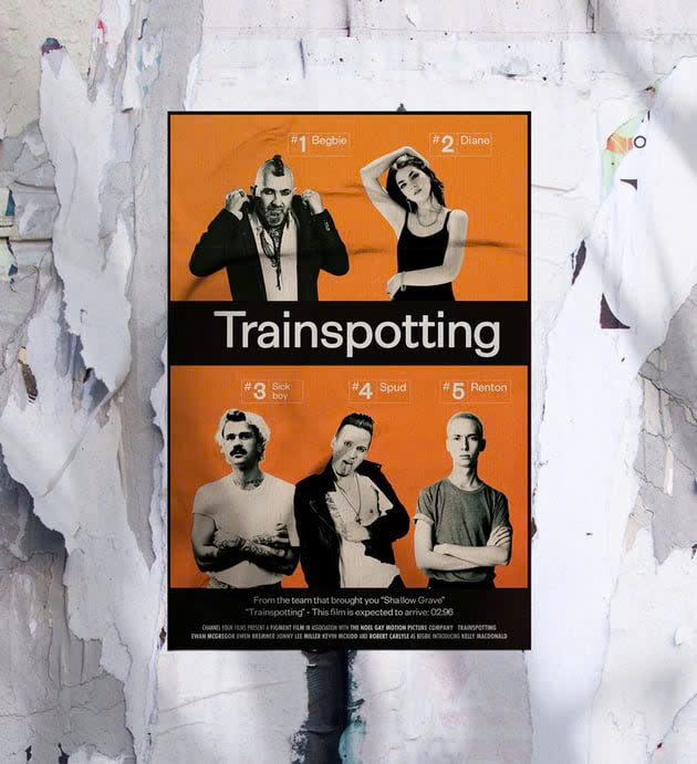
The Trainspotting movie poster was designed by Mark Blamire and Rob O'Connor of the London-based company Stylorouge. The poster was originally intended to remind viewers of train schedules and warnings on medical packaging.
It uses Helvetica as the title font - a bold font often used on billboards. The black, white and bright orange color scheme helps to emphasize the time theme of the campaign. Collage-style shots of the actors were added to the poster to help market the film.
.jpg)
Today, the Trainspotting poster remains one of the most iconic film poster designs of the 20th century. It is particularly notable for its simplicity, as well as its memorability, which makes it a powerful impact on viewers.
How to Create a Trainspotting Movie Poster in Your Style
In this article, we will use Adobe InDesign to set up the poster layout and Adobe Photoshop to edit the photos.
The resources you will need for this design are:
Extensa Grotesk font
Texture Paper Texture Bundle, Film Grain Texture Bundle.
Character photos: a punk-style man, a genderless man, a posing girl, a blond man, a man in a leather jacket.
You can also try using your photos and those of your friends. Now let's get started creating the poster.
2. Setting up a Trainspotting movie poster in Indesign
Step 1: Open InDesign and go to File => New => Document to create a new document. Set the Width of the document to 27 in and Height to 40 in to create a standard movie poster size.
.jpg)
Set the Margins to 0.5 in and add a Bleed of 0.25 in before clicking Create.
.jpg)
Step 2: Go to the Layers panel and create 4 new layers, named in order: Background, Images, Type and Paper Texture at the top. Lock all layers except the Background layer, as we will be working on them first.
.jpg)
Step 3: Next, we will create some color swatches to use on our Trainspotting poster. Go to Window => Color => Swatches and select New Color Swatch from the panel menu.
We will be creating a digital poster to post online, so we will create RGB versions of the swatches. If you want to create a poster for print, simply enter the RGB values below, then convert the Color Mode of the swatches to CMYK.
The first swatch is an opaque white, R=231 G=232 B=234. Create three more swatches: R=17 G=7 B=6 (opaque black), R=242 G=104 B=5 (orange), and R=243 G=131 B=3 (light orange).
.jpg)
Then select New Gradient Swatch from the Swatches panel menu.
.jpg)
Name the swatch Orange Gradient and click the left stop on the Gradient Ramp, setting it to orange. Click the right stop and set it to pale orange. Click Add and OK.
.jpg)
Step 4: While working on the Background layer, use the Rectangle Tool (M) to create a shape across the entire page, setting the Fill to opaque black.
.jpg)
Create a second, smaller rectangle so that there is a small black border around the edge of the poster. Set the Fill to Orange Gradient.
.jpg)
Create two more rectangles, the narrower ones can be positioned below and just above the center of the layout. Set their Fill to opaque black as shown.
.jpg)
3. Add Text to the Trainspotting Movie Poster
Step 1: Lock the Background layer and unlock the Type layer.
Use the Type Tool (T) to create a large text frame at the top of the central black bar. Type the title of the movie and set the font to Exensa Grotesk Bold, around 307 pt. Set the Font Color to opaque white.
.jpg)
Step 2: Create two more wide text frames and place them at the bottom of the poster, above the bottom black bar. The top text frame can contain the tagline for the movie, set in Exensa Grotesk.
The bottom frame can contain the credits. Set them to Futura Condensed or a sans serif typeface.
.jpg)
Step 3: To create character labels for each actor, use the Rectangle Tool (M) to create a small rectangle with no fill and an opaque white Stroke Color. Set the stroke Weight to about 1.4 pt.
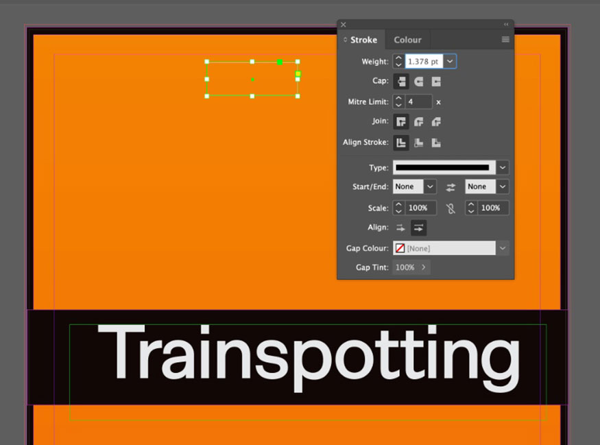
Add a vertical line about 1/3 of the way up the shape using the Line Tool (\), setting the Weight to about 0.9 pt.
.jpg)
Use the Type Tool (T) to create text frames that fit into each section of the frame. The first frame reads “#1” and the second frame reads “Begbie”. Set the font of these frames to Exensa Grotesk Bold with an opaque white Font color.
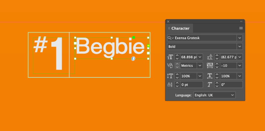
Step 4: Select the rectangle, vertical line and two text frames, then right-click => Group.
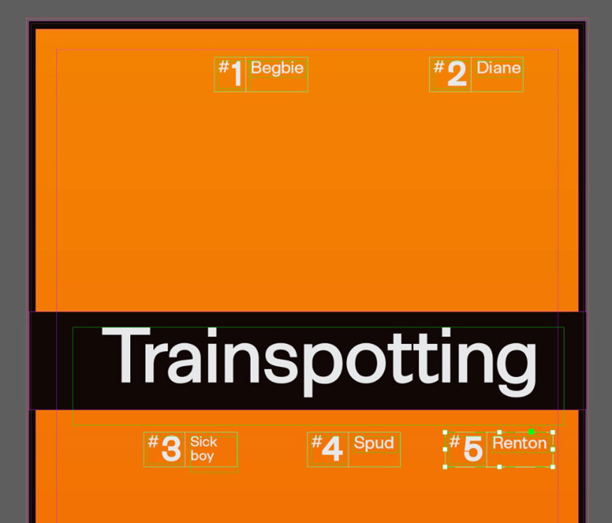
Now you can Edit => Copy, Edit => Paste this group to create more character labels. Scatter them around the poster layout, two labels above the title and three labels below, edit the number and character name.
4. How to Edit Photos for Your Trainspotting Poster
Once you have downloaded enough character images for your poster, you can easily edit them to make them look more stylish.
Step 1: Now, go to File => Save your InDesign document and minimize the window. Open your first image in Photoshop, from the Layers panel, duplicate the Background layer. Lock the original Background layer and turn off its visibility.
Select the Object Selection Tool (W) and click Select Subject from the control panel at the top. When you hover over a subject in the image, Photoshop will automatically select it.
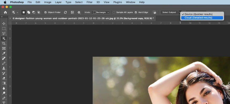
To refine the selection, click Select and Mask in the Controls panel at the top. In the Properties window that opens, check Smart Radius and move the Radius and Shift Edge sliders until you are happy with the result. Click OK to exit.
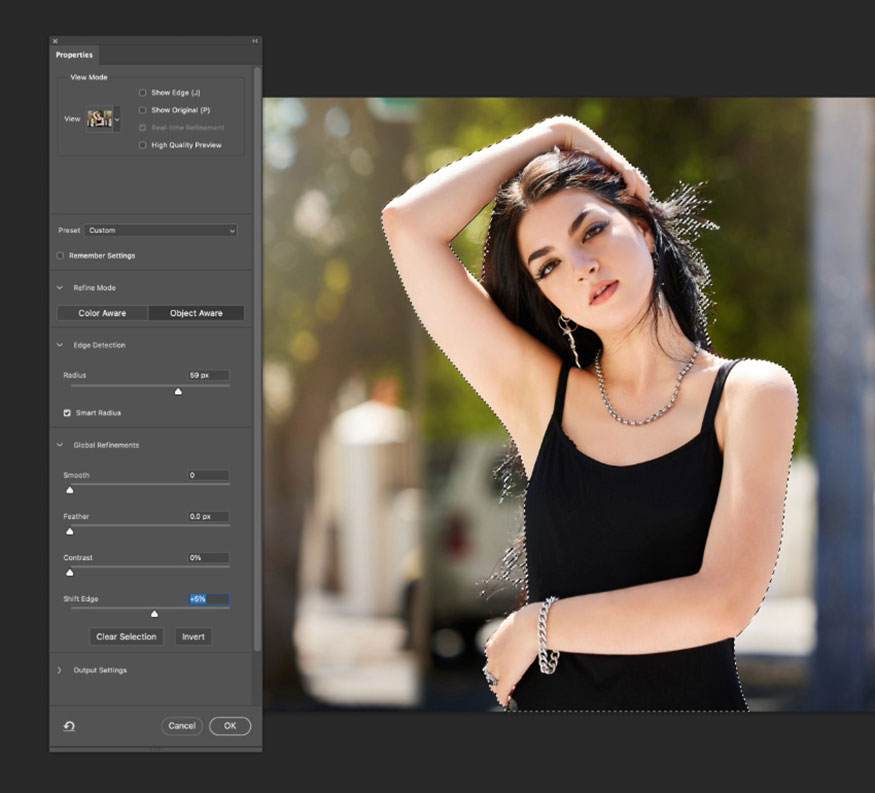
Copy and paste the selected subject into a new layer, then turn off the visibility of the layers below.
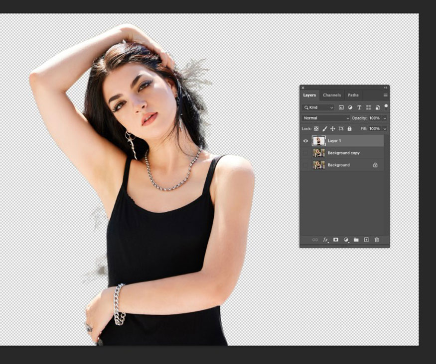
Step 2: In this image, I want to remove excess hair to keep the image looking clean and collage-like. Duplicate sections using the Lasso tool (L) and erase them to keep a strong silhouette.
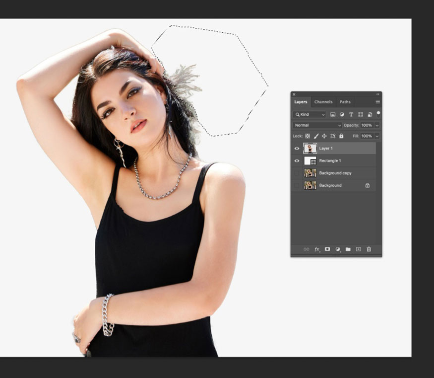
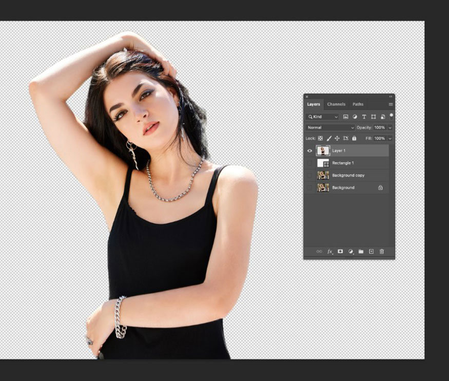
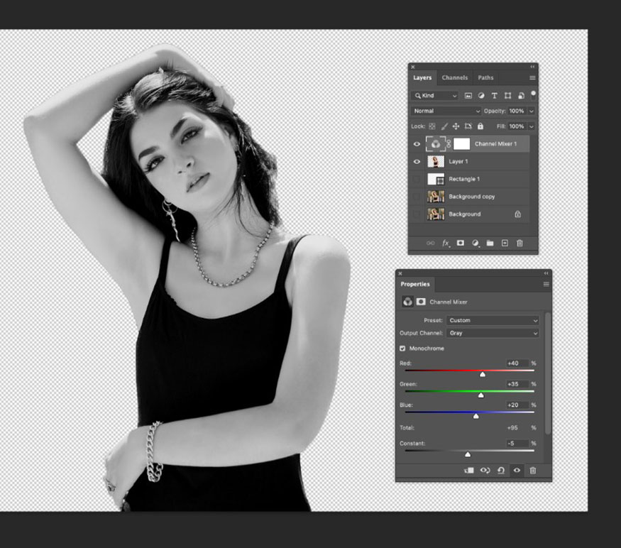
Step 3: Make sure all the layers below the isolated subject at the top are turned off. Then, select the Channel Mixer option from the Adjustment Layer menu at the bottom of the Layers panel. Check the Monochrome option in the panel that opens to convert the image to black and white.
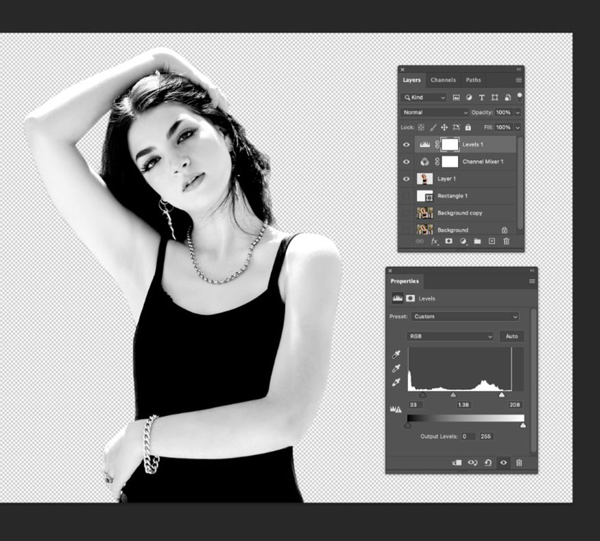
Step 4: To improve the contrast in the image, add a new Levels adjustment layer. Drag the light and dark sliders inwards to increase the contrast, resulting in a black and white image rather than a greyscale one.
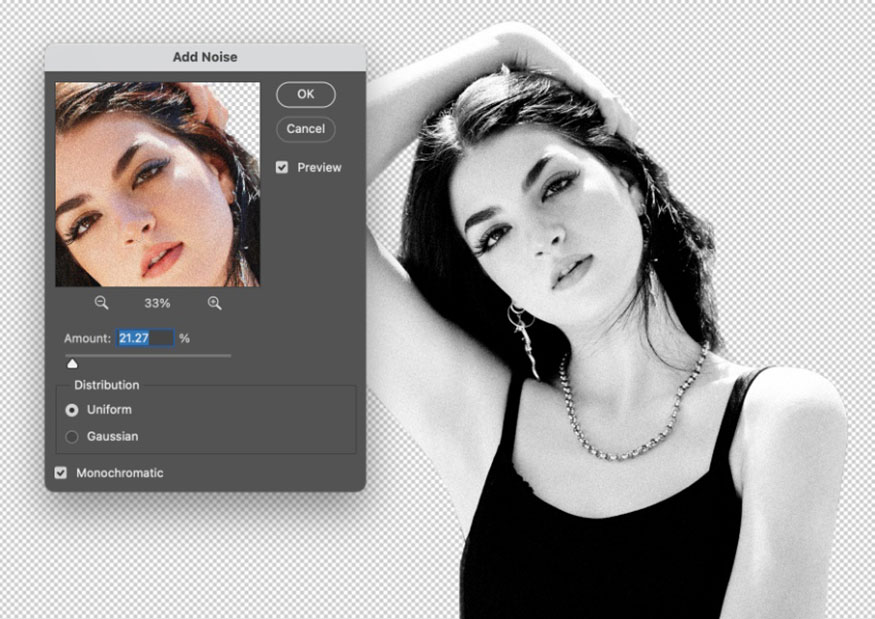
Finally, we can add a bit of vintage texture to the image by adding some noise. Go to Filter => Add Noise. Increase the Amount to around 20% and click OK.
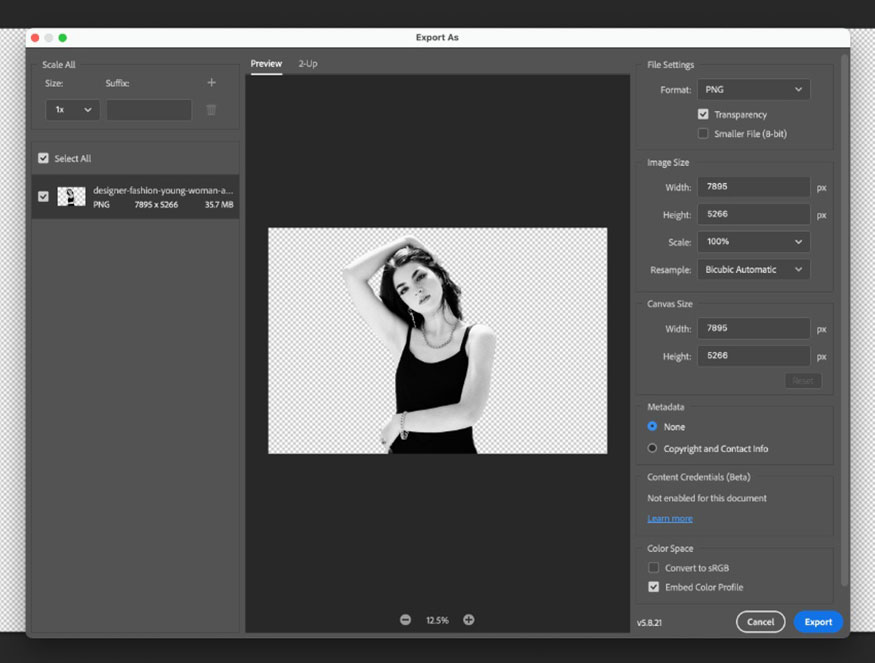
Step 5: After editing the image, go to File => Export As. Select PNG from the Format option and make sure that Transparency is selected. Then click Export.
Repeat the above five-step process with all five of your remaining character images.
5. How to Add Characters to a Trainspotting Movie Poster in Your Style
Once you have your characters isolated and edited, we're ready to add them to the poster.
Step 1: Go back to your InDesign poster and unlock the Images layer.
Use the Rectangle Frame Tool (F) to create an image frame in the upper left corner of the poster above the movie title.
File > Place and select your first character image, so that the subject's body, shoulders and head are visible in the frame.
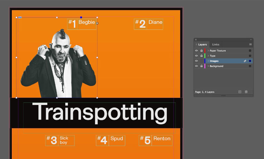
Repeat this process to place all five of your characters in frames around the poster, two frames above and three frames below the title.
Once you're happy with the placement of all five images, right-click => Group them all together.
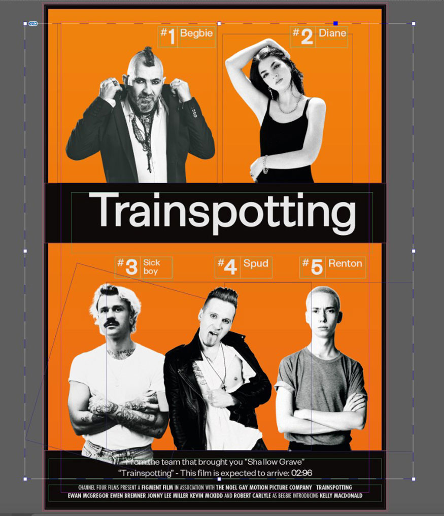
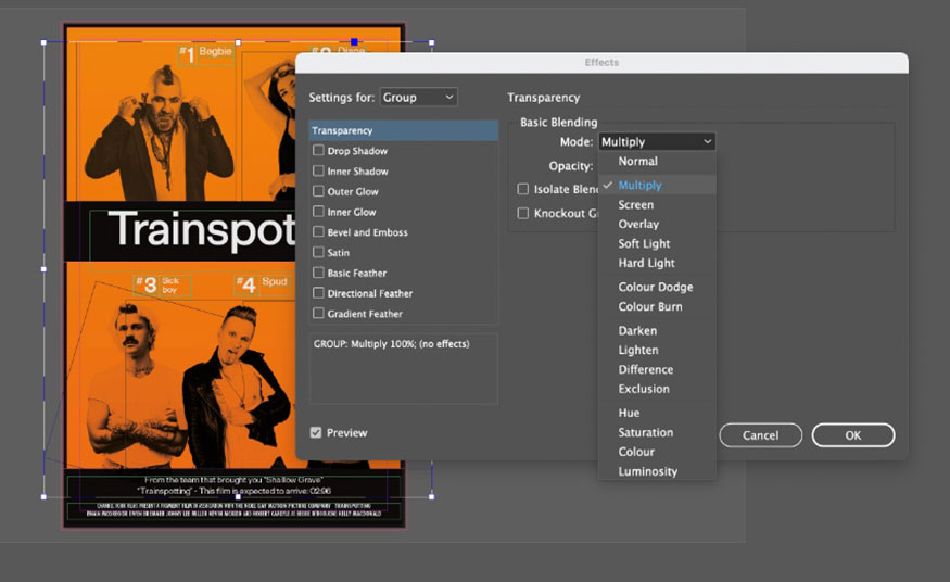
Step 2: Select the group of images and go to Object => Effects => Transparency.
Set the Mode to Multiply and the Opacity to 100% before clicking OK.
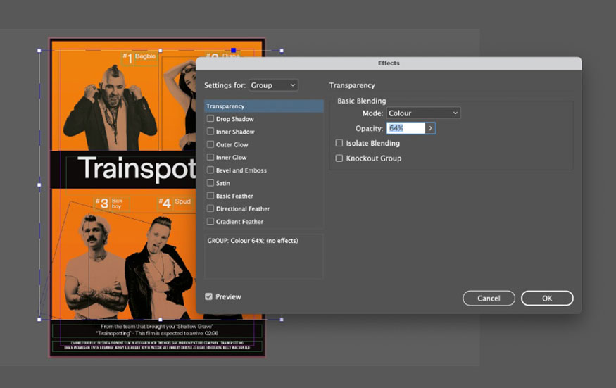
Select the group and go to Edit => Copy, Edit => Paste in Place. With this second group of images, we'll apply a different transparency effect. So go back to Object => Effects => Transparency. This time, choose the Mode to Color and reduce the Opacity to around 65%.
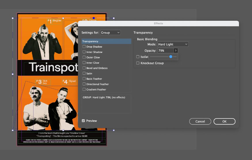
On the menu bar go to Edit => Paste in Place again to create a third group of images. With this group, we'll try to bring more light into the collage. Go to Object => Effects => Transparency again, and this time choose Hard Light as the Mode and reduce the Opacity to around 80%.
.jpg)
6. How to Add Vintage Textures to a Trainspotting Movie Poster in Your Style
Once you have the characters, we’ll add vintage textures to the poster to give it a unique, Trainspotting vibe.
Step 1: Lock the Image layer and unlock the Paper Texture layer on top.
Use the Rectangle Frame Tool (F) to create a frame on the page and File => Place, select one of the textures from the Paper Texture Bundle you downloaded. Allow the texture to fill the entire page.
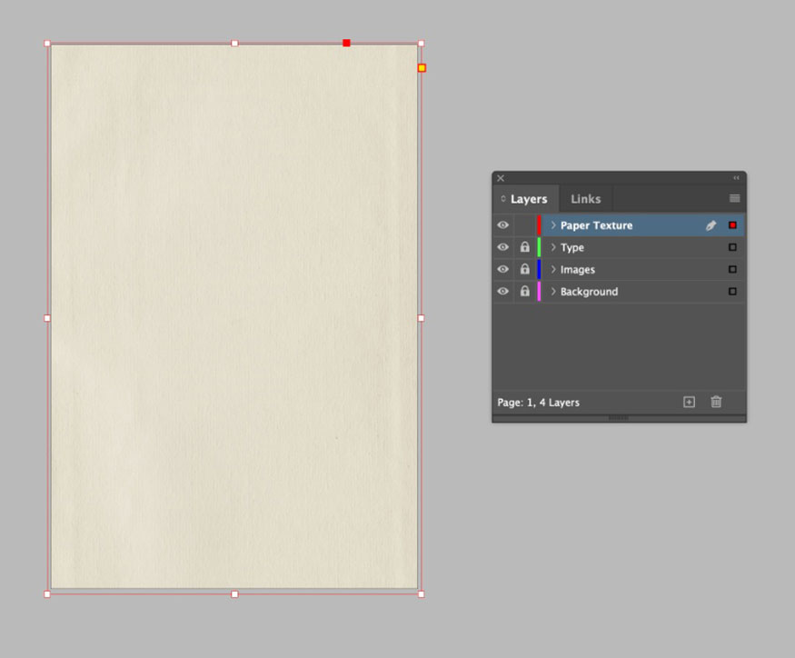
With the frame selected, on the menu bar go to Object => Effects => Transparency. Set the Mode to Multiply and the Opacity to 75% before clicking OK.
.jpg)
Step 2: The movie texture will give the poster that authentic vintage feel. Create a second texture layer by creating a second image frame. File => Place, choose one of the textures from the Film Grain Bundle.
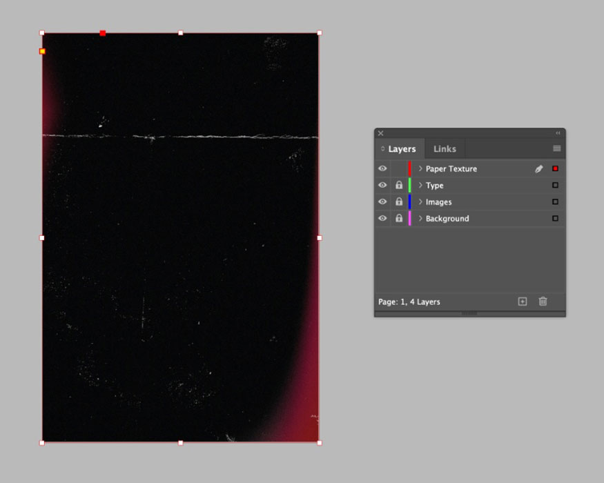
On the menu bar go to Object => Effects => Transparency. Set the Mode to Screen and the Opacity to around 20% before clicking OK.
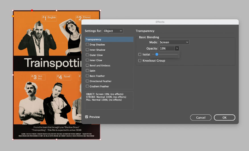
Overlaying these two images will give the poster design more depth and a vintage texture.
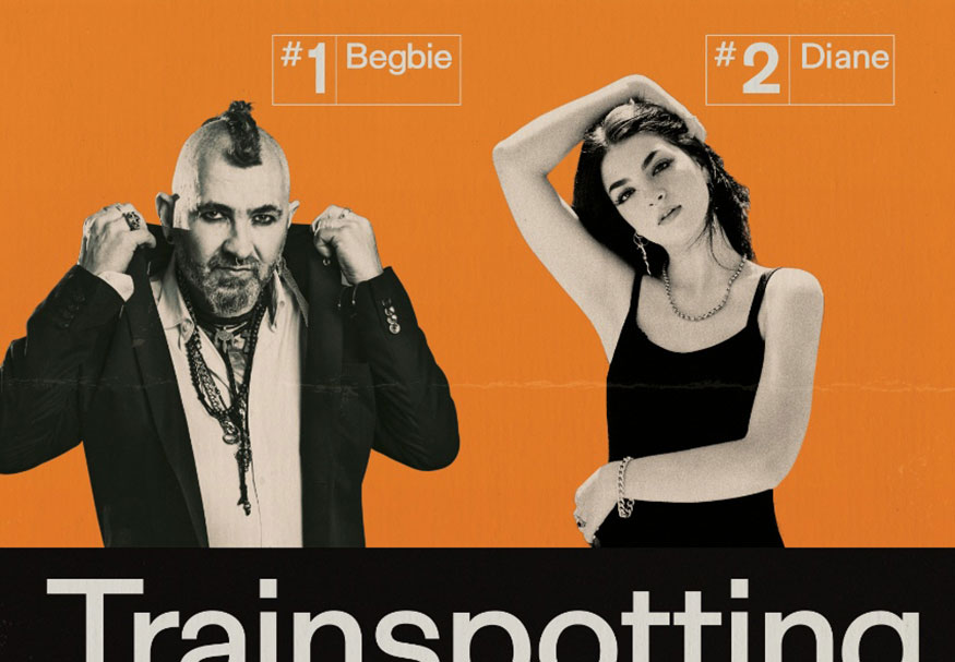
And that’s it, creating your own Trainspotting movie poster is complete! This is a poster in the very typical 5-person style of this movie.
7. How to Create a Character Poster
If you don’t want to create a poster of 5 people, you can create a poster as a character. We will “frame” the character to create a unique single poster.
Step 1: Create a second page in your InDesign document from the Pages panel (Window => Pages).
Select the background and Paper texture layers on your original poster design then Edit => Copy. Scroll down to the second blank page and Edit => Paste in Place.
Erase all the black elements from the background layer and drag the edges of the orange shape in so that it lies on the margin.
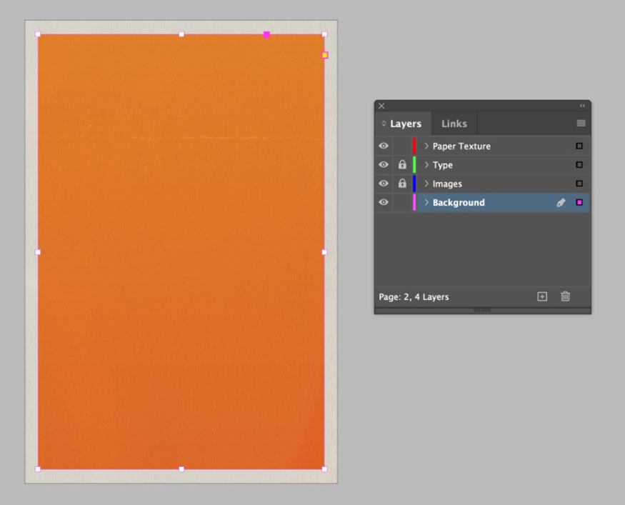
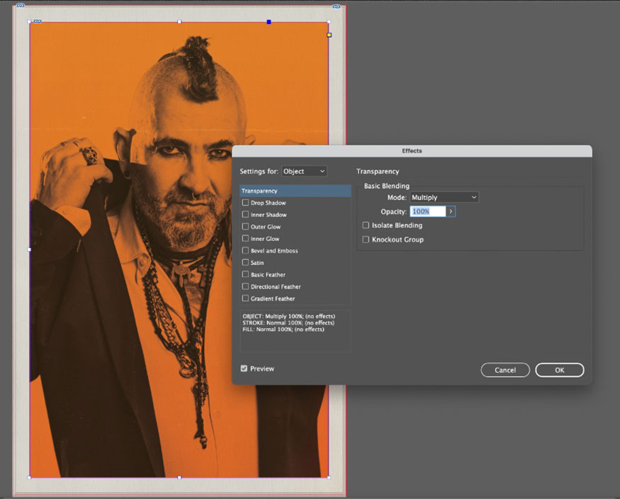
Step 2: Select the Images layer, create a large image frame that fits neatly inside the orange rectangle. On the menu bar select File => Place, select your first character image.
When you are happy with the size of the image, go to Object => Effects => Transparency. Set the Mode to Multiply and the Opacity to 100% before clicking OK.
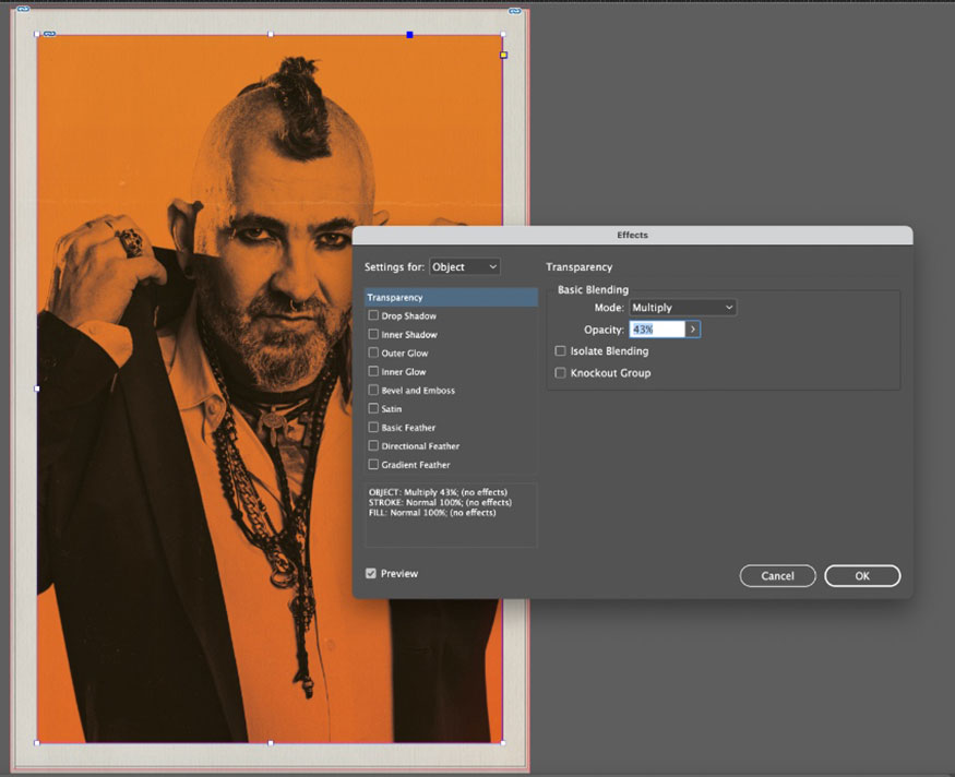
Select the image frame and choose Edit => Copy then Edit => Paste in Place. For this image, go back to the Effects panel and reduce the Multiply to around 45%.
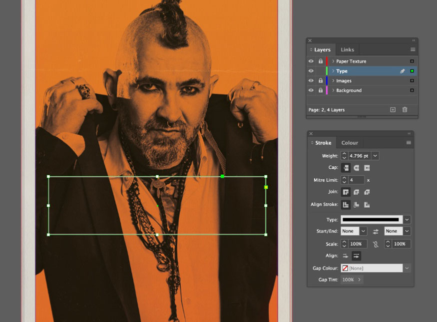
Step 3: Select the Type layer, use the Rectangle Tool (M) to create a wide rectangle in the middle of the poster, set the Stroke Weight to around 5 pt and use an opaque white Stroke Color.
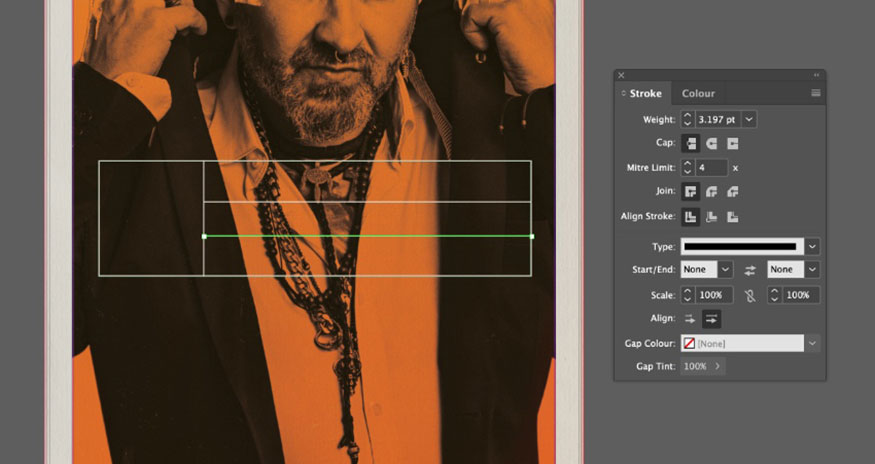
Add a vertical line and two horizontal lines, also opaque white, with a slightly narrower Weight, around 3 pt, to create a label effect.
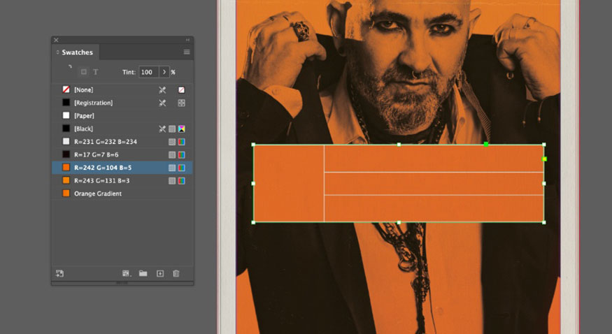
Create an orange rectangle at the top of this label design. Right-click => Arrange => Send to Back.
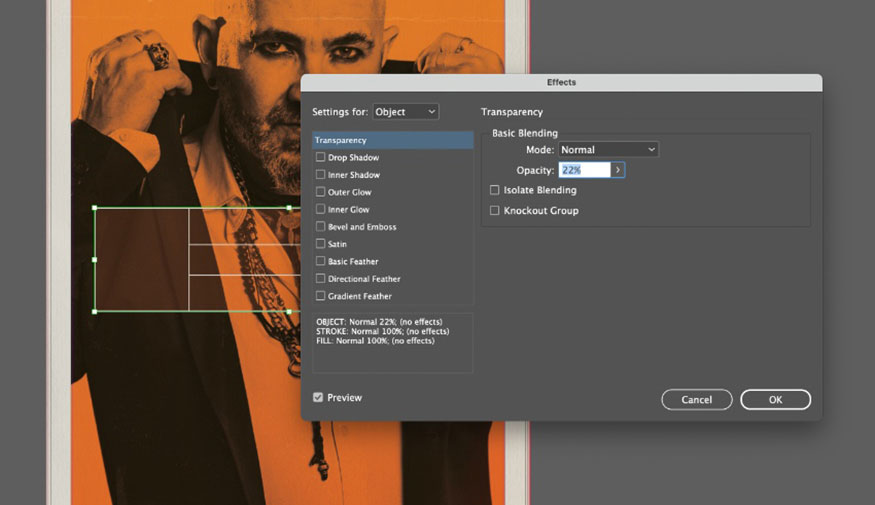
With the orange shape selected, go to Object => Effects => Transparency. Reduce the Opacity to around 20% and click OK.
Use the text box to fill in the number of characters, the name and the tagline of the movie, set the Font to Exensa Grotesk Bold and the Font Color to opaque white.
.jpg)
That's it. You can now duplicate the page to create more character posters.
Step 4: Once you have completed your poster, you can export your design as an image for printing or sharing online.
For print, go to File => Export and select Adobe PDF (Print) from the Format option. Make sure to include Bleed on your exported PDF for professional printing.
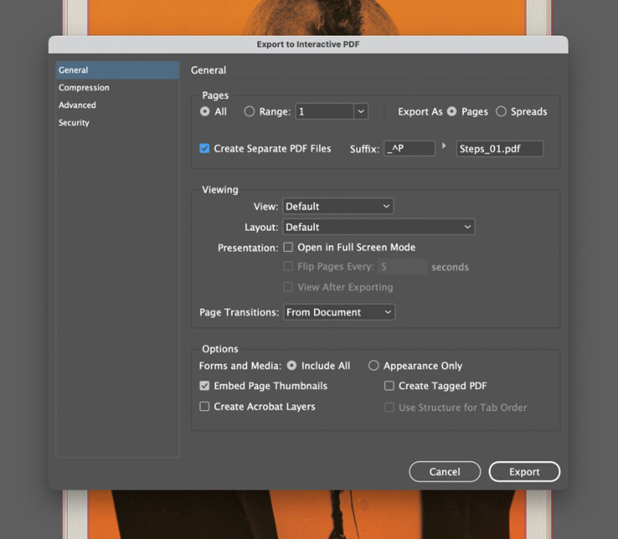
For digital creation, we can also export our design as an Interactive PDF, which will preserve the vibrancy of the hazard orange palette. Go to File => Export and select Adobe PDF (Interactive). In the window that opens, you can choose to export your poster as a separate PDF by checking the Create Separate PDF Files box.
Your Trainspotting poster is now exported and ready to share.
Above is a summary of the steps to create a Trainspotting movie poster in your own style. The implementation is not too difficult, but requires meticulousness and a combination of many tools.
Installation and support contact information:
🏡 SADESIGN Software Company Limited
📨 Email: phamvansa@gmail.com
🌍 Website: https://sadesign.ai








.png)
