Best Selling Products

Windows 10 & 11 Pro Key
36 USD

Upgrade genuine Capture One account
120 USD

ChatGPT Plus Account (GPT-4)
16 USD

Copyright Adobe Lightroom Account
59 USD

Adobe Photoshop Copyright - Full App
120 USD

Plugin Retouch4me
69 USD

Genuine Cheap Canva Pro
39 USD

Genuine Adobe Illustrator account
99 USD

Upgrade Duolingo Super
29 USD

Capcut Pro 1 Year
39 USD

MidJourney Account
29 USD

Freepik Premium Account
59 USD

Autodesk All App Account Copyright
120 USD

Adobe Premiere Pro Account
99 USD

Upgrade Genuine Office 365
49 USD
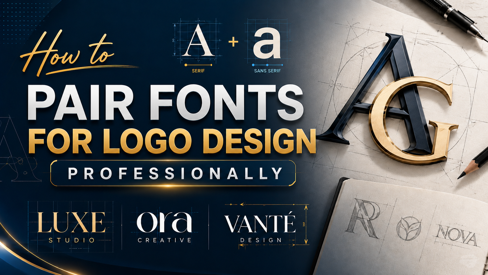
How to Pair Fonts for Professional Logo Design
Nội dung
- 1. Pair two fonts from the same font family
- 2. A thick font pairs well with a thin font
- 3. Try tight Kerning with wide Kerning
- 4. Two fonts with complementary shapes
- 5. Use Serif and Sans Serif together
- 6. Try a traditional heading with a decorative body
- 7. Use a decorative heading with a traditional body
- 8. Do not use fonts that are too similar
- 9. Avoid pairing fonts that are too different
- 10. Three is enough
- 11. Make sure they are easy to read
- 12. Conclusion
In the world of logo design, choosing and pairing fonts is one of the important factors that determines the success of a brand. A logo not only needs to look beautiful but also must effectively convey the message of the business. Combining fonts properly not only helps create uniqueness but also highlights brand identity. In this article, Appvip will explore with you the basic steps and useful tips for pairing fonts professionally, helping your logo become more outstanding and memorable.
1. Pair two fonts from the same font family
When starting the journey of logo design, choosing the right font is one of the most important decisions. Using fonts from the same family not only helps you create harmony but also brings a consistent feeling to the entire design. Font families are classified into many groups such as serif, sans serif, script, and monospace, each group having its own characteristics, helping you easily find fonts that complement each other.
A great advantage of using fonts from the same family is that you can take advantage of the variety of styles they provide. For example, a font family may include options in weight (thickness or thinness), size, and capitalization. This allows you to be more flexible in design while still maintaining consistency. The NIGHTOWL logo is a typical example, with the perfect combination of type styles within the same family, creating a cohesive and memorable look.
In addition, choosing fonts from the same family helps you save time searching and experimenting. You will not have to worry about whether the fonts conflict with each other, because they have been designed to harmonize with one another. This contributes to creating a better user experience, as viewers can easily recognize the brand and the message you want to convey.
.png)
2. A thick font pairs well with a thin font
One of the most effective techniques in logo design is creating contrast between fonts. The combination of a thick font and a thin font not only enhances aesthetics but also clarifies the message you want to convey. Thick fonts often bring a strong feeling, while thin fonts create sophistication and lightness.
When combining these two types of fonts, the main point is to ensure that they are contrasting enough for viewers to easily distinguish. For example, in the logo design for Bla Bla Bla Podcast, you can see the combination of a thick font for the “Bla Bla Bla” part and a thin font for the word “Podcast”. This separation not only creates a visual hierarchy but also attracts attention to the main name of the program.
Moreover, using different weights between fonts also helps create a harmonious and balanced design. This can highlight important messages, while clearly showing the role of each part in the overall design. This contrast will help your logo stand out more in the eyes of viewers and be easier to remember.
3. Try tight Kerning with wide Kerning
Kerning is an important factor in design that helps adjust the spacing between characters in a font. Experimenting with tight kerning and wide kerning can create interesting effects and help strengthen the distinction between parts of the logo. Proper spacing between characters not only helps the text become easier to read but also creates a certain aesthetic feeling.
However, when working with kerning, you need to be subtle and careful. If the spacing between characters is too close, it can create a cramped and hard-to-read feeling. Conversely, if the spacing is too far, readers may feel distracted or lose interest. The balance between these two factors is very important to ensure that your logo is not only beautiful but also easy to recognize.
Remember that adjusting size and kerning can also help you find the perfect combination for your logo. By experimenting with font pairs with different kerning, you can create a harmonious and outstanding overall design. This not only creates an impressive design but also helps viewers easily recognize and remember your brand.
.png)
4. Two fonts with complementary shapes
When it comes to pairing fonts, the shape and emotion that the font conveys are factors that cannot be overlooked. Each typeface carries its own message, from professionalism to playfulness or even silliness. For example, a round, playful font with a bubble-like shape would be very suitable for a children’s birthday invitation, while a more serious font would be more suitable for a business brand.
The important thing is that you need to choose fonts with complementary shapes, creating a harmonious overall look. The Heavy Routine Fitness Center logo is a typical example of combining fonts that have similarity in form but still highlight each separate part. This complement not only creates an attractive design but also helps viewers easily understand the message that the brand wants to convey.
Choosing fonts with complementary shapes also helps create a consistent feeling in the design. When viewers see two fonts that complement each other, they will easily recognize the brand and feel more comfortable when interacting with it. Try experimenting with fonts that have contrasting shapes but still maintain emotional connection to create a unique and impressive logo.
5. Use Serif and Sans Serif together
Combining Serif and Sans Serif fonts is one of the most popular and effective methods in logo design. Serif fonts, such as Times New Roman, have decorative strokes at the ends of characters, creating a formal and classic feeling. In contrast, Sans Serif fonts, such as Arial, bring simplicity and modernity, without complex decorative details.
This combination not only brings balance to the design but also creates clear contrast between different parts of the logo. When using a Serif font for the title and a Sans Serif font for the secondary part, you can easily draw attention to the main message without losing clarity. The Book Club logo is a typical example, when the serif letters bring sophistication to the word “book”, while the sans serif letters create an approachable and attractive feeling.
However, when combining these two types of fonts, you need to pay attention to their weight and overall style. Both fonts should have clear differences to avoid a boring feeling or lack of creativity. With attention to detail and careful consideration in selection, you can create an impressive and memorable logo design.
.png)
6. Try a traditional heading with a decorative body
In logo design, determining the role of each font in the hierarchy is extremely important. The heading is usually the part that attracts the most attention, so it needs to have a large size and heavier weight to create a strong impression. Moreover, the heading also sets the tone for the brand, making it the first thing viewers come into contact with.
In the case of Mystic Theory Beauty, using a traditional font for the heading not only shows modernity but also creates a trustworthy feeling for the brand. By combining it with a decorative font for the body, the logo brings an appealing contrast and a strong visual effect. The audience will feel professionalism while still sensing artistry, attracting them to the brand.
Pairing a traditional font for the heading with a decorative font for the body helps create a clear hierarchy. This not only highlights the main messages but also creates a design that is easy to remember. When you consider how each part interacts with one another, you will notice the strong influence that this combination brings to the overall logo.
7. Use a decorative heading with a traditional body
In logo design, choosing fonts is not simply a decision about appearance but also a way of conveying emotion. If you want your logo to evoke fun and comfort, combining a decorative heading with a traditional body font is a perfect choice. Decorative fonts often have creativity and uniqueness, while traditional fonts bring a professional and trustworthy feeling.
An interesting point is that the change in font usage between the heading and content can create strong contrast, helping the logo stand out more. Using a decorative heading to attract viewers’ eyes, combined with a traditional body, will create a comfortable feeling while still making a professional impression. TailorBrands’ Fitness logo is a typical example of this combination, where fun and professionalism blend together.
However, if you cannot find compatibility between the typefaces you have chosen, do not worry. In fact, there are many ways to experiment and find the perfect combination for your logo. Expand your perspective and be creative with different typefaces to create a truly impressive and unique design.
.png)
8. Do not use fonts that are too similar
When pairing fonts, the golden rule you need to remember is: Contrast, contrast, and once again contrast! This is the core factor that helps you create an effective logo design. The combination of serif and sans serif fonts is proof of this, as they create just enough contrast to highlight different parts of the logo.
When choosing font pairs, consider many factors such as size, weight, color, spacing, and style. These factors will help you evaluate whether the two fonts truly complement each other or not. If you feel unable to determine which part is important in the logo, you may have chosen fonts that are too similar in style, weight, and size.
A logo design will become less effective if the fonts cannot be distinguished from one another. Viewers will have difficulty recognizing the message you want to convey, and this can lead to confusion. Make sure that each font has its own role and contributes to the overall logo clearly and understandably.
9. Avoid pairing fonts that are too different
Although creating contrast is very important, too much difference between fonts can make your message difficult to understand. Fonts need to have a certain similarity, like planets in the same solar system. If you combine fonts that are too different, viewers will easily feel confused and fail to grasp the meaning you want to convey.
To determine compatibility between fonts, you can look with the naked eye or apply some basic rules. A simple rule is to check the ratio and x-height (the height of the character “x” in each font). If the x-height is similar but the shape and style are different, this can be a good combination.
In addition, try choosing two fonts with thin strokes but different sizes, or choose a font with a different weight but similar style. These choices will help create a logo design that is not only unique but also easy to recognize and remember.
.png)
10. Three is enough
In logo design, the rule limiting the number of fonts is often recommended as three. The main reason is that when you use more than three fonts, the design can become unbalanced and easily cause confusion for viewers. Some designers may think that breaking this rule is necessary for creativity, but in this case, keeping the rule will bring better results.
If you feel the need to add a fourth font, try adjusting the fonts you already have. You can make them bolder, italicized, or underlined to create difference without adding a new typeface. This not only helps the design look neater but also keeps it from becoming too complicated, helping viewers easily receive the message.
Before deciding to use a new font, ask yourself the reason behind that choice. Each font you choose should have a specific reason and bring benefit to the overall logo design. If you cannot convince yourself of the necessity of that font, then it is very likely that the audience will feel the same way.
11. Make sure they are easy to read
One of the main goals of using fonts in logo design is to elevate the image and create an emotional connection with the audience. However, if viewers cannot read the text, all your efforts will become meaningless. Therefore, ensuring that the fonts you choose are easy to read is extremely important.
Fonts need to be clear and easy to recognize, not only on screen but also in print. This is especially important in today’s context, when more and more people access information through mobile devices. A beautiful but hard-to-read logo will cause users to quickly skip it, and this can affect their first impression of the brand.
Consider the size, thickness, and style of the font you use. Make sure they not only fit the design style but are also easy for viewers to receive. An effective logo is not only beautiful but also must easily convey the message you want to send. Pay attention to this factor to create impressive and memorable designs.
12. Conclusion
In short, pairing fonts in logo design is not simply choosing a few typefaces but also the art of combining and building brand identity. By mastering the basic principles and applying useful tips, you can create impressive logos that properly reflect the values and vision of the business. Contact Appvip now to upgrade design software and create the perfect font.





















VIP Products








Best Selling Products
Windows 10 & 11 Pro Key
36 USD
Upgrade genuine Capture One account
120 USD
ChatGPT Plus Account (GPT-4)
16 USD
Copyright Adobe Lightroom Account
59 USD
Adobe Photoshop Copyright - Full App
120 USD
Plugin Retouch4me
69 USD
Genuine Cheap Canva Pro
39 USD
Genuine Adobe Illustrator account
99 USD
Upgrade Duolingo Super
29 USD
Capcut Pro 1 Year
39 USD
MidJourney Account
29 USD
Freepik Premium Account
59 USD
Autodesk All App Account Copyright
120 USD
Adobe Premiere Pro Account
99 USD
Upgrade Genuine Office 365
49 USD