Best Selling Products

Upgrade Duolingo Super
29 USD

Upgrade genuine Capture One account
120 USD

MidJourney Account
29 USD

Adobe Photoshop Copyright - Full App
120 USD

Capcut Pro 1 Year
39 USD

Windows 10 & 11 Pro Key
36 USD

Plugin Retouch4me
69 USD

Genuine Adobe Illustrator account
99 USD

Adobe Premiere Pro Account
99 USD

Freepik Premium Account
59 USD

Genuine Cheap Canva Pro
39 USD

Autodesk All App Account Copyright
120 USD

Copyright Adobe Lightroom Account
59 USD

ChatGPT Plus Account (GPT-4)
16 USD

Upgrade Genuine Office 365
49 USD
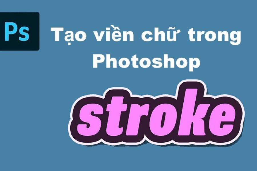
How to use Photoshop Stroke to create beautiful outlines quickly and easily.
Nội dung
- 1. What is a stroke in Photoshop?
- 2. Important Photoshop Stroke Parameters You Need to Know
- 2.1 Size: Adjust the thickness of the border.
- 2.2 Position: Choose the position of the border
- 2.3 Opacity: Adjust transparency
- 2.4 Fill Type: Customize the color style of the Stroke
- 3. How to quickly create a stroke for text in Photoshop
- 4. How to use Photoshop Stroke to create borders for images
- 5. Tips for using Photoshop Stroke to create better outlines.
- 6. Common mistakes when creating strokes in Photoshop
- 7. Conclusion
With just a few steps, the Stroke effect can make text stand out against the background, separate the subject from the background, or highlight details that might otherwise be lost in the composition. It''s also a familiar effect used in designing posters, thumbnails, banners, advertisements, and social media content. If adjusted correctly, a Stroke isn''t simply a line around an object. You can change its thickness, color, position, transparency, or even create gradient borders to suit your design style. In this article, let''s explore how to use Photoshop Strokes from basic to practical to create borders quickly, beautifully, and easily.
1. What is a stroke in Photoshop?
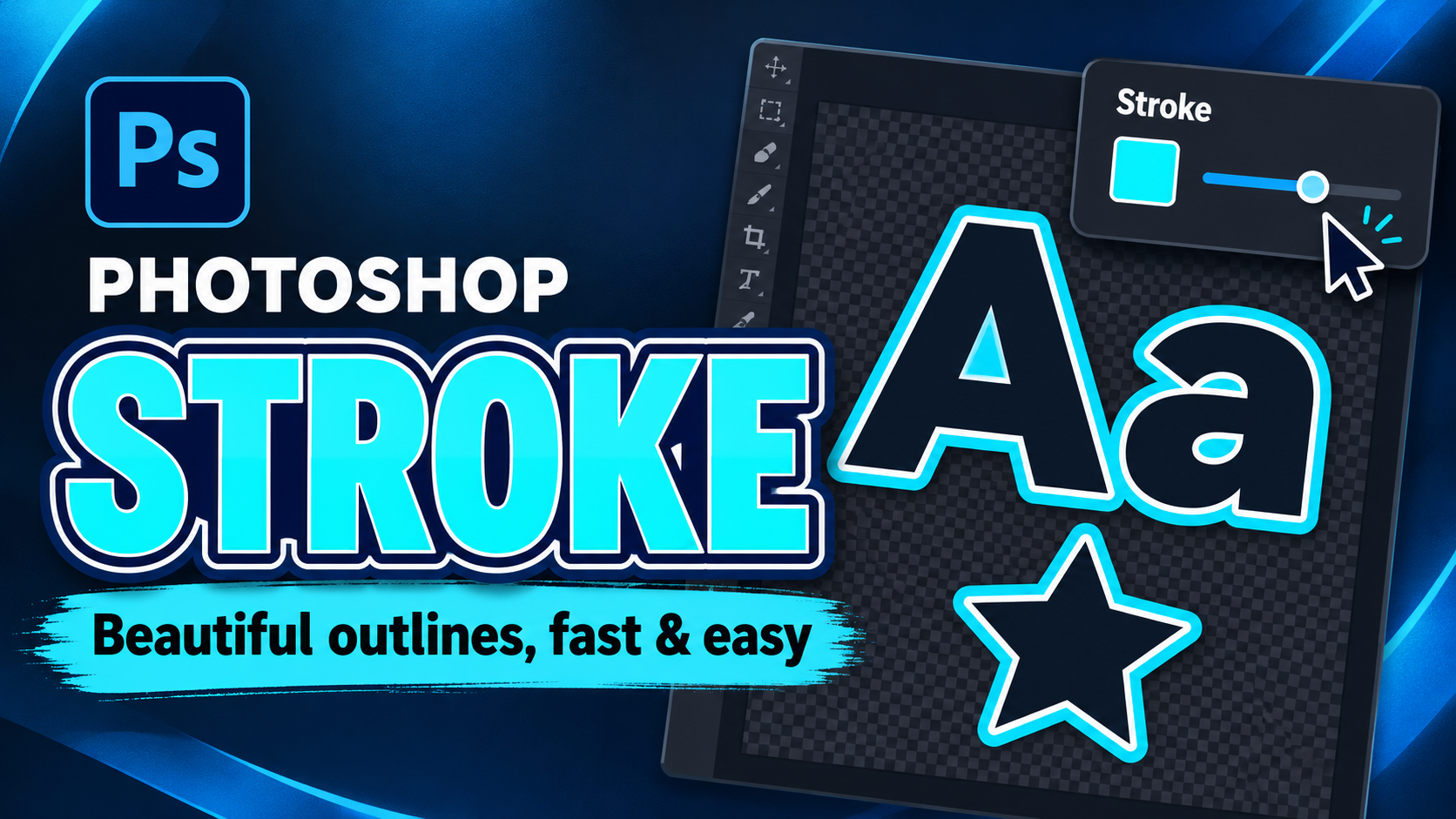
Simply put, a stroke in Photoshop is an effect that creates a border around an object in a design. This object could be text, an image, a shape, or a selected area. When a stroke is added, the border follows the object's outline, making the subject stand out and easier to identify against a detailed background. The interesting thing about strokes is their flexible customization. You're not limited to a single color border; you can change many parameters to create a style that suits each design. Some common applications of strokes include:
-
Create a white or black border around the text to increase contrast with the background.
-
Highlight the character, product, or object in the photo.
-
Create sticker effects for images.
-
Decorate the title, logo, or other graphic elements.
-
Create borders for shapes and selections in Photoshop.
-
Combine Stroke with Shadow, Glow, or other Layer Style effects.
2. Important Photoshop Stroke Parameters You Need to Know
2.1 Size: Adjust the thickness of the border.
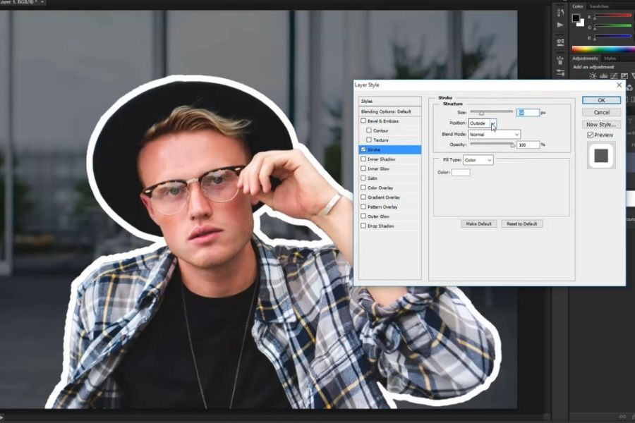
Size determines the thickness of the border. This parameter is usually measured in pixels and will directly change the stroke size around the object. For small text, a moderate border should be used to avoid distorting the original shape of the characters. Conversely, when designing thumbnails or posters to create a strong emphasis, a thick border can help the subject stand out immediately. However, balance the object size and stroke thickness so that the overall design doesn't look heavy.
2.2 Position: Choose the position of the border
Position determines where the stroke is located relative to the object's original boundary. Photoshop typically offers three options: Inside, Center, and Outside.
-
Inside: The border is located on the inside of the object.
-
Center: The outline is evenly divided between the inside and outside of the boundary.
-
Outside: The border extends outwards from the object.
If you want to create a border around text and keep the content inside clear, the "Outside" option is often the convenient choice. For images or shapes, you can try all three positions to find the best way to display them within your layout.
2.3 Opacity: Adjust transparency
Opacity determines the intensity of the outline. At 100%, the stroke is most prominent and strong. Reducing the opacity makes the outline lighter, allowing the background color or image to influence the overall feel. For designs requiring a striking outline, a high opacity stroke is often more suitable. Meanwhile, for minimalist layouts or those aiming for a softer effect, reducing the opacity allows the outline to blend seamlessly into the overall design.
2.4 Fill Type: Customize the color style of the Stroke
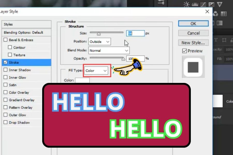
Fill Type allows you to choose how to color the border. Depending on the situation, you can use solid colors, gradients, or patterns to create different effects.
-
Color: Create a stroke using a single color.
-
Gradient: Creates a gradient border, suitable for modern design.
-
Pattern: Use patterns to create decorative borders.
If you're new to Photoshop, Color is the easiest option to use. Once you've mastered the basic adjustments, you can try Gradient or Pattern to create more eye-catching designs.
3. How to quickly create a stroke for text in Photoshop
Creating a stroke for text is one of the most frequently used design operations. White text on a light background can be difficult to read, but simply adding a dark border significantly improves readability. This is why the stroke effect appears quite often in thumbnails, posters, and social media content designs. The advantage of this method is that you can edit the text after adding the border without having to start over. Simply changing the content, size, or font will retain the stroke effect on the layer. The steps are as follows:
-
Step 1: Open Photoshop and use the Type Tool or press the shortcut key T , then create a new text layer and type the content you want to design.
-
Step 2: In the Layers panel , find the layer containing the text you just created, then right-click on the layer and select Blending Options to open the Layer Style panel.
-
Step 3: In the Layer Style window, select Stroke from the list of effects on the left. Click directly on the Stroke option to bring up the detailed settings panel.
-
Step 4: In the Stroke settings, adjust the Size to select the desired outline thickness, choose the appropriate Position , and click the color box to set the Stroke color.
-
Step 5: Adjust the opacity further if you want the border to be thicker or thinner, then press OK to apply the effect.
4. How to use Photoshop Stroke to create borders for images
Strokes can be used not only for text but also to create outlines for characters, products, or subjects that have been separated from the background. This method is very useful when you want to turn an image into a sticker, highlight a product in an advertisement, or create the illusion that the subject is emerging from the background. Unlike text, images usually need to be selected before applying a stroke directly. Therefore, the quality of the outline depends heavily on whether the subject has been cleanly separated from the background. If the selection is incomplete or still has background elements, the stroke may not look good.
-
Step 1: Open the image in Photoshop and ensure the layer containing the subject has been separated from the background or has a suitable transparent area.
-
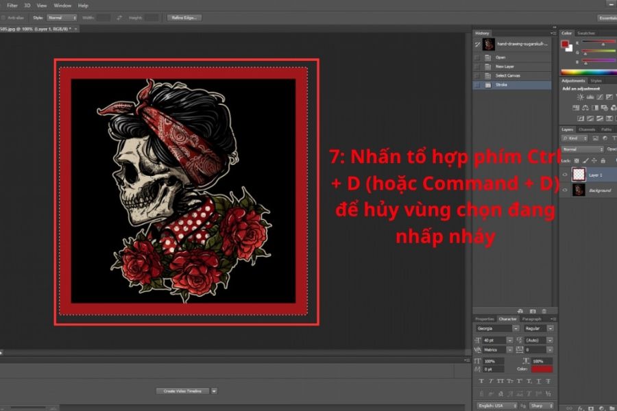
Step 2: Press and hold Ctrl on Windows or Command on Mac, then click on the layer thumbnail to create a selection area based on the object's shape.
-
Step 3: After the selection area appears, open the Edit menu on the toolbar at the top and select Stroke .
-
Step 4: In the Stroke dialog box, enter the border thickness in the Width field , then click on the color section to select the Stroke color.
-
Step 5: In the Location section , select the border position as Inside , Center , or Outside, depending on your design needs.
-
Step 6: Click OK to apply the border to the selection.
-
Step 7: Press Ctrl + D on Windows or Command + D on Mac to deselect the area and check the final result.
5. Tips for using Photoshop Stroke to create better outlines.
A beautiful border doesn't necessarily have to be thick or overly bright. The important thing is that the stroke serves the main purpose of the design. If the border takes up too much space, viewers might focus on the effect instead of the content. Conversely, a stroke that's too thin or too similar in color to the background can easily lose its effect. For a more balanced design, you should view the stroke as part of the overall design rather than an effect added at the end. Consider the background color, subject color, font, size, and spacing between elements before deciding on the border thickness.
-
Choose a stroke color with appropriate contrast: Light text tends to stand out easily with a dark border, while dark text can be combined with a light border.
-
Avoid using excessively thick strokes: Especially with small fonts, thick strokes can make the text feel cramped and less spacious.
-
Prioritize the "Outside" border when creating text borders: This helps prevent the border from taking up too much space inside the character.
-
Combine multiple Layer Styles: Stroke can be paired with Drop Shadow, Inner Shadow, or Outer Glow to create depth.
-
Use gradients when you need a focal point: Gradient borders are suitable for youthful, modern, or creative designs.
-
Maintain consistency: If the design has multiple objects, use similar stroke thickness and style to avoid a cluttered layout.
-
Check at actual size: A border that looks good when enlarged may not necessarily fit when the design is scaled down for social media posting.
-
Separate effects into Layer Styles whenever possible: This makes it easy to go back and edit without directly affecting the original content.
Upgrade your licensed version of Photoshop.
6. Common mistakes when creating strokes in Photoshop
When using Stroke, Photoshop beginners often encounter errors that result in less-than-perfect outlines. Most of these problems stem from selecting the wrong position, setting the size too large, or applying the stroke to an uncleaned selection. By checking each parameter, you can quickly identify the cause. In particular, don't rush to increase the stroke thickness just to make the subject stand out more. If the background already has good contrast, a moderately thick outline will look much more professional than an overly thick one. Consider the following points:
-
The border is obscuring the text: Check the Size and try changing the Position to Outside.
-
The border is encroaching on the image: Try changing the Position or rechecking the selection area.
-
Border color is too bright: Choose a color closer to the overall color palette or reduce the opacity.
-
Uneven border: Check the quality of the selection area before using Stroke.
-
The image is cluttered: Reduce the number of effects and keep the stroke at a moderate level.
-
The border is not prominent: Increases the contrast between the stroke color and the background.
-
Results change when the image is scaled down: Recheck the Stroke Size after resizing the design.
7. Conclusion
Photoshop strokes are a simple yet highly versatile feature in graphic design. With just a few steps, you can create outlines for text, images, shapes, or selections, making important elements stand out more in the layout. Understanding how to adjust Size, Position, Opacity, and Fill Type makes controlling the effect much easier. The most important thing when using strokes is not to follow a fixed formula. Choose the appropriate thickness and color based on the object's size, background color, and design style. By using strokes appropriately and skillfully, you can transform a simple design into a more visually appealing, clear, and professional product.





















VIP Products








Best Selling Products
Upgrade Duolingo Super
29 USD
Upgrade genuine Capture One account
120 USD
MidJourney Account
29 USD
Adobe Photoshop Copyright - Full App
120 USD
Capcut Pro 1 Year
39 USD
Windows 10 & 11 Pro Key
36 USD
Plugin Retouch4me
69 USD
Genuine Adobe Illustrator account
99 USD
Adobe Premiere Pro Account
99 USD
Freepik Premium Account
59 USD
Genuine Cheap Canva Pro
39 USD
Autodesk All App Account Copyright
120 USD
Copyright Adobe Lightroom Account
59 USD
ChatGPT Plus Account (GPT-4)
16 USD
Upgrade Genuine Office 365
49 USD