Best Selling Products
Genuine Adobe Illustrator account
99 USD

Autodesk All App Account Copyright
120 USD

MidJourney Account
29 USD
Adobe Photoshop Copyright - Full App
120 USD

Freepik Premium Account
59 USD

Upgrade genuine Capture One account
120 USD

Capcut Pro 1 Year
39 USD

Upgrade Duolingo Super
29 USD

Adobe Premiere Pro Account
99 USD

Windows 10 & 11 Pro Key
36 USD

Upgrade Genuine Office 365
49 USD

ChatGPT Plus Account (GPT-4)
16 USD

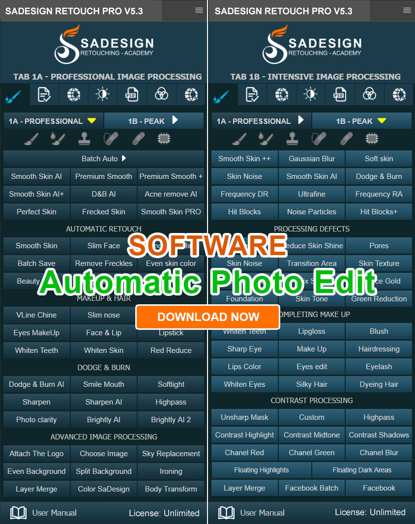
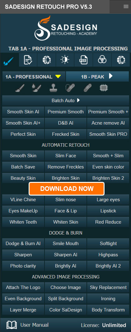
Plugin Retouch4me
69 USD

Genuine Cheap Canva Pro
39 USD

Copyright Adobe Lightroom Account
59 USD
Mobile website design and 4 principles for creating an excellent user experience.
Nội dung
The success of a website depends directly on how information is presented and its ability to make an impression on visitors. As smartphones and tablets become the primary devices for browsing the web, mobile access is increasingly becoming more prevalent, and Google has shifted its focus to mobile versions when indexing and ranking pages. This has led to a fundamental shift in design thinking. The formula for success remains effective information presentation and memorable impressions, but the factors to consider have changed significantly. This article analyzes four core principles that help designers build truly user-friendly, memorable, and trustworthy mobile websites.
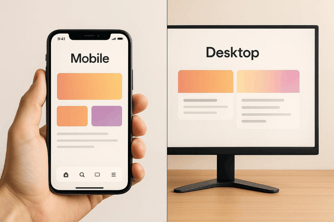
1. Designing for mobile doesn't mean shrinking the interface.
The most common mistake made by newcomers to mobile website design is assuming that simply shrinking the desktop version to fit a phone screen is sufficient. This thinking overlooks a crucial fact: mobile users constantly zoom in , scroll horizontally, and accidentally tap repeatedly.
Mobile design requires a complete rethinking, not just resizing. Start by identifying what content and functionality truly matter to users when they access it on their phones. Then, prioritize them using their fingers instead of a mouse cursor, as they view a much narrower frame and frequently use their devices in distracting situations. A mechanically scaled-down interface often results in overly small text, buttons too close together, and a cramped layout, forcing users to prioritize tasks in a clear order. Decorative or low-value elements should be removed or moved to expandable content layers. The multi-tiered navigation bars of a computer can be replaced with a clean menu, and horizontal content blocks should be arranged into a single, easily scrollable column.
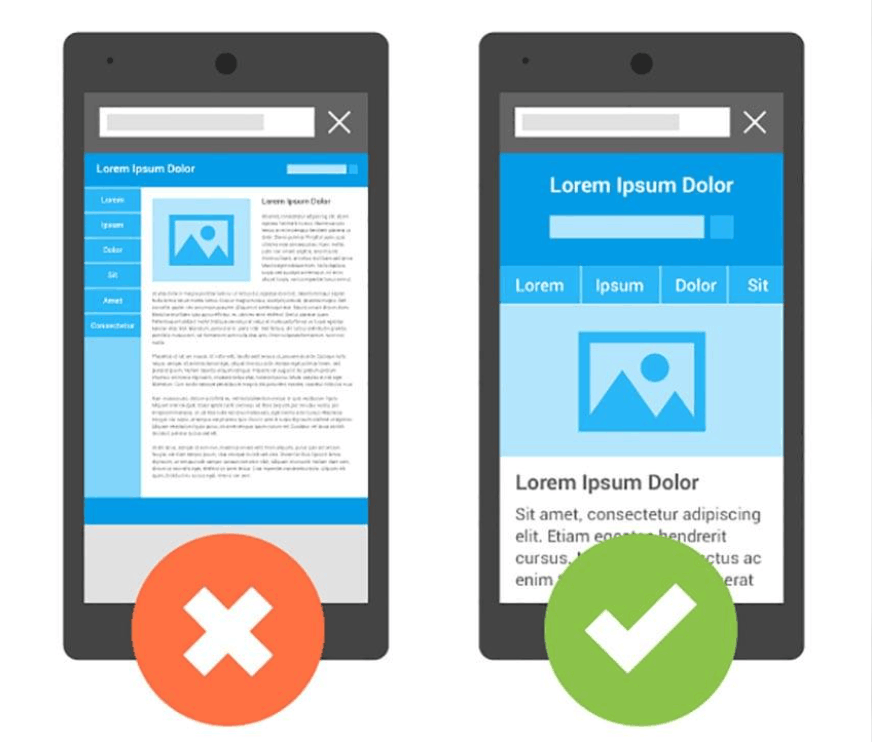
Beyond layout, you also need to pay attention to touch functionality. Common design standards recommend a minimum touch area size of around 44 dots on iOS and 48 dp on Android, along with reasonable spacing between interactive elements. The font size should be large enough for comfortable reading without zooming in, typically 16 pixels or larger. When an element on the desktop version is no longer suitable for the mobile space, feel free to redesign it so that the experience on the phone is equal to, or even surpasses, the original version.
2. Convey your message quickly and make a strong first impression.
Users spend less time on websites on computers, and even less time on mobile devices. No matter how well you optimize the interface, the comfortable browsing experience on a small screen is still hard to match on a computer, plus users often access websites while on the go, waiting, or doing other things. This means you only have a very short time to make them understand what the website is about, what it offers, and what they should do next.
To achieve this, the page needs to be designed for immediate understanding. The title should be concise and clearly state the core value, images should be relevant to the content rather than just decorative, and the call-to-action button should be prominent, easily visible, and easily clickable with a thumb. Visual hierarchy plays a crucial role, as size, color, and whitespace guide the user's eye through the most important information. Paragraphs should be short and concise, and longer content should be broken down by subheadings so readers can quickly scan and still grasp the main points.

Page load speed is also an integral part of first impressions. Google research has shown that user churn increases significantly when mobile pages take more than three seconds to load. Therefore, compress images, limit heavy code snippets, take advantage of slow loading times for images on the first screen, and prioritize displaying important content first. The ultimate goal is to minimize the time from when a user clicks on a link to when they receive and evaluate the information.
3. Maintain consistency so that users recognize the brand instantly.
The majority of a mobile website's audience has previously, or continues to be, accessed the desktop version of the same brand. Therefore, creating a clear link between the two versions is essential for a seamless experience. When users switch from a computer to a phone, they need to immediately feel like they are still in the familiar place, not having to start over with an unfamiliar interface.
This consistency is built upon specific identifying elements such as color palette, typography, background textures, visual style, icons, and content tone. When the mobile version retains the personality and spirit of the desktop version, users will recognize the brand almost instantly, thereby increasing trust and familiarity. A shared design system, with standardized interface components, will help the team sustainably maintain this consistency as the website grows and expands.
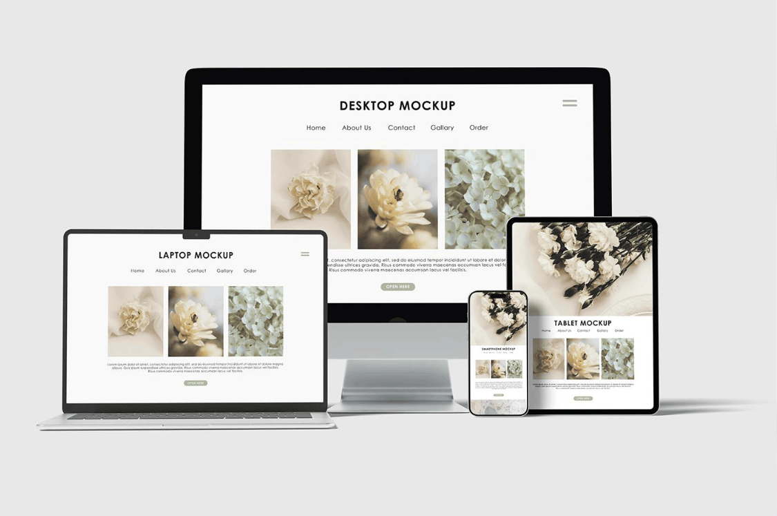
However, consistency doesn't mean exact copying. Branding can be expressed through user experience, such as smooth animations, information layout, or a refined interactive experience, rather than simply repeating the visual appearance. You can also connect your mobile website to your physical presence, for example by integrating maps, quick-call buttons, QR codes, or information on the nearest store. Any improvements that give mobile users a better experience and foster brand loyalty are worth investing in.
4. Optimized experience in both portrait and landscape modes.
Designing based on usage context isn't a priority when creating websites for computers, but it's especially important for mobile devices. Phones are used while on the go, while doing other things, with one hand or two, in bright or dark environments. It's difficult to know exactly where the user is, what their circumstances are, and how they're holding their device when accessing your website.
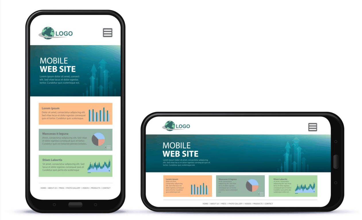
Therefore, websites need to function well in both portrait and landscape orientations. Most modern phones automatically rotate their interface according to how the user holds the device, so regardless of when they rotate the device, the experience should not be interrupted or confusing. If a user is viewing a page in portrait mode and then rotates to landscape, the layout must adapt flexibly, content should not be cut off, scrolling positions should be maintained, and incomplete forms should not be deleted. Implementing responsive design with flexible grids, relative units, and appropriate break points will help the interface adapt smoothly.
Landscape mode requires separate consideration because the usable height is significantly reduced. Fixed top and bottom bars, if too tall, can take up almost the entire screen and obscure the main content. Images and videos need to maintain the correct aspect ratio, and the virtual keyboard should not block the input field when it appears. Thoroughly test on multiple screen sizes and real devices, as browser simulations sometimes don't fully reflect user issues.
5. Conclusion
Effective mobile website design isn't about making things smaller, but about understanding your users and their usage context to make the right decisions. Redesign instead of shrinking, allowing users to understand your message in seconds, maintaining brand identity, and ensuring a consistent interface across all screen orientations. The fundamental principles of design remain unchanged, and when you put the user experience at the center, your mobile website has a much better chance of generating satisfaction, retaining visitors, and achieving business goals.


















VIP Products






Best Selling Products
Genuine Adobe Illustrator account
99 USD
Autodesk All App Account Copyright
120 USD
MidJourney Account
29 USD
Adobe Photoshop Copyright - Full App
120 USD
Freepik Premium Account
59 USD
Upgrade genuine Capture One account
120 USD
Capcut Pro 1 Year
39 USD
Upgrade Duolingo Super
29 USD
Adobe Premiere Pro Account
99 USD
Windows 10 & 11 Pro Key
36 USD
Upgrade Genuine Office 365
49 USD
ChatGPT Plus Account (GPT-4)
16 USD
Plugin Retouch4me
69 USD
Genuine Cheap Canva Pro
39 USD
Copyright Adobe Lightroom Account
59 USD