Best Selling Products

Plugin Retouch4me
69 USD

MidJourney Account
29 USD
Adobe Photoshop Copyright - Full App
120 USD

Genuine Adobe Illustrator account
99 USD

Adobe Premiere Pro Account
99 USD

Freepik Premium Account
59 USD

Windows 10 & 11 Pro Key
36 USD
Upgrade Duolingo Super
29 USD

Autodesk All App Account Copyright
120 USD
Genuine Cheap Canva Pro
39 USD

Upgrade genuine Capture One account
120 USD

Upgrade Genuine Office 365
49 USD

Copyright Adobe Lightroom Account
59 USD

Capcut Pro 1 Year
39 USD

ChatGPT Plus Account (GPT-4)
16 USD
The secret to logo color coordination that helps brands make a strong impression.
Nội dung
- 1. Why is color combination important in a logo?
- 2. Things to consider before choosing colors for your logo
- 2.1 Common mistakes when choosing color combinations
- 2.2 What is the maximum number of colors a logo can have?
- 3. 8 impressive logo color combination ideas for modern brands
- 3.1 Red-orange and pale white
- 3.2 Light pink and gray
- 3.3 Neon Green and Blue
- 3.4 Mint Green and Blue
- 3.5 Peach and Brown
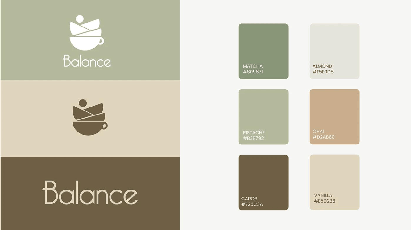
- 3.6 Green and Cream
- 3.7 Pink and blue gradient
- 3.8 Forest Green and Amber Brown
- 4. Conclusion
In the journey of brand building, the logo is the first point of contact between a business and its customers. And in a logo, color is the element perceived before any shape or text. A well-chosen color palette can make a brand memorable, trustworthy, and distinctive, while a poorly chosen one can easily distort the message or get lost among countless competitors. This article will help you understand why color coordination is important, what to consider before making a decision, and suggest eight ways to combine colors in a modern logo suitable for various industries.
1. Why is color combination important in a logo?
The color palettes of famous brand logos are rarely the result of chance. Branding experts understand that color determines first impressions, contributes to building long-term relationships with customers, and shapes their emotional response to the brand. Choosing colors for a logo is therefore not simply picking a few shades from the color wheel, but a strategic decision tied to positioning and target audience.
Color has a powerful impact on psychology, emotions, and socio-cultural associations. Numerous studies on consumer behavior have shown that the color in a logo can influence how customers perceive a brand's style, or decide whether they consider a product to be environmentally friendly. This demonstrates that each color choice carries a layer of meaning that viewers interpret almost instinctively.
The emotions evoked by a color also depend on the context. A logo entirely in red might convey a strong, energetic feeling, but if placed in the wrong context, it can easily be perceived as harsh or overbearing. By combining multiple colors, designers can amplify, soften, or balance these psychological effects. Therefore, logo color coordination is like a delicate balancing act, where each shade expresses its own personality while complementing the others to create a unified message.
2. Things to consider before choosing colors for your logo
The best logo color palette is one that perfectly matches the brand and target audience. This requires market research, understanding the psychological impact of each color, and observing the color combinations commonly used in your industry.
Let's take the example of a construction company choosing the color combination orange and blue. This combination is not only familiar in the construction industry but also conveys the right message. Orange suggests dynamism and a sense of good value, while blue represents stability, reliability, and professionalism. As a result, both customers and B2B partners receive a positive impression from the very first glance.
However, sometimes you can proactively go against the general trend of the industry to create a distinctive, unconventional brand identity. This is a riskier choice but can yield outstanding results if the colors are chosen skillfully. Apple is a prime example, having used a multi-colored rainbow logo in the 1980s and 1990s to differentiate itself from an industry dominated by shades of blue and gray. Although it later switched to a minimalist black and gray logo, Apple returned to the colorful spirit in its Spring Loaded campaign in 2021.
2.1 Common mistakes when choosing color combinations
There are two most common mistakes when choosing colors for a logo. The first mistake is selecting clashing colors, resulting in an aesthetically unappealing and unpleasant visual effect. The second mistake is choosing colors that convey a message inconsistent with the brand's personality, leading customers to misunderstand the values you want to express.
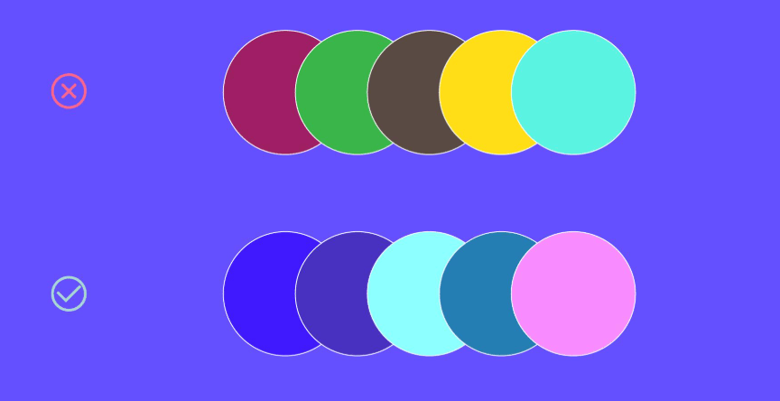
To avoid the second mistake, you need to take the time to understand the psychological meaning of each color and compare it to your brand positioning, as analyzed above. To avoid color clashes, you should familiarize yourself with the workings of the color wheel and understand the relationships between different shades. Additionally, consulting the Pantone color guide is a useful option, as this tool suggests harmonious combinations based on the latest market research from the color institute.
Another important point is to test the logo on various backgrounds and materials. A color combination that looks great on a screen might lose clarity when printed at small sizes or placed on a dark background, so be sure to check carefully before finalizing your choice.
2.2 What is the maximum number of colors a logo can have?
Technically, there's no limit to the number of colors in a logo, and in fact, many successful brands still opt for vibrant color palettes with many shades to create a strong visual impact. However, a safe rule of thumb for many designers is to use only one or two primary colors for a logo.
The reason is that the fewer colors a logo has, the clearer, easier to read, and easier to remember it becomes. At the same time, the psychological effect of each color isn't diluted by too many competing shades. A logo with fewer colors is also easier to apply to a variety of materials, from signage and packaging to app icons on mobile phones, while also saving on printing costs.
Choosing traditional color combinations that are considered harmonious is a safe bet, but don't be afraid to try unexpected combinations. Sometimes an unconventional pairing creates a unique and more effective impact than expected. Below are eight logo color scheme ideas, each built around a balanced color pair and associated with specific industries.
3. 8 impressive logo color combination ideas for modern brands
3.1 Red-orange and pale white
Red is inherently powerful, but sometimes it can feel harsh. By switching to a softer, orange-red shade, you retain the energy and passion of red while adding a warmer, more intimate feel. Off-white, or ivory, acts as a softening agent, providing breathing space for the design and allowing the orange-red to stand out without being overwhelming.
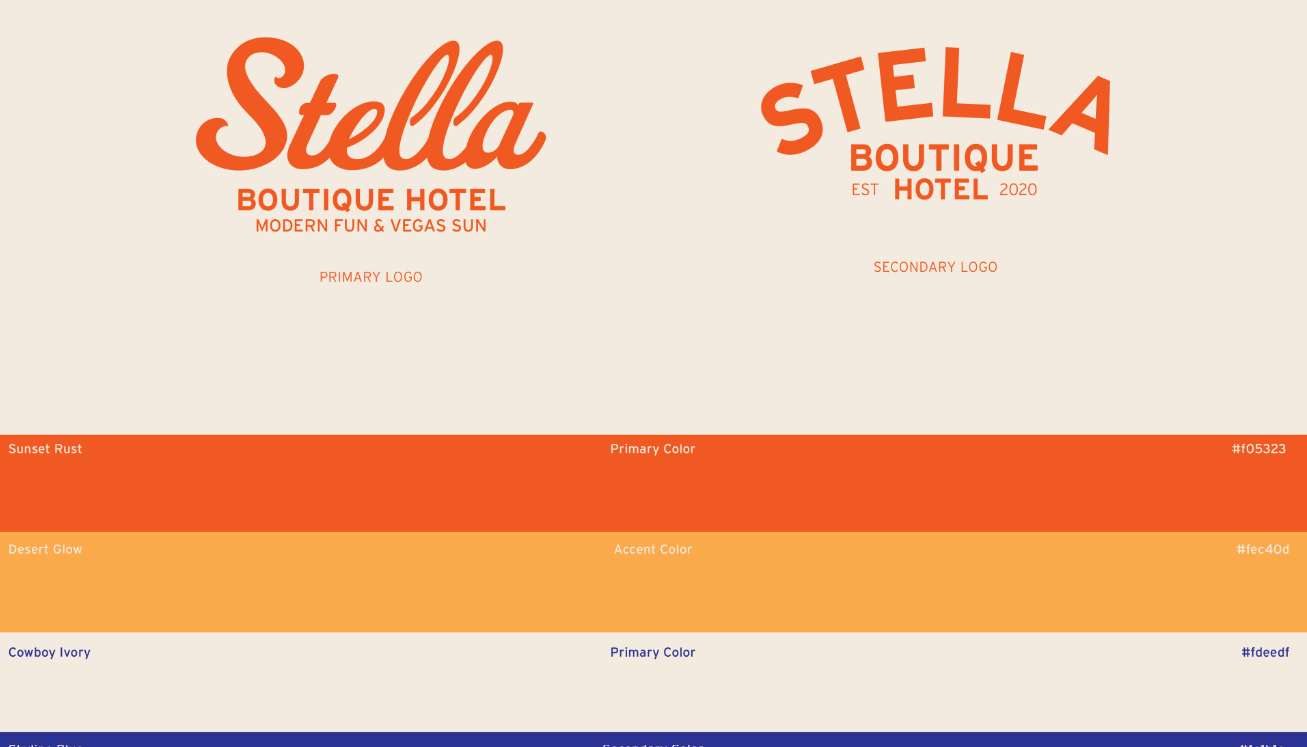
This is a sophisticated color combination for a dynamic, decisive yet elegant style. This pairing is particularly suitable for human resources businesses, sports brands, and corporate logos. In the human resources industry, red-orange conveys a spirit of human connection and enthusiasm, while pale white maintains a professional image. In sports, red-orange evokes motivation and a desire for victory. For large businesses, this color combination shows a brand that is both ambitious and mature.
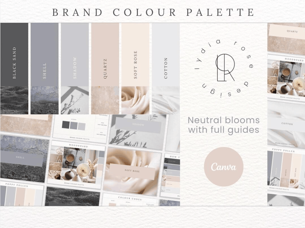
3.2 Light pink and gray
If you're designing a logo for a lifestyle brand, try a soft color palette of pale pink and greyish-green. Pale pink evokes a gentle, friendly feeling, while the greyish-green tone calms the overall aesthetic, creating a relaxed atmosphere reminiscent of nature. This combination isn't flashy, but it has a subtle and enduring appeal.
This color palette is suitable for lifestyle, retail, and wellness brands. Furniture stores, flower shops, yoga studios, spas, or minimalist cosmetics brands can all utilize this combination to convey a sense of peace and sophistication. The strength of this color combination lies in its ability to create a positive impression without being overbearing, helping customers feel comfortable interacting with the brand.
3.3 Neon Green and Blue
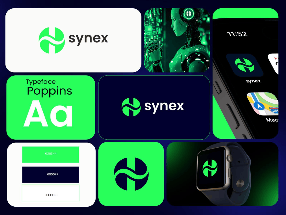
If you want to harness the visual appeal of contrast, try combining deep blue with neon green. Neon green offers a dynamic energy and evokes a sense of environmental friendliness, while deep blue adds a touch of stability, reliability, and a business-like feel.
The contrast between a muted shade and a bright, vibrant shade makes the logo easily recognizable even when displayed at a small screen size. Therefore, this combination is very suitable for technology and electronics brands, where modernity and innovation are paramount. A clean energy startup or a smart management application could use this color combination to both showcase creativity and maintain the necessary credibility.
3.4 Mint Green and Blue
Healthcare brands often choose green, blue, or white to express healing and a sense of peace. If you want to refresh this familiar image, you can try combining mint green with turquoise in a gradient effect. The gradient effect provides a more modern, smooth, and deeper feel compared to solid blocks of color.
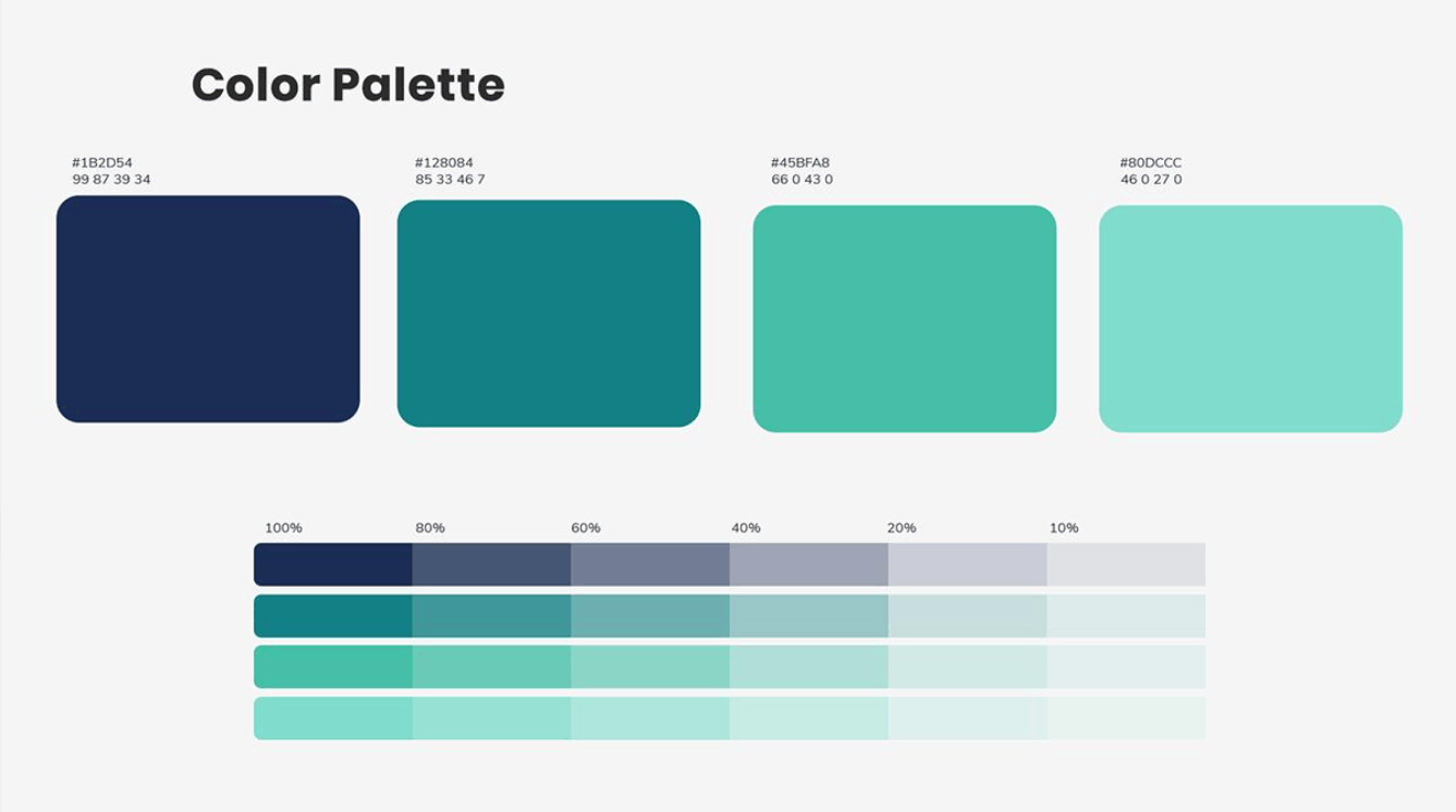
Mint green evokes freshness and cleanliness, while turquoise conveys trust and professionalism. This color combination is well-suited for healthcare brands, clinics, pharmacies, and pharmaceutical products, especially those seeking to break away from traditional, rigid imagery and connect more with younger consumers. It's also a good choice for digital healthcare applications where clarity and a sense of security are key.
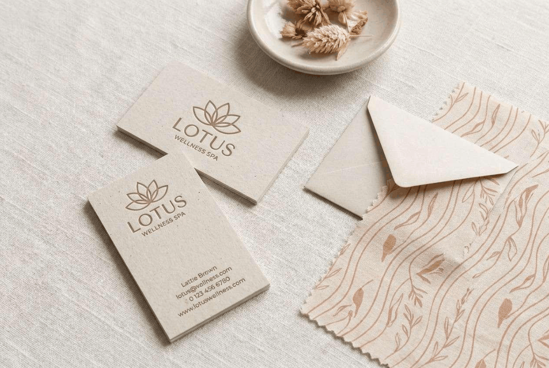
3.5 Peach and Brown
This earthy color combination is a perfect choice for organic brands or beauty industry logos. Brown is associated with nature and stability, while peach evokes a nostalgic feel reminiscent of the 1970s, being both warm and approachable.
This combination creates a natural, gentle feel, perfect for beauty brands, yoga studios, and organic product lines. A handmade cosmetics brand, a herbal tea shop, or a natural skincare salon could use this color combination to convey authenticity and a commitment to sustainable values. When using it, balance the proportions so that the peach color stands out while the brown serves as a base, avoiding an overall heavy look.
3.6 Green and Cream
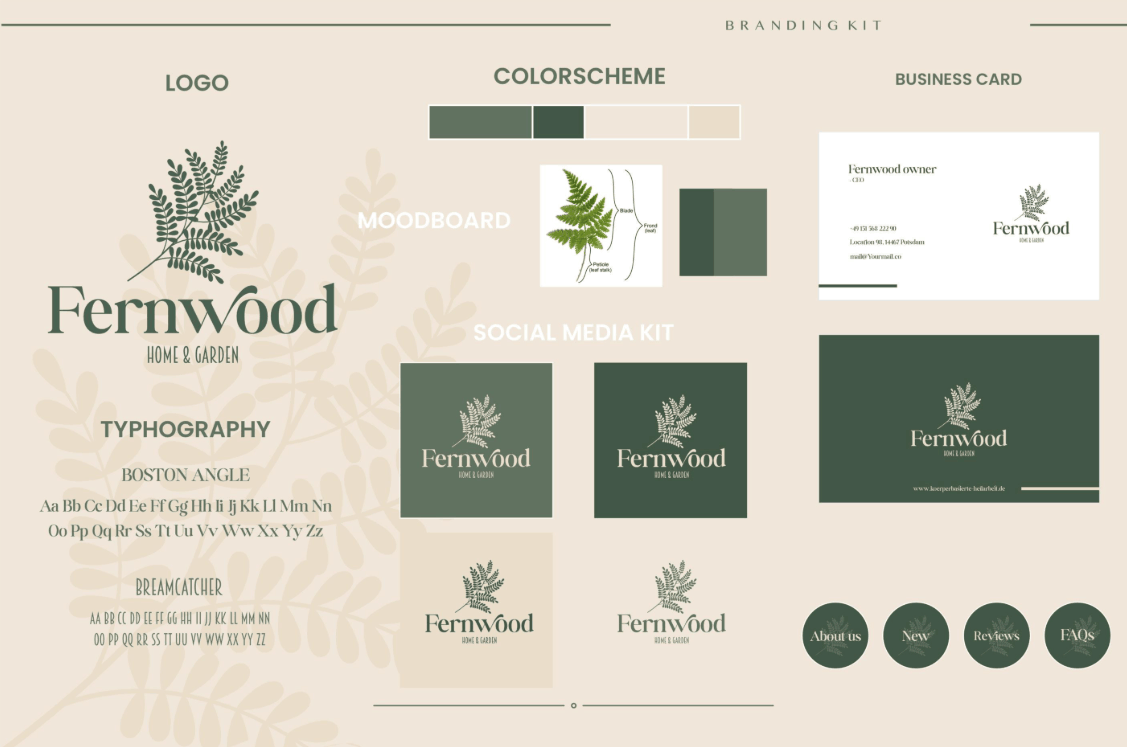
If you want to enhance the eco-friendly message of your logo, choose a color palette of green and cream. Green is a shade that clearly symbolizes nature, growth, and sustainability. When paired with cream instead of pure white, the overall effect becomes more modern, subdued, and simple, conveying a sense of sleekness and warmth.
This color palette is particularly well-suited for organic food brands, eco-friendly brands, and sustainable products. It's also an ideal choice for vegetarian restaurants, organic produce stores, or recycled packaging brands. The cream color also makes the logo easily compatible with materials like kraft paper, wood, or burlap, reinforcing a natural image throughout all publications.
3.7 Pink and blue gradient
Gradient color palettes are ideal for giving logos a dynamic and dynamic feel. They also display beautifully on websites and apps, especially against a deep black background. This combination uses two popular colors, fuchsia pink and violet, which blend together to create a design that is both soothing and futuristic.
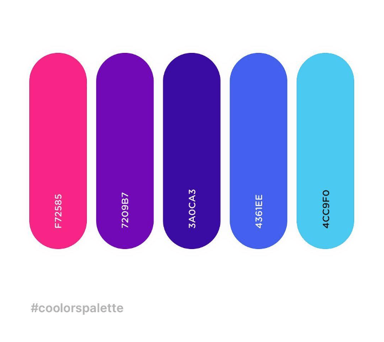
This gradient color scheme is often chosen by media companies, advertising brands, and website logo designers. For businesses working in a digital environment, the gradient effect not only creates a visual focal point but also conveys a spirit of creativity and openness to technology. However, you should prepare a single-color version of the logo for printing or when the background doesn't suit the gradient effect.
3.8 Forest Green and Amber Brown
Bring your brand project closer to nature with this color palette inspired by trees and soil. Forest green and amber brown are both common colors in the natural environment, so when placed together they create a harmonious, authentic, and trustworthy feel.
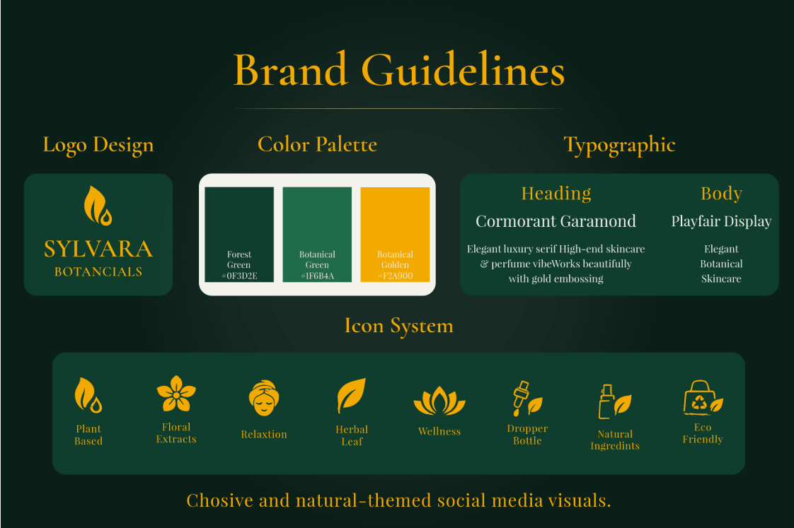
To enhance the natural atmosphere, you can incorporate blue into your logo design or use it as a background color. This color palette is suitable for brands related to wildlife, charities, and conservation projects. Organizations working for the community and the environment can rely on this color combination to convey messages of compassion, connection with nature, and social responsibility.
4. Conclusion
Logo color schemes are not just about aesthetics; they're a strategic decision that influences how customers perceive and remember your brand. Start by understanding your target audience and brand personality, then consider the relationships between colors on the color wheel, keep the number of colors reasonable, and experiment with the logo on various materials. The eight ideas in this article can be a starting point for finding the right color palette, but always adjust it to your own identity to make your logo truly unique and memorable.




















VIP Products






Best Selling Products
Plugin Retouch4me
69 USD
MidJourney Account
29 USD
Adobe Photoshop Copyright - Full App
120 USD
Genuine Adobe Illustrator account
99 USD
Adobe Premiere Pro Account
99 USD
Freepik Premium Account
59 USD
Windows 10 & 11 Pro Key
36 USD
Upgrade Duolingo Super
29 USD
Autodesk All App Account Copyright
120 USD
Genuine Cheap Canva Pro
39 USD
Upgrade genuine Capture One account
120 USD
Upgrade Genuine Office 365
49 USD
Copyright Adobe Lightroom Account
59 USD
Capcut Pro 1 Year
39 USD
ChatGPT Plus Account (GPT-4)
16 USD