Best Selling Products

Capcut Pro 1 Year
39 USD

Adobe Premiere Pro Account
99 USD

ChatGPT Plus Account (GPT-4)
16 USD

Copyright Adobe Lightroom Account
59 USD

Genuine Adobe Illustrator account
99 USD

Upgrade genuine Capture One account
120 USD

Plugin Retouch4me
69 USD

Upgrade Duolingo Super
29 USD

Adobe Photoshop Copyright - Full App
120 USD

Autodesk All App Account Copyright
120 USD

Freepik Premium Account
59 USD

Upgrade Genuine Office 365
49 USD

MidJourney Account
29 USD

Windows 10 & 11 Pro Key
36 USD

Genuine Cheap Canva Pro
39 USD
Negative Space in Photography and Design: The Art of Restraint
Nội dung
- 1. What is negative space in photography
- 2. Positive space and its relationship with negative space
- 3. Common misconceptions about negative space
- 4. How to use negative space effectively in photography and design
- 4.2 Balancing the color palette
- 4.3 Framing the subject
- 4.4 Exploiting layers, light and shadow
- 4.5 Negative space in typography
- 5. Tips for creating negative space in your photos
- 6. Using negative space to elevate your images
Most of us tend to see empty space as something that needs to be filled. When looking at a frame, instinct often urges us to add a detail, a color, a line of text, as if emptiness were a sign of something lacking. In reality, experienced photographers and designers understand the opposite. Deliberately arranged empty space is the most powerful tool for guiding the eye, conveying emotion and creating a composition with depth. This article will help you understand what negative space is, how it works and how to apply it effectively in both photography and design.

1. What is negative space in photography
Negative space, also called empty space, blank area or white space, is the area surrounding the main subject in a photograph or a design. It can be the vast sky above a small boat, a flat wall beside a pedestrian, the still water around a bird, or simply a uniform color background behind a product to be promoted. Negative space includes both the area surrounding the main subject and the gaps lying between and within the objects in the frame.
The first thing to understand is that "negative" here does not carry a negative meaning. The word only serves to distinguish it from the "positive" part, that is, where the emphasized object resides. Negative space is not a leftover or neglected part, but a component with an active role in the composition. It acts as a breathing space for the viewer's eyes, helping them take in information gently instead of being overwhelmed by too many competing details.

When used correctly, negative space can elevate an ordinary photo into an emotionally rich work. Conversely, when ignored or handled without intention, the composition easily becomes cluttered, loses its focus and leaves viewers not knowing where to look first. For this reason, photographers often regard mastering negative space as one of the important steps forward on the journey of maturing in visual thinking.
In photography, negative space also carries a very distinctive expressive power. A small subject in the middle of a wide frame can evoke a feeling of loneliness, stillness or the vastness of nature. A subject placed off to one side, leaving a large empty area on the other, can create a feeling of waiting, reaching toward something or deep reflection. The same subject with different amounts of empty space can completely change the message the photo conveys.
2. Positive space and its relationship with negative space
To fully understand negative space, we need to look at its opposite. Positive space is the main subject or the area of greatest interest in the work. It can be a person, an object, a line of text, a symbol or any element to which the creator wants to direct the viewer's attention.
These two kinds of space do not exist independently but always define each other. Positive space stands out thanks to its contrast with the quiet area around it, while negative space only has meaning when there is a subject for it to serve as a backdrop. If everything in the frame is trying to attract attention, no accent will truly be felt. The vividness of an accent can only appear when there is a neutral area wide enough to make it stand out.

This relationship is often illustrated with the familiar Rubin vase image in visual psychology. Looking at it, the viewer can see a white vase, or two black faces facing each other, depending on which part is regarded as figure and which as ground. This example shows that the human brain automatically separates the visual world into object and background, and the creator can actively control that process by arranging negative space.
Negative space is also a tool for defining the outline of an object, creating balanced proportions and maintaining harmony among shapes, textures, lettering and colors. In graphic design, designers can exploit the gaps between shapes to create hidden images, giving birth to brand symbols that are both refined and memorable. Many famous logos around the world have applied this technique, making viewers smile when they recognize the second message hidden behind a familiar shape.
Applying negative space correctly brings many clear benefits, including softening the relationships among components in the composition, preventing a photo or design from becoming cramped, increasing elegance and style, improving the rhythm of the content, helping the viewer's eyes glide across comfortably, enhancing the readability and recognition of information, creating a distinctive atmosphere and emotion for the work, and at the same time producing the necessary balance and contrast.
3. Common misconceptions about negative space
The most common misconception is that negative space must be empty, plain or white. In reality, negative space does not have to be white, and does not even need to be "empty" in the literal sense. It can have any color, texture, pattern or image, as long as it serves to highlight the positive space and does not compete for attention with the subject.
A cloud-covered sky, a rippling sea surface, a wall mottled with moss or a stretching field of flowers can all act as negative space if they are visually simple enough for the subject to remain the clearest accent. What decides it is not whether the background is "empty," but whether it creates enough stillness for the subject to speak.
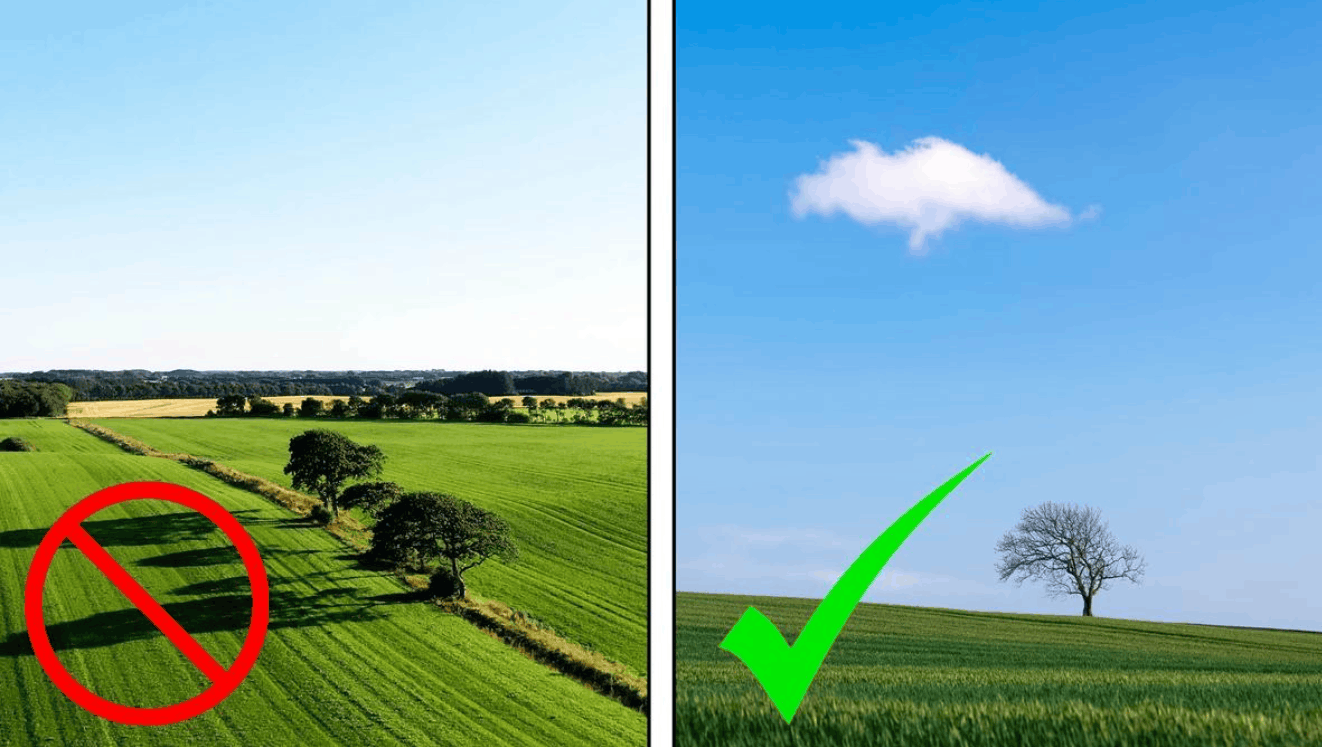
In photography, you can take advantage of the contrast between color and monochrome to create negative space. For example, you choose a subject you want to emphasize, such as a person, an object or even a shadow, then keep or slightly increase the vividness of that subject in post-processing, while converting the surrounding environment to black and white or neutral tones. This approach keeps the negative space natural and interesting without having to replace it with a dull plain background.
Another misconception is that the more negative space there is, the more beautiful the photo. In fact, there is no absolute formula for the ideal amount of empty space. Too little empty space makes the composition stifling, but too much can make the subject feel lost, disconnected from the whole. What matters is balance and expressive purpose. Depending on the message you want to convey, the appropriate amount of negative space will differ.
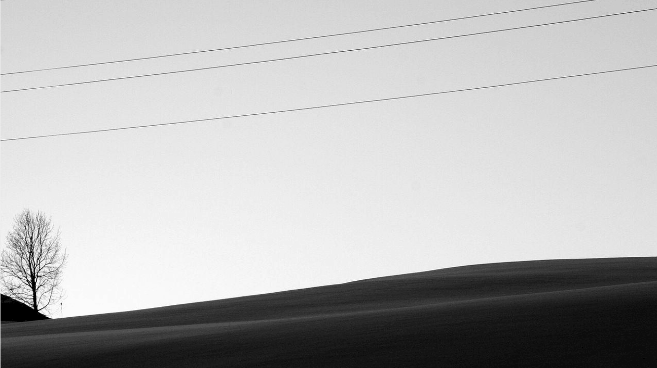
Some people also believe that using negative space means producing boring photos or photos lacking content. This is not true. Many of the most evocative works are precisely minimalist frames, where every element has a reason to be present. Restraint requires the photographer to think harder about what is truly important, instead of capturing a great many details in the hope that one of them will attract the viewer.
Finally, remember that there is no absolutely right or wrong way to use it. Using negative space ineffectively can cause distraction, but small adjustments in the composition are enough to completely change the viewer's perception. Therefore, treat the principles below as a compass rather than unchangeable rules.
4. How to use negative space effectively in photography and design
The strategies below can be applied to most creative fields, from photography and graphic design to web design.
4.1 Building visual hierarchy
Visual hierarchy is the way of arranging elements by level of importance, in which the core information or image appears first, followed by secondary content. This is a simple way to balance positive and negative space. When shooting or designing, ask yourself questions about the flow of the gaze. Where will the viewer's eyes naturally stop first, what is the second stopping point, where will they end the journey, and most importantly, where do you want them to look.
When you can picture that journey, you will know which element to place where, and in which positions to leave empty space to guide the viewer's eyes according to your intention. Instead of letting the gaze jump around the whole frame, use negative space as paths leading them to what you want to convey.
4.2 Balancing the color palette
Negative space does not have to be a white background. A good design can exploit color within the negative space itself to tell a story, convey a message or evoke a symbol. However, color should not be overused to the point of losing focus. The task of negative space is to support the positive space, not to take over its attention.
A useful principle is to limit the negative space area to two or three colors, for example one color for the background and one to two colors for the shapes placed on that background. You can certainly experiment with unique color combinations, as long as they do not overpower the colors, or the absence of color, in the positive space.

4.3 Framing the subject
Framing is one of the most common ways of using negative space, especially in photography. This technique is simple but effective, suitable for designing posters and logos as well as taking photos. Negative space surrounding the main subject emphasizes the focal point while also highlighting that empty space itself, thereby shaping the theme of the work more clearly. This approach is often associated with a minimalist style, where the viewer is guided to absorb the quiet around before focusing all attention on the center.
The rule of thirds is a familiar composition technique that combines very well with negative space. This rule divides the frame into nine equal parts by two horizontal lines and two vertical lines, creating four intersections regarded as points that attract the eye. When combined with negative space, photographers and designers often place the subject at one intersection and leave one or two of the remaining intersections empty. This arrangement both emphasizes the focal point and allows the empty space to play its role in conveying emotion.
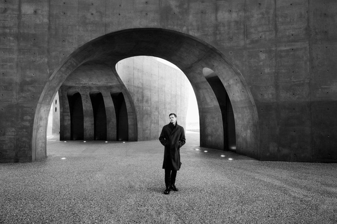
4.4 Exploiting layers, light and shadow
Do not be afraid to experiment with light, texture and overlapping layers to create distinctive designs. The layering technique lets you pick two or more shapes, assigning one as negative space and the other as positive space. The result is often an interesting cut-out effect, especially suitable for brands with multiple missions or multiple layers of meaning.
Shadow is also a great way to create negative space. In photography, you can create this effect by adjusting the light so that one side of the subject is well lit while the other sinks into darkness, thereby creating a dense shadow area that serves as negative space. In graphic design, the same principle applies. Picture a symbol or illustration as a three-dimensional object, consult real photos to determine where shadows fall, then use the lit part as positive space and the dark part as negative space, or vice versa. The contrast of shadow makes the subject look more vivid and energetic.
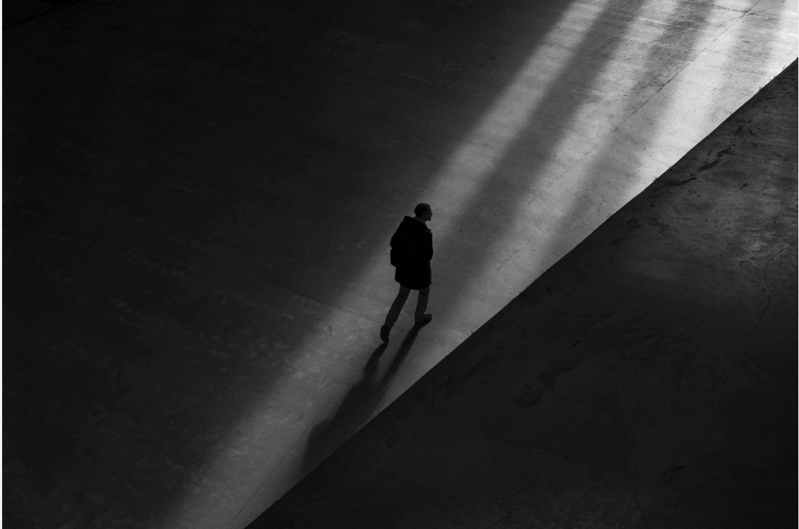
In addition, transparency also helps create balanced and creative negative space. Different levels of transparency make objects look heavy or light, establishing visual priority. Stacking transparent components on top of each other creates a dynamic composition, helping you control perspective and space, while forming soft boundaries between positive and negative areas.
4.5 Negative space in typography
In typography, the letters themselves are positive space, so the empty space around and inside them is often overlooked. However, when you know how to interpret that empty space according to the meaning of the letters, you can create clever logos or symbols, where a second image emerges in the white space between the strokes.
5. Tips for creating negative space in your photos
Creating negative space is an effective way to improve composition and draw attention to the main subject. Below are practical suggestions that you can apply right in your upcoming shoots.
Pay attention to balance. When introducing negative space into a photo, observe carefully the balance between light and dark areas. A balanced composition creates an impressive structure, helping the gaze naturally turn toward the subject. You can try placing a small subject in a corner and leaving the rest as a wide background area, then adjust the position so that the whole is not unintentionally lopsided.
Make use of natural scenery. Rocks, trees, sky, water, sand or fog are all ready-made sources of negative space. They help create depth and give you an interesting backdrop for the main subject without adding any artificial elements. Try looking for places with simple backgrounds such as an empty beach, an open field or a single-colored wall, then place the subject there.
Capture movement. Movement is an effective way to create negative space and make the photo more lively. Elements such as wind, waves, a flock of birds in flight or a running animal increase visual impact. When the subject is moving, you should leave plenty of empty space in front of the direction of travel to create a sense of room for the subject to move into, instead of leaving them as if touching the edge of the frame.
Avoid clutter. When shooting photos with negative space, it is crucial to remove unnecessary details from the frame. Just one small object appearing unintentionally at the edge of the photo is enough to break the stillness you have worked hard to build. Before pressing the shutter, scan the entire frame, especially the corners, to make sure everything present has a reason.
Use a shallow depth of field. Opening a large aperture to blur the background is a quick and effective way to create negative space. The blurred background becomes a soft patch of color, pushing the foreground subject to stand out. A blurred backdrop is a very powerful tool in most genres of photography, especially when you want to adjust the balance of the composition. A wide aperture also increases the contrast between light and dark areas, helping you achieve a more effective composition.
Try different shooting angles. Shooting from a low angle toward the sky, or from high above looking down at the ground or water, are two simple ways to get a clean, wide background. A person standing on the horizon with a vast sky behind them, for example, is by itself a complete negative space composition.
Crop with intention. In post-processing, re-cropping the frame lets you adjust the amount of negative space precisely. Sometimes just expanding the empty space a little on one side, or narrowing it on the other, is enough to completely change the emotion of the photo.
Finally, be creative and dare to experiment. Everyone has their own way of seeing and applying empty space, and unique approaches are what make your photos stand out in the crowd.
6. Using negative space to elevate your images
The name "negative space" may make many people think of something negative, but as we have seen, it is entirely the opposite. Negative space is the foundation of every high-quality, carefully calculated photo and design. It increases visual navigation, prevents elements from becoming overloaded and gives you control over where the viewer's attention rests.
The most precious thing about negative space is that it teaches creators to be selective. Instead of trying to say a great deal, you learn to say what matters and let the rest fall silent. That very silence makes the message clearer, weightier and more memorable to viewers than any layer of decoration.
Start with small steps. The next time you pick up your camera, try leaving a little more empty space around the subject. When designing, try removing an element instead of adding one. Over time, you will gradually sense the breathing rhythm of a frame, knowing when it needs to be full and when it needs to be empty, and create images that are creative, practical and rich in purpose.
If you like, I can convert this article into a Word file or a document page so that it is easier for you to edit and publish.




















VIP Products








Best Selling Products
Capcut Pro 1 Year
39 USD
Adobe Premiere Pro Account
99 USD
ChatGPT Plus Account (GPT-4)
16 USD
Copyright Adobe Lightroom Account
59 USD
Genuine Adobe Illustrator account
99 USD
Upgrade genuine Capture One account
120 USD
Plugin Retouch4me
69 USD
Upgrade Duolingo Super
29 USD
Adobe Photoshop Copyright - Full App
120 USD
Autodesk All App Account Copyright
120 USD
Freepik Premium Account
59 USD
Upgrade Genuine Office 365
49 USD
MidJourney Account
29 USD
Windows 10 & 11 Pro Key
36 USD
Genuine Cheap Canva Pro
39 USD