Best Selling Products

ChatGPT Plus Account (GPT-4)
16 USD

Capcut Pro 1 Year
39 USD

Plugin Retouch4me
69 USD

Windows 10 & 11 Pro Key
36 USD

Copyright Adobe Lightroom Account
59 USD

MidJourney Account
29 USD

Freepik Premium Account
59 USD

Upgrade genuine Capture One account
120 USD

Genuine Adobe Illustrator account
99 USD

Genuine Cheap Canva Pro
39 USD

Upgrade Genuine Office 365
49 USD

Adobe Photoshop Copyright - Full App
120 USD

Autodesk All App Account Copyright
120 USD

Adobe Premiere Pro Account
99 USD

Upgrade Duolingo Super
29 USD
Principles for Choosing Fonts That Make a Design “Stand Out” Instantly
Nội dung
- 1. Define Brand Personality to Choose the Right Font
- 2. Prioritize Readability When Choosing Fonts
- 3. Carefully Evaluate Technical Factors When Selecting Fonts
- 4. Test Fonts Before Deciding to Purchase
- 5. Consider Licensing and Budget When Choosing Fonts
- 6. Keep the Number of Fonts Minimal to Create Harmony
- 7. Conduct Thorough Research Before Choosing Fonts
- 8. Consider the Display Medium When Selecting Fonts
- 9. Keep It Simple
Typography is a core element of graphic design, yet it is often underestimated. With the 10 font selection principles in this article, you will learn how to create designs that are clear, visually appealing, and engaging. These are practical tips that help you avoid common mistakes when working with fonts.
1. Define Brand Personality to Choose the Right Font
Choosing a font is not simply an aesthetic decision; it must accurately reflect the personality and core values of a brand. The right typeface can make a brand more recognizable, leave a lasting impression on customers, and strengthen the image the brand aims to build.
Darren Richardson, co-founder and creative director at Gardiner Richardson, emphasizes that fonts act as an important “memory structure” in brand identity design. He compares a font to a brand’s unique handwriting, a visual element that consistently and clearly expresses its character. However, the greatest challenge is balancing uniqueness with practical considerations such as cost, long-term usability, and flexibility across different contexts.
A youthful and energetic brand may work well with modern sans-serif typefaces, while a premium brand often chooses serif fonts to create a sense of elegance and trustworthiness. Creative brands sometimes opt for more distinctive typefaces to express a strong personality and stand out from competitors.
If you find it difficult to identify a font that meets all these requirements, consider researching brands with a similar direction and examining the typefaces they use. This research is not about copying but about gaining insights into how other brands use typography to communicate their personality.
A useful resource in this process is Fonts in Use, where you can see how typefaces are applied in real-world projects and evaluate their effectiveness in different contexts. Brand and design director Alexandra Lunn advises that any font you choose should be closely aligned with your brand personality, helping communicate the right message while maintaining consistency throughout the identity system.
Choosing a font should therefore never be rushed or based solely on personal preference. It requires research and a deep understanding of the brand so that every decision contributes to building a strong image that resonates with the target audience.
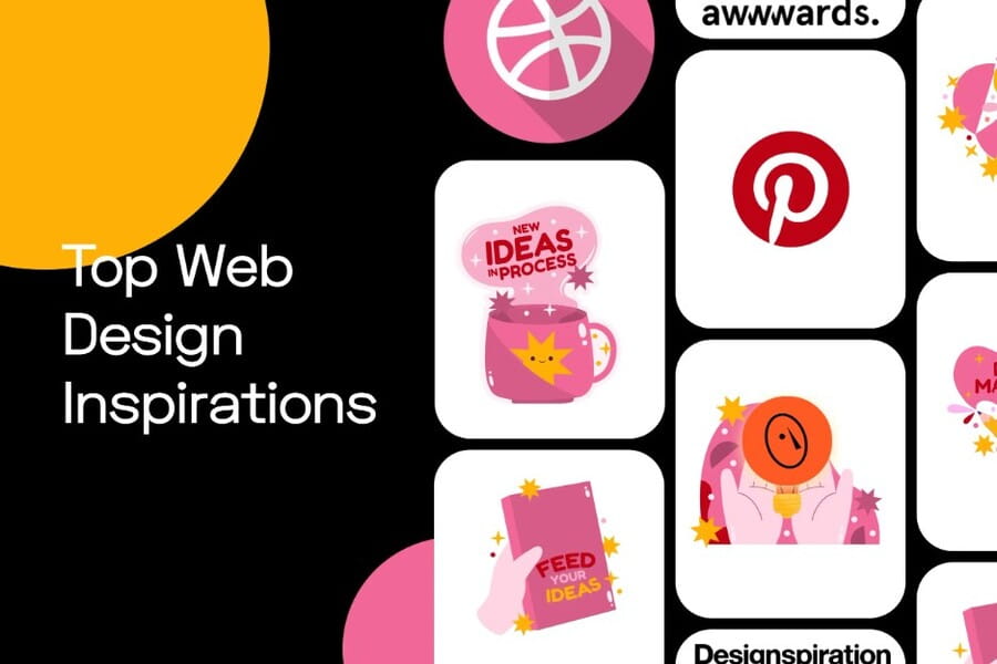
2. Prioritize Readability When Choosing Fonts
In design, selecting fonts based on aesthetics is understandable, but the most important factor is ensuring readability and clear character recognition. A visually attractive typeface is not necessarily suitable for every audience, especially when considering user experience.
Grace Ellins, Senior Graphic Designer at the Office for National Statistics, believes that a good font should not only look appealing but also support multiple languages and feature clear character structures. Factors such as a large x-height, appropriate letter spacing, and multiple weight variations help improve readability, especially at smaller sizes.
For web and application projects, readability becomes even more critical. Screen content is often skimmed and scanned more quickly than printed material, so the typeface must ensure clarity and immediate recognition at first glance.
%20(1).jpg)
Stan Potra, a product designer, recommends prioritizing simple and highly readable typefaces for body content, while decorative fonts should be reserved for headings or emphasis elements.
A readable font not only helps users absorb information faster but also creates a comfortable reading experience for long-form content. This is especially important for websites, blogs, and content platforms where users spend significant time reading and interacting with information.
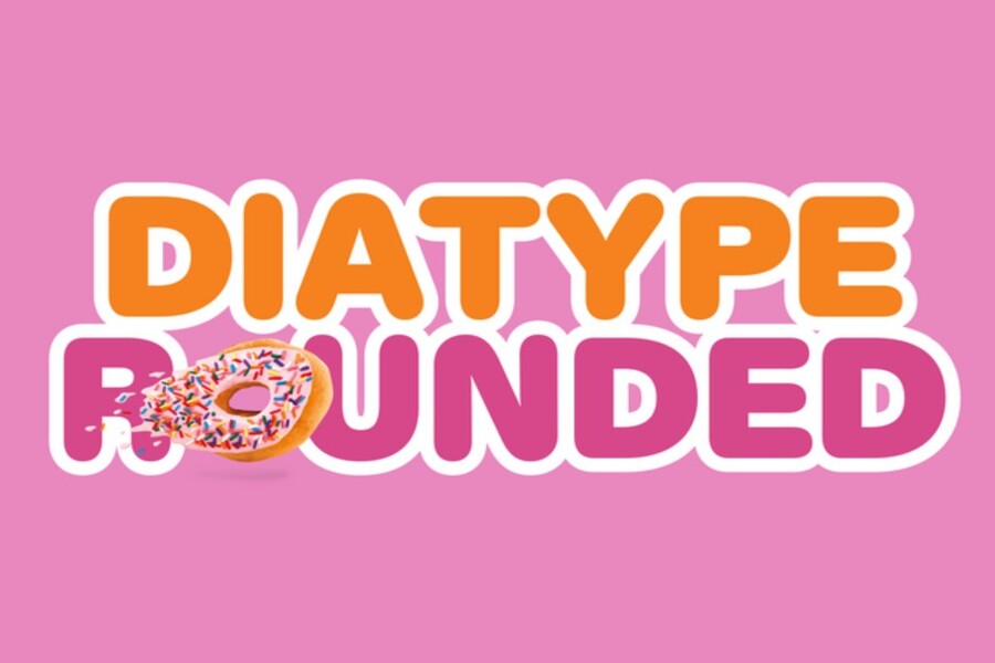
3. Carefully Evaluate Technical Factors When Selecting Fonts
Beyond aesthetics and readability, designers should also consider numerous technical aspects to ensure a font performs well across different situations. A typeface may look beautiful but still present limitations if it lacks essential features.
.GIF)
Type designer Sarah Cowan notes that many brands have comprehensive visual identities but use fonts missing important elements such as italics, small caps, or specialized numeral styles. These features may not seem important at first, but they become essential when working with complex documents or professional layouts.
In addition, settings such as kerning, leading, and tracking directly affect the visual quality of text. Poor spacing between characters can make content look unbalanced and difficult to read.
Graphic design expert Khurram Shahzad shares that he always tests fonts at various sizes and across different platforms to ensure consistency. For web design, font loading speed is also important because it impacts website performance and user experience.
A common tip among designers is to inspect special characters such as the @ symbol and numerals to ensure they are well designed. These small details can significantly affect the professionalism of a project, especially in branding-related work.
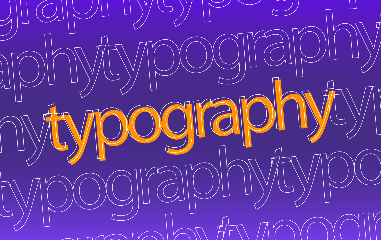
4. Test Fonts Before Deciding to Purchase
Choosing a font should not rely solely on promotional images or sample previews from a type foundry’s website. Many typefaces look impressive in isolation but may not perform effectively when applied to real-world layouts. Differences in size, line spacing, contrast, or display behavior across devices can make a seemingly perfect font less suitable for a specific project.
Daan Hornstra, co-founder and Head of Brand Design at TIN, strongly encourages designers to test fonts in realistic environments before purchasing them. According to him, testing helps identify issues such as uneven character spacing, missing style variations, or display inconsistencies across platforms. Although these factors may seem minor, they can significantly affect the final quality of a large-scale design project.
%20(1).jpg)
An effective method is to create a testing board in design software such as Figma or Illustrator. Designers can evaluate typefaces at different sizes, experiment with heading levels, body text, and captions, and place them within layouts similar to actual projects. This provides a clear understanding of how a font performs across various scenarios, from large headlines to lengthy paragraphs.
Testing also makes it easier to compare multiple typefaces visually. By placing different options side by side within the same layout, designers can quickly identify which font better aligns with the brand personality and communication goals. This step is essential for avoiding costly mistakes and ensuring that the chosen typeface is not only visually appealing but also effective in real design applications.
5. Consider Licensing and Budget When Choosing Fonts
An important factor that is often overlooked when selecting fonts is licensing and cost. Many designers focus heavily on aesthetics and forget that fonts are copyrighted products with specific usage terms. Without careful research, you may face unexpected expenses or even copyright violations when using fonts in commercial projects.
Leigh Whipday, co-founder of ToyFight, once shared that a project had to change direction because the licensing cost of a chosen typeface was too high. In that case, the fee reached tens of thousands of dollars because the client’s website received substantial monthly traffic. This demonstrates how font costs can increase significantly as projects scale or expand across multiple platforms.
To avoid similar situations, designers should carefully review licensing agreements before using fonts for commercial purposes. Many typefaces advertised as free are actually limited to personal use only. Applying them to branding materials, websites, applications, or advertising campaigns may require additional licensing fees.
%20(1).jpg)
In addition, defining a font budget at the beginning of a project is highly recommended. This allows the design team to choose suitable typefaces without affecting the overall project budget. When resources are limited, open-source libraries such as Google Fonts or collections available through Adobe Fonts can be excellent alternatives. These sources provide high-quality typefaces while helping reduce costs.
Carefully considering licensing and budget not only minimizes legal risks but also ensures a smoother design process without unexpected financial obstacles.
6. Keep the Number of Fonts Minimal to Create Harmony
In design, using too many fonts can make a layout feel cluttered and inconsistent. While combining multiple typefaces can introduce freshness and variety, poor execution may distract viewers and reduce the effectiveness of the message.
A well-constructed typography system typically uses only two or three complementary fonts. One typeface may be used for headlines to create strong visual impact, while another serves body content to maintain readability and user comfort. This balanced approach establishes a clear information hierarchy, making it easier for viewers to distinguish primary content from supporting elements.
Limiting the number of fonts also helps maintain consistency across different platforms. When a brand uses the same typography system across websites, social media, advertisements, and printed materials, audiences can recognize and remember the brand more easily.
%20(1).jpg)
Many renowned designers follow this minimalist principle. They believe that a carefully selected font system delivers greater long-term value than constantly switching between different typefaces. Simplicity in typography not only enhances professionalism but also creates a cohesive visual experience that makes content easier to access and remember.
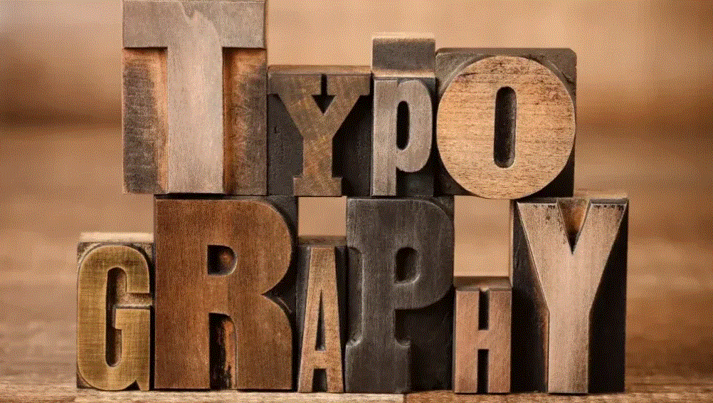
7. Conduct Thorough Research Before Choosing Fonts
Research is an essential step that helps designers make informed decisions when selecting fonts. In many cases, choosing a typeface is not merely an aesthetic matter but also a strategic branding decision. Design director Olly Sussams believes that every typography choice should have a clear rationale rather than being based on impulse or convenience.
The research process can begin with exploring current design trends. This helps designers understand which styles are widely used and how brands build identity systems through typography. However, researching trends does not mean following them blindly. In many cases, understanding trends helps you identify opportunities to create something distinctive.
Analyzing how other brands use typography can also provide valuable insights. By studying successful identity systems, you can learn how they combine fonts for headlines, body text, and supporting graphics to create cohesive visual experiences. The purpose is not imitation but understanding how typography functions in real-world contexts.
%20(1).jpg)
Another valuable source of inspiration comes from independent type foundries. These studios are often responsible for introducing fresh ideas and unique typefaces that are not yet widely adopted. Exploring such sources can help designers discover more original solutions rather than relying solely on familiar fonts.
Beyond trends and market analysis, understanding the history of a typeface also plays an important role. Every font was designed within a specific historical period and reflects the aesthetic needs of its time. For example, classic serif typefaces are often associated with tradition and credibility, while modern sans-serif fonts evoke minimalism and technology. Understanding this context helps designers select typefaces that better align with a brand’s story and values.
8. Consider the Display Medium When Selecting Fonts
Another crucial factor in font selection is the display environment. A typeface that performs beautifully in print may not work as effectively on digital screens. This is especially important today as content appears across smartphones, tablets, and desktop displays.
Khurram Shahzad once shared an experience in which he selected a decorative handwritten font for an advertising campaign because it looked stunning in print. Its elegant strokes and intricate details created a unique artistic feel. However, when the campaign was adapted for mobile platforms, the font became difficult to read due to smaller screen sizes and varying pixel densities. As a result, the advertising message was not communicated as effectively as intended.
.gif)
From this experience, he learned an important lesson: always test fonts across multiple platforms before making a final decision. This includes reviewing how a font appears on different devices, testing various sizes, and evaluating performance under different lighting and contrast conditions.
Different media also have unique typography requirements. In print design, typefaces can include more intricate details while maintaining clarity thanks to high-resolution output. In digital design, however, fonts often require simpler structures to ensure readability on screens. Factors such as stroke weight, character spacing, and contrast must be optimized for the intended environment.
Considering the display medium from the beginning helps designers avoid unnecessary mistakes and ensures the selected font performs effectively across all contexts, from websites and mobile applications to printed communication materials.
9. Keep It Simple
In design, simplicity often delivers more lasting value than overly complex choices. A typeface may appear highly distinctive and fashionable today, but if it does not align with the brand or intended purpose, it can quickly become outdated or difficult to use across multiple platforms.
Graphic designer and photographer Katie Ehrlich once shared an interesting experience while working with a client. She proposed using a variable font for a new brand identity because of its flexibility and customization capabilities. The typeface allowed adjustments in width, weight, and many other characteristics, offering significant creative potential.
%20(1).jpg)
However, after careful consideration, the client chose not to use it because they did not actually need those advanced features. Instead, they selected a simpler typeface that was easier to implement and better suited to the brand’s practical needs.
This example illustrates how designers can sometimes become overly focused on technological trends or innovative solutions while forgetting that the primary goal of design is to communicate clearly and effectively. A simple, readable, and reliable typeface often provides greater long-term value than a complex choice driven solely by trends.
Simplicity in typography does not mean a lack of creativity. On the contrary, it reflects the ability to select and refine only the elements that truly matter, resulting in a clear and effective visual system. When a font is chosen thoughtfully and applied consistently, it strengthens brand recognition and creates a more comfortable reading experience for users.
Typography is one of the most important elements in graphic design and branding. The right choice can make a design appear professional, readable, and memorable. Conversely, a poorly considered choice can reduce the effectiveness of the entire message.


VIP Products


Best Selling Products
ChatGPT Plus Account (GPT-4)
16 USD
Capcut Pro 1 Year
39 USD
Plugin Retouch4me
69 USD
Windows 10 & 11 Pro Key
36 USD
Copyright Adobe Lightroom Account
59 USD
MidJourney Account
29 USD
Freepik Premium Account
59 USD
Upgrade genuine Capture One account
120 USD
Genuine Adobe Illustrator account
99 USD
Genuine Cheap Canva Pro
39 USD
Upgrade Genuine Office 365
49 USD
Adobe Photoshop Copyright - Full App
120 USD
Autodesk All App Account Copyright
120 USD
Adobe Premiere Pro Account
99 USD
Upgrade Duolingo Super
29 USD