Best Selling Products

Copyright Adobe Lightroom Account
59 USD

MidJourney Account
29 USD

Adobe Premiere Pro Account
99 USD

Genuine Cheap Canva Pro
39 USD

Adobe Photoshop Copyright - Full App
120 USD

Upgrade genuine Capture One account
120 USD

Capcut Pro 1 Year
39 USD

Freepik Premium Account
59 USD

Upgrade Duolingo Super
29 USD

Genuine Adobe Illustrator account
99 USD

Upgrade Genuine Office 365
49 USD

Autodesk All App Account Copyright
120 USD

ChatGPT Plus Account (GPT-4)
16 USD

Windows 10 & 11 Pro Key
36 USD

Plugin Retouch4me
69 USD
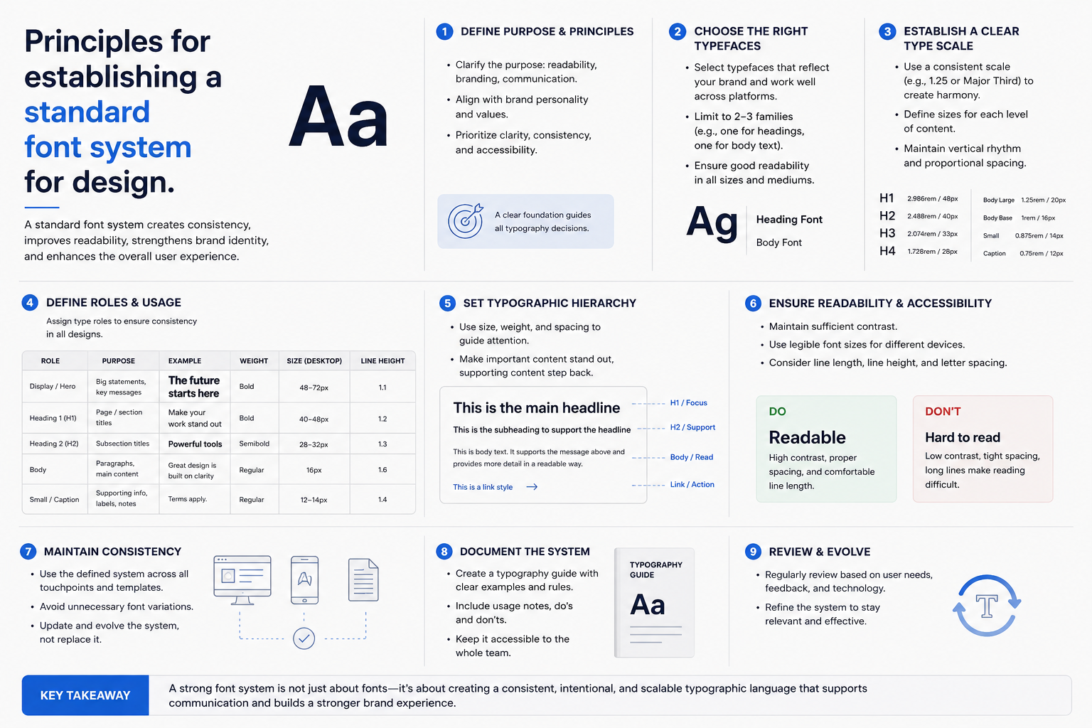
Principles for establishing a standard font system for design.
Nội dung
- 1. Why is it necessary to build a font system?
- 2. Principles of font system construction
- 2.1. Clear Hierarchy
- 2.2. Creating contrast while maintaining harmony
- 2.3. Always prioritize reading ability.
- 3. Font system development process
- Step 1: Choose your main font
- Step 2: Choose a supported font.
- Step 3: Use consistently
- 4. Suggestions for beautiful font combinations.
- 5. Conclusion
Fonts are not simply tools for displaying text; they are also crucial elements that determine the emotion, the ability to convey a message, and the level of professionalism of a design.
1. Why is it necessary to build a font system?
One common mistake made by beginner designers is using too many fonts in a single product. Many people think that the more typefaces, the more striking the design will be, but in reality, this often has the opposite effect. Combining too many fonts makes the layout lose its unity, makes it difficult for viewers to focus on the main content, and the overall design becomes cluttered.
In many cases, the title font and the content font have absolutely no stylistic connection. The title might have a modern feel while the content uses a classic font, resulting in a lack of harmony. Furthermore, many designs make the mistake of choosing overly elaborate fonts, making the text beautiful but difficult to read, especially when displayed at small sizes or on mobile devices.
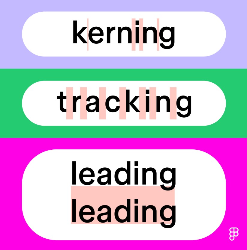
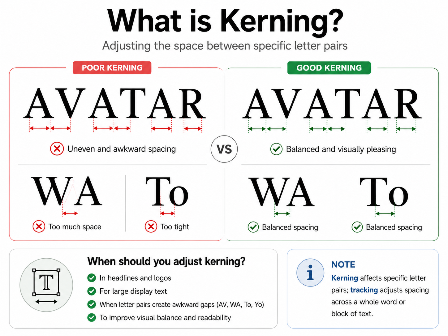
Character spacing (kerning), line spacing (leading), and font size are often overlooked. These seemingly minor details directly impact the reader's experience and visual perception.
A well-structured font system offers numerous benefits. First, it makes the design more professional because every element follows a clear pattern. Secondly, the font system creates a hierarchy, helping viewers quickly identify headings, main content, and supplementary information.
For businesses or individuals building a brand, using a consistent font set also helps increase brand recognition. Viewers will gradually remember the presentation style and associate it with the brand even before seeing the logo.
More importantly, a good font system helps readers absorb information faster. Beautiful design is not just for aesthetics; it must also effectively convey the message.
2. Principles of font system construction
To create a professional font system, you don't need to use too many typefaces. The important thing is to understand the role of each font and know how to combine them harmoniously.
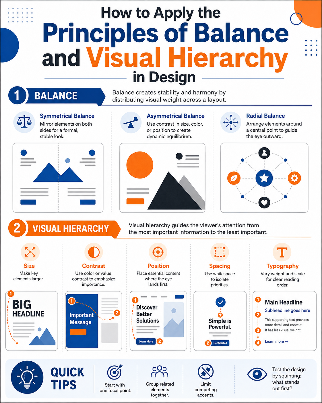
2.1. Clear Hierarchy
The first principle is to categorize fonts according to their specific roles in the design.
The headline font is the first thing that catches the eye. This is where the brand's personality or design theme is showcased. Header fonts typically have a larger weight, stand out more, and create a strong or distinctive feel.
Subtitle fonts play a crucial role in connecting the title to the main content. They create a smoother layout, establish rhythm in the presentation, and help viewers transition naturally from the introduction to the main content.
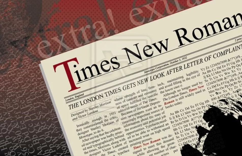
The font used for the content should prioritize readability. This is the most frequently used element in the design, so choose fonts that are simple, clean, and easy to read at various sizes.
In fact, most beautiful designs only use three basic font roles: a title font, a supporting font, and a body font. In many cases, you can absolutely use just two fonts and still achieve great results if you know how to adjust the letter weight, size, and spacing.
An important rule is to avoid using more than two or three fonts in the same layout. Limiting the number of fonts helps maintain design consistency and prevents a cluttered look.
2.2. Creating contrast while maintaining harmony
A beautiful font system isn't about identical fonts, but rather a deliberate combination of different typefaces that complement each other.
A trick many designers use is to combine bold and thin fonts. Headlines can use a bold font to create emphasis, while the body text uses a thinner font to improve readability.
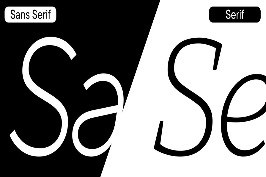
In addition, the combination of Serif and Sans-serif fonts is also very effective. Serif fonts create a sense of elegance, classicism, and reliability, while Sans-serif fonts are modern, minimalist, and easy to read on screens.

You can also combine a bold font with a minimalist one. For example, the title could use a strong, distinctive font to make an impression, while the content could use a simple font to help the reader focus on the information.
The right amount of contrast will add depth to the composition without distracting the viewer. It's important that the fonts maintain stylistic cohesion to create a harmonious overall effect.
2.3. Always prioritize reading ability.
Many people choose fonts simply because they find them aesthetically pleasing, forgetting the most important purpose of typography: to convey information.
A good font should be easy to read even when displayed at small sizes. Fonts with too much decorative detail are often suitable for headings but should not be used for long paragraphs.
Additionally, the font needs to display clearly on a variety of devices, from computer screens to phones. Nowadays, the majority of users access content on mobile devices, so the ability to display on small screens is a crucial factor.

For banners, posters, or social media posts, factors like kerning, leading, and font size directly impact the visual experience. Too close a character spacing makes the text difficult to read, while too narrow a line spacing makes the content feel cramped. Conversely, if the spacing is too large, the layout will lack cohesion and reduce the effectiveness of the message.
Adjusting these parameters appropriately will help create a more professional design without adding any complex effects.
3. Font system development process
After understanding the basic principles, you can start building your own font set in three simple steps below.
Step 1: Choose your main font
The dominant font is the element that reflects the personality of the entire design. This will be the typeface that appears in the title or the most important areas.
If you want to convey a modern feel, prioritize sans-serif fonts with clean lines.
If you're aiming for a luxurious or high-end style, serif fonts would be a suitable choice.
For technology or digital themes, geometric fonts with clear shapes will create a modern and futuristic feel.
Meanwhile, projects aimed at children or brands with a playful style would be well-suited to Rounded Fonts with their soft, rounded corners.
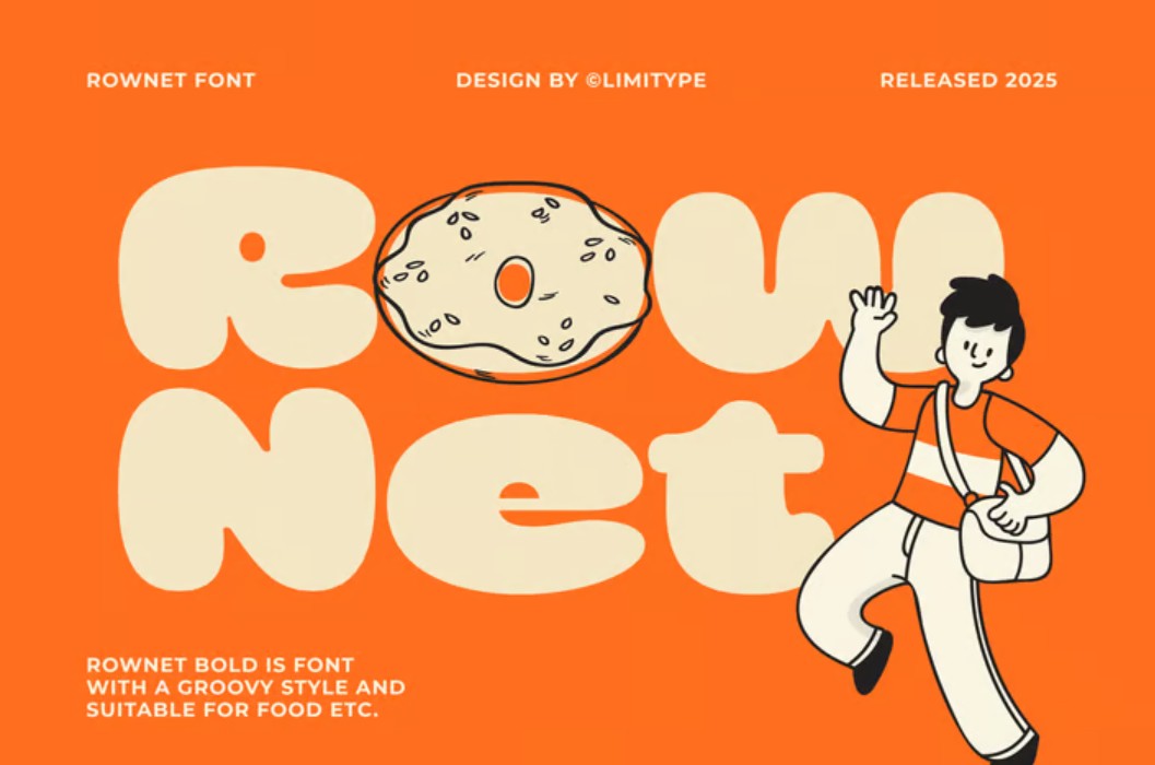
Defining the right style from the outset will help ensure consistency throughout the entire font system.
Step 2: Choose a supported font.
Once you have your main font, the next step is to choose supporting fonts.
The secondary font shouldn't compete for attention with the title. Instead, it should be easier to read, simpler, and serve as a complement to the content.
A good font always strikes a balance between aesthetics and the ability to convey information. Supporting fonts help reduce the heaviness of headings while creating a smooth transition between different sections of the layout.
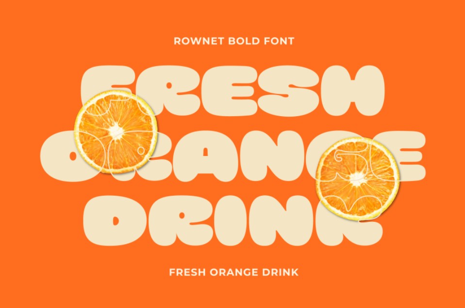
When choosing, try placing the title and paragraph side-by-side to check for harmony. If both fonts stand out equally or are too different in style, you should consider changing them to achieve a better balance.
Step 3: Use consistently
This is a step many people often overlook, but it determines the quality of the entire design system.
Once you've chosen the right font, use it consistently across all your banners, social media posts, brochures, website, or other communication materials.
You shouldn't change fonts randomly just to create a fresh feel. Consistency makes your brand more professional and leaves a lasting impression on customers.
In addition, you should also clearly define the size of the title, subtitle, content, line spacing, and font weight so that all designs adhere to the same standard.
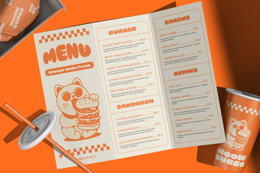
When the entire team uses the same font system, the design process is faster, edits are more convenient, and product quality is consistently maintained.
4. Suggestions for beautiful font combinations.
Choosing the right font pair can save you a lot of time during the design process.
For a modern style, the Montserrat + Inter combination is a very popular choice. Montserrat has strong, modern lines and is suitable for headlines, while Inter is optimized for screen readability and is therefore ideal for the content. Another option is Bebas Neue + Poppins , which creates a striking headline while maintaining overall balance.
If you're aiming for a luxurious style, Playfair Display + Lato is a combination used by many high-end brands. Playfair Display has a classic and sophisticated feel, while Lato is simple, elegant, and easy to read. Additionally, Cormorant + Open Sans is also an ideal font set for fashion, cosmetics, or interior design projects.
With its technology-themed design, Orbitron + Manrope offers a modern and futuristic feel. Another option is Exo + Inter , which is both sharp and ensures good display capabilities across multiple platforms.
If the design aims for cuteness or softness, Baloo + Nunito will create a friendly and approachable feel. Meanwhile, Fredoka + Quicksand is a font set very suitable for educational projects, children's products, or brands with a youthful style.
5. Conclusion
With just a properly selected headline font, supporting font, and content font, you can create visually appealing, clear, and effective designs. Combined with principles of information hierarchy, letter spacing, line spacing, and the right font combination, you can build a professional typography system that enhances design quality and brand image in all your creative work.





















VIP Products








Best Selling Products
Copyright Adobe Lightroom Account
59 USD
MidJourney Account
29 USD
Adobe Premiere Pro Account
99 USD
Genuine Cheap Canva Pro
39 USD
Adobe Photoshop Copyright - Full App
120 USD
Upgrade genuine Capture One account
120 USD
Capcut Pro 1 Year
39 USD
Freepik Premium Account
59 USD
Upgrade Duolingo Super
29 USD
Genuine Adobe Illustrator account
99 USD
Upgrade Genuine Office 365
49 USD
Autodesk All App Account Copyright
120 USD
ChatGPT Plus Account (GPT-4)
16 USD
Windows 10 & 11 Pro Key
36 USD
Plugin Retouch4me
69 USD