Best Selling Products

Genuine Cheap Canva Pro
39 USD

Adobe Photoshop Copyright - Full App
120 USD

Upgrade genuine Capture One account
120 USD

Windows 10 & 11 Pro Key
36 USD

MidJourney Account
29 USD

Genuine Adobe Illustrator account
99 USD

Freepik Premium Account
59 USD

ChatGPT Plus Account (GPT-4)
16 USD

Copyright Adobe Lightroom Account
59 USD

Autodesk All App Account Copyright
120 USD

Upgrade Duolingo Super
29 USD

Adobe Premiere Pro Account
99 USD

Upgrade Genuine Office 365
49 USD

Capcut Pro 1 Year
39 USD

Plugin Retouch4me
69 USD
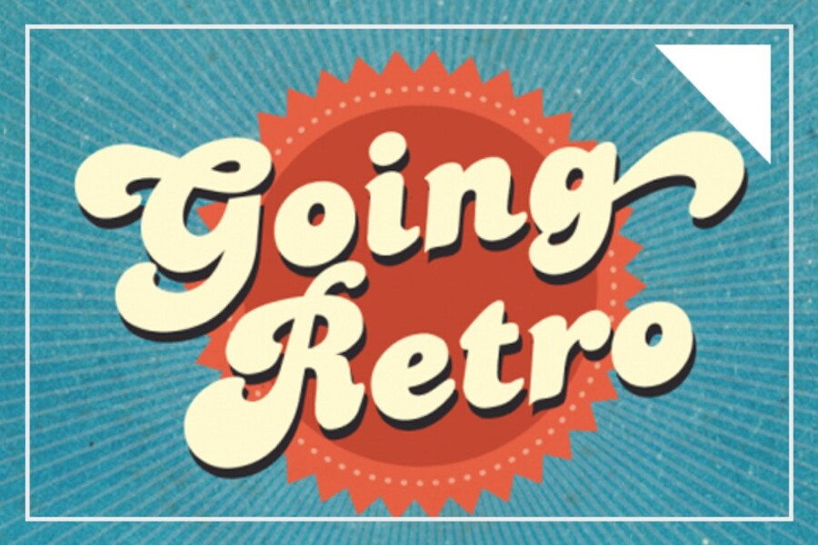
Retro in Design: The Art of Renewing the Old
Nội dung
Retro proves that the old isn't boring when placed in the right context. This article explores how modern designers apply classic color palettes, fonts, and layouts to create vibrant visual products. An interesting perspective for creative enthusiasts.
In today's design landscape, particularly in graphic design, digital art, branding, and website design, the Retro style is seen as a refreshing breath of fresh air amidst the fast-paced rhythm of modern trends. It helps brands create a unique identity, evoke emotions in viewers, and encourage them to linger and admire the style. Behind every Retro detail lies a story, a shared memory of an entire generation, an echo of golden ages.
This article will take you deep into the Retro style, from its origins and characteristics to its advantages and disadvantages, while also guiding you through important tips for creating impressive and profound Retro designs. This is not only a resource for designers but also a source of inspiration for anyone who loves the beauty of nostalgia while still evoking a sense of the future.
1. A brief overview of the Retro style
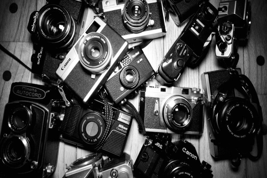
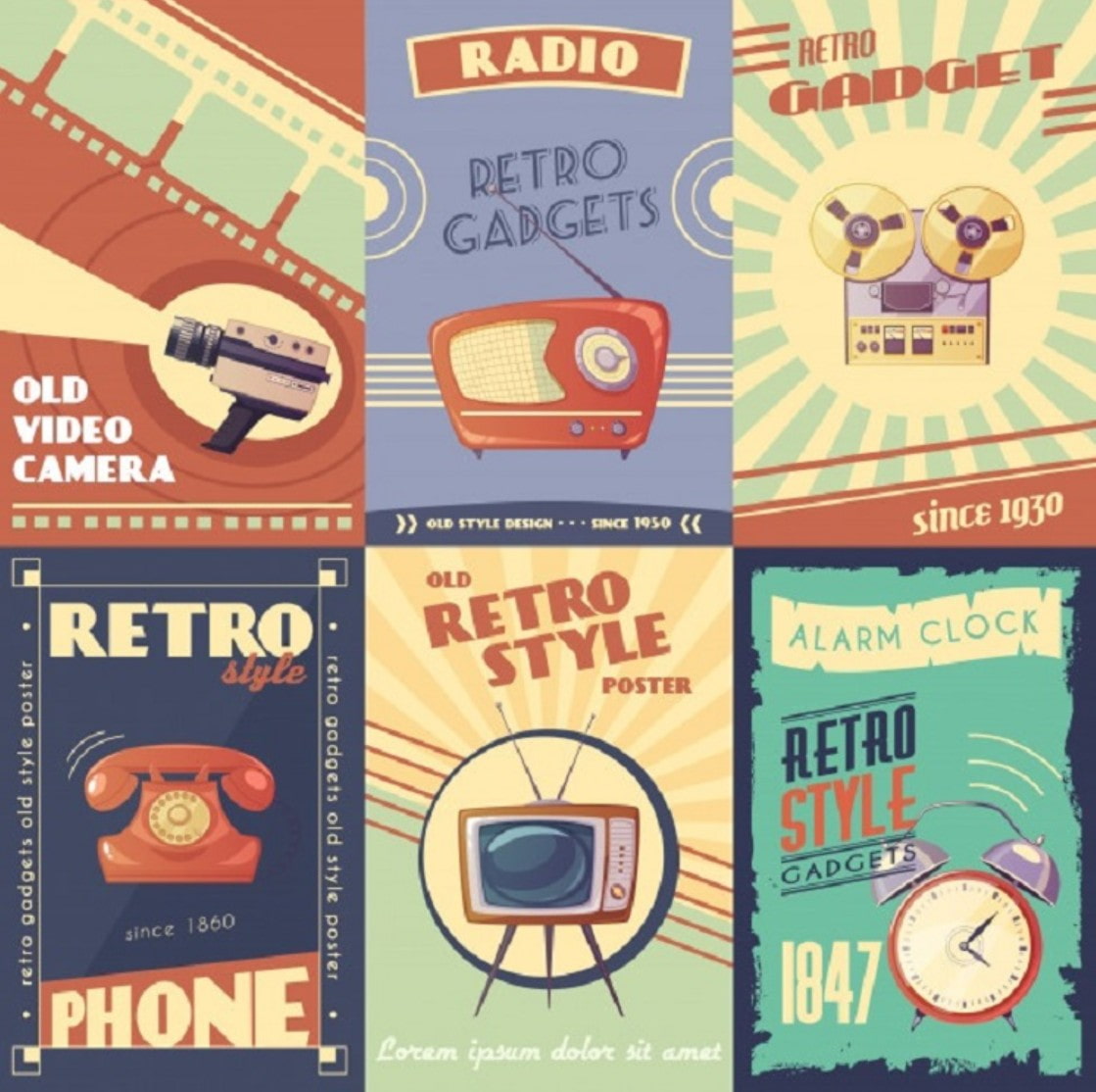
The Retro style emerged around the 1950s, a period when the creative industries began to flourish, with art, design, music, fashion, and popular culture thriving. It was the era of box TVs, radios, vintage cars, vibrant colors, and distinctive typography reminiscent of classic signs, theaters, cinemas, and advertisements. Therefore, Retro is not just a design style, but also represents an entire artistic landscape of the previous century.
When we talk about Vintage, we think of something old, quiet, experienced, and imbued with the passage of time. Vintage leans towards the old, while Retro aims for nostalgia but with a stronger emphasis on innovation. Retro isn't confined to the stillness of memory; instead, it blends old elements into a new context. A Retro design might draw inspiration from the color palette of the 1960s but is expressed through modern, digital methods, a fresh layout, and contemporary design thinking. This is why Retro is increasingly being used in modern website design, branding, and UI/UX.
The essence of Retro lies in the blend of two extremes: old and new, gentle and intense, nostalgic and creative. Therefore, each Retro design has the ability to evoke strong emotions, bringing delight at first glance, much like a child's joyful reaction to seeing a Polaroid camera for the first time or the excitement of encountering glowing neon signs in 1980s films.
1.1. Characteristics of the Retro Style
Despite limiting the use of bullet points, the article retains the necessary categories to ensure clarity:
Retro often uses thin, light-colored lines, sometimes combined with thick outlines to create a striking effect. Twisted patterns, soft curves, and stylized shapes are frequently used, especially in posters and signage. Flatness is also an important characteristic of this style; Modern Retro typically minimizes detail and complex effects to focus on composition, form, typography, and color palette.
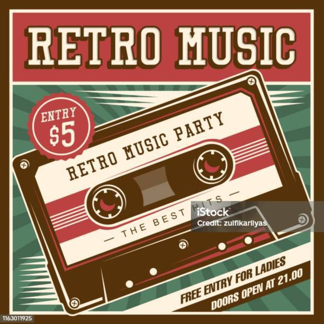
Additionally, Retro is often associated with the Neon style: bright lighting that mimics the neon effects of old bars and theaters. This creates a vibrant and attractive feel, perfectly suited to themes such as music, technology, or fashion.
In terms of fonts, Retro encourages customization. Designers often boldly experiment with rounded fonts, serif fonts, square fonts, or typefaces that mimic old movie titles. Soft script fonts, classic serif fonts, or geometric fonts can all become Retro "material," as long as they evoke a suitable sense of nostalgia.
Retro color palettes tend towards vibrant and bold hues. Gold, orange, red, blue, turquoise, and mint green have become iconic colors of this style. The colors are used not only to attract the eye but also to evoke feelings of happiness, joy, and energy.
1.2. Advantages of the Retro Style
Retro style evokes a cheerful and lighthearted feeling thanks to its use of simple shapes and bright colors. It's particularly well-suited to technology, music, entertainment, and products targeting young people who appreciate uniqueness. Retro style creates a sense of familiarity and ease of understanding, thus helping to convey the brand's message more effectively.
1.3. Disadvantages of the Retro Style
However, Retro isn't a style for everyone. Some groups may not appreciate the beauty of Retro due to differences in cultural experiences or personal aesthetics. Furthermore, Modern Retro is a highly unified style; when combined with other trends, the design can easily become chaotic or lackluster. If the designer lacks finesse in color combinations, font selection, or layout construction, disorder will immediately become apparent.
2. 5 impressive retro-style design tips
2.1. Color
If we had to choose the element that makes Retro most recognizable, it would definitely be color. Retro doesn't adhere to the soft pastel palettes or minimalist white tones of modern trends. Warm and vibrant colors always dominate, especially yellow, orange, brown, brick red, turquoise, and mint green. When combined, they create a feeling that is both old-fashioned, dusty, and distinctly reminiscent of the "golden decades" of design.
Combining muted colors like brown or beige with bright hues is the key to creating a design that feels both classic and striking. This pairing helps designers balance nostalgia with modern vibrancy.
2.2. Geometric Shapes
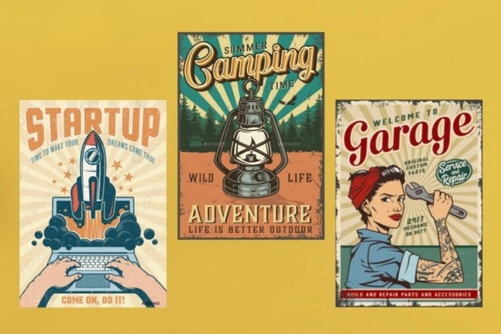
Geometric shapes are a crucial element in creating the soul of the Retro style. The 60s to 80s favored the use of stylized shapes, from bows, ribbons, badges, and sign frames to neon symbols and geometric patterns. These shapes not only serve as decoration but also create visual rhythm, making the design more dynamic and layered.
Many signs and posters from that era used geometric shapes to guide the eye or create a focal point. Therefore, when designing retro designs today, you can absolutely utilize geometric shapes to create a unique impression, especially in projects related to events, advertising, or poster design.
Besides geometric shapes, classic patterns such as floral designs, swirling curves, or classic geometric patterns also evoke a distinct retro feel. Depending on the theme, you can choose patterns that are more "contemporary" such as boho, mid-century, or pop art.
2.3 . Font
Typography plays an extremely important role in Retro design. The choice of font can instantly define the style, period, and mood of a design.
Retro designs often favor serif fonts with thick serifs, soft script fonts, or distinctive display fonts that mimic vintage signage. Additionally, geometric fonts with rounded curves and thick strokes frequently appear in designs from the 1980s, the heyday of pop art and neon signs.
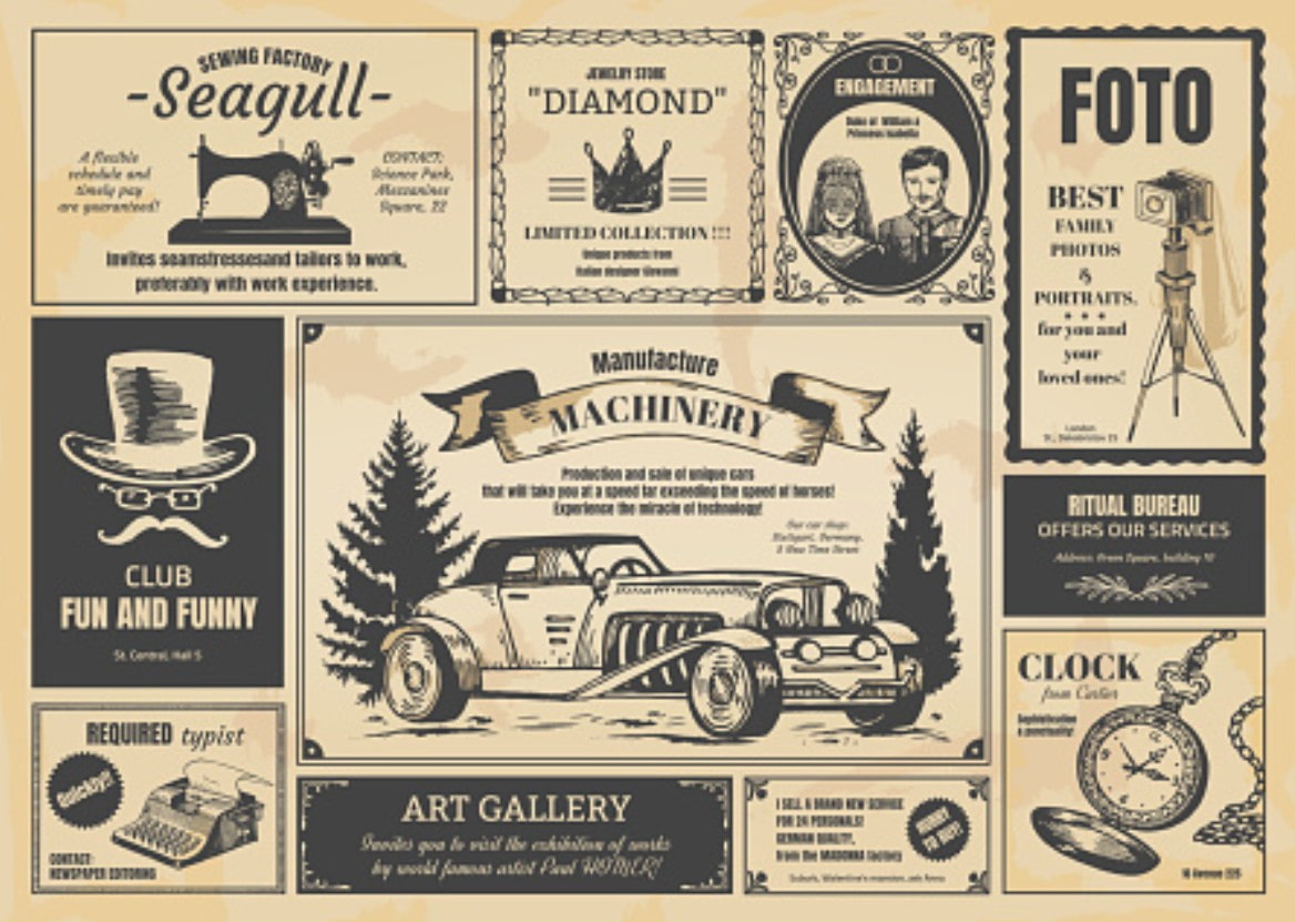
To make the text stand out more, designers can add subtle effects such as light shadows, thick borders, or gradient color effects reminiscent of vintage signage. However, restraint is essential. Overusing effects or choosing overly busy fonts can make the design look sloppy and lacking in sophistication.
Kerning and tracking—these two factors related to letter spacing—are particularly important in Retro fonts, as older typefaces often have uneven proportions and a rather free-flowing style. Controlling spacing will help create a more harmonious and readable overall design.
2.4. Texture
To enhance the "vintage" feel of a design, texture is indispensable. A photograph, poster, or sign from several decades ago will often be faded, slightly scratched, rough, or yellowed. These characteristics, when subtly recreated using texture, will create a realistic and vibrant feel.
Common textures in retro design include grain, noise, paper texture, film dust, vignette, or faded effects. These help recreate the feel of old materials, giving designs a more "aged" look while also creating visual depth.
In website design, squares, circles, or ovals combined with leaf patterns, curved borders, or simple icons are often used to enhance the nostalgic element. Images with delicate lines and not overly elaborate designs are always a safe choice for Retro because their minimalism helps maintain the inherent elegance of this style.
Incorporating modern imagery is also a way to prevent retro posters from looking outdated. A retro poster with a classic layout but using digital illustrations or modern photographs will create an interesting balance between the old and the new. The important thing is that the designer needs to know how to moderate the elements so that the overall effect doesn't become disjointed.
Retro style is a gentle reminder of the beauty of the past, but it doesn't stop at simply copying what's old. It continues to evolve and adapt to suit the new era, from branding and UI/UX to advertising and website design. Retro helps to evoke emotions, tell stories through images, and provide a unique visual experience that no other style can replace.


VIP Products


Best Selling Products
Genuine Cheap Canva Pro
39 USD
Adobe Photoshop Copyright - Full App
120 USD
Upgrade genuine Capture One account
120 USD
Windows 10 & 11 Pro Key
36 USD
MidJourney Account
29 USD
Genuine Adobe Illustrator account
99 USD
Freepik Premium Account
59 USD
ChatGPT Plus Account (GPT-4)
16 USD
Copyright Adobe Lightroom Account
59 USD
Autodesk All App Account Copyright
120 USD
Upgrade Duolingo Super
29 USD
Adobe Premiere Pro Account
99 USD
Upgrade Genuine Office 365
49 USD
Capcut Pro 1 Year
39 USD
Plugin Retouch4me
69 USD