In the context of modern web design always aiming for minimalism, gentleness and sophistication, pastel color palette has become a popular trend not only for businesses but also for creative individuals. Pastel colors with soft, pleasant and enchanting beauty bring a comfortable and friendly feeling to users. In the article below, SaDesign will explore with you the Top 7 beautiful pastel color design websites with quality assessment criteria, outstanding trends and practical advice for designers.
1. Introduction to pastel colors in design
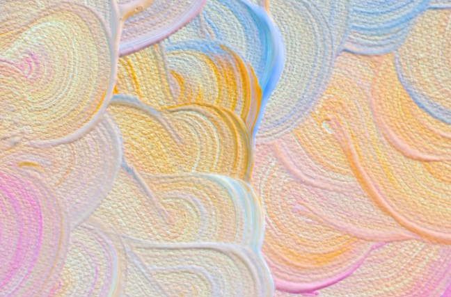
Pastel colors are soft colors, often diluted with a white background, creating a cool and sophisticated visual space. In web design, the use of pastel colors not only helps to minimize the interface but also creates a friendly, accessible feeling for users. With the explosion of the minimalist trend and superior user experience (UX), designers increasingly favor pastel color palettes because of their ability to soothe the eyes and bring a sense of relaxation to viewers.
2. Meaning and benefits of using pastel colors
Pastel colors have many outstanding strengths:
Soft first impression: Soft tones create a cool, pleasant feeling at first sight, helping to subtly portray the brand image.
Optimal user experience: When the interface is designed with pastel colors, users often find it easy to read, without eye strain, helping them focus on the main content.
The balance between art and function: Pastel is not only beautiful but can also highlight information, supporting clear and easy-to-understand content layering.
Versatility: Pastel color palettes work well in a variety of design types, from e-commerce sites to blogs to personal portfolios.
Thanks to the above characteristics, pastel colors are not only an aesthetic trend but also a useful tool in enhancing user experience, while bringing about a difference in the way the brand is expressed.
3. List of 7 pastel color design websites
After clarifying the evaluation criteria, SaDesign would like to introduce in detail 7 typical websites with beautiful pastel color palettes along with detailed analysis of each website.
3.1. PastelDreams
PastelDreams is an interior design and lifestyle website that uses pastel colors to create a very soft and warm visual space. The brand has created a very sophisticated image through the harmonious combination of colors and images.
Highlights:
Harmonious color palette: PastelDreams uses a soft pastel color palette, making users feel comfortable from the first visit. The combination of colors such as light pink, mint green and pale yellow creates a lively yet sophisticated space.
Minimalist layout: The website interface is designed in a modern style with lots of white space, helping to highlight key information and product images. The reasonable space allocation makes the user experience smooth and intuitive.
Good User Interaction: With smooth hover effects and quick response, PastelDreams creates a friendly, approachable and easy-to-use online experience.
3.2. SoftHue Studio
SoftHue Studio is a brand specializing in graphic design and advertising with a modern style that harmoniously combines pastel colors. This brand is not afraid to express creativity through unique patterns and color depth, bringing a modern but very soft feeling.
Highlights:
Unique Patterns: SoftHue Studio does not limit itself to pastel colors but also gets creative with patterns and background images. The combination of modern patterns and soft color palettes helps create a unique identity for the website.
High quality images: Every graphic detail is meticulously designed, harmoniously combined with sharp images, helping to create an impressive and professional overall look.
Flexible interaction: Page loading speed and smooth motion effects contribute positively to the user experience, creating a dynamic feeling without losing sophistication.
3.3. PastelPortfolio
PastelPortfolio is a website that showcases outstanding design projects by a group of young designers. This website is aimed at customers who love creativity and innovation, thereby expressing both the expertise and individuality of each design.
Highlights:
Unique design style: PastelPortfolio knows how to take advantage of pastel color palettes to highlight each project, creating depth for content through subtle lighting effects and gradients.
Clear information hierarchy: The tables of contents are scientifically arranged, helping users easily search for information and refer to outstanding projects.
Excellent responsiveness: With a design that is compatible across multiple devices, from desktops to smartphones, PastelPortfolio ensures a smooth experience for all users.
3.4. DreamyPastel
DreamyPastel is a website in the field of design and fashion, famous for its application of pastel color palette in every small detail of the interface. This website not only brings a gentle, relaxing feeling but also shows creativity through every design line.
Highlights:
Detailed pastel color application: From buttons, menus to backgrounds, DreamyPastel shows meticulousness in the use of pastel colors, bringing a sense of unity and harmony.
Relaxing design: The interface is built in a minimalist style with smooth graphic elements, helping users not feel overloaded when receiving information.
Subtle animations: Subtle animations when moving the mouse or scrolling the page create a fun and elegant online experience.
3.5. PastelVibe
PastelVibe is a website specializing in the field of art and creativity, with a pastel color palette as a special highlight. This website not only shows a strong aesthetic taste but also supports users through an intuitive interface, optimized for both reading experience and referencing works of art.
Highlights:
Subtle blend of art and pastel: PastelVibe uses soft colors combined with unique artistic images, creating a creative and inspiring space.
Highly Interactive Design: This website is designed with dynamic interactive elements, from hover effects to animations, creating a unique and intuitive experience.
Consistent Brand Identity: Every detail on PastelVibe is meticulously crafted, demonstrating consistency in the application of the pastel color palette, contributing to a strong brand identity.
3.6. LightPastel
LightPastel is a website for a start-up brand specializing in technology and digital content creation. The website emphasizes youthfulness and dynamism through the subtle application of pastel color palette, both modern and approachable.
Highlights:
Youthful pastel color palette: LightPastel uses colors such as light blue, pink and lavender, creating a fresh, modern but equally soft feeling.
Logical content structure: LightPastel's interface is designed with a clear information architecture, from the introduction section to the product categories, providing a seamless user experience.
Integrating modern technology: Website is optimized for performance and page loading speed, supports responsive design, helping users access smoothly on all platforms.
3.7. ArtPastel
ArtPastel is a multimedia art website where creative works are displayed in pastel tones. The website focuses on art, creativity and an aesthetic interface.
Highlights:
Creative in lighting effects: ArtPastel is known for its unique dynamic lighting and color transition effects, which help highlight artworks and create a sense of smooth motion.
Artistic interface: Every design detail is meticulously cared for, from typography to image layout, creating an artistic whole.
Top-notch user experience: With fast page loading speed and high compatibility on all devices, ArtPastel brings maximum satisfaction to users through every smooth experience.
In the ever-changing world of design, pastel colors have established their position not only through aesthetics but also through their ability to support and enhance user experience. Each website on the list is a living testament to creativity and sophistication in color application. SaDesign hopes that through this article, you will not only find inspiration but also gain valuable experience to improve the interface and user experience in your projects. Thank you for taking the time to follow and read this lengthy but passionate article.


.png)
.png)
.png)
.png)
.png)
.png)
.png)
.png)